 kage
kage
fideisland.it.com
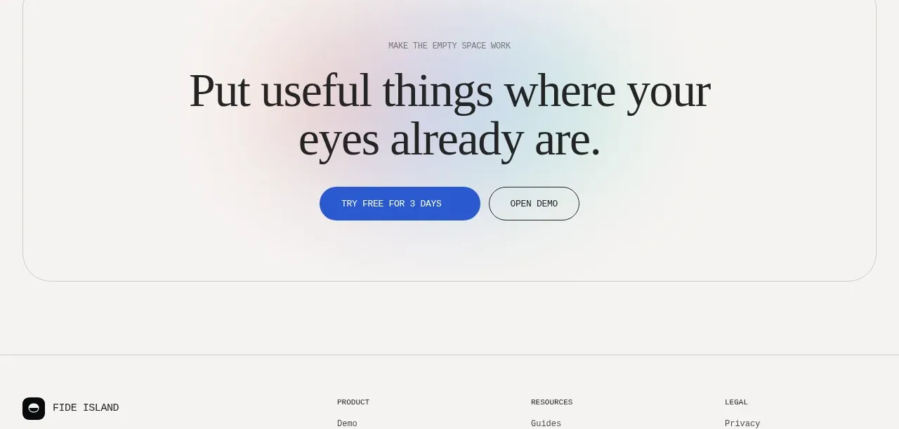
Design analysis
A bordered rounded callout uses a subtle pastel glow, centered editorial headline, and two contrasting actions to close the page.
Prompt preview
## Reference images

Study these alongside the description below: hierarchy, rhythm, spacing, colour. Build for the product you are asked about, using this design language.

- Component: https://kage-design-assets.t3.tigrisfiles.io/components/fide-island/e90b7c78-4279-44cf-a252-bbd8cdefeb5b-1789711574-9.webp
- Full page it was cut from: https://kage-design-assets.t3.tigrisfiles.io/screenshots/fide-island/e90b7c78-4279-44cf-a252-bbd8cdefeb5b-1789711455018-full.webp
- Component on Kage: https://kage.design/component/fide-island-cta

## Before you start
Ask what the user's primary conversion goal is and what reassurance should accompany it. Apply this structure to that goal and brand.

Build a centered closing CTA inside a large rounded bordered panel. Add a tiny uppercase eyebrow, a two-line serif invitation, and two pill buttons: a filled cobalt primary action and an outlined secondary action. Use a very subtle pastel atmospheric wash behind the headline—soft blue, blush, and mint rather than a loud gradient—on a warm off-white surface. Give the panel generous vertical whitespace, a 1px #d8d8d3 border, 28px radius, centered max-width content, and clear hover/focus states. Keep the message concise and make the primary action visually dominant without overpowering the page.

Never: use the reference's logos, product names, copy, illustrations, imagery, or exact branding.
More components
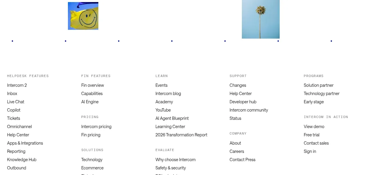
 Final customer experience call to action
intercom.com · Call to action
Final customer experience call to action
intercom.com · Call to action

 App download conversion
Lull · Call to action
App download conversion
Lull · Call to action

 Centered final call to action
ApplySeed · Call to action
Centered final call to action
ApplySeed · Call to action

 Inline conversion banner
QAgent · Call to action
Inline conversion banner
QAgent · Call to action

A
Final signup call to action
Axiom · Call to action
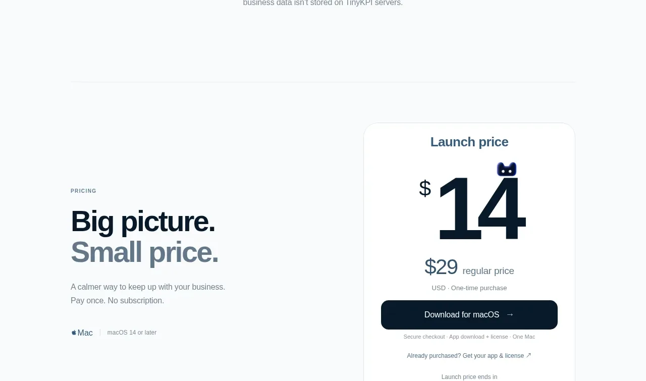
 Privacy promise
TinyKPI · Call to action
Privacy promise
TinyKPI · Call to action