kage
kage
fideisland.it.com

Design analysis
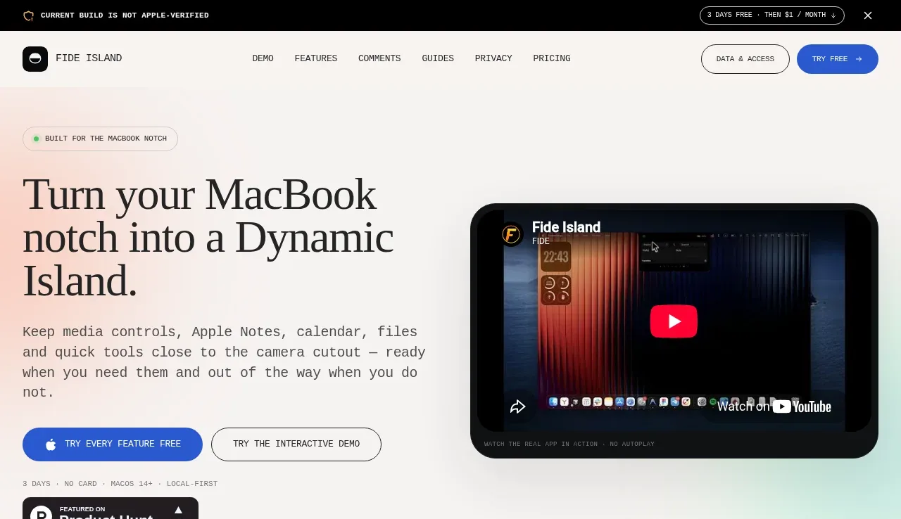
A long-form, editorial product page uses oversized high-contrast serif headlines against an off-white canvas, with compact monospace labels and body copy supplying a technical, local-first tone. The page moves from a split hero and dark media preview into an interactive demo, a dense three-column feature grid, testimonials, a pale blue privacy section, pricing, installation guidance, FAQ, and a final CTA; thin rules, restrained radii, and occasional pastel blue/pink gradients create rhythm without adding visual clutter.
Prompt preview
## Reference images

Study these alongside the description below: hierarchy, rhythm, spacing, colour. Build for the product you are asked about, using this design language.

- Full page: https://kage-design-assets.t3.tigrisfiles.io/screenshots/fide-island/e90b7c78-4279-44cf-a252-bbd8cdefeb5b-1789711455018-full.webp
- Above the fold: https://kage-design-assets.t3.tigrisfiles.io/screenshots/fide-island/e90b7c78-4279-44cf-a252-bbd8cdefeb5b-1789711452134.webp
- Design on Kage: https://kage.design/designs/fide-island-landing-page

## Before you start
Ask the user what they are building, who it is for, and what brand assets they already have (name, colours, type choices, logo, imagery, and product UI). Wait for their answers before designing. Apply the system below to that product, not to the reference product.

## Page structure
1. **Announcement strip and navigation:** Begin with a thin black announcement bar containing a small status cue, compact uppercase/monospace copy, a trial offer, and a close control. Place a light navigation row below it with a small product mark and name on the left, evenly spaced anchor links in the centre, and outlined/blue action buttons on the right.
2. **Hero:** Use a generous split layout on an off-white background. Put a small pill label, very large multi-line serif headline, technical monospace description, two pill CTAs, a small trial/compatibility note, and a compact proof badge on the left; place a large rounded dark product/video preview on the right.
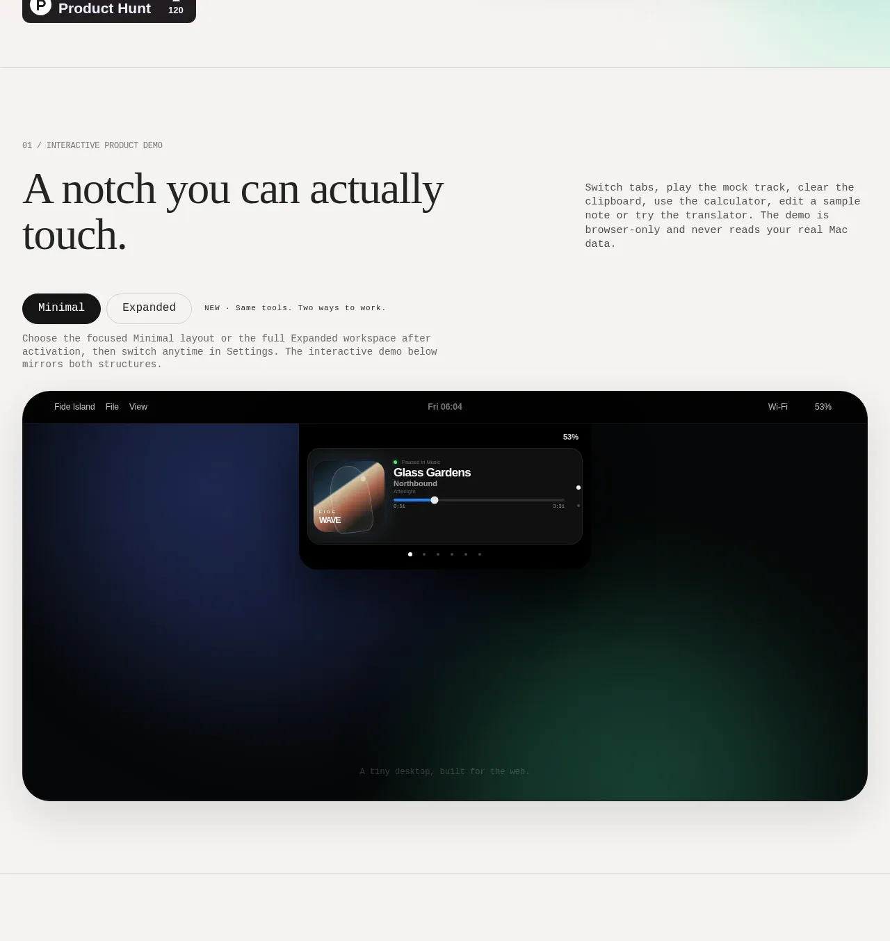
3. **Interactive product demo section:** Separate the section with a thin horizontal rule and a numbered monospace eyebrow. Pair a large serif statement on the left with a compact explanatory paragraph on the right, then add a dark/light segmented control and a short note before a wide, heavily rounded dark demo viewport.
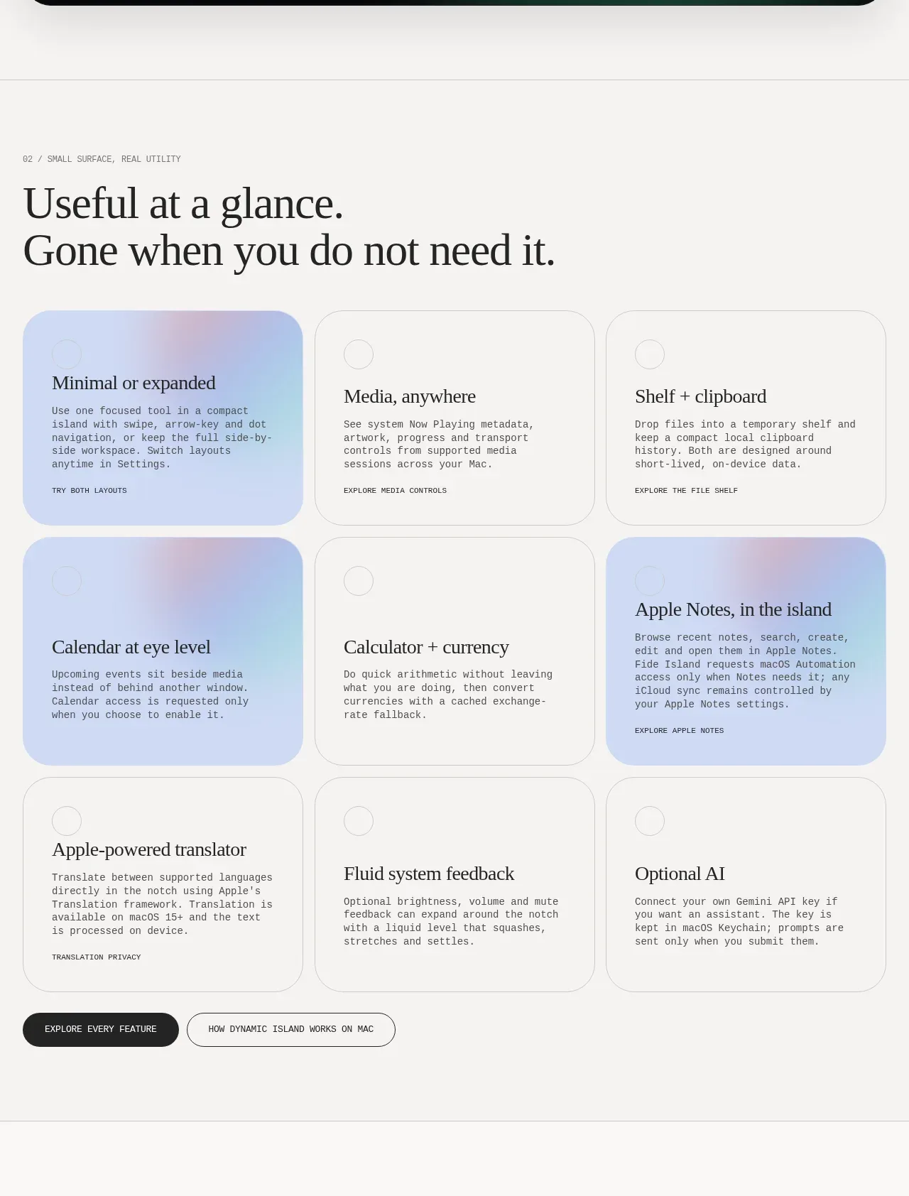
4. **Feature overview grid:** Introduce a second numbered section with a large two-line serif heading. Below it, use a three-column by three-row card grid: mostly white cards with thin borders, two or three pale blue/pink gradient highlight cards, small circular markers, serif feature titles, monospace descriptions, and tiny uppercase links. Finish with two pill buttons.
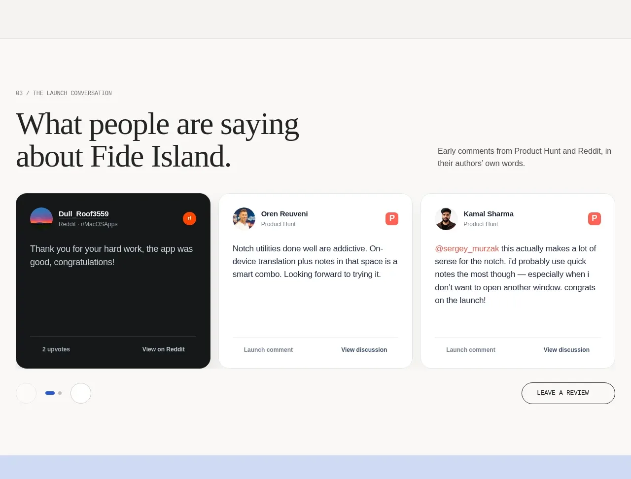
5. **Testimonials:** Use another numbered eyebrow and a split heading/intro row, then present three horizontally aligned testimonial cards. Mix one dark card with white cards, include small avatars or source markers, compact attribution, quote text, and bottom metadata links. Add carousel dots and a right-aligned review button below.
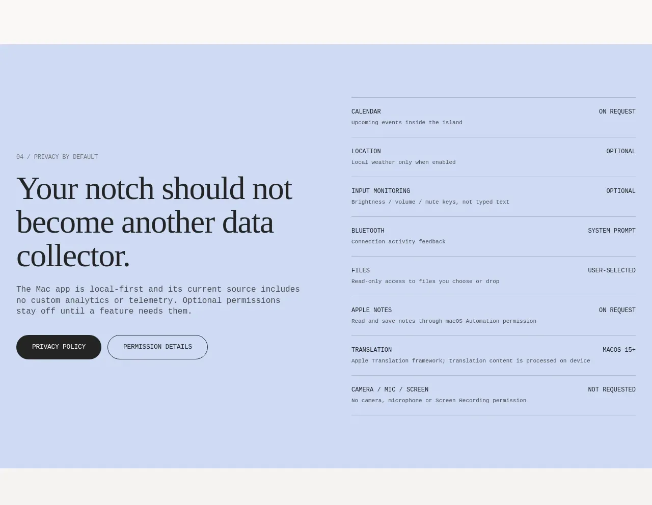
6. **Privacy and permissions section:** Switch to a full-width pale blue panel. Set a large serif privacy statement and supporting copy with two buttons on the left; on the right, display a ruled permission matrix with rows, small monospace descriptions, and right-aligned states such as optional, on request, or user-selected.
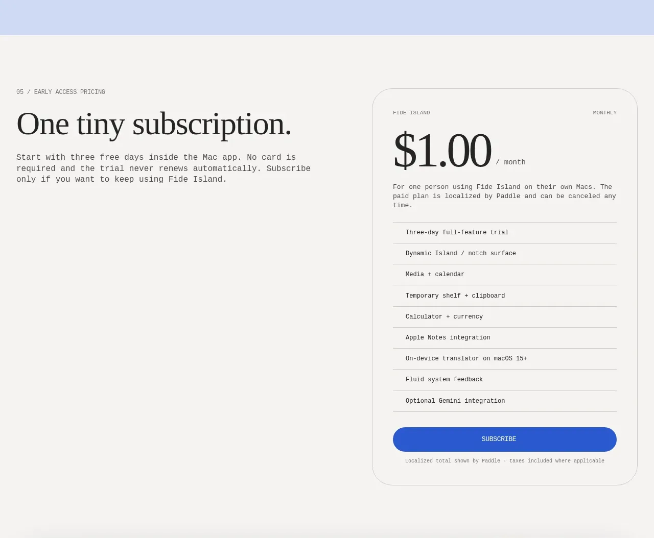
7. **Pricing section:** Return to the off-white canvas and use a two-column layout: an eyebrow, large serif pricing headline, and explanatory paragraph on the left; a bordered rounded pricing card on the right with a small plan label, oversized price, billing unit, feature checklist separated by rules, and a full-width blue subscribe button.
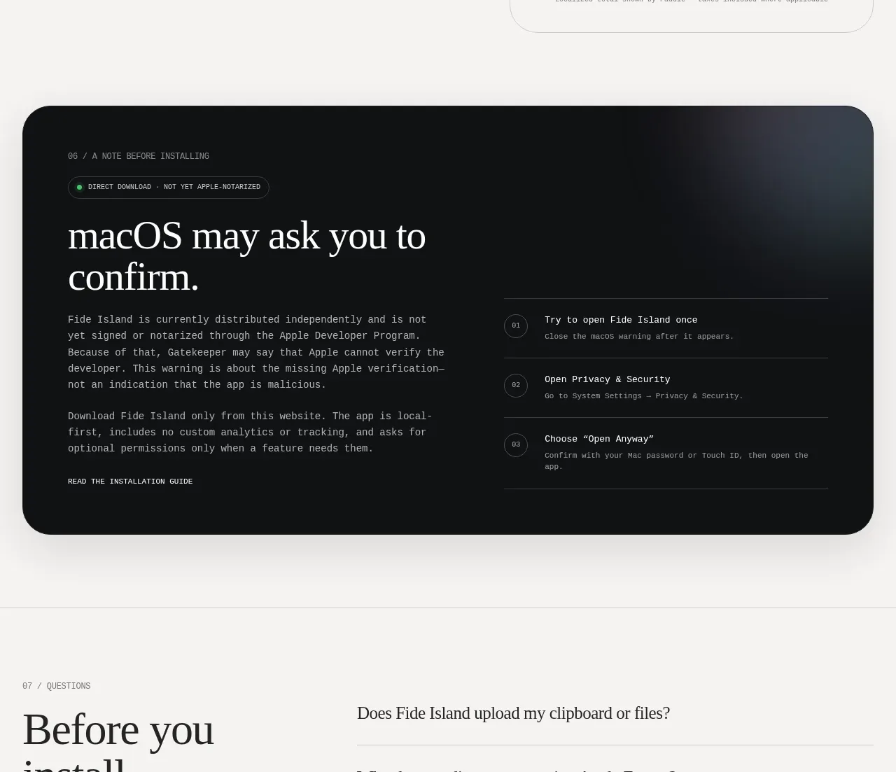
8. **Installation warning panel:** Place a wide, very dark rounded panel with a subtle cool glow. Include a numbered eyebrow, status pill, large light serif heading, explanatory monospace paragraphs and guide link on the left; show three numbered installation steps with dividers on the right.
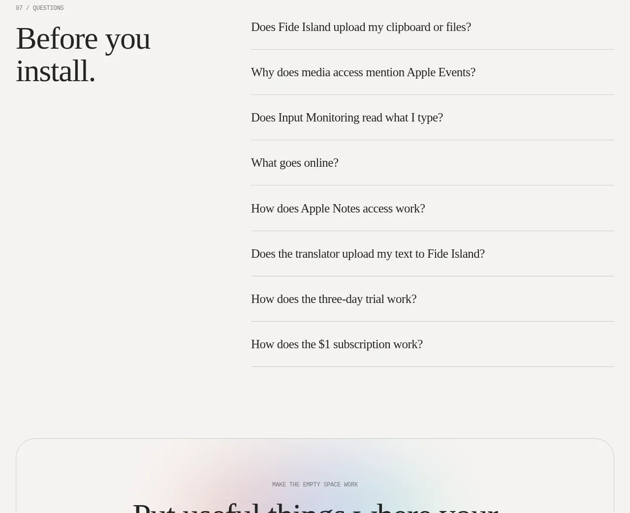
9. **FAQ section:** Use a numbered eyebrow and a two-column layout with a large serif “before you install” heading on the left and a vertical accordion/list of questions on the right. Keep each item spacious, separated by thin rules, with no heavy containers.
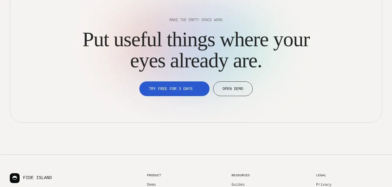
10. **Final CTA:** Add a large rounded bordered callout with a very subtle pastel blue/pink glow behind the centred content. Use a small eyebrow, large centred serif invitation, and blue primary plus outlined secondary buttons.
11. **Footer:** Finish with a ruled footer containing the product mark and short local-first descriptor on the left, three compact link columns for product, resources, and legal, then a bottom rule with copyright and small system/accessibility status text.

## Design language
- Build hierarchy through contrast in type scale rather than excessive decoration: use oversized literary serif headlines, compact technical monospace labels and descriptions, and restrained small sans-serif utility text.
- Pair a high-contrast display serif with a readable monospace for product/technical copy. Use tight uppercase tracking for section numbers, labels, metadata, and buttons; let main headings use generous line height and deliberate line breaks.
- Keep the main canvas warm off-white, approximately `#f7f7f5` or `#f5f5f2`, with near-black text around `#171719`. Use pure or soft black for dark media and installation panels.
- Reserve saturated blue, approximately `#2f5ed8`, for primary actions and active controls. Use very light periwinkle blue around `#cbd8f4` and faint pink/peach around `#f2d9d7` as sparse atmospheric gradients, not as general fills.
- Change rhythm down the page: start with an airy, image-led hero; become denser in the demo and feature grid; loosen again for testimonials; use the privacy matrix and pricing card for structured information; end with a calm FAQ, CTA, and compact footer.
- Use thin light-gray rules, roughly `#d8d8d5`, to divide sections and rows. Cards should have subtle 1px borders, medium-to-large corner radii around 22–30px, and little or no shadow; let contrast and spacing create elevation.
- Use pills for CTAs, tabs, badges, and status labels. Primary buttons are blue with white text, secondary buttons are transparent with dark borders, and active segmented controls use black fill with white text.
- Make product previews and dark panels wide, cinematic, and strongly rounded. Add only restrained glow, blur, or gradient behind media; avoid ornamental illustrations when real interface imagery can explain the product.
- Treat interaction as quiet and purposeful: tabs switch demo variants, cards and feature links can reveal details, FAQ rows expand, and carousel dots change testimonials. Use short opacity/colour transitions and subtle motion, never bouncing or decorative animation.
- Keep generous outer margins and consistent section padding, but allow dense data areas such as permissions, pricing features, and footer links to tighten into ruled rows. Preserve the editorial desktop composition while stacking split layouts and card grids cleanly on small screens.

## Never
- Do not copy the reference product’s logos, wordmarks, product name, exact copy, illustrations, photography, screenshots, UI labels, or icon set.
- Do not present the result as Fide Island or imply affiliation with it.
- Do not reproduce the reference’s specific feature names, pricing, testimonial text, installation wording, or brand identity; replace them with content and assets for the user’s product.
Components from this page
All components
F
Announcement bar and primary navigation
Fide Island · Navigation
F
Product promise hero
Fide Island · Hero
F
Interactive product demo
Fide Island · Feature grid
F
Feature overview card grid
Fide Island · Feature grid
F
Community comments
Fide Island · Testimonials
F
Privacy and permissions
Fide Island · Feature grid
F
Single-plan early access pricing
Fide Island · Pricing table
F
Installation and security note
Fide Island · Card
F
Pre-installation questions
Fide Island · FAQ
F
Final conversion call to action
Fide Island · Call to action

F
Product footer and legal links
Fide Island · Footer