kage
kage
fideisland.it.com
Design analysis
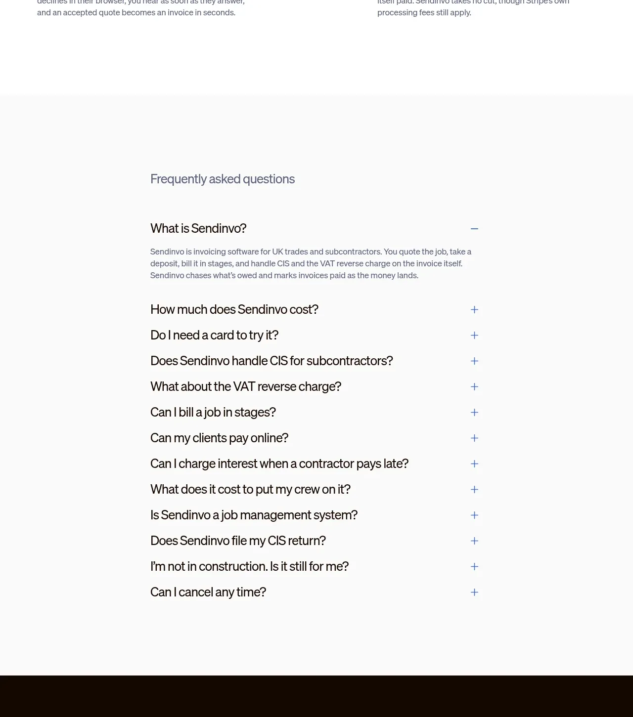
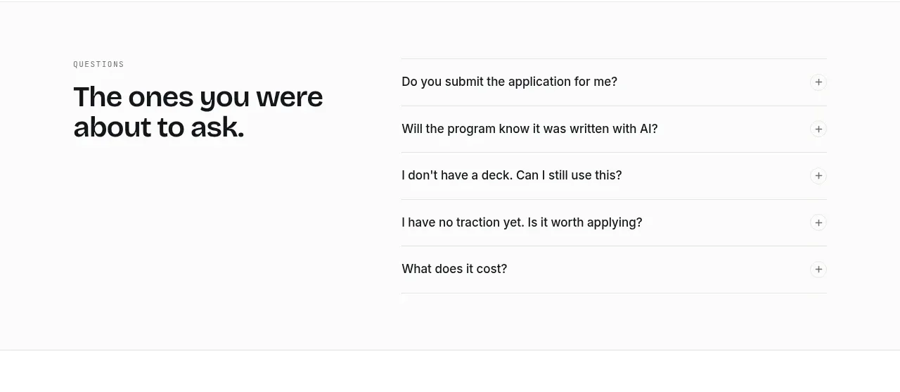
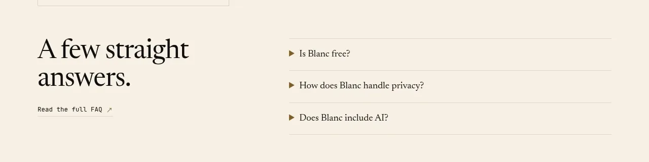
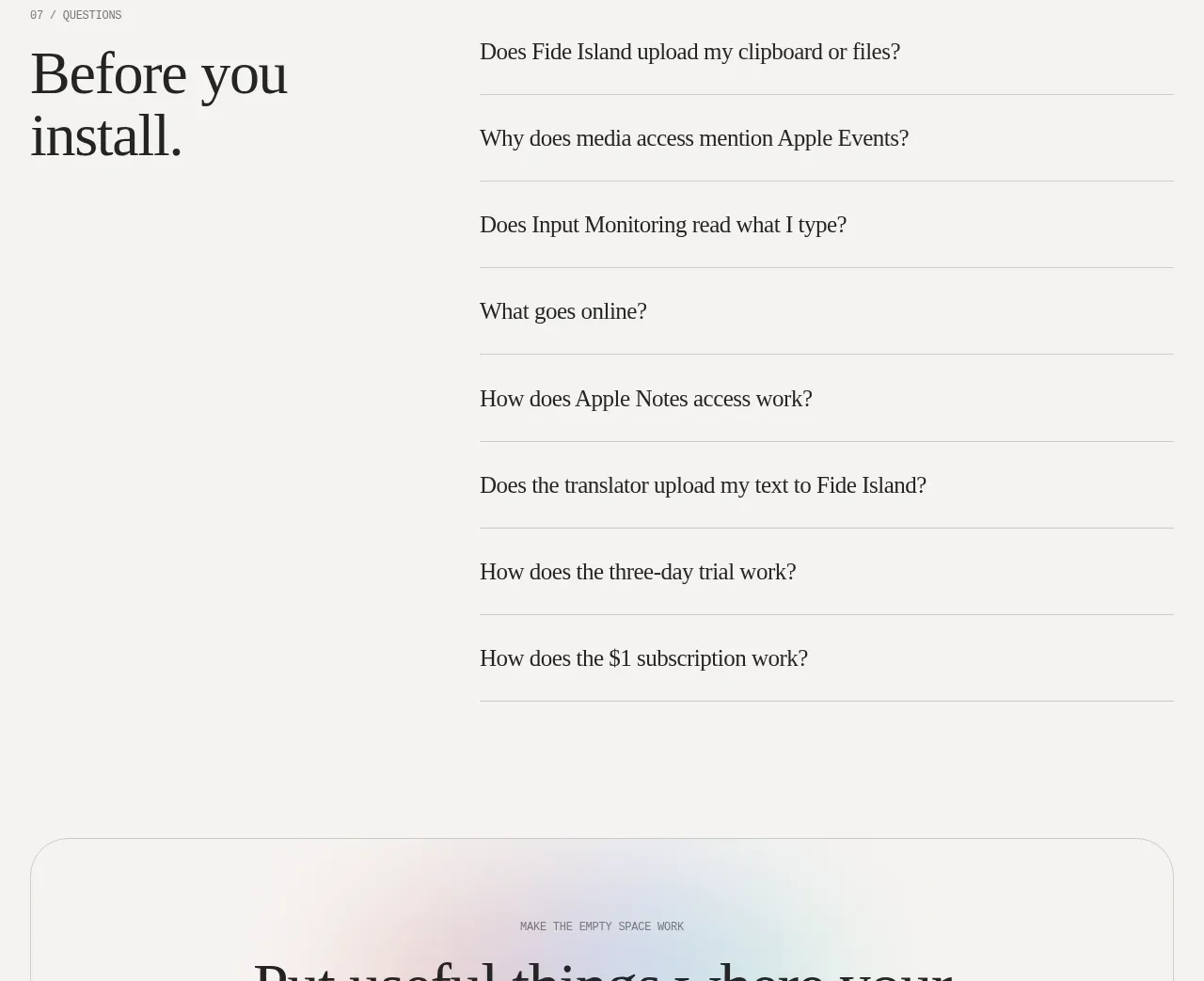
A split FAQ layout places a large “before you install” heading beside a clean list of horizontally divided questions.
Prompt preview
## Reference images

Study these alongside the description below: hierarchy, rhythm, spacing, colour. Build for the product you are asked about, using this design language.

- Component: https://kage-design-assets.t3.tigrisfiles.io/components/fide-island/e90b7c78-4279-44cf-a252-bbd8cdefeb5b-1789711574-8.webp
- Full page it was cut from: https://kage-design-assets.t3.tigrisfiles.io/screenshots/fide-island/e90b7c78-4279-44cf-a252-bbd8cdefeb5b-1789711455018-full.webp
- Component on Kage: https://kage.design/component/fide-island-faq

## Before you start
Ask what prospective users need to know before adopting the product and which answers reduce uncertainty. Turn those into concise, truthful FAQ items.

Create a spacious FAQ section with a two-column desktop layout: a large serif heading and small eyebrow on the left, and a vertical list of accordion questions on the right. Each item should be separated by a thin neutral rule, use comfortable vertical padding, and include a clear disclosure affordance. Keep question typography larger than the supporting UI but smaller than the main heading. Use #f5f4f1, #202020 text, #d7d7d2 dividers, serif question text, and mono/grotesk utility labels. Allow one or multiple items to open, animate subtly, support keyboard interaction, and expose expanded state to assistive technology. Collapse to one column on mobile.

Never: use the reference's logos, product names, copy, illustrations, imagery, or exact branding.