kage
kage
fideisland.it.com

Design analysis
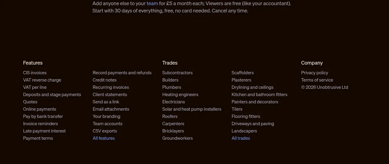
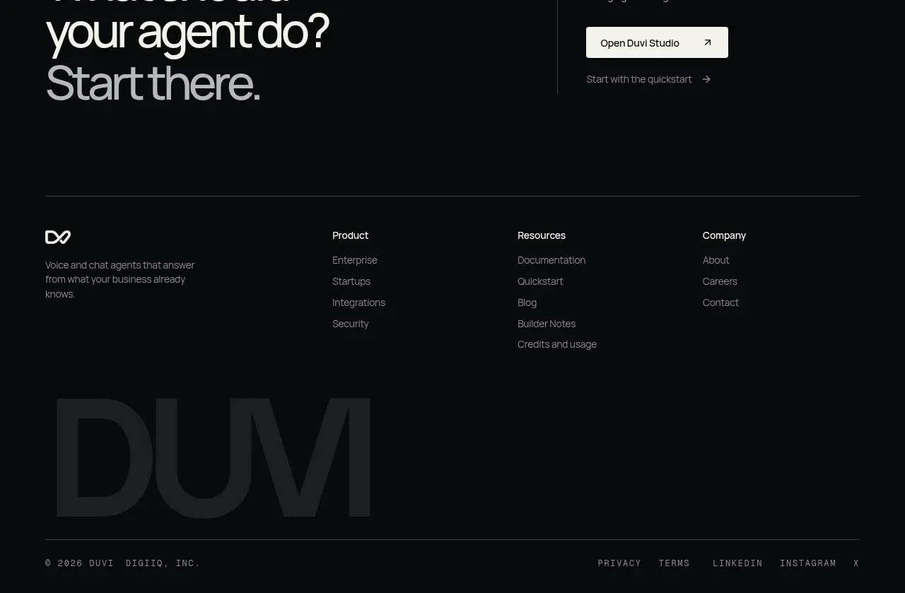
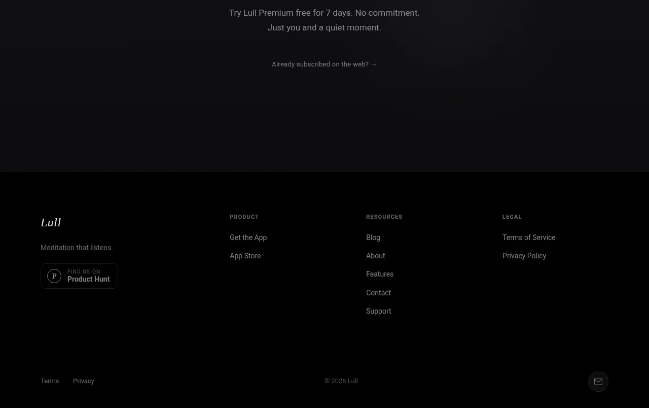
A restrained footer presents the product mark and short descriptor on the left, grouped navigation and legal links across the row, then a thin divider and copyright/status line.
Prompt preview
## Reference images

Study these alongside the description below: hierarchy, rhythm, spacing, colour. Build for the product you are asked about, using this design language.

- Component: https://kage-design-assets.t3.tigrisfiles.io/components/fide-island/e90b7c78-4279-44cf-a252-bbd8cdefeb5b-1789711574-10.webp
- Full page it was cut from: https://kage-design-assets.t3.tigrisfiles.io/screenshots/fide-island/e90b7c78-4279-44cf-a252-bbd8cdefeb5b-1789711455018-full.webp
- Component on Kage: https://kage.design/component/fide-island-footer

## Before you start
Ask what navigation groups, support links, legal requirements, and company details the user's product needs. Organize only what is relevant.

Create a minimal multi-column footer on a warm off-white background. Put a compact product mark, wordmark, and one-line descriptor in the first column; place product, resources, and legal link groups in subsequent columns. Finish with a thin horizontal divider and a small copyright/status row. Use generous top padding, compact mono or grotesk labels, near-black text, muted secondary text, 1px #d8d8d3 rules, and no decorative clutter. Make every link keyboard-accessible, preserve readable contrast, and stack columns cleanly on narrow screens.

Never: use the reference's logos, product names, copy, illustrations, imagery, or exact branding.