 kage
kage
callfifi.app

Design analysis
A dark closing conversion band repeats the waitlist action with a centered headline, supporting text, email input, and bright button.
Prompt preview
## Reference images

Study these alongside the description below: hierarchy, rhythm, spacing, colour. Build for the product you are asked about, using this design language.

- Component: https://kage-design-assets.t3.tigrisfiles.io/components/fifi/65f510a7-1d11-431a-a427-6e570df25f2f-1789538469-8.webp
- Full page it was cut from: https://kage-design-assets.t3.tigrisfiles.io/screenshots/fifi/65f510a7-1d11-431a-a427-6e570df25f2f-1789538432367-full.webp
- Component on Kage: https://kage.design/component/fifi-cta

## Before you start
Ask what the user's product is, who it serves, and what their brand personality and palette are. Apply the following principles to that product rather than reproducing the reference.

Create a compact centered CTA band using deep navy #06182b, warm-white headline text, and muted blue-gray supporting copy. Use a two-line headline at roughly 32–40px, a constrained paragraph beneath, and a single horizontal email form with a translucent dark input and a pale yellow or brand-accent pill button. Add a small reassurance line below the form. Keep the section self-contained with 72–88px vertical padding and enough contrast for the form to be the obvious next step. Stack the form controls on narrow screens and include clear validation and focus states.

Never: use logos, product names, copy, illustrations, or imagery from the reference.
More components
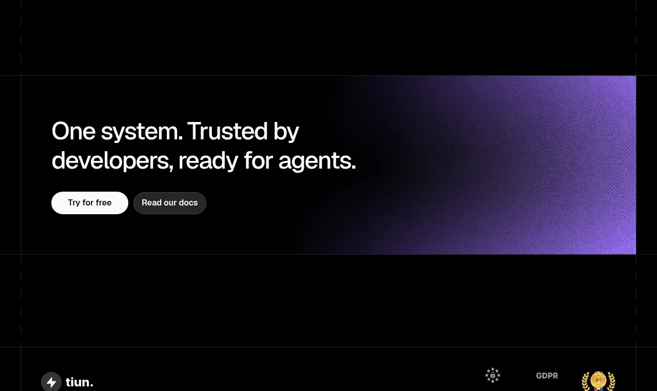
 Final conversion banner
tiun. · Call to action
Final conversion banner
tiun. · Call to action
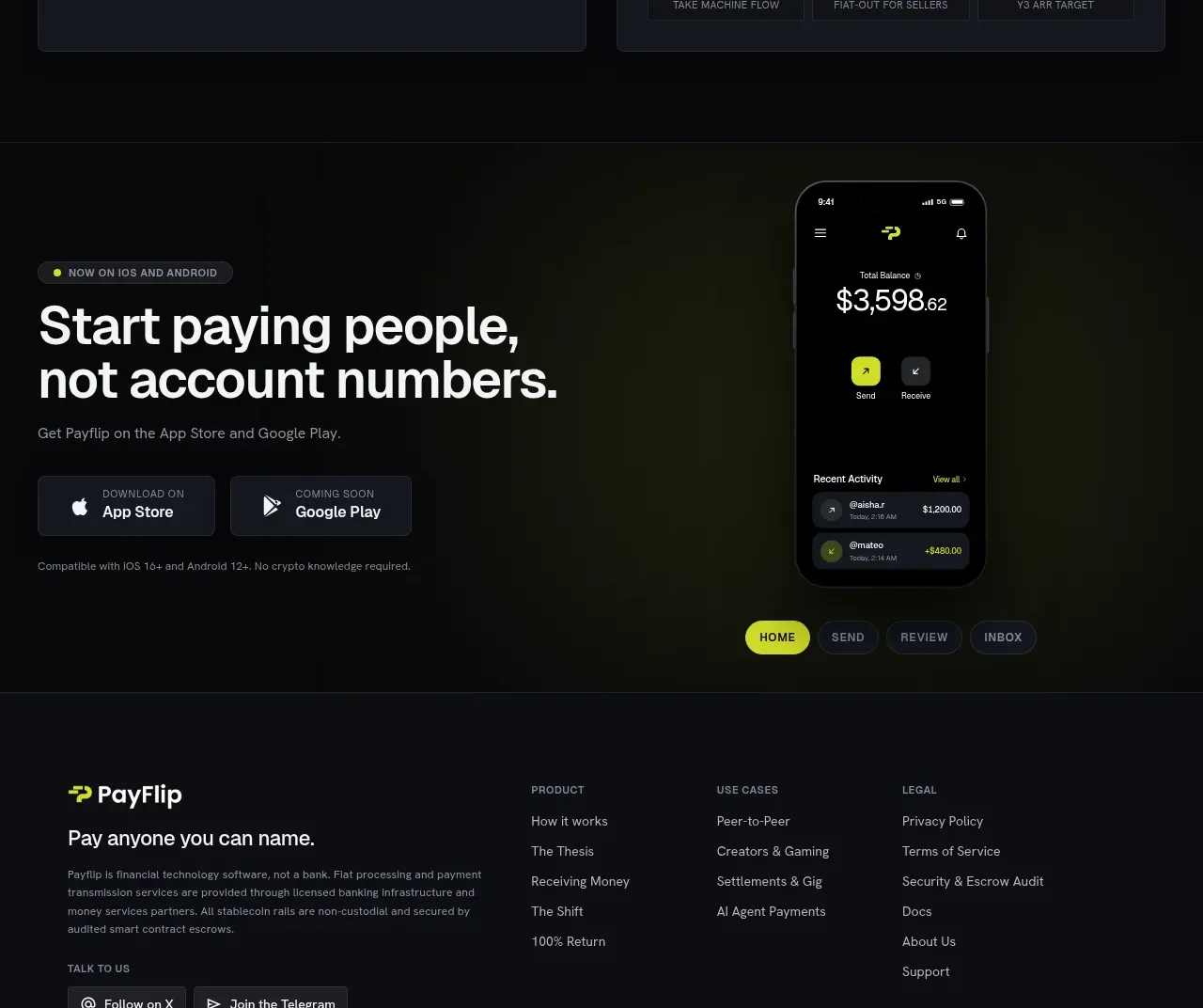
 Mobile app conversion CTA
Payflip · Call to action
Mobile app conversion CTA
Payflip · Call to action

 Final download call to action
Grimo AI · Call to action
Final download call to action
Grimo AI · Call to action

 Download conversion panel
Kilo Code for iOS and Android · Call to action
Download conversion panel
Kilo Code for iOS and Android · Call to action
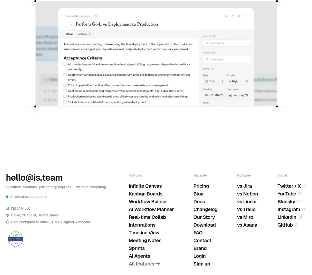
 Final conversion CTA
is.team · Call to action
Final conversion CTA
is.team · Call to action

 Studio closing call to action
FATHER · Call to action
Studio closing call to action
FATHER · Call to action