kage
kage
callfifi.app

Design analysis
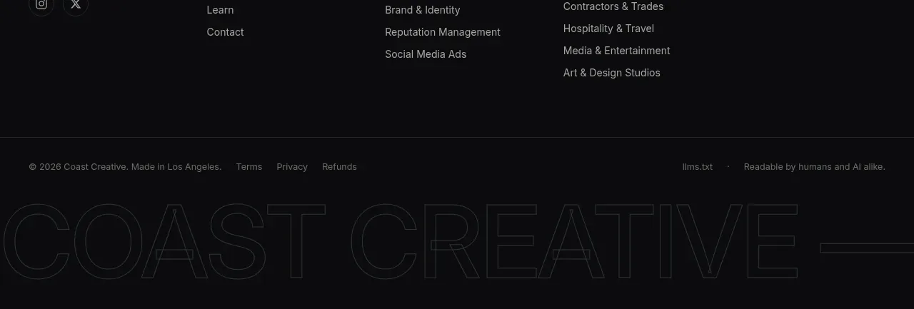
The footer continues the dark palette with a centered brand descriptor, a single row of utility links, and a small copyright line.
Prompt preview
## Reference images

Study these alongside the description below: hierarchy, rhythm, spacing, colour. Build for the product you are asked about, using this design language.

- Component: https://kage-design-assets.t3.tigrisfiles.io/components/fifi/65f510a7-1d11-431a-a427-6e570df25f2f-1789538469-9.webp
- Full page it was cut from: https://kage-design-assets.t3.tigrisfiles.io/screenshots/fifi/65f510a7-1d11-431a-a427-6e570df25f2f-1789538432367-full.webp
- Component on Kage: https://kage.design/component/fifi-footer

## Before you start
Ask what the user's product is, who it serves, and what their brand personality and palette are. Apply the following principles to that product rather than reproducing the reference.

Build a restrained dark footer matching the CTA surface. Center a small brand label, a one- or two-line descriptor in muted slate, and a horizontal row of compact navigation and legal links. Use warm-white for the label and #aab8c6 for secondary text. Add a small copyright line at the bottom with generous spacing. Keep the footer visually calm: no large imagery, no card treatment, and no competing CTA. Use around 56–72px top padding, 28–40px bottom padding, and wrap links gracefully on mobile.

Never: use logos, product names, copy, illustrations, or imagery from the reference.