 kage
kage
figma.com
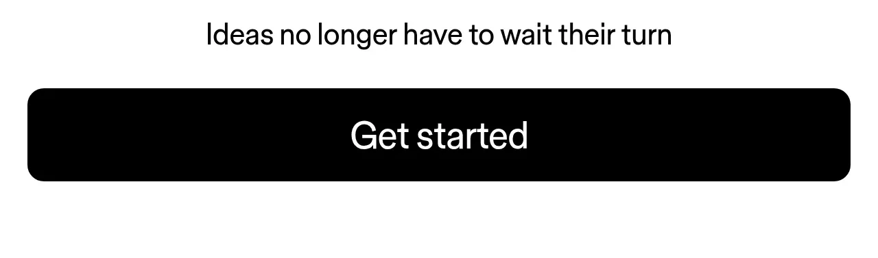
Design analysis
A minimal conversion block centers a short motivational line above a very large full-width black button.
Prompt preview
## Reference images

Study these alongside the description below: hierarchy, rhythm, spacing, colour. Build for the product you are asked about, using this design language.

- Component: https://kage-design-assets.t3.tigrisfiles.io/components/figma-agent/07db1d51-fc5a-42e3-8555-5aed12aa6731-1791439428-8.webp
- Full page it was cut from: https://kage-design-assets.t3.tigrisfiles.io/screenshots/figma-agent/07db1d51-fc5a-42e3-8555-5aed12aa6731-1791439335233-full.webp
- Component on Kage: https://kage.design/component/figma-agent-cta

## Before you start
Ask what the user's product, audience, and brand are, then apply the principles below to that product rather than reproducing the reference.

Create a high-contrast conversion CTA near the end of the page. Center a short, optimistic heading above one dominant full-width or near-full-width dark button. Use a clean white background, a 24–30px heading, and a large button with approximately 24px radius, generous vertical padding, and 28–36px label text. Keep the composition intentionally minimal so the action is unmistakable. Add a secondary text link only if users need an alternative path. Include hover, focus, disabled, and loading states, and make the button easy to use on touch screens.

Never:
- use logos, product names, copy, illustrations, or imagery from the reference
- add a competing set of CTAs
- use a low-contrast or ambiguous primary action
More components
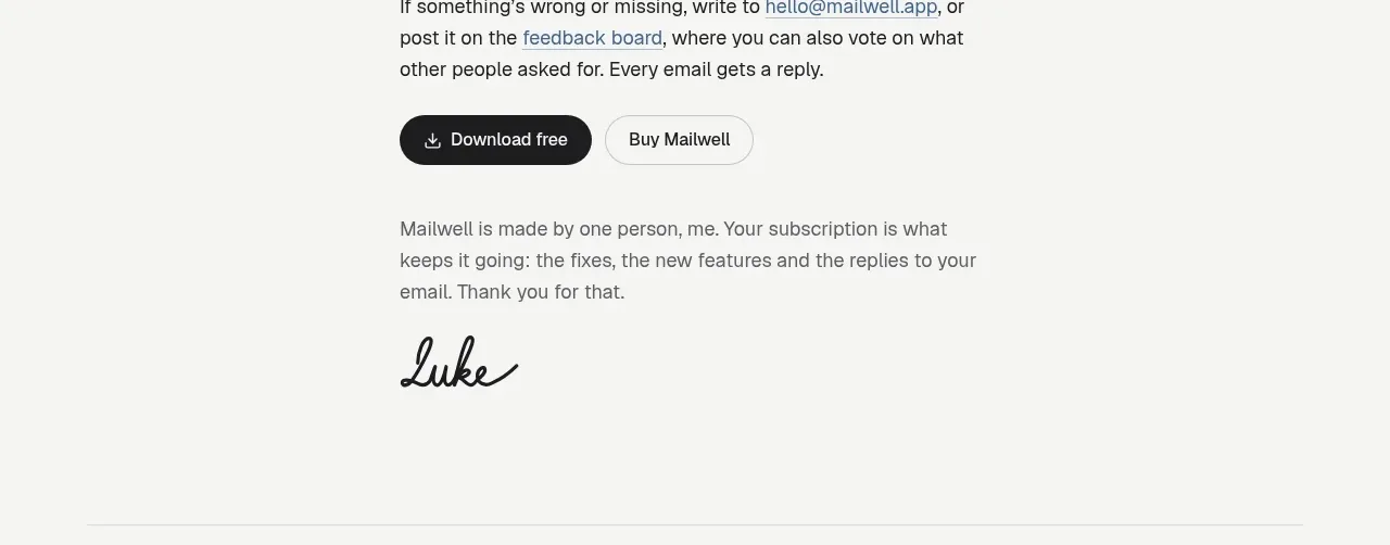
 Trial and purchase call to action
Mailwell · Call to action
Trial and purchase call to action
Mailwell · Call to action
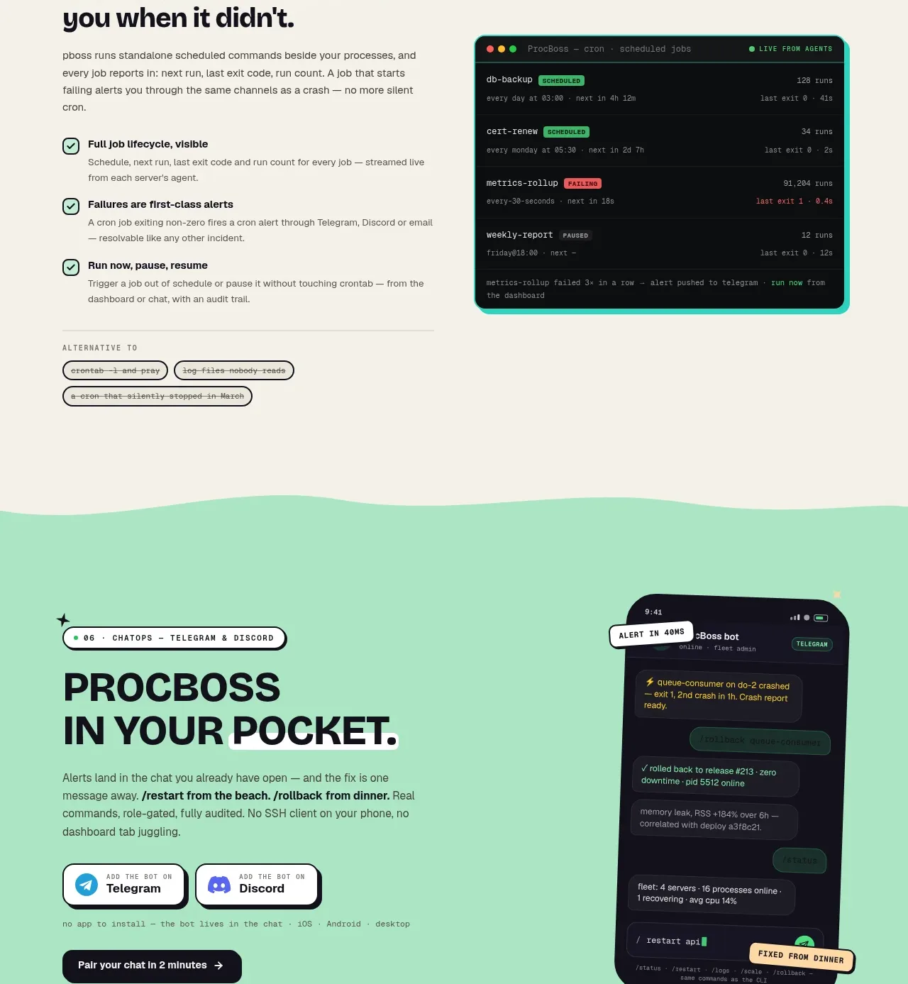
 Pocket alerts call to action
ProcBoss · Call to action
Pocket alerts call to action
ProcBoss · Call to action
 Dark final conversion band
ProcBoss · Call to action
Dark final conversion band
ProcBoss · Call to action
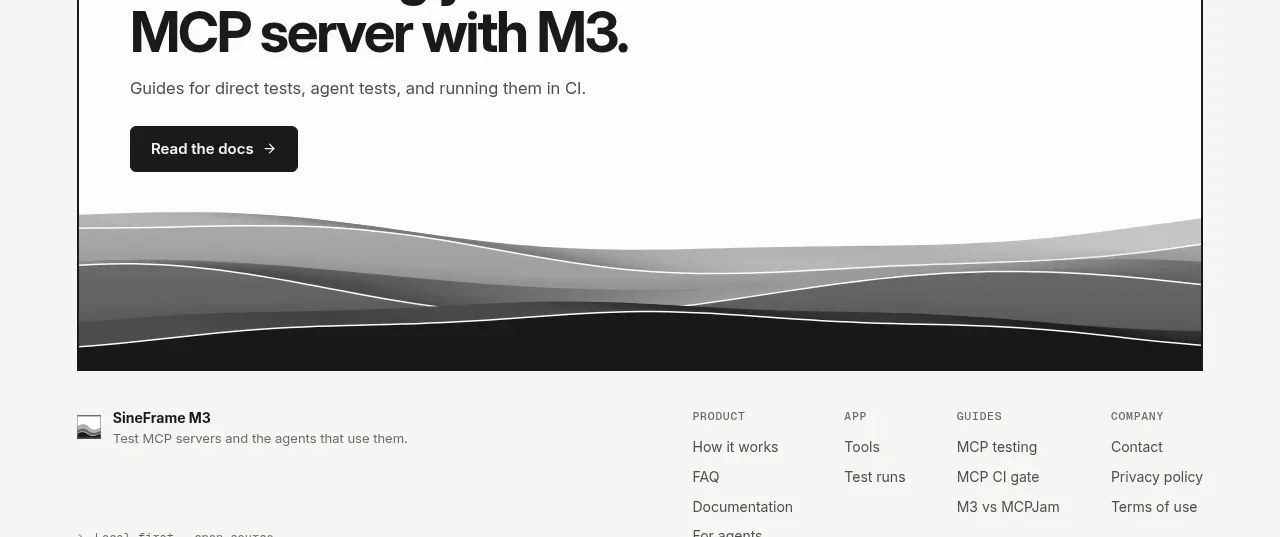
 Documentation call to action
SineFrame M3 · Call to action
Documentation call to action
SineFrame M3 · Call to action
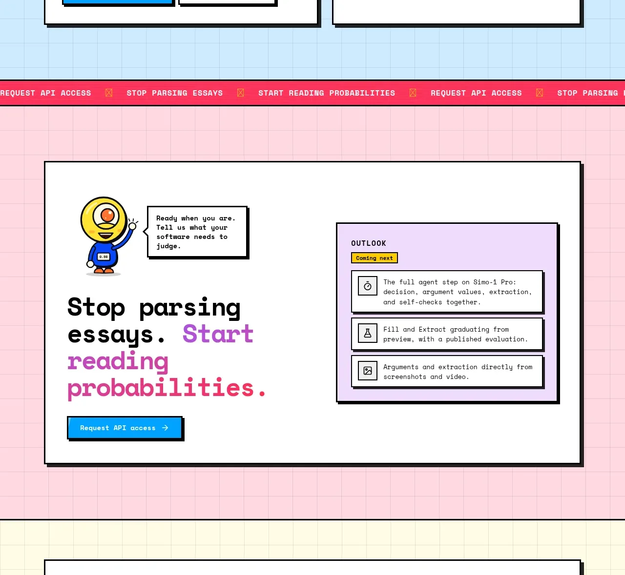
 Conversion call to action
Simo · Call to action
Conversion call to action
Simo · Call to action
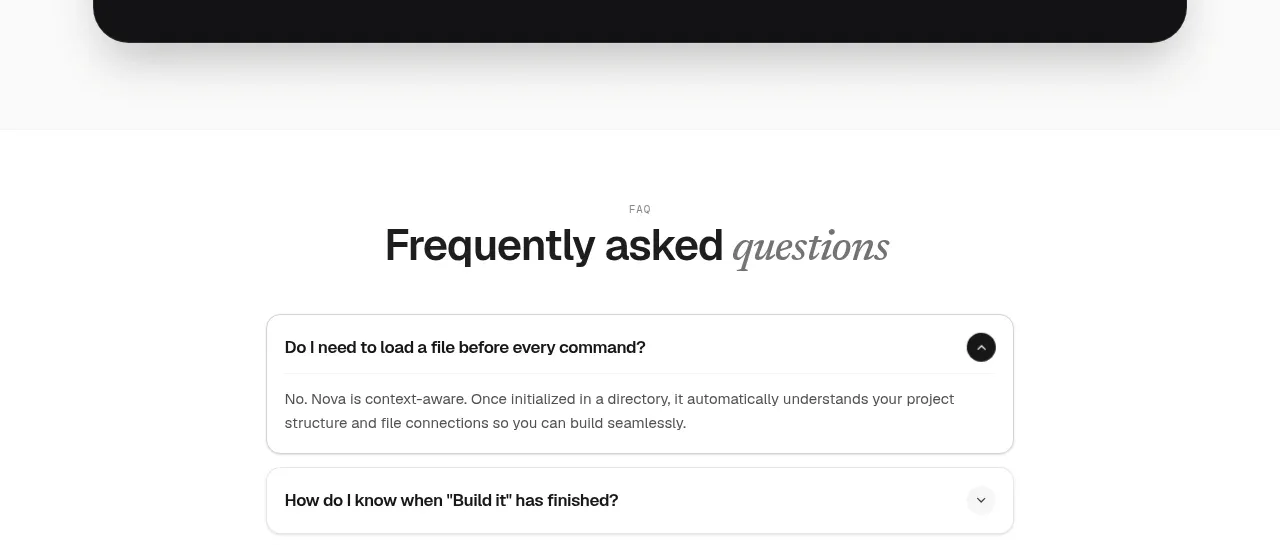
 Install command CTA
NOVA CLI v1.0 · Call to action
Install command CTA
NOVA CLI v1.0 · Call to action