kage
kage
figma.com

Design analysis
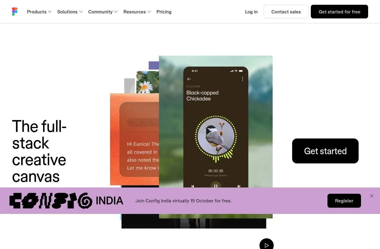
A white-canvas marketing page where hierarchy is carried almost entirely by type: giant two-tone statements (black lead sentence, gray continuation) alternate with airy video blocks, and a masonry collage of colourful work samples — each tagged with a circular play button — shows the tool's output. The hero splits into headline left, overlapping rotated product screenshots centre and a black pill CTA right, followed by a lavender announcement strip. Social proof pairs an oversized pull-quote with a huge '95%' stat split by a hairline, and the page closes with a full-width black CTA pill, a four-card resource carousel and a dense black mega footer.
Prompt preview
## Reference images

Study these alongside the description below: hierarchy, rhythm, spacing, colour. Build for the product you are asked about, using this design language.

- Full page: https://kage-design-assets.t3.tigrisfiles.io/screenshots/figma-agent/07db1d51-fc5a-42e3-8555-5aed12aa6731-1791439335233-full.webp
- Above the fold: https://kage-design-assets.t3.tigrisfiles.io/screenshots/figma-agent/07db1d51-fc5a-42e3-8555-5aed12aa6731-1791439329974.webp
- Design on Kage: https://kage.design/designs/figma-agent-landing-page

## Before you start
Ask the user what product or page they are building, who the primary audience is, and which brand assets they already have (name, logo, colours, typeface). Wait for the answers before writing any code. Everything below is applied to their product, never to the reference site.

## Page structure
Build the page top-to-bottom in these sections:

1. **Slim utility nav** — ~64px white bar: wordmark left; four dropdown labels plus one plain link centre-left; right-aligned text link, an outlined pill button and a solid black pill button.
2. **Three-part hero** — one tall airy row (~80vh): oversized display headline pinned left, a collage of overlapping, slightly rotated product screenshots floating centre, a solid black pill CTA on the right.
3. **Announcement strip** — directly under the hero, a full-width soft-lavender band: decorative glyph or wordmark left, one short sentence centre, small black pill button right, dismiss "×" at the far edge.
4. **Video story block** — a large media frame with a black circular play button, followed by the page's biggest whitespace margin.
5. **Two-tone statement** — left-aligned block, max-width ~700px: first sentence solid black, remaining sentences muted gray, set at display size (~32–40px).
6. **Full-bleed media** — edge-to-edge screenshot/video block with play button, then more generous white space.
7. **Centred two-tone statement** — same black/gray pattern, centred; another large media block below it.
8. **Two-column capability list** — two items only: small icon, bold one-line label, one gray sentence, underlined arrow link. Wide gutters, no cards.
9. **Gallery header + masonry collage** — left: bold section title with a gray subtitle; right: underlined arrow link. Below, a masonry grid (3–4 columns, varied tile heights) of colourful work samples bleeding slightly off the page edges, each tile overlaid with a black circle play button.
10. **Second statement + showcase** — a centred two-tone statement about the workflow, a large media showcase, and an underlined arrow link anchored bottom-left.
11. **Social proof band** — bold headline; then a two-column row: an oversized pull-quote with avatar, name and role on the left; a giant percentage stat (e.g. "95%") with a small caption on the right, the pair separated by a thin vertical hairline. Underneath, a horizontally scrolling monochrome customer logo row.
12. **Full-width CTA band** — a centred one-liner above an enormous black pill button spanning nearly the entire content width.
13. **Resource carousel** — two-tone header (black title, gray subtitle) with an underlined "browse all" link and "1 of 10" pagination arrows on the right; four equal image cards, each with a small underlined category label beneath.
14. **Mega footer** — solid black: wordmark plus social icons left; five small-type link columns (Product, Plans, Use cases, Resources, Company); tiny legal row with language selector at the very bottom.

## Design language
- **Canvas and colour**: pure white page (#FFFFFF), near-black text (#111111), muted gray secondary copy (#6F6F6F), black (#000000) reserved for buttons, footer and media overlays. Exactly one accent — a soft lavender (#B3A2E0) used only for the announcement strip. All other colour arrives through real imagery, never through UI chrome.
- **Two-tone statements are the signature**: every manifesto-style block renders its first sentence in solid black and the continuation in gray, at display size (~32–64px, line-height ~1.15). Use this pattern instead of eyebrows, subheadings or badges.
- **Type**: one geometric grotesque family throughout. Scale steps: ~13px nav, 16–18px body, 24–28px section titles, 40–64px statements and hero. Tight tracking on display sizes; no serifs; caps only for tiny footer column labels.
- **Buttons and links**: primary actions are fully rounded black pills with white text; secondary actions are black underlined text links with a trailing "→" that nudge right on hover; outlined pills for tertiary actions.
- **Borders and shadows**: none in the page body — hierarchy comes from whitespace and scale alone. The only hairlines are a 1px #E6E6E6 rule inside the footer and the vertical divider in the stat pair.
- **Imagery treatment**: overlapping, slightly rotated screenshots collaged in the hero; edge-to-edge media frames; varied-height gallery tiles. Any playable media carries a black circle with a white triangle play overlay.
- **Rhythm and density**: alternate airy statement blocks with dense imagery; give each section 120–200px vertical padding so the page breathes, then let the footer compress into a tight, small-type link grid for a sharp density change.
- **Motion**: minimal and functional — underline and nudge transitions on links, subtle hover lift on cards, video playback only inside media frames. No decorative animation.

## Never
- Do not reproduce the Figma wordmark or logo, its product names (Figma Design, Figma Make, FigJam, Dev Mode, etc.), or any of the reference copy.
- Do not reuse the bird-app screenshots, the "Config India" event, the Code and Theory quote, the "95% of the Fortune 500" claim, or the customer logo row (airbnb, Atlassian, Dropbox, Duolingo, GitHub, Mercado Libre).
- Do not present the result as Figma or imply any affiliation with it.
- Replace all imagery, quotes, stats and logos with the user's own brand assets and real content; never ship placeholders that mimic the reference.
Components from this page
All components
 Global navigation bar
Figma Agent · Navigation
Global navigation bar
Figma Agent · Navigation
 Creative canvas hero
Figma Agent · Hero
Creative canvas hero
Figma Agent · Hero
 AI-native canvas introduction
Figma Agent · Feature grid
AI-native canvas introduction
Figma Agent · Feature grid
 Product development workspace overview
Figma Agent · Feature grid
Product development workspace overview
Figma Agent · Feature grid
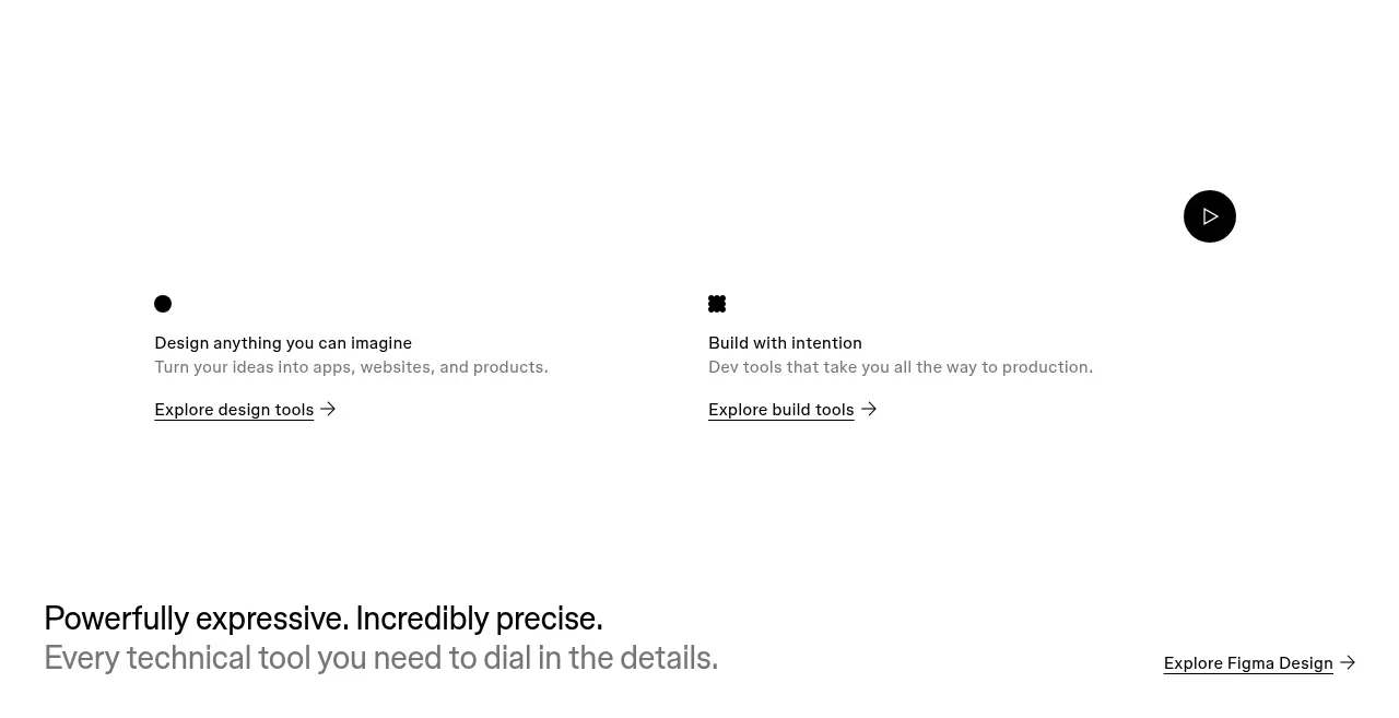 Design and build capability split
Figma Agent · Feature grid
Design and build capability split
Figma Agent · Feature grid
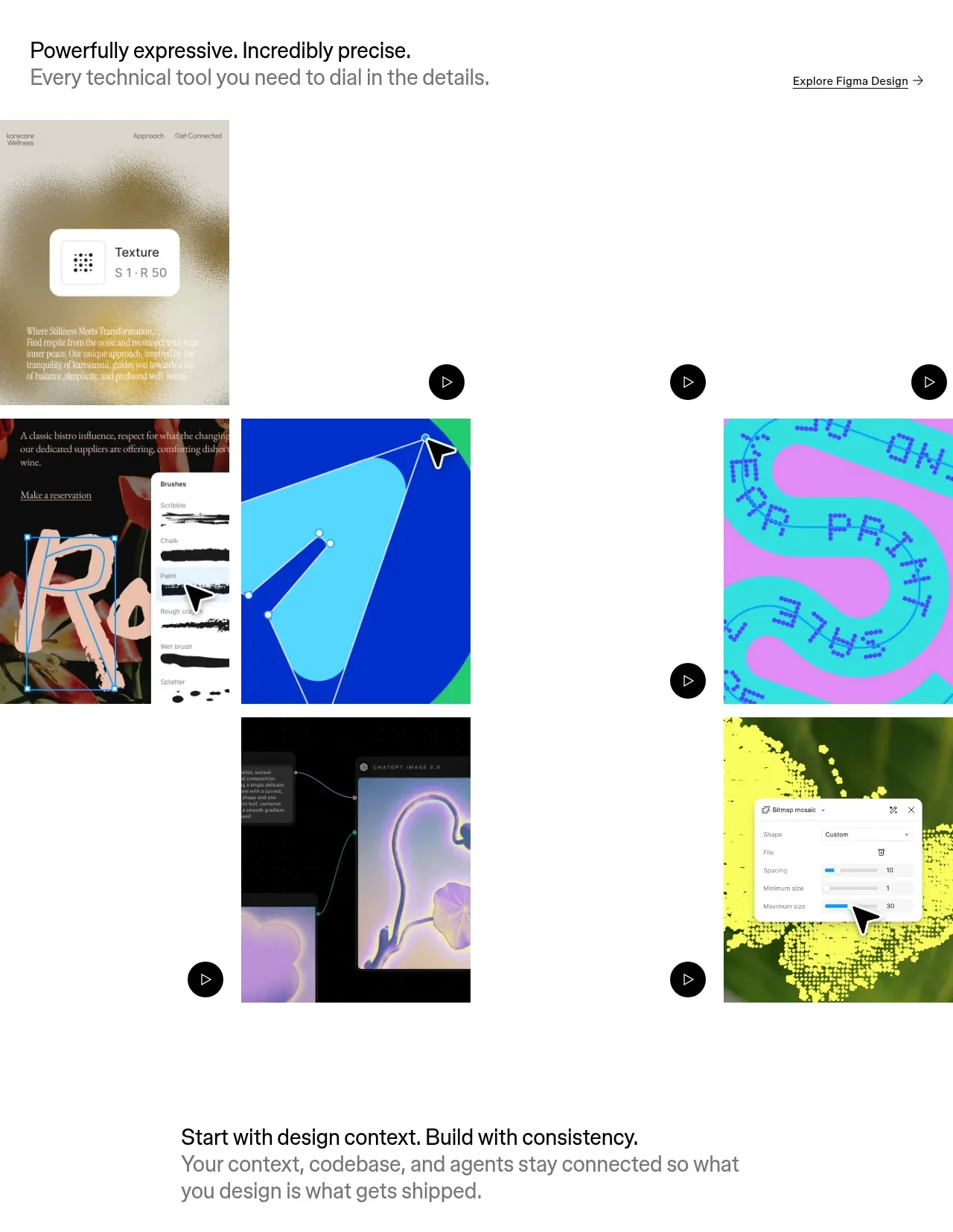 Expressive tools gallery
Figma Agent · Gallery
Expressive tools gallery
Figma Agent · Gallery
 Connected context workflow
Figma Agent · Feature grid
Connected context workflow
Figma Agent · Feature grid
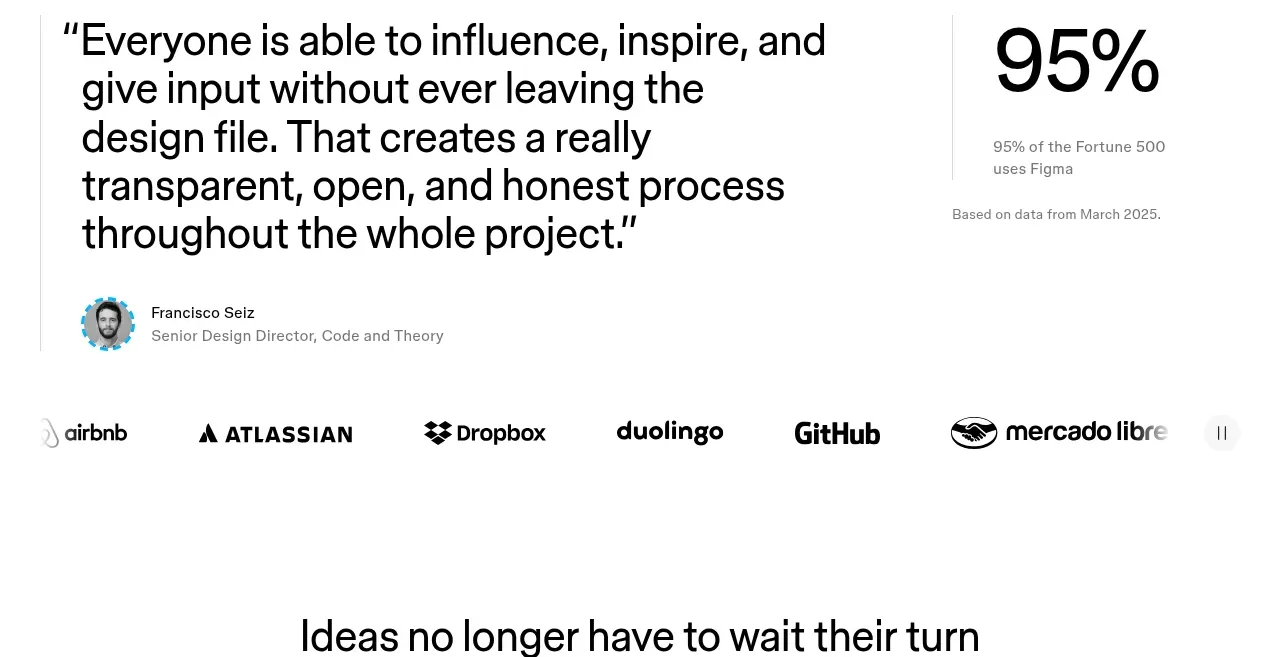 Customer proof and adoption stats
Figma Agent · Testimonials
Customer proof and adoption stats
Figma Agent · Testimonials
 Primary conversion call to action
Figma Agent · Call to action
Primary conversion call to action
Figma Agent · Call to action
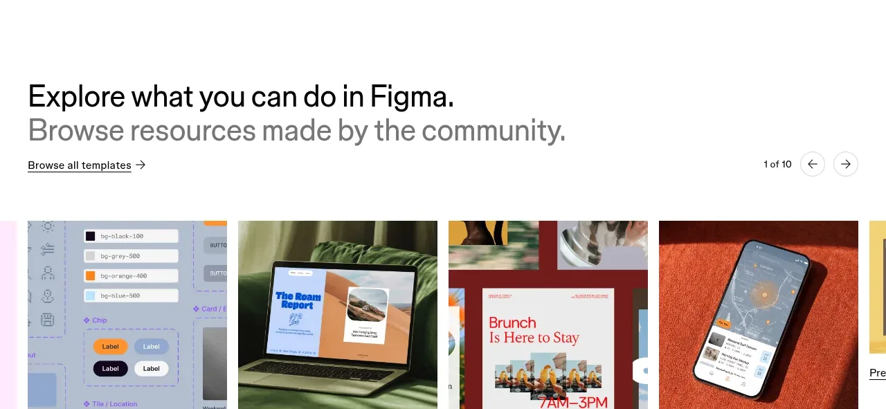 Community resources gallery
Figma Agent · Gallery
Community resources gallery
Figma Agent · Gallery
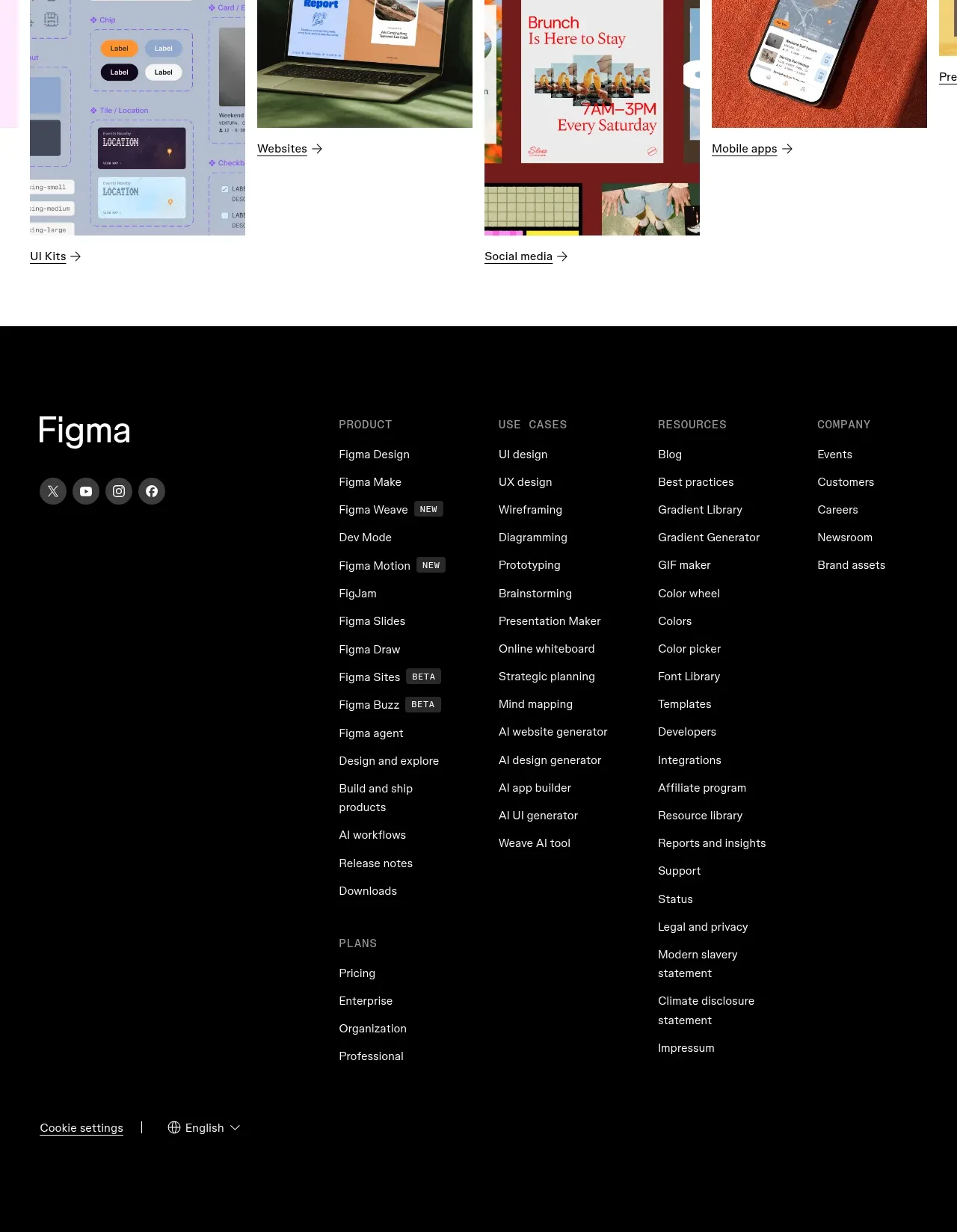 Multi-column dark footer
Figma Agent · Footer
Multi-column dark footer
Figma Agent · Footer