kage
kage
figma.com
Design analysis
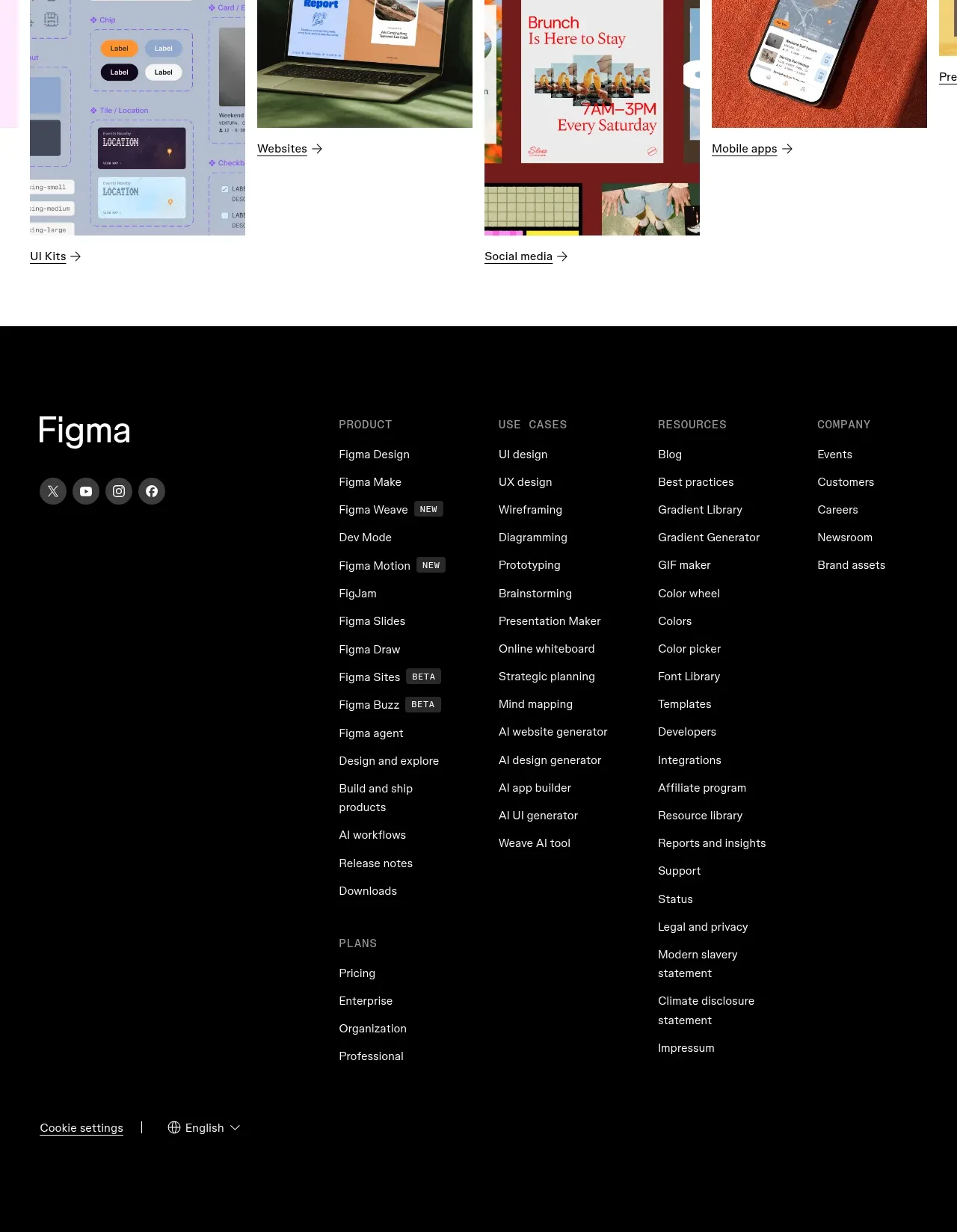
A tall black footer uses a large wordmark area, social icons, multiple categorized link columns, and bottom controls for settings and language.
Prompt preview
## Reference images

Study these alongside the description below: hierarchy, rhythm, spacing, colour. Build for the product you are asked about, using this design language.

- Component: https://kage-design-assets.t3.tigrisfiles.io/components/figma-agent/07db1d51-fc5a-42e3-8555-5aed12aa6731-1791439428-10.webp
- Full page it was cut from: https://kage-design-assets.t3.tigrisfiles.io/screenshots/figma-agent/07db1d51-fc5a-42e3-8555-5aed12aa6731-1791439335233-full.webp
- Component on Kage: https://kage.design/component/figma-agent-footer

## Before you start
Ask what the user's product, audience, and brand are, then apply the principles below to that product rather than reproducing the reference.

Build a responsive dark footer with a strong multi-column information architecture. Use a near-black background, white primary text, muted-gray section labels and links, and a large brand-name area on the left with social icon buttons beneath it. Organize links into clear columns such as product, use cases, resources, company, and plans; use 11–14px body text with 24–32px row spacing and 24–40px column gaps. Add subtle badges for new/beta items only when useful. Finish with a lower utility row containing settings, language, legal, and accessibility links separated by a thin subdued divider. On mobile, turn columns into collapsible accordions or stacked groups while keeping the brand and essential legal links visible.

Never:
- use logos, product names, copy, illustrations, or imagery from the reference
- copy the reference footer taxonomy or exact link labels
- make legal, language, or accessibility controls hard to find