kage
kage
figma.com
Design analysis
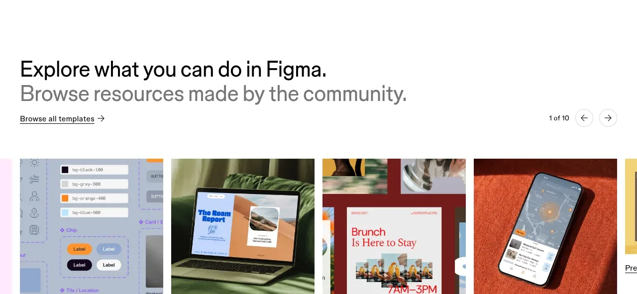
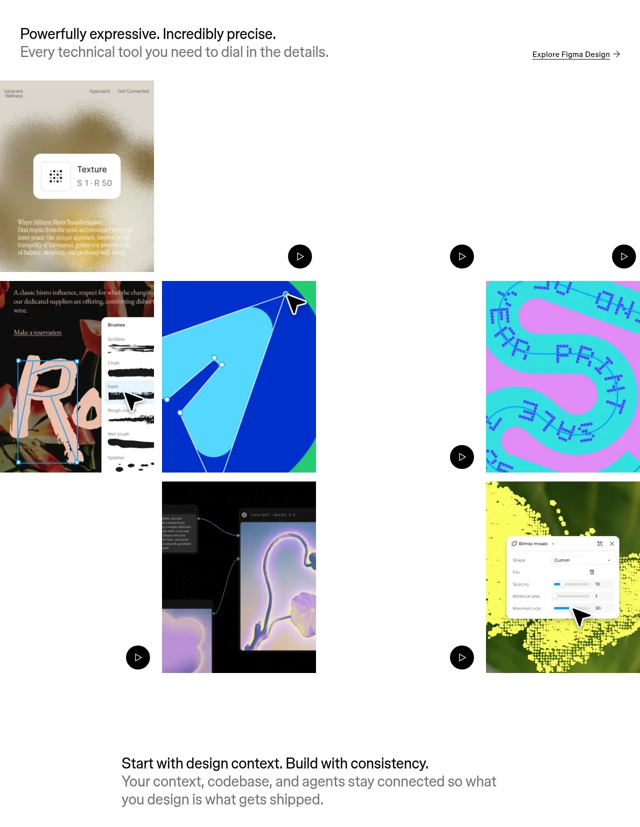
A visual gallery presents expressive product capabilities through an editorial mosaic of colorful tiles, screenshots, and play controls, introduced by a heading and a right-aligned link.
Prompt preview
## Reference images

Study these alongside the description below: hierarchy, rhythm, spacing, colour. Build for the product you are asked about, using this design language.

- Component: https://kage-design-assets.t3.tigrisfiles.io/components/figma-agent/07db1d51-fc5a-42e3-8555-5aed12aa6731-1791439427-5.webp
- Full page it was cut from: https://kage-design-assets.t3.tigrisfiles.io/screenshots/figma-agent/07db1d51-fc5a-42e3-8555-5aed12aa6731-1791439335233-full.webp
- Component on Kage: https://kage.design/component/figma-agent-gallery

## Before you start
Ask what the user's product, audience, and brand are, then apply the principles below to that product rather than reproducing the reference.

Build an editorial capability gallery. Start with a heading and muted supporting copy on the left, plus a small utility link on the right. Below, arrange a responsive mosaic of varied-size visual tiles showing different product capabilities; use real product UI or abstract generated visuals, with rounded or square corners according to the brand. Include occasional circular play buttons over demo tiles. Preserve a clear grid with intentional asymmetry, consistent gaps around 12–24px, and enough white space between rows. On hover, slightly lift or scale a tile and reveal its title or action. On mobile, use a two-column or single-column sequence rather than shrinking the desktop mosaic.

Never:
- use logos, product names, copy, illustrations, or imagery from the reference
- reuse the reference artwork, screenshots, colors, or tile arrangement
- make every tile the same size if the editorial mosaic is part of the concept