kage
kage
figma.com
Design analysis
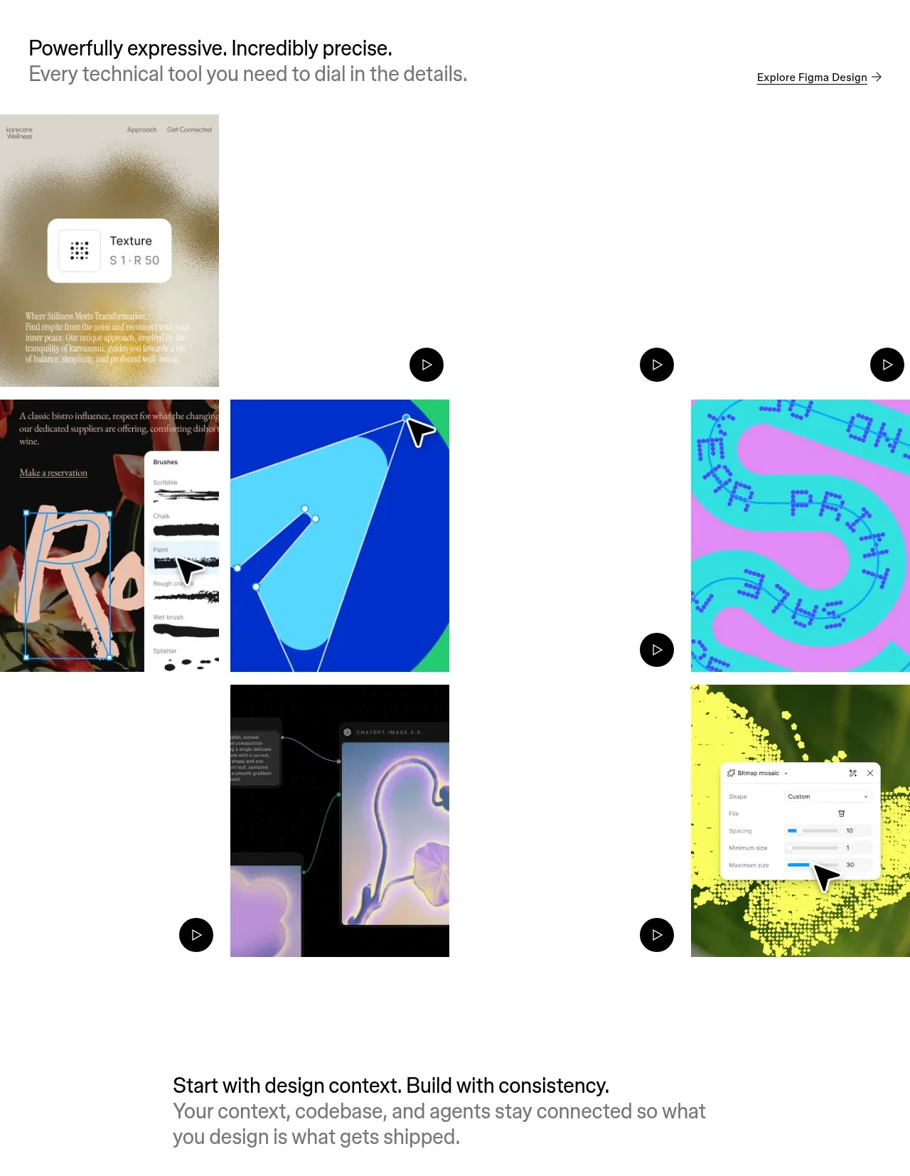
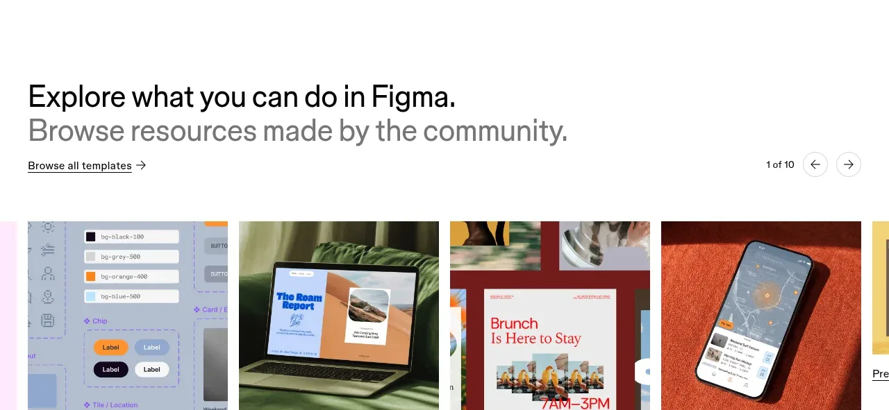
A resources section introduces community-made work with browse controls and a horizontal row of large visual cards labeled by category.
Prompt preview
## Reference images

Study these alongside the description below: hierarchy, rhythm, spacing, colour. Build for the product you are asked about, using this design language.

- Component: https://kage-design-assets.t3.tigrisfiles.io/components/figma-agent/07db1d51-fc5a-42e3-8555-5aed12aa6731-1791439428-9.webp
- Full page it was cut from: https://kage-design-assets.t3.tigrisfiles.io/screenshots/figma-agent/07db1d51-fc5a-42e3-8555-5aed12aa6731-1791439335233-full.webp
- Component on Kage: https://kage.design/component/figma-agent-gallery-2

## Before you start
Ask what the user's product, audience, and brand are, then apply the principles below to that product rather than reproducing the reference.

Build a browseable community-resources gallery. Use a heading with a muted subtitle, a small browse-all link, and compact carousel pagination/arrow controls aligned on the same header row. Below, show a horizontally scrolling row of image-led cards with consistent aspect ratios, concise category labels, and arrow links. Let the row overflow intentionally on desktop to hint at more content, while enabling keyboard and touch scrolling. Use 16–24px gaps, subtle card radius, and a white background. On mobile, show one prominent card plus a partial next card and keep controls reachable.

Never:
- use logos, product names, copy, illustrations, or imagery from the reference
- reuse the reference templates or image assets
- make carousel navigation inaccessible or autoplay without controls