kage
kage
finalframe.photo
Design analysis
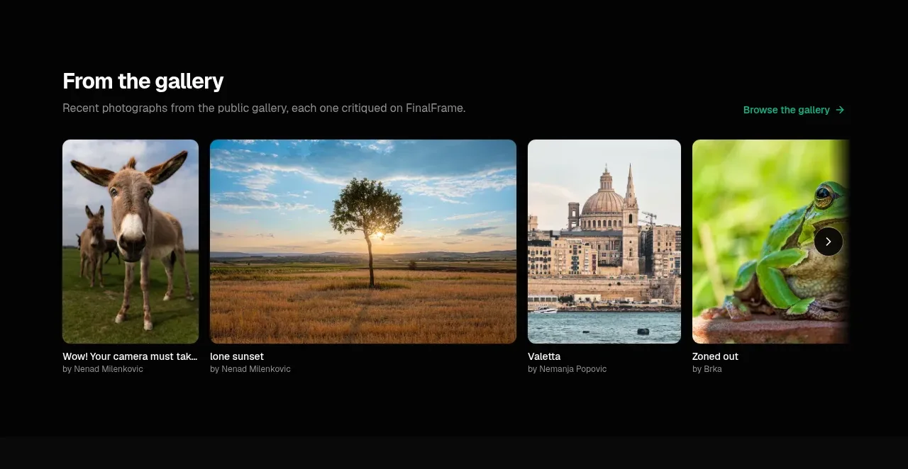
A short gallery section provides proof through varied visual examples, with a heading, browse link, card metadata, and a horizontal row of image tiles.
Prompt preview
## Reference images

Study these alongside the description below: hierarchy, rhythm, spacing, colour. Build for the product you are asked about, using this design language.

- Component: https://kage-design-assets.t3.tigrisfiles.io/components/finalframe/10bde091-c6ec-4ca8-aeab-6378e76e091a-1790402731-2.webp
- Full page it was cut from: https://kage-design-assets.t3.tigrisfiles.io/screenshots/finalframe/10bde091-c6ec-4ca8-aeab-6378e76e091a-1790402604641-full.webp
- Component on Kage: https://kage.design/component/finalframe-gallery

## Before you start
Ask what kind of work the user's product showcases, what visual brand direction it has, and whether the gallery should be browsable or filtered. Then apply these principles to that content.

Build a dark gallery band with a compact heading row: title and short supporting sentence on the left, a small accent-coloured browse action on the right. Below it, show a horizontal four-card media rail with varied aspect ratios, 10px rounded corners, tight but consistent gaps, and restrained metadata beneath each image. Use a black background (#050505), soft white text, muted gray metadata, and mint accent links (#08c99a). Images should be cropped with object-fit: cover and maintain a clear focal point. Add subtle horizontal scrolling or carousel controls on touch and keyboard-accessible next/previous controls where appropriate. Keep the section visually dense but leave enough surrounding padding to feel curated.

Never: use logos, product names, copy, illustrations, or imagery from the reference.