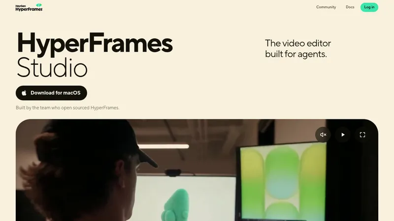
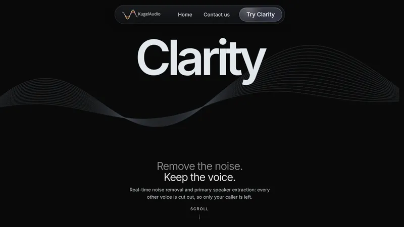
kage
kage
finalframe.photo

Design analysis
A long, dark landing page uses a near-black canvas, restrained gray typography, thin low-contrast borders, and a small teal accent to make the product feel like a focused creative utility. The hero pairs a large two-line value proposition with an upload panel, then shifts through gallery imagery, centered explanatory sections, compact feature grids, product-like critique panels, pricing, FAQ rows, and a final CTA; spacing stays generous while information density rises inside framed cards and data examples.
Prompt preview
## Reference images

Study these alongside the description below: hierarchy, rhythm, spacing, colour. Build for the product you are asked about, using this design language.

- Full page: https://kage-design-assets.t3.tigrisfiles.io/screenshots/finalframe/10bde091-c6ec-4ca8-aeab-6378e76e091a-1790402604641-full.webp
- Above the fold: https://kage-design-assets.t3.tigrisfiles.io/screenshots/finalframe/10bde091-c6ec-4ca8-aeab-6378e76e091a-1790402599131.webp
- Design on Kage: https://kage.design/designs/finalframe-landing-page

## Before you start
Ask the user what they are building, who it is for, and which brand assets they already have (name, colours, type choices, logo or other visual assets). Wait for their answers before designing. Apply the system below to their product, not to the reference product, and use their content and brand assets throughout.

## Page structure
1. **Persistent header:** Use a slim, dark navigation bar with a small brand mark/name at left, compact links toward the right, a language control, a sign-in link, and one filled accent CTA. Keep it horizontally restrained with a subtle bottom border.
2. **Hero with primary action:** Build a wide two-column hero. On the left, place a small eyebrow, a very large stacked headline with the second line muted, a short explanatory paragraph, a quiet supporting sentence, and a filled CTA with an arrow. On the right, place a bordered upload/dropzone panel with a dashed inner target, upload instructions, file constraints, privacy language, and a small no-account note.
3. **Gallery preview:** Follow with a section titled as a source or gallery preview. Put the heading and short description on the left and a small accent browse link on the right, then show a four-item horizontal image grid with varied aspect ratios, rounded corners, captions, and subdued metadata below each image.
4. **Problem framing:** Add a centered section explaining the uncertainty the product resolves. Use a bold primary line, a muted continuation line, and a narrow supporting paragraph. Beneath it, lay out four evenly spaced feature columns, each with a small teal line icon, short title, and concise explanatory copy.
5. **Sample output:** Introduce a centered example section with a title and short description, then place a single dark, bordered critique/result panel below. The panel should contain a score and tier at the top, paired progress bars or metrics, a highlighted main issue, actionable adjustment ranges, and a small status label. Make it feel like a real product output rather than decorative content.
6. **Process steps:** Present a centered title and subtitle followed by three equal columns. Each column uses a very large low-contrast step number, a title, and a compact explanation, creating a clear upload-to-result sequence.
7. **Context or mode selector:** Add a centered section about adapting results to context. Below it, use a two-row, three-column grid of compact bordered option cards. Each card has a teal icon, a title, and one muted line of supporting text.
8. **Included-output inventory:** Separate the next section with a thin horizontal rule and darker band treatment. Center the heading and description, then show four bordered cards in a row for distinct output types. Under them, add a line of small pill labels and a final explanatory sentence.
9. **Editor-specific guidance:** Use a wide two-column section. The left side has a two-line heading with a muted second line, a paragraph, and a two-column list of supported tools or integrations marked by teal check icons. The right side is a large bordered, monospace-like instruction panel showing editor context, grouped adjustment commands, and numeric values.
10. **Version comparison:** Follow with another two-column product section. The left side has a two-line title, explanatory paragraph, and a vertical list of benefits with small teal icons. The right side contains a compact comparison card showing score deltas, what changed, and a newly identified issue. Finish the section with a centered filled CTA.
11. **Scoring explanation:** Add a bordered-section transition and a centered heading explaining the scoring model. Below, use two equal bordered panels: one for dual scores with horizontal progress bars and one for a tier legend with coloured or tinted tier badges and descriptions.
12. **Trust and principles:** Add a dark, open two-column band with one concise principle per column. Each starts with a small teal icon, then a title and a paragraph explaining privacy, honesty, or context-aware behavior.
13. **Pricing:** Introduce a centered pricing section with a heading and one-line subtitle. Show three equal pricing cards in a row, with the middle plan emphasized by a brighter teal border and recommendation badge. Include price, billing unit, short qualification copy, feature lists with teal checkmarks, and a small cancellation note below; add a secondary comparison link/button.
14. **FAQ:** Center a heading, then stack a narrow column of full-width accordion rows. Each row is a thin bordered rectangle with a question aligned left and a small chevron aligned right. Keep the closed state visually quiet and consistent.
15. **Final CTA:** Use a spacious centered closing block with a strong restatement of the product outcome, a short paragraph, a filled CTA, a no-commitment note, and a subtle underlined secondary signup link.
16. **Footer:** Finish with a thin top border and a compact footer. Put copyright and a muted tagline on the left, and arrange legal, product, support, subscription, and cookie-management links in small grouped text on the right.

## Design language
- Build hierarchy with a strong type scale: oversized 42–56px hero heading, 24–32px section headings, 14–16px body copy, and 11–12px metadata. Use weight and contrast more than decorative treatments.
- Use a near-black base around `#050505` or `#070707`, with occasional slightly lighter bands around `#0a0a0a` and panels around `#0d0d0d`. Keep most surfaces flat and avoid gradients.
- Reserve a vivid mint-teal accent around `#00c995`–`#12d6a0` for primary buttons, active borders, progress bars, small icons, links, and positive status indicators. Use it sparingly so actions and data stand out.
- Use white or near-white `#f2f2f0` for primary headings, gray `#8b8b8b` for body copy, and darker gray `#555555` for secondary metadata. Fade the second line of important headlines to gray to create a deliberate two-tone hierarchy.
- Pair a clean modern sans-serif with a restrained monospace or technical treatment inside score, adjustment, and comparison panels. Keep body line length narrow and readable.
- Use thin 1px borders around cards, inputs, dropzones, pricing panels, and FAQ rows in low-contrast gray such as `#242424` or `#303030`. Use brighter teal borders only for the selected pricing tier or primary state.
- Keep radii modest, approximately 6–10px. Avoid heavy shadows; use surface contrast and borders to establish depth. Dashed borders are reserved for the upload target.
- Let the page rhythm change deliberately: spacious hero and centered narrative sections, image-led gallery, tighter four-column feature grids, dense framed product examples, then structured pricing and FAQ. Use generous vertical padding between major bands.
- Prefer restrained, functional iconography: small line icons in teal circles or simple teal glyphs, never large decorative illustrations. Use arrows and chevrons as compact directional affordances.
- Make cards feel like tools: concise labels, measurable values, progress bars, badges, checklists, and grouped commands. Align numbers and metadata carefully and preserve strong internal spacing.
- Buttons should be compact filled teal rectangles with dark text, subtle radius, and a small arrow; secondary links can be gray or underlined. Provide clear hover states through slight brightness or border changes rather than animation-heavy effects.
- Keep interactions calm and utility-oriented. The upload zone should visibly accept drag-and-drop and file selection, gallery navigation can use a small circular arrow control, FAQ rows should expand as accordions, and pricing/CTA states should be keyboard accessible. Use short opacity, border, and background transitions only.
- Make the layout responsive: collapse the hero and two-column product sections into one column on narrow screens, turn horizontal grids into scrollable or stacked cards, and keep touch targets generous without losing the dense data-panel character.

## Never
- Do not copy the reference product's logos, wordmarks, product names, copy, illustrations, photography, screenshots, or icon set.
- Do not present the result as FinalFrame or imply affiliation with it.
- Do not reuse the reference's photography subjects, exact sample scores, plan names, editor names, or literal section wording; invent content appropriate to the user's product.
- Do not turn the dark visual language into a generic neon cyberpunk treatment: keep it quiet, editorial, precise, and utility-led.
Components from this page
All components
 Minimal product navigation
FinalFrame · Navigation
Minimal product navigation
FinalFrame · Navigation
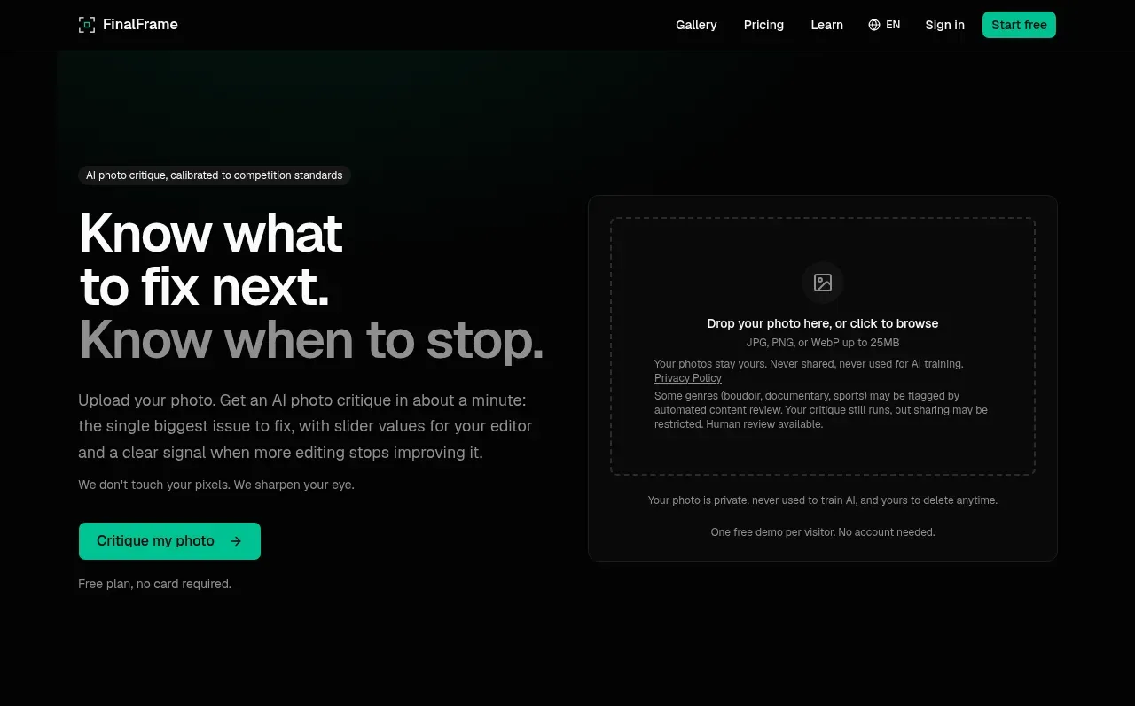 Upload-first product hero
FinalFrame · Hero
Upload-first product hero
FinalFrame · Hero
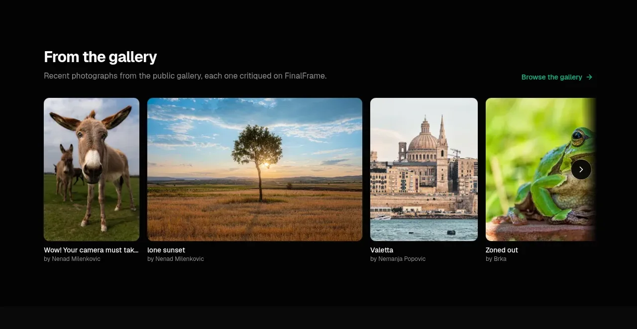 Curated work gallery
FinalFrame · Gallery
Curated work gallery
FinalFrame · Gallery
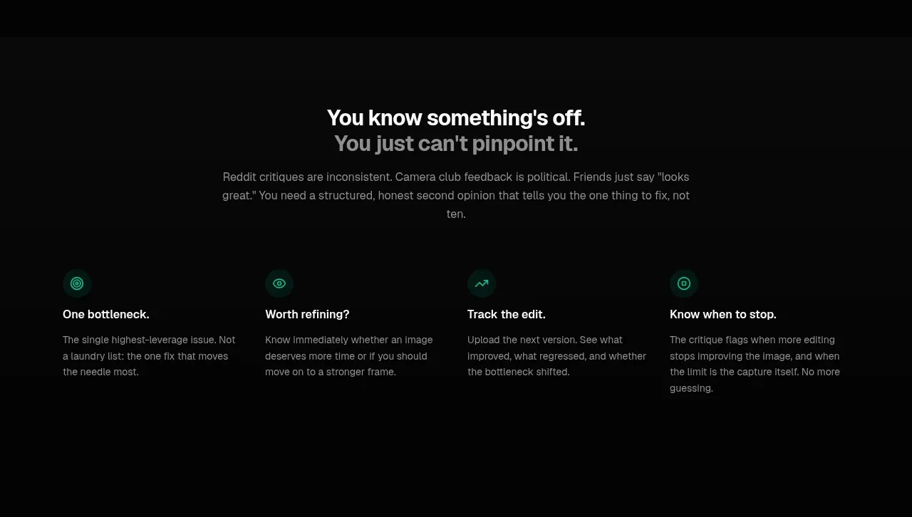 Why structured critique matters
FinalFrame · Feature grid
Why structured critique matters
FinalFrame · Feature grid
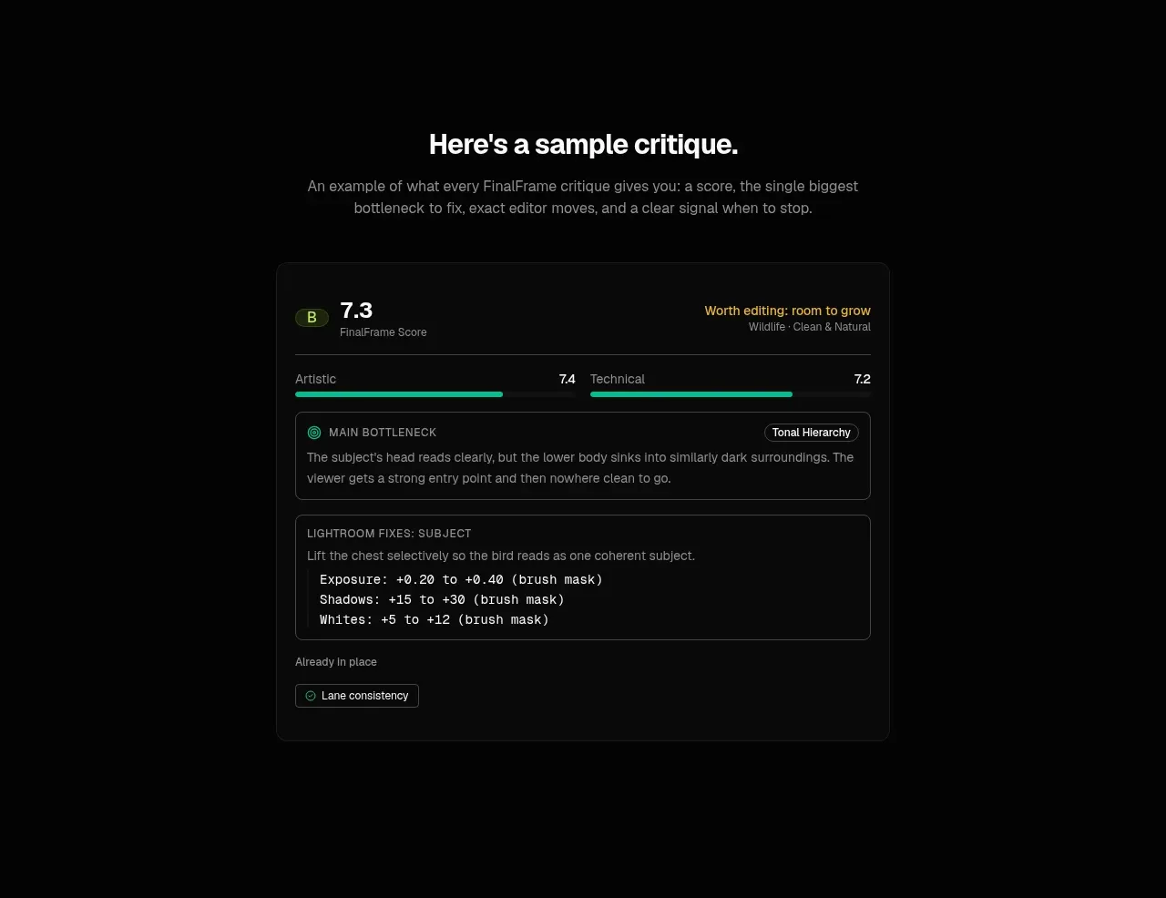 Sample analysis card
FinalFrame · Card
Sample analysis card
FinalFrame · Card
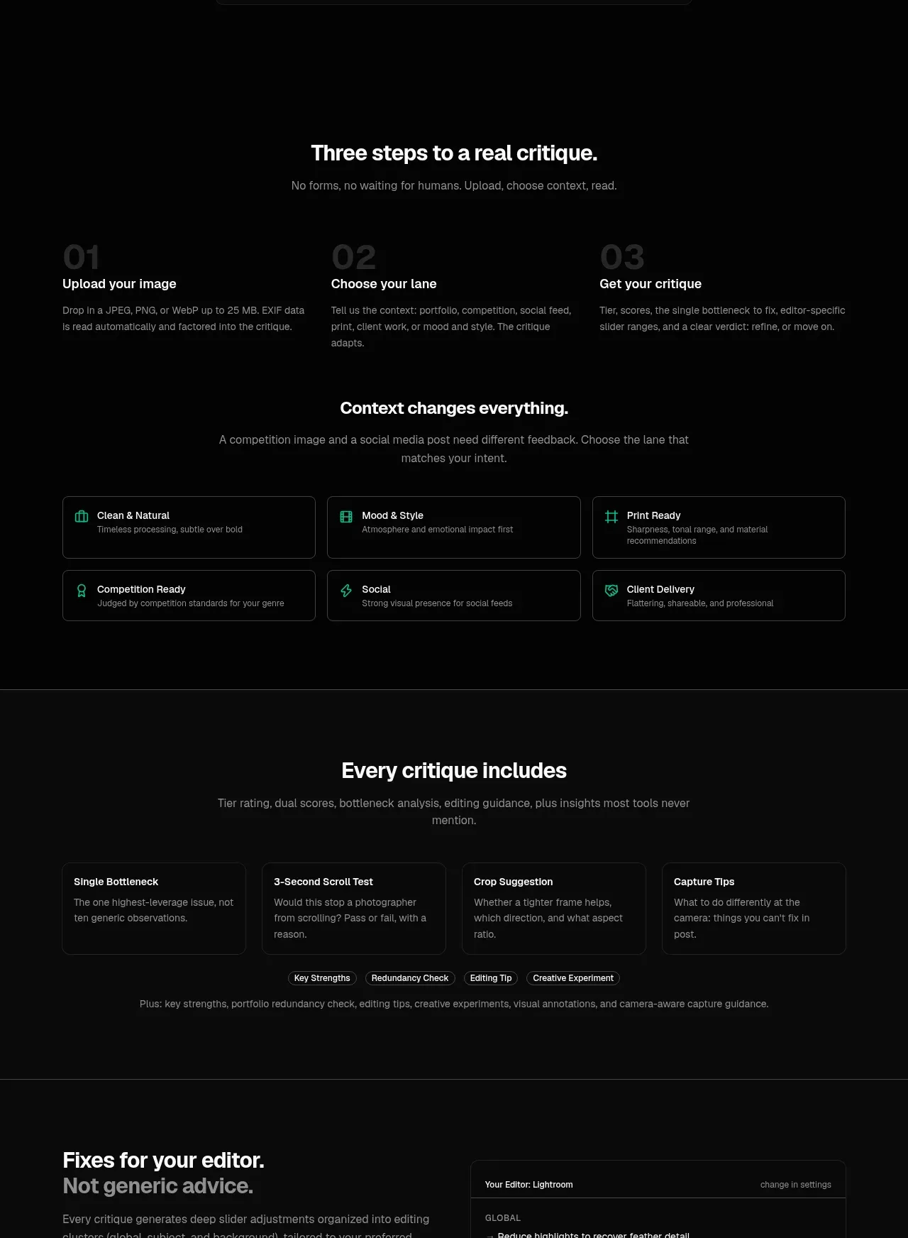 Workflow, context, and lanes
FinalFrame · Feature grid
Workflow, context, and lanes
FinalFrame · Feature grid
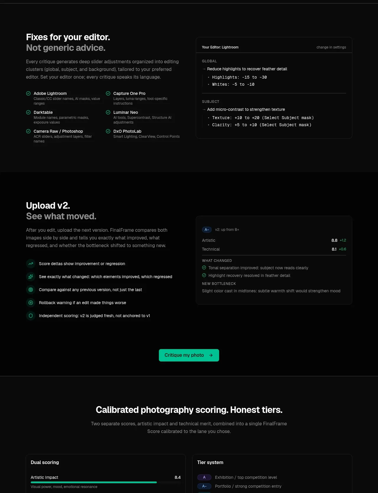 What every result includes
FinalFrame · Feature grid
What every result includes
FinalFrame · Feature grid
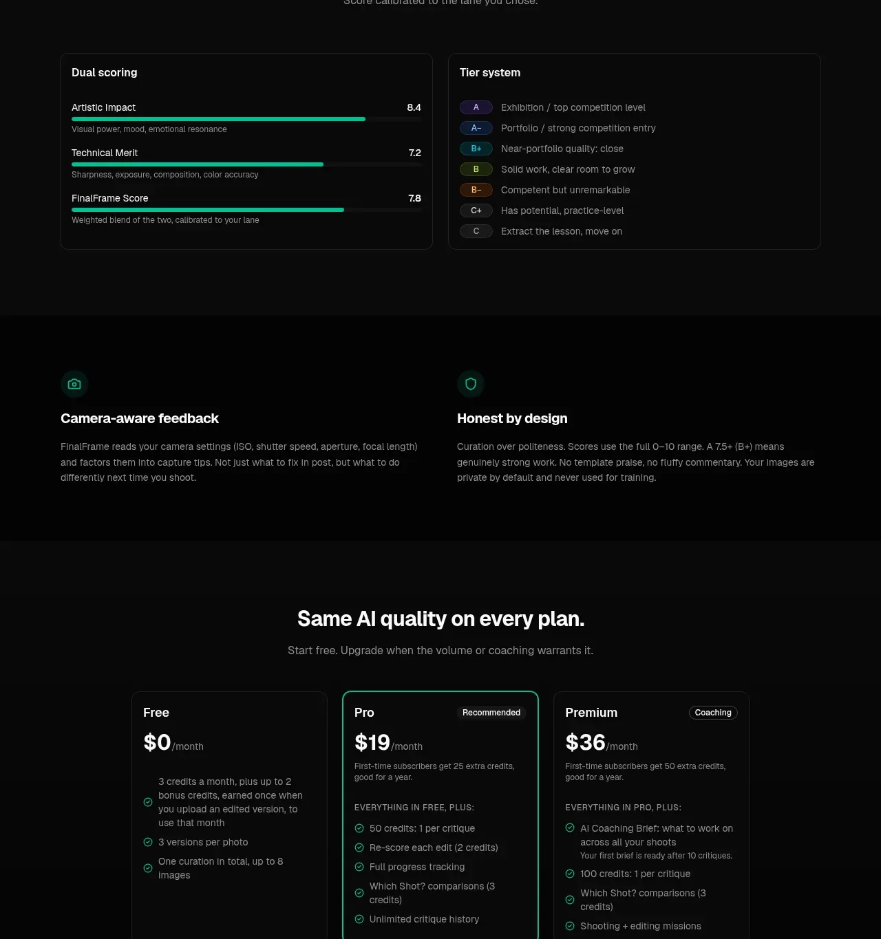 Scoring and trust principles
FinalFrame · Feature grid
Scoring and trust principles
FinalFrame · Feature grid
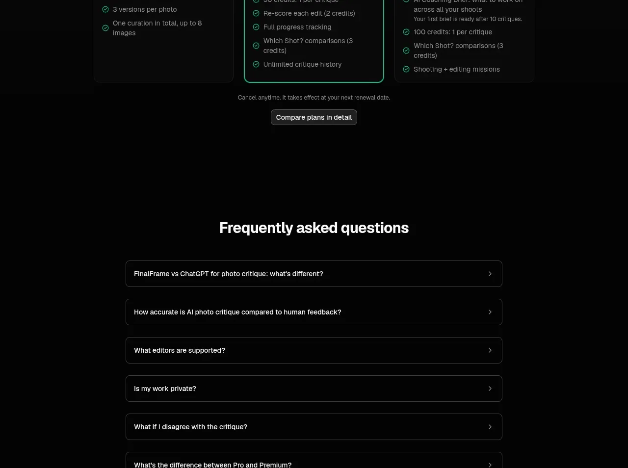 Three-tier pricing
FinalFrame · Pricing table
Three-tier pricing
FinalFrame · Pricing table
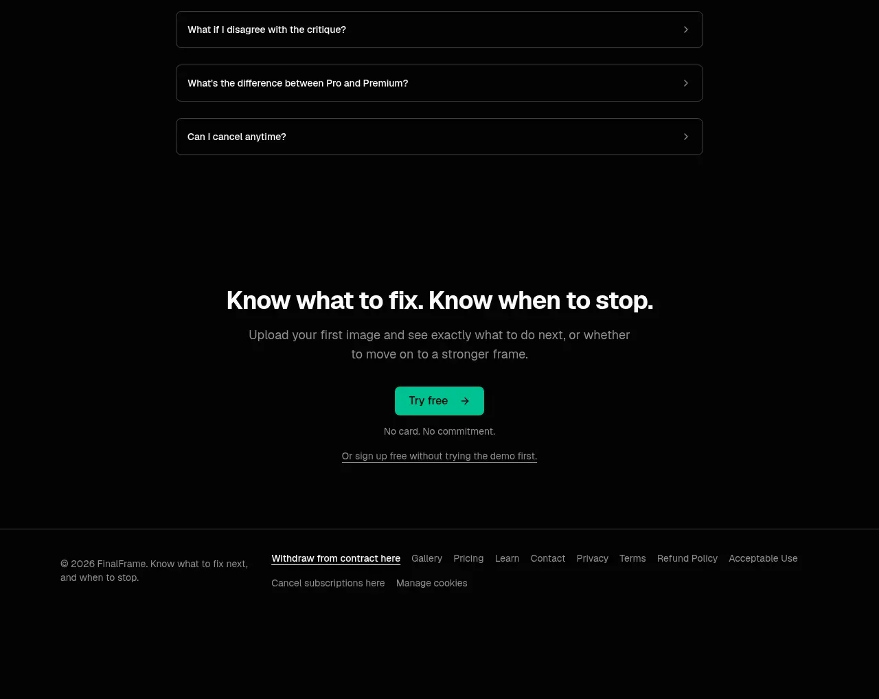 Frequently asked questions
FinalFrame · FAQ
Frequently asked questions
FinalFrame · FAQ
 Final conversion call to action
FinalFrame · Call to action
Final conversion call to action
FinalFrame · Call to action
 Utility footer
FinalFrame · Footer
Utility footer
FinalFrame · Footer