 kage
kage
flowcub.com
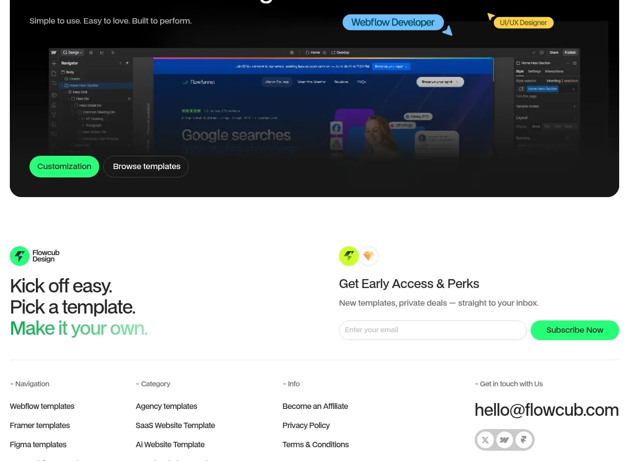
Design analysis
A large rounded black banner closes the sales narrative with a strong headline, colorful role chips, a product preview, and paired actions.
Prompt preview
## Reference images

Study these alongside the description below: hierarchy, rhythm, spacing, colour. Build for the product you are asked about, using this design language.

- Component: https://kage-design-assets.t3.tigrisfiles.io/components/flowcub-com/a37af876-acd7-4211-984b-565faddfb31d-1790420146-9.webp
- Full page it was cut from: https://kage-design-assets.t3.tigrisfiles.io/screenshots/flowcub-com/a37af876-acd7-4211-984b-565faddfb31d-1790420112256-full.webp
- Component on Kage: https://kage.design/component/flowcub-cta

## Before you start
Ask what the user's product is, who it serves, and what its brand personality and primary conversion goal are. Then apply the following principles to that product rather than reproducing the reference.

Create a full-width dark conversion banner with large 18–20px corner radius and generous 28–40px padding. Put a small technology or category badge row above a two-line white headline and muted supporting copy. Add a few floating colored pill labels to suggest audiences or use cases, then place a wide product preview or video panel along the lower half with a dark gradient. Anchor two pill buttons near the lower left: a bright green primary and a dark outlined secondary. Use #050505, #FFFFFF, #B7B7B7, green #25F276, plus a few purposeful blue, purple, and yellow chips. Keep decorative labels secondary to the CTA and ensure the banner remains readable without imagery.

Never: use logos, product names, copy, illustrations, or imagery from the reference.
More components
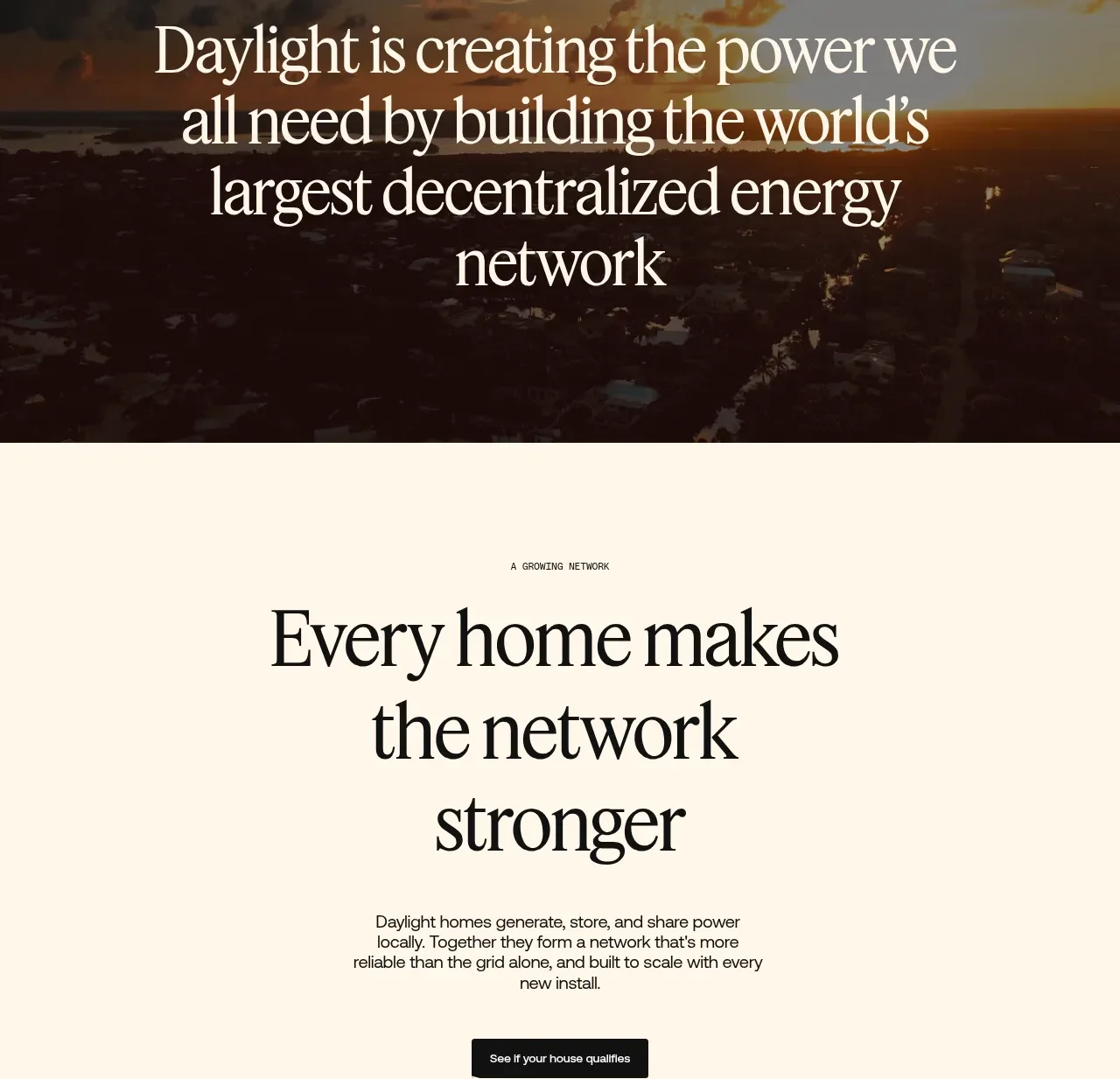
 Network growth CTA
godaylight.com · Call to action
Network growth CTA
godaylight.com · Call to action
 Split closing CTA
godaylight.com · Call to action
Split closing CTA
godaylight.com · Call to action

 Closing conversion banner
FastRouter.ai · Call to action
Closing conversion banner
FastRouter.ai · Call to action
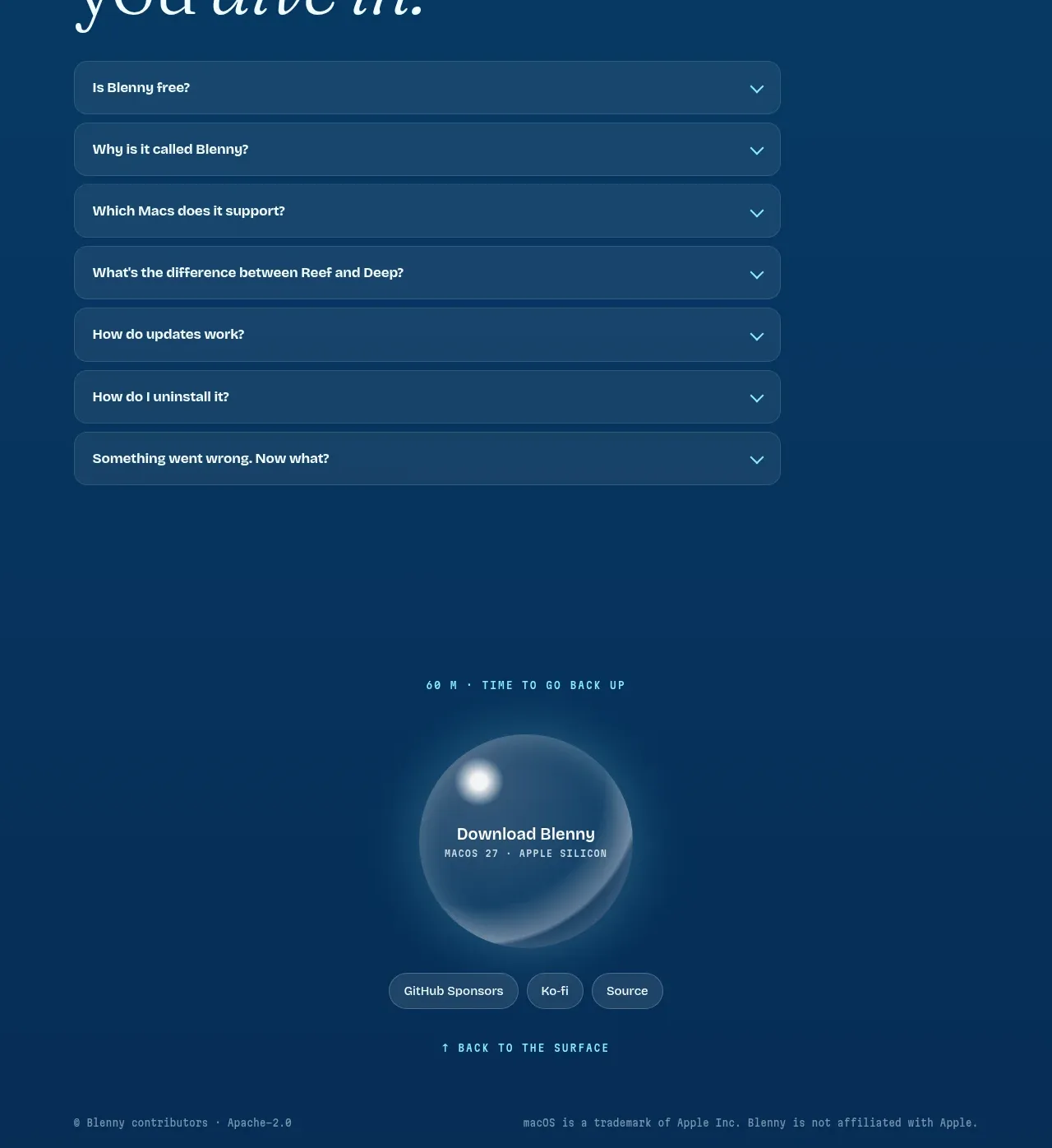
 Final download call to action
Blenny · Call to action
Final download call to action
Blenny · Call to action
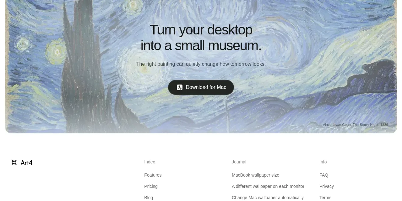
 Visual download call to action
Art4 · Call to action
Visual download call to action
Art4 · Call to action
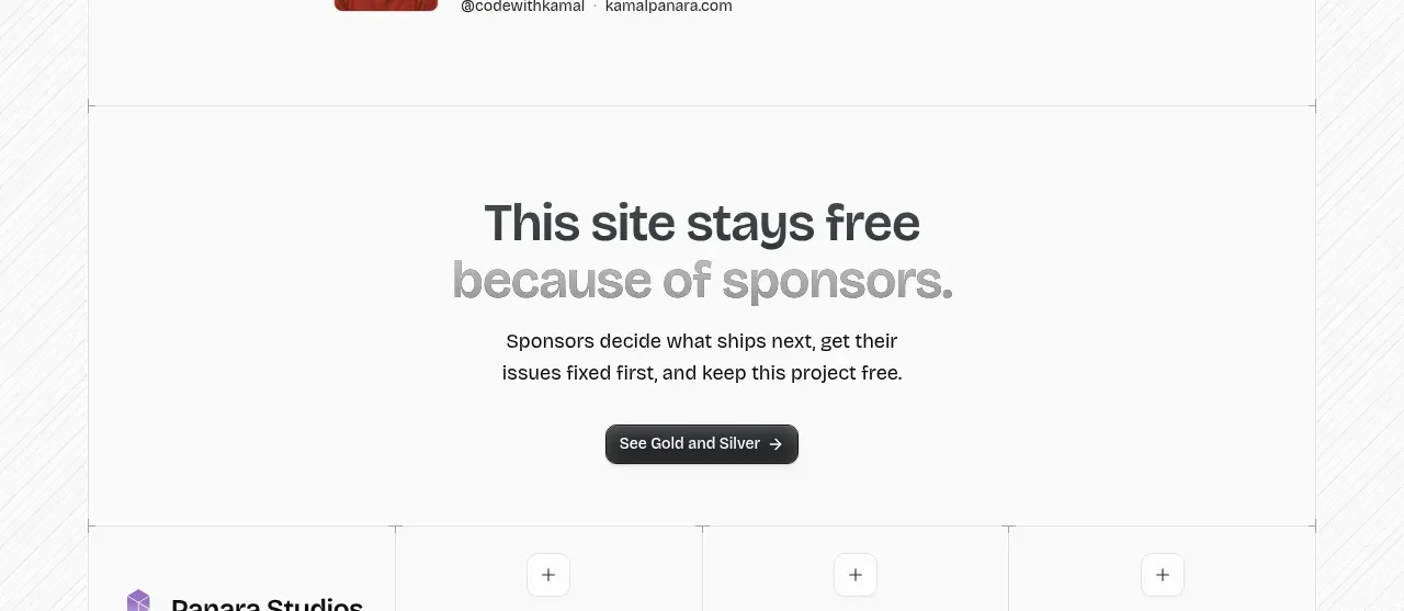
 Sponsor call to action
opensend.cc · Call to action
Sponsor call to action
opensend.cc · Call to action