kage
kage

Design analysis
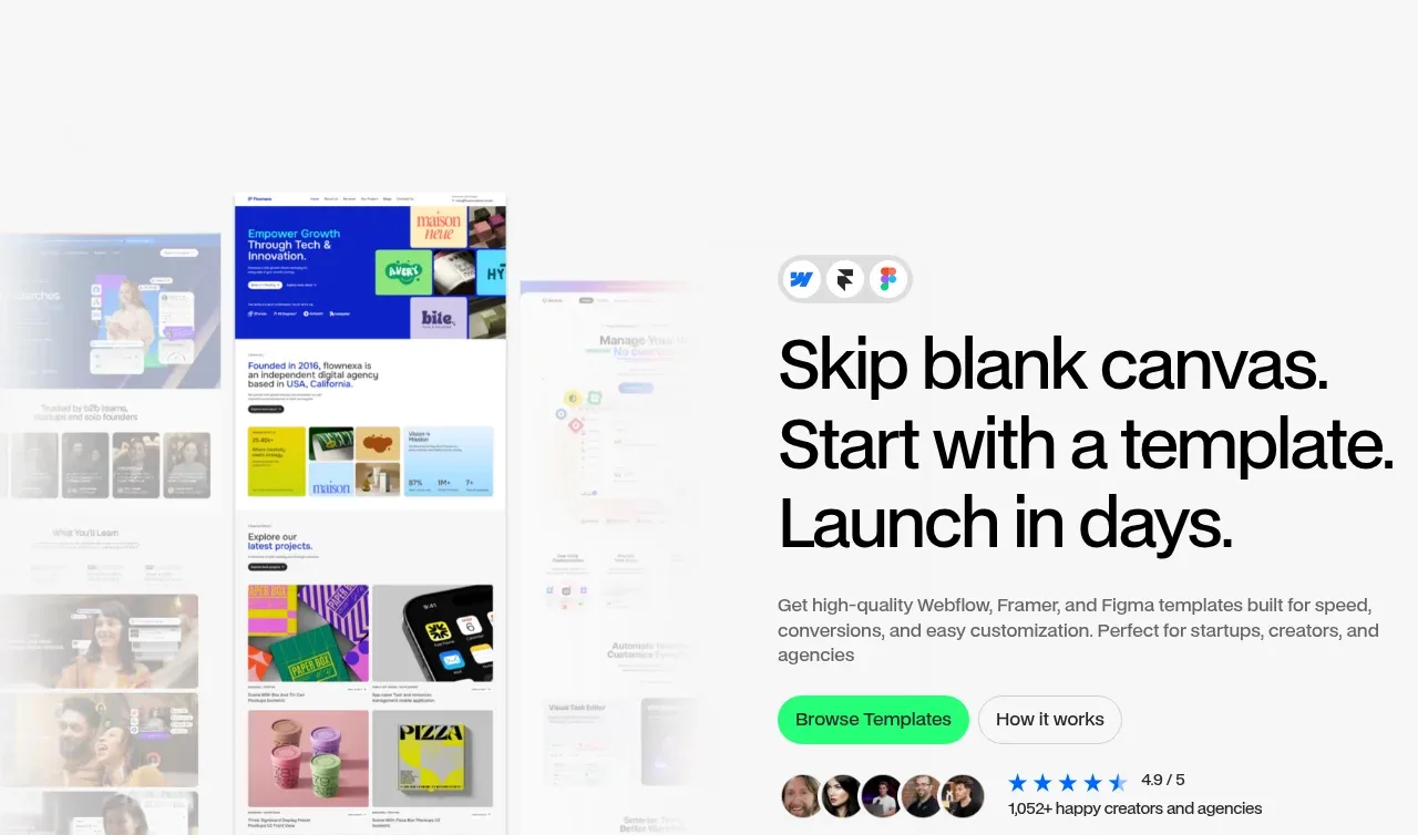
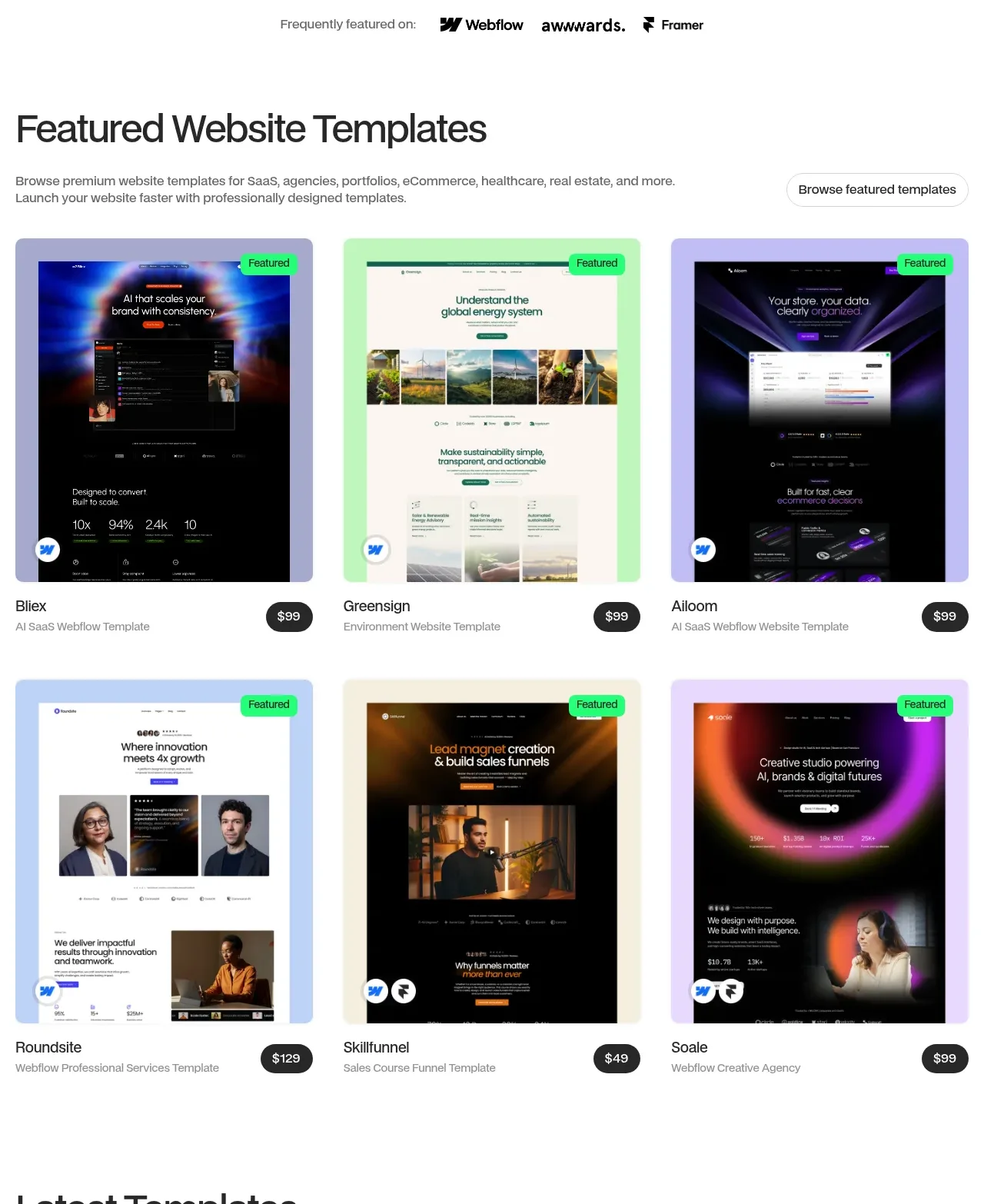
A template-marketplace landing page built on a strict grid system: a split hero with an overlapping screenshot collage gives way to repeated three-column template galleries where pastel-tinted preview frames, bright-green status pills and circular dark price chips supply nearly all the visual variety. Mid-page the rhythm deliberately changes — a bento band of black, white and green cards, then three dark numbered step cards, then centered two-tone headings for the performance and FAQ sections — before a full-bleed black CTA banner decorated with Figma-style cursor pills and an oversized footer with a subscribe row. The whole long page stays coherent through one bright green accent used only for CTAs and badges, pill-shaped everything, ~20px card radii, and headings whose second clause drops to gray.
Prompt preview
## Reference images

Study these alongside the description below: hierarchy, rhythm, spacing, colour. Build for the product you are asked about, using this design language.

- Full page: https://kage-design-assets.t3.tigrisfiles.io/screenshots/flowcub-com/a37af876-acd7-4211-984b-565faddfb31d-1790420112256-full.webp
- Above the fold: https://kage-design-assets.t3.tigrisfiles.io/screenshots/flowcub-com/a37af876-acd7-4211-984b-565faddfb31d-1790420103056.webp
- Design on Kage: https://kage.design/designs/flowcub-landing-page

## Before you start
Ask the user what product they are building, who it is for, and what brand assets they already have (name, logo, colours, typeface). Wait for their answers before writing any code. Everything below is a design language to apply to *their* product — not the reference site — so swap all copy, categories and imagery for theirs.

## Page structure
1. **Hero (split)** — Left ~55%: a stacked, slightly overlapping collage of product screenshots as tilted/layered cards. Right: small platform icon chips, a 3-line headline (~72–80px), one short gray paragraph, two pill buttons (filled green primary + bordered white secondary), then a social-proof row of overlapping avatars, star rating, and a small gray count line.
2. **Featured-on strip** — Small centered gray caption plus 3 wordmarks in gray, on white, generous vertical padding.
3. **Featured items gallery** — Left-aligned big heading, small gray description below-left, pill button floated right. A 3×2 grid of cards: each card is a screenshot inside a pastel-tinted frame (lavender, mint, cream, sky — different per card), a tiny bright-green status pill pinned to the image's top-right, a small circular platform badge bottom-left; under the card, item name + category on the left and a circular dark price chip on the right.
4. **Latest items gallery** — Identical grid mechanics; the heading is two-tone (first line black, second line gray) with caption and pill button on the right. Six cards with New/Featured/Free pills and prices including one Free.
5. **Value bento band** — Light-gray section. Two-tone heading on the left with a small gray caption. Bento grid: row 1 = solid black statement card with icon chips, a light card with a 3-step checklist + screenshot, and a saturated green card for a support promise; row 2 = a light card with a checkmark benefit list, a card with a device mockup over a big green circle, and a black promo card with a white pill button and a small code label.
6. **Process steps** — Two-tone heading left, small caption, and two thin-line icon bullets stacked on the right. Three equal near-black cards labelled `// 01`, `// 02`, `// 03` with a title, one sentence, and a screenshot filling the lower half; the first card also carries a green pill and a secondary button.
7. **Performance section (centered)** — Centered two-tone heading, tiny caption, two pill CTAs. Below, two wide light cards side by side: one showing the product at desktop/tablet/mobile widths, one showing four green circular score rings with labels and a small attribution line.
8. **FAQ (centered)** — Centered heading, one caption line, a green pill button, then a two-column accordion with thin dividers, chevron icons, and ~14px semibold questions.
9. **Full-bleed black CTA banner** — Rounded ~24px dark card spanning the content width: icon chips top-left, big white heading, small gray caption, floating pastel role pills with cursor-arrow pointers drifting over the upper right, a screenshot collage across the lower half, and green + white pill buttons bottom-left.
10. **Footer** — Light. Top row: left a three-line statement with the final line in the accent green; right a "get updates" caption with an email input and green subscribe pill. Middle: four link columns with tilde-prefixed labels (`~ Navigation`, `~ Category`, `~ Info`, `~ Get in touch with Us`), one oversized email address, and round social chips. Bottom bar: copyright left, a small partnership note right, separated by a hairline.

## Design language
- **Hierarchy:** Oversized grotesque sans headings (hero ~72–80px, section heads ~44–56px, medium weight ~500–600, tight tracking, sentence case). Use the two-tone device repeatedly: the first clause in near-black `#111`, the second in gray `#9ca3af` — it marks section rhythm without extra decoration. Every heading gets a 13–15px gray caption underneath.
- **Rhythm and density:** Alternate dense screenshot galleries (3-column grids, two rows) with airy single-idea sections (centered heading + one widget), and break the loop once mid-page with a bento band on `#f4f4f5`. End loud: full-bleed black banner, then a large footer. Vertical padding ~120px between major sections, ~24px gutters in grids.
- **Colour:** White `#ffffff` base; light-gray band `#f4f4f5`; near-black cards and banner `#0b0b0b`; body gray `#71717a`; hairlines `#e4e4e7`. One saturated accent green (~`#3dd96f`) reserved for primary buttons, status pills, one footer line, and score rings — never for large surfaces except a single bento card. Differentiate gallery cards with pastel frames: lavender `#cbb9f2`, mint `#bfe8cd`, cream `#ece4d4`, sky `#bcd6f2`.
- **Type:** A single grotesque sans throughout (Inter-like). Scale: 13px captions → 14–16px body → 18px semibold card titles → 44–56px section heads → 72–80px hero. No serif, no display face; let size and the gray two-tone do the work.
- **Shape and depth:** Radius is the signature — cards 16–24px, everything pill-shaped (buttons, status badges, inputs, social chips), and circular dark price/number chips (`#111` with white text) as a recurring motif. No drop shadows on light cards; depth comes from solid black cards, pastel frames and hairline borders instead.
- **Buttons and badges:** Primary = green pill with dark text; secondary = white pill with 1px `#e4e4e7` border. Tiny green status pills (Featured/New/Free) pinned to image corners; small circular monochrome platform/feature badges at image bottom-left.
- **Motion:** Restrained. ~200ms ease transitions: slight lift/scale on card hover, chevron rotation in the accordion, and cursor-arrow-labelled pastel pills floating in the CTA banner to imply collaboration. Nothing bounces.
- **Icons and data:** Thin-line icons inside small circles for benefit bullets; metrics rendered as green ring/score circles with labels beneath.

## Never
- Do not reuse the reference's name, wordmark, logo, taglines, testimonial numbers, ratings, promo codes, or any of its template screenshots or card copy.
- Do not use Webflow, Framer, Figma, or awwwards logos/badges — replace platform chips with the user's own relevant tools or omit them.
- Never present the output as the reference product; every headline, category and image must come from the user's answers in **Before you start**.
Components from this page
All components
 Minimal top navigation
flowcub.com · Navigation
Minimal top navigation
flowcub.com · Navigation
 Template-led hero
flowcub.com · Hero
Template-led hero
flowcub.com · Hero
 Featured-by trust strip
flowcub.com · Logo cloud
Featured-by trust strip
flowcub.com · Logo cloud
 Featured template catalogue
flowcub.com · Feature grid
Featured template catalogue
flowcub.com · Feature grid
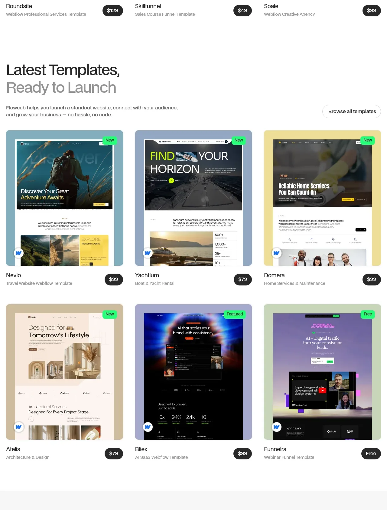 Latest template catalogue
flowcub.com · Feature grid
Latest template catalogue
flowcub.com · Feature grid
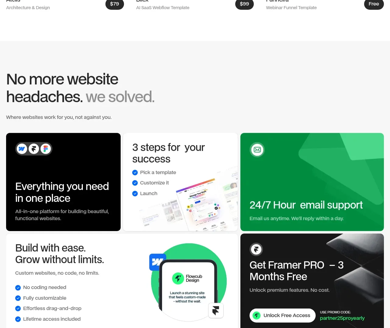 Benefits bento grid
flowcub.com · Feature grid
Benefits bento grid
flowcub.com · Feature grid
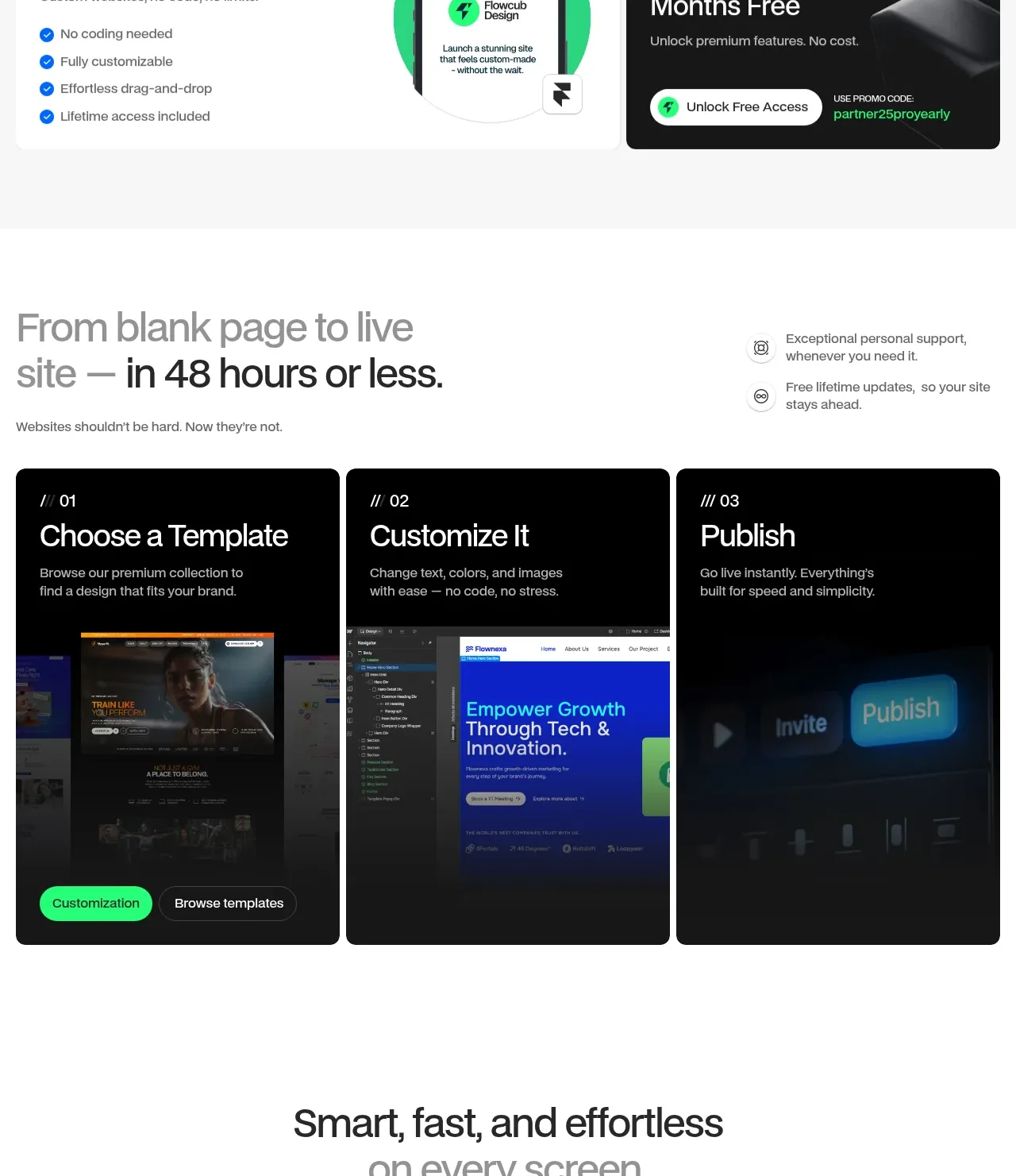 Three-step launch process
flowcub.com · Feature grid
Three-step launch process
flowcub.com · Feature grid
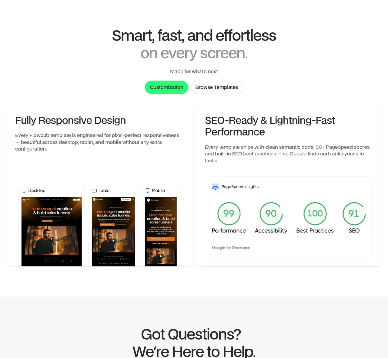 Responsive and performance proof
flowcub.com · Feature grid
Responsive and performance proof
flowcub.com · Feature grid
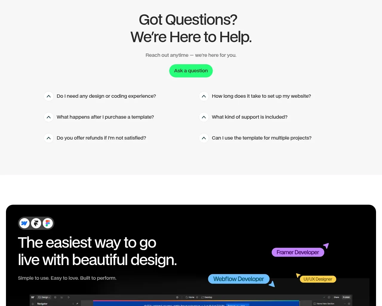 Support FAQ
flowcub.com · FAQ
Support FAQ
flowcub.com · FAQ
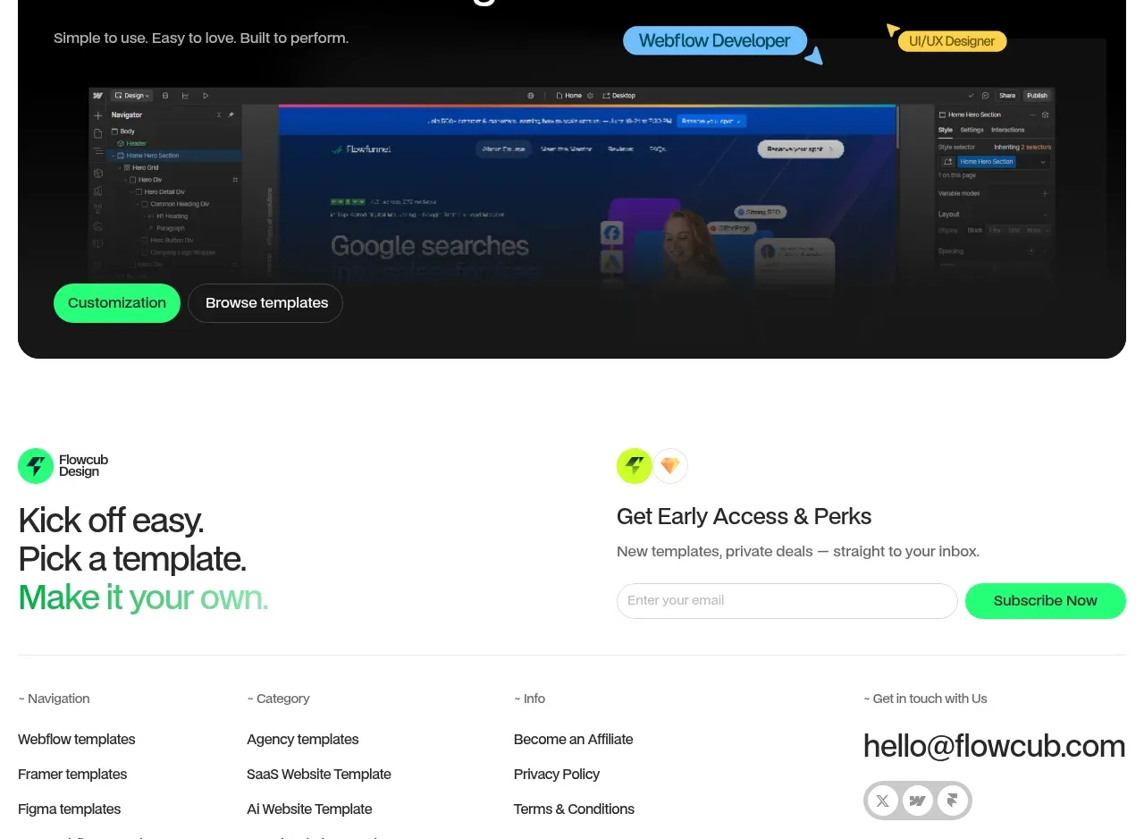 Dark conversion banner
flowcub.com · Call to action
Dark conversion banner
flowcub.com · Call to action
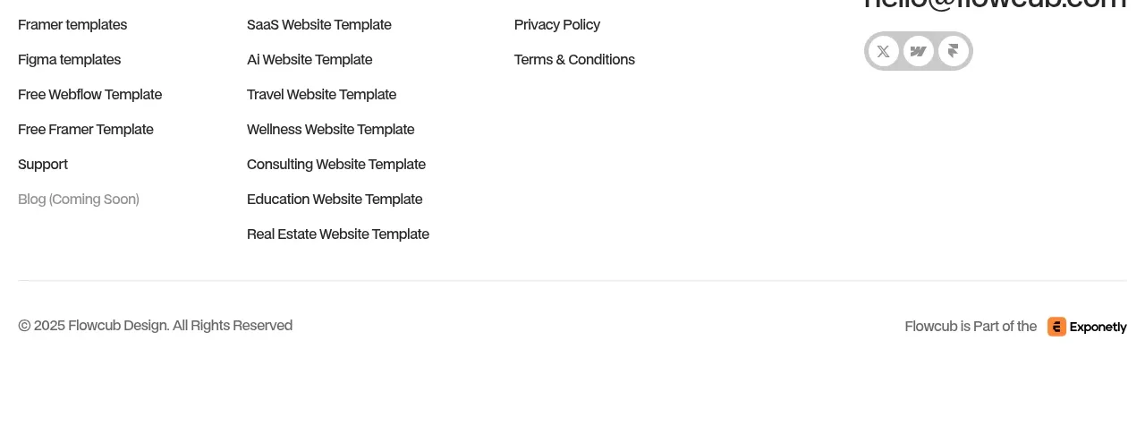 Newsletter and link footer
flowcub.com · Footer
Newsletter and link footer
flowcub.com · Footer