kage
kage
flowcub.com
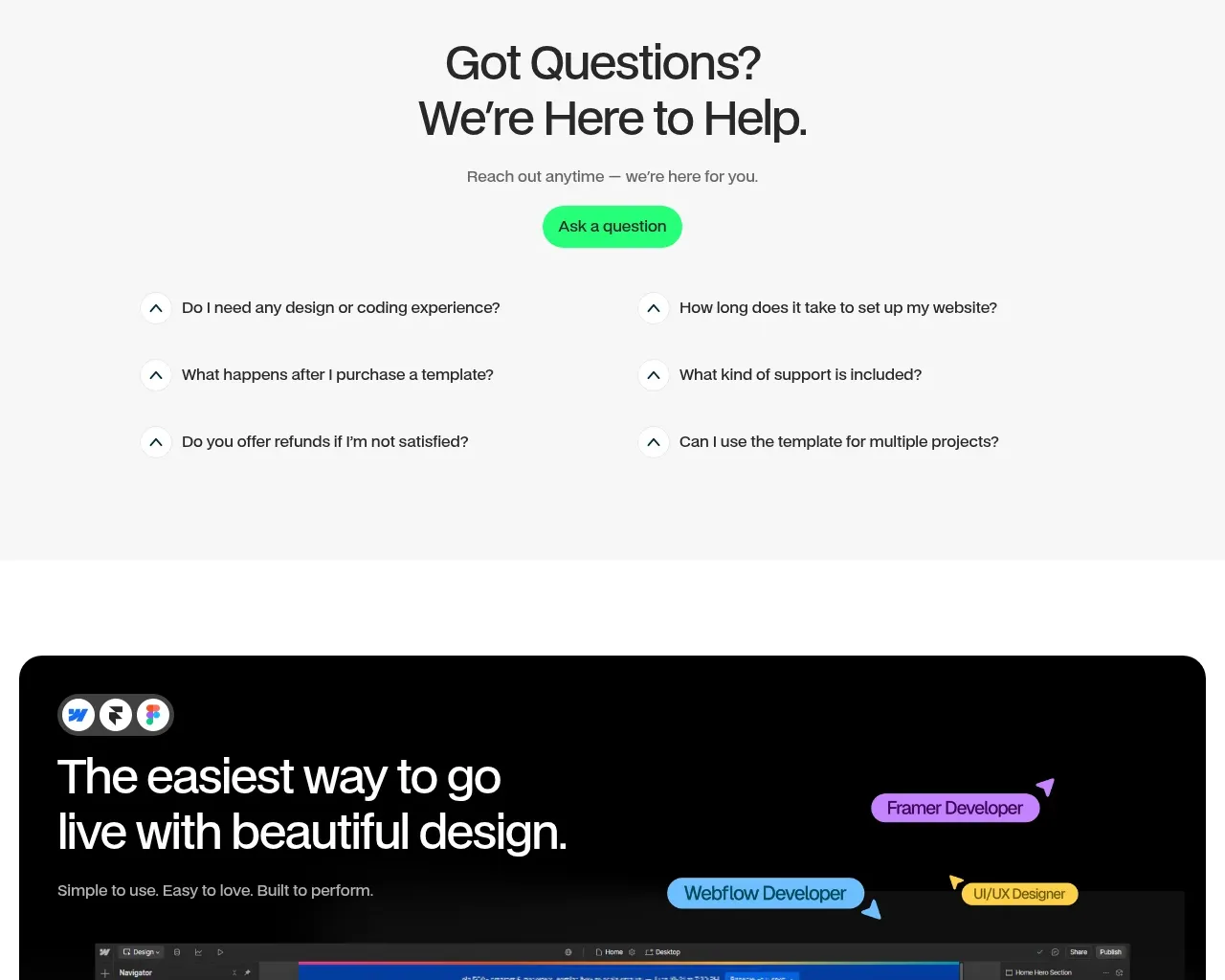
Design analysis
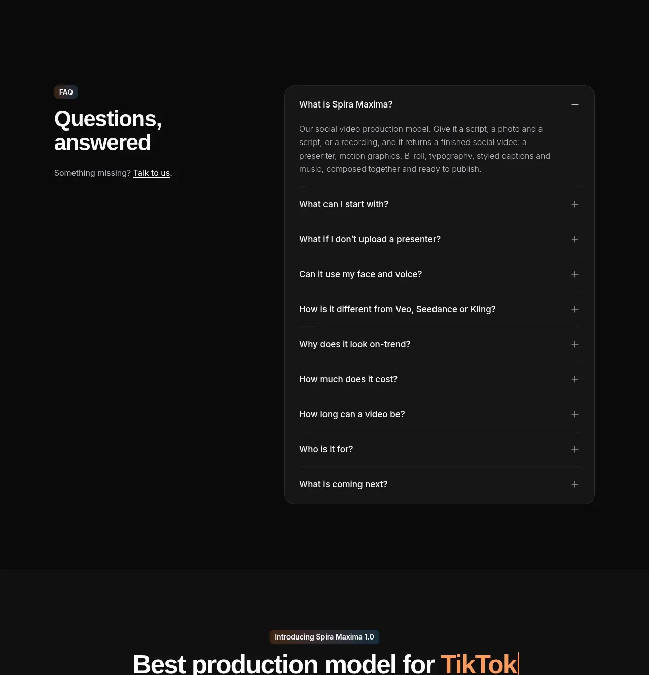
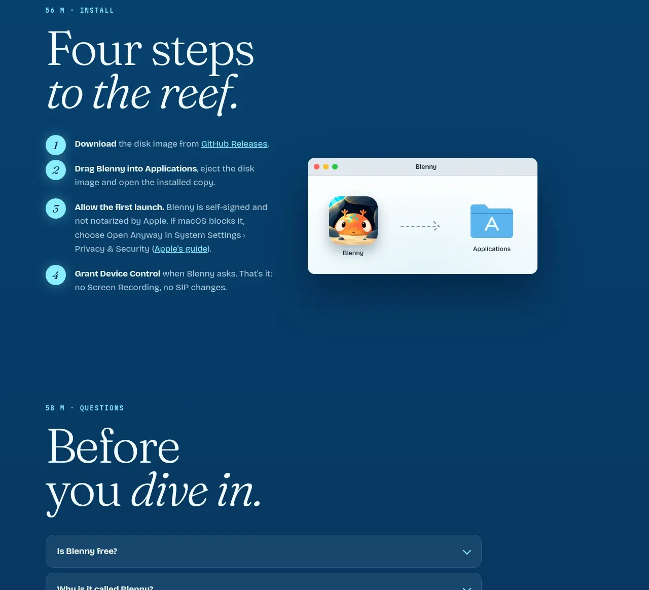
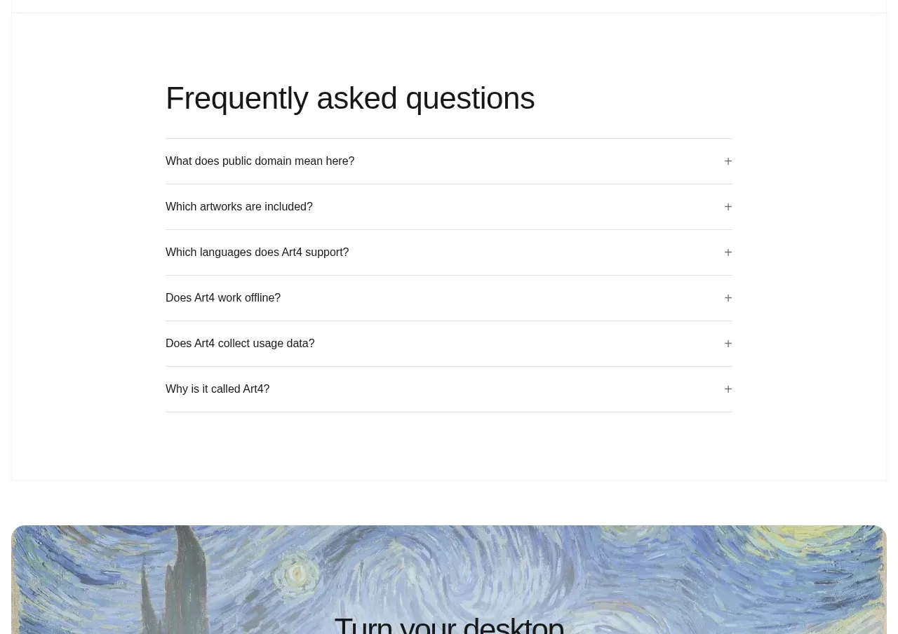
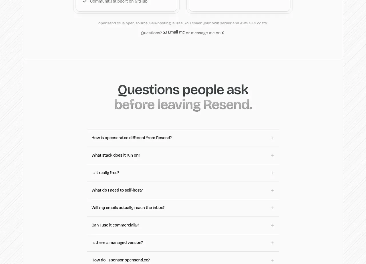
A calm centered FAQ section uses six compact questions in a two-column accordion layout and a single support CTA to resolve purchase friction.
Prompt preview
## Reference images

Study these alongside the description below: hierarchy, rhythm, spacing, colour. Build for the product you are asked about, using this design language.

- Component: https://kage-design-assets.t3.tigrisfiles.io/components/flowcub-com/a37af876-acd7-4211-984b-565faddfb31d-1790420146-8.webp
- Full page it was cut from: https://kage-design-assets.t3.tigrisfiles.io/screenshots/flowcub-com/a37af876-acd7-4211-984b-565faddfb31d-1790420112256-full.webp
- Component on Kage: https://kage.design/component/flowcub-faq

## Before you start
Ask what the user's product is, who it serves, and what its brand personality and primary conversion goal are. Then apply the following principles to that product rather than reproducing the reference.

Build an FAQ section on a soft gray background (#F7F7F7). Center a two-line heading, short supporting sentence, and green pill CTA. Below, show six questions in two columns with generous row spacing, thin separators or understated structure, and circular chevron controls. Use 40–48px headline text, 15px questions, 14px supporting text, black #111, muted #707070, and green #25F276. Implement true accessible accordion behavior with button elements, aria-expanded, animated height, and only one or multiple open items according to the product's needs. Stack to one column on mobile.

Never: use logos, product names, copy, illustrations, or imagery from the reference.