kage
kage
flowcub.com
Design analysis
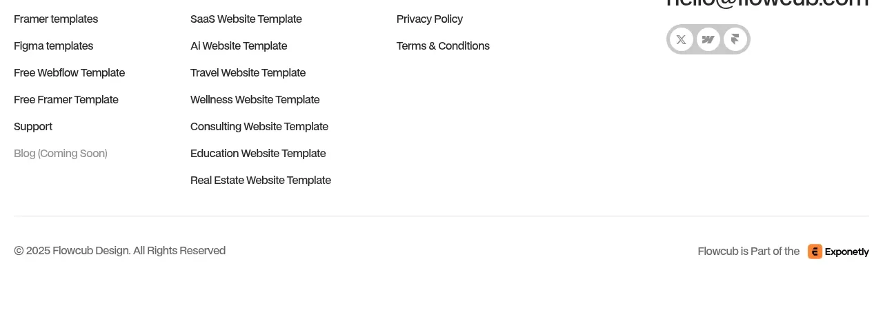
The footer combines a final invitation and email field with a structured multi-column link directory, contact detail, social controls, and legal ownership line.
Prompt preview
## Reference images

Study these alongside the description below: hierarchy, rhythm, spacing, colour. Build for the product you are asked about, using this design language.

- Component: https://kage-design-assets.t3.tigrisfiles.io/components/flowcub-com/a37af876-acd7-4211-984b-565faddfb31d-1790420147-10.webp
- Full page it was cut from: https://kage-design-assets.t3.tigrisfiles.io/screenshots/flowcub-com/a37af876-acd7-4211-984b-565faddfb31d-1790420112256-full.webp
- Component on Kage: https://kage.design/component/flowcub-footer

## Before you start
Ask what the user's product is, who it serves, and what its brand personality and primary conversion goal are. Then apply the following principles to that product rather than reproducing the reference.

Build a white footer with a top newsletter row: a compact brand lockup and invitation on the left, and an email input plus green subscribe button on the right. Follow with a thin divider and four link columns covering navigation, categories, company information, and contact/social details. End with another divider and a small legal/copyright row. Use a max-width 860–900px container, 24px horizontal padding, 30–44px vertical spacing, 14px link text, 12px legal text, black #111, gray #6F6F6F, green #25F276, #E8E8E8 dividers, and 999px input/button radii. Make the form keyboard accessible, provide a visible focus state, and stack the newsletter and columns on mobile.

Never: use logos, product names, copy, illustrations, or imagery from the reference.