 kage
kage
flowoapp.com

Design analysis
A large centered statement crystallizes the product's main value proposition in bold, multi-line type with substantial surrounding whitespace.
Prompt preview
## Reference images

Study these alongside the description below: hierarchy, rhythm, spacing, colour. Build for the product you are asked about, using this design language.

- Component: https://kage-design-assets.t3.tigrisfiles.io/components/flowo/46dcd8ed-31a5-4fb1-ab3b-3d3a2b966cfb-1791439602-4.webp
- Full page it was cut from: https://kage-design-assets.t3.tigrisfiles.io/screenshots/flowo/46dcd8ed-31a5-4fb1-ab3b-3d3a2b966cfb-1791439391035-full.webp
- Component on Kage: https://kage.design/component/flowo-cta

## Before you start
Ask what the user's strongest product promise is and what belief the audience should remember. Write fresh copy for that product instead of reusing the reference wording.

Build a statement-led positioning section with one large, high-confidence sentence. It should feel like a pause in the page: minimal, centered, and strong enough to communicate the product's category and benefit without supporting clutter.

- Center the statement in a max-width of 440–520px and allow intentional line breaks at desktop sizes.
- Use 38–58px bold type, approximately 0.95 line-height, with responsive scaling down to 30–38px.
- Use near-black (`#111111`) on warm white (`#FAFAF8`); avoid gradients and heavy decoration.
- Give the section 140–220px vertical padding so the message has room to land.
- Add only a small supporting line or link if it materially improves understanding.
- Keep motion subtle: a short fade or rise is acceptable, but respect reduced-motion preferences.

Never use logos, product names, copy, illustrations, or imagery from the reference.
More components
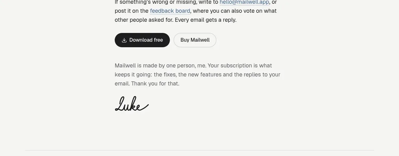
 Trial and purchase call to action
Mailwell · Call to action
Trial and purchase call to action
Mailwell · Call to action
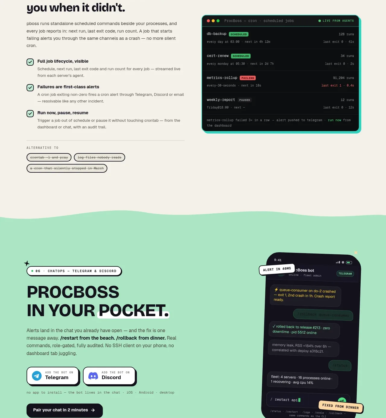
 Pocket alerts call to action
ProcBoss · Call to action
Pocket alerts call to action
ProcBoss · Call to action
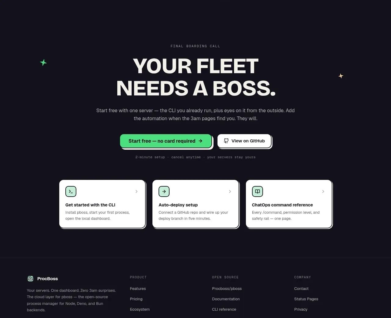 Dark final conversion band
ProcBoss · Call to action
Dark final conversion band
ProcBoss · Call to action
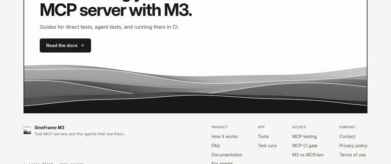
 Documentation call to action
SineFrame M3 · Call to action
Documentation call to action
SineFrame M3 · Call to action
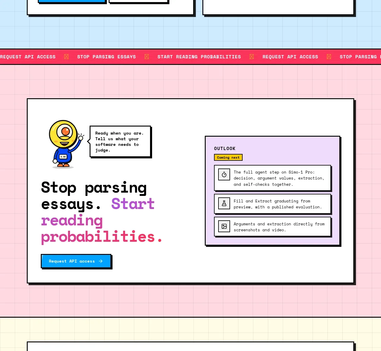
 Conversion call to action
Simo · Call to action
Conversion call to action
Simo · Call to action
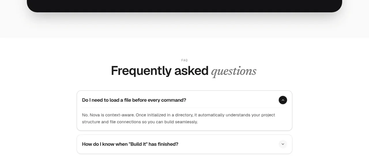
 Install command CTA
NOVA CLI v1.0 · Call to action
Install command CTA
NOVA CLI v1.0 · Call to action