kage
kage
flowoapp.com

Design analysis
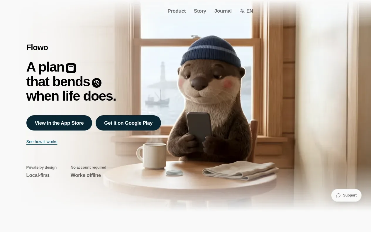
A calm, warm landing page built around a cream canvas and huge editorial grotesque type. The hero pairs a soft illustrated otter with pill-shaped store buttons and trust chips, then a tabbed showcase (Capture / Schedule / Inspect / Re-plan) drives an iPhone mockup with captioned screens. Below, the page alternates dense instructional blocks with airy, oversized centred statements, then compresses into a privacy triptych, a newsletter form with store CTAs, a hairline-divided FAQ accordion, and a minimal centred footer. The rhythm deliberately breathes — vast whitespace between scroll-driven sections reinforces the low-pressure product promise.
Prompt preview
## Reference images

Study these alongside the description below: hierarchy, rhythm, spacing, colour. Build for the product you are asked about, using this design language.

- Full page: https://kage-design-assets.t3.tigrisfiles.io/screenshots/flowo/46dcd8ed-31a5-4fb1-ab3b-3d3a2b966cfb-1791439391035-full.webp
- Above the fold: https://kage-design-assets.t3.tigrisfiles.io/screenshots/flowo/46dcd8ed-31a5-4fb1-ab3b-3d3a2b966cfb-1791439386845.webp
- Design on Kage: https://kage.design/designs/flowo-landing-page

## Before you start

Ask the user what product they are building, who it is for, and what brand assets they already have (name, logo, colours, typeface, illustration or mascot style). Wait for their answers before writing any code. Everything below is applied to *their* product — the reference page is only a design language to borrow, never its content.

## Page structure

Build a single-scroll landing page in this order:

1. **Hero** — full-bleed warm illustrated scene (a gentle mascot in a cosy setting) with the wordmark top-left, a small nav top-right (Product / Story / Journal / language switch). Left-aligned display headline with small inline icons breaking each line, two dark pill store buttons, a quiet text link below, then a two-column row of trust chips (privacy claim + local-first, no-account claim + works offline). A floating "Support" pill sits bottom-right.
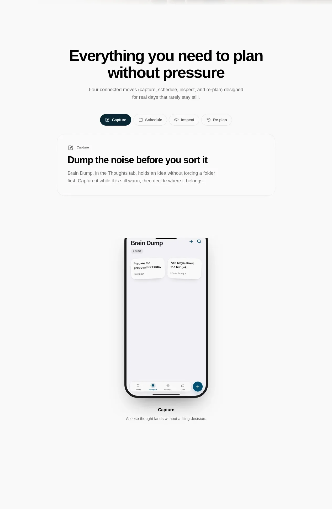
2. **Capability intro** — centred two-line headline ("Everything you need to plan without pressure" pattern) plus a one-sentence subtitle naming the product's core modes.
3. **Mode switcher showcase** — a pill segmented control with 4–5 modes (first one active, dark). Below it, a white rounded card with a small icon+label, a bold card headline, and 2–3 lines of body copy.
4. **Phone mockup** — centred iPhone-frame mockup rendering the active mode's screen (header, list cards, bottom tab bar with a floating "+" action), with a bold caption word and one muted sentence underneath. Each tab swaps the mockup screen and caption.
5. **Positioning statement** — large centred headline contrasting the product with conventional tools ("Most to-do apps ask you to organize before you are ready" pattern) plus a short subtitle.
6. **Scroll-spaced feature sequence** — 4 alternating blocks, each a large left-aligned headline with a small 2-line paragraph, separated by very large vertical whitespace (use sticky/scroll-reveal if the stack supports it): capture-first, visible structure, user control, graceful re-planning.
7. **Giant statement blocks (×3)** — full-width centred display text at enormous size, one or two sentences each, separated by huge margins. No imagery, just type as the visual.
8. **Privacy section** — centred heading "Private by design" pattern, a justified short paragraph with an inline link, then three stacked centred micro-rows: small bold title + one-line description (no account required / data stays local / cloud only when invoked).
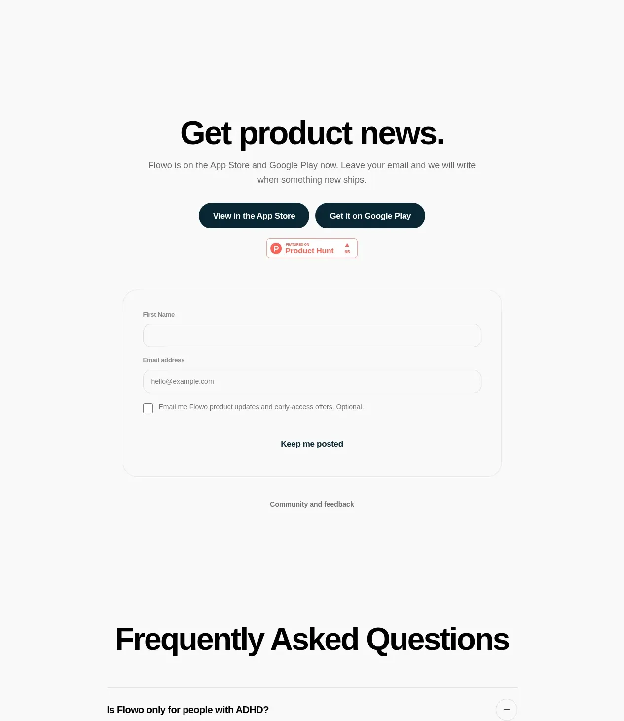
9. **Newsletter section** — centred heading ("Get product news."), subtitle, the two dark store pill buttons repeated, a third-party launch badge, then a narrow stacked form: labelled first-name and email inputs, a small checkbox with consent copy, and a dark submit button. A quiet "Community and feedback" link below.
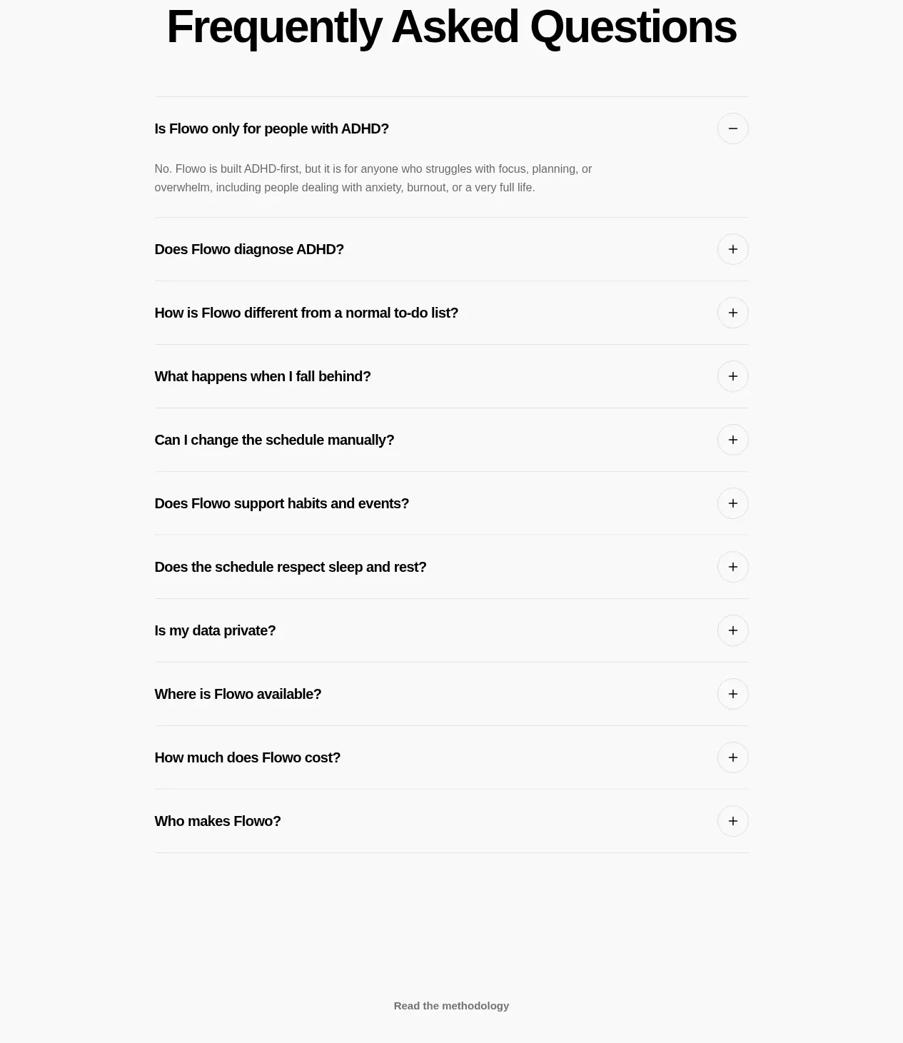
10. **FAQ** — centred "Frequently Asked Questions" heading, then an accordion list (10–11 questions) separated by hairline rules; first item open with a minus icon, others closed with plus icons; answers are 1–2 muted sentences.
11. **Footer** — a quiet "Read the methodology" link, a centred link row (Product · Contact · Privacy · extra), a launch badge, a row of small monochrome social icons, and a tiny copyright line.

## Design language

- **Canvas and colour**: warm cream page background (~#F6F1E8), near-black ink text (~#141414), white cards and mockup surfaces (~#FFFFFF), muted warm grey for secondary copy (~#8A857A), hairline borders (~#E6DFD2). Primary buttons and active tabs are dark slate/ink (~#1E2B33 or the user's dark brand tone) with white text. Use colour almost nowhere else — warmth comes from the illustration and the cream, not from accent colours.
- **Type**: one modern grotesque sans family throughout. Build hierarchy purely with scale: hero headline ~clamp(2.5rem, 5vw, 4rem) with normal line breaks; giant statement blocks ~clamp(2.5rem, 6vw, 5.5rem) centred; section headings ~2.5–3.5rem; body copy 0.9–1rem at comfortable line-height; captions and chips 0.75–0.85rem. Medium weight for headings, regular for body, generous letter-spacing on tiny labels.
- **Shape and depth**: everything is soft — pill-shaped buttons, pills for tabs and badges, 16–24px card radius, ~44px phone frame radius. Shadows are nearly absent; separate layers with hairline borders and the cream/white contrast instead. One soft ambient shadow behind the phone mockup at most.
- **Buttons**: dark filled pills with white 0.85rem text and ~44px height, side by side with a small gap. Secondary actions are plain text links with underlines. Never use bright or gradient CTAs.
- **Rhythm down the page**: start dense and warm (hero), then instructional density (tabs + card + phone), then deliberately decompress — the scroll-spaced feature rows and giant statements should each get 30–50vh of breathing room. After the airy middle, compress again: privacy rows, form, and FAQ are compact and tightly stacked. Alternate dense ↔ airy to mirror the product's calm, low-pressure promise.
- **Content treatment**: every feature claim is one bold headline plus one or two plain, empathetic sentences — no bullet spam, no feature grids, no screenshots collages. Legal/trust copy is short, factual, and linked.
- **Motion and interaction**: calm and functional only — tab switches crossfade the phone screen and caption, accordion rows expand smoothly with a plus/minus rotation, sections fade-rise gently on scroll. No parallax gimmicks, no marquees, nothing that feels busy.

## Never

- Never reuse the otter mascot, any animal illustration, the Flowo name or wordmark, its tagline, its feature copy, or its specific FAQ questions.
- Never copy the App Store / Google Play / Product Hunt badge artwork verbatim as branded assets beyond standard official store badges the user actually needs.
- Never present the result as Flowo or imply the user's product is made by the same company; apply the visual language to the user's own brand, colours, and mascot-free content unless they supply their own illustration.
Components from this page
All components
 Minimal top navigation
Flowo · Navigation
Minimal top navigation
Flowo · Navigation
 Product promise hero
Flowo · Hero
Product promise hero
Flowo · Hero
 Connected workflow overview
Flowo · Feature grid
Connected workflow overview
Flowo · Feature grid
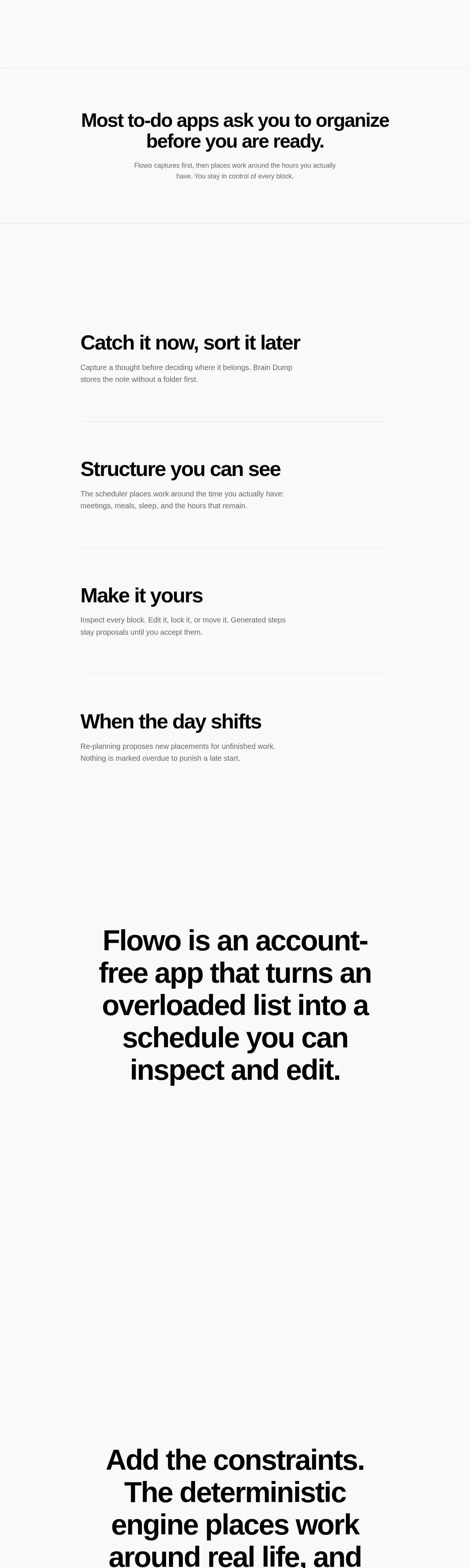 Capture, plan, inspect, re-plan
Flowo · Feature grid
Capture, plan, inspect, re-plan
Flowo · Feature grid
 Account-free product statement
Flowo · Call to action
Account-free product statement
Flowo · Call to action
 Constraint-led planning statement
Flowo · Call to action
Constraint-led planning statement
Flowo · Call to action
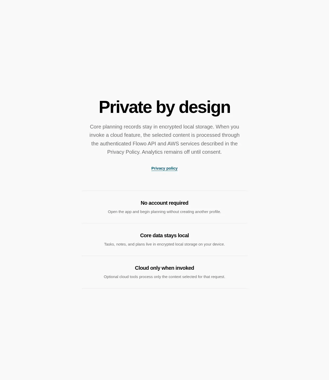 Audience-focused closing statement
Flowo · Call to action
Audience-focused closing statement
Flowo · Call to action
 Privacy and trust principles
Flowo · Feature grid
Privacy and trust principles
Flowo · Feature grid
 Product news signup
Flowo · Form
Product news signup
Flowo · Form
 Frequently asked questions
Flowo · FAQ
Frequently asked questions
Flowo · FAQ