 kage
kage
flowoapp.com
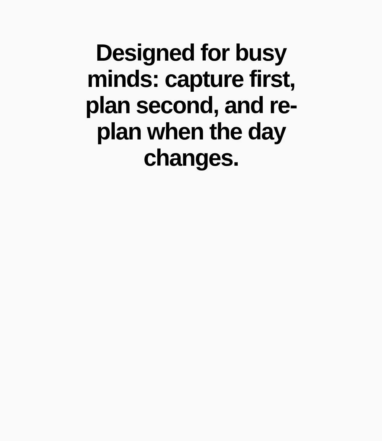
Design analysis
A second oversized message explains the product's differentiator—working around real-world constraints—through direct, centered typography.
Prompt preview
## Reference images

Study these alongside the description below: hierarchy, rhythm, spacing, colour. Build for the product you are asked about, using this design language.

- Component: https://kage-design-assets.t3.tigrisfiles.io/components/flowo/46dcd8ed-31a5-4fb1-ab3b-3d3a2b966cfb-1791439602-5.webp
- Full page it was cut from: https://kage-design-assets.t3.tigrisfiles.io/screenshots/flowo/46dcd8ed-31a5-4fb1-ab3b-3d3a2b966cfb-1791439391035-full.webp
- Component on Kage: https://kage.design/component/flowo-cta-2

## Before you start
Ask what constraints the user's product handles better than alternatives and which differentiator deserves emphasis. Apply the following layout principles with new copy and brand styling.

Create a bold editorial statement section that names a meaningful differentiator. Use one concise paragraph or headline, centered in a generous field, so the page alternates between detailed explanation and memorable conviction.

- Use a centered content measure of roughly 400–500px and generous top and bottom padding.
- Set the headline between 38–56px, with tight leading and 2–5 deliberate lines.
- Pair black text (`#111111`) with a warm off-white background (`#FAFAF8`); use a single accent color only for small details.
- Avoid cards, icons, and competing buttons; this section should feel like a confident pause.
- Ensure the layout remains balanced when the statement wraps differently on mobile.

Never use logos, product names, copy, illustrations, or imagery from the reference.
More components
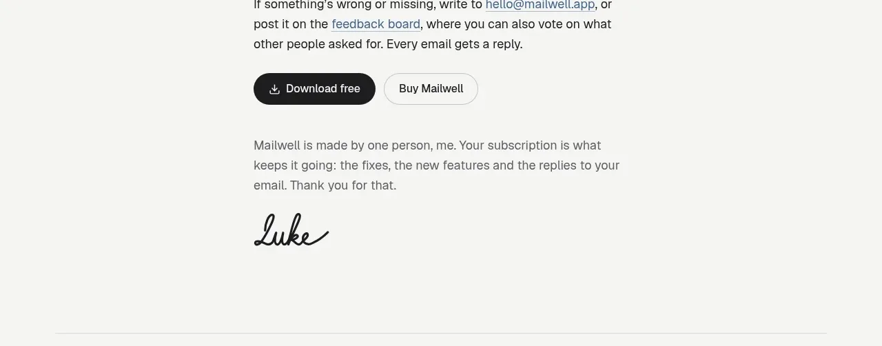
 Trial and purchase call to action
Mailwell · Call to action
Trial and purchase call to action
Mailwell · Call to action
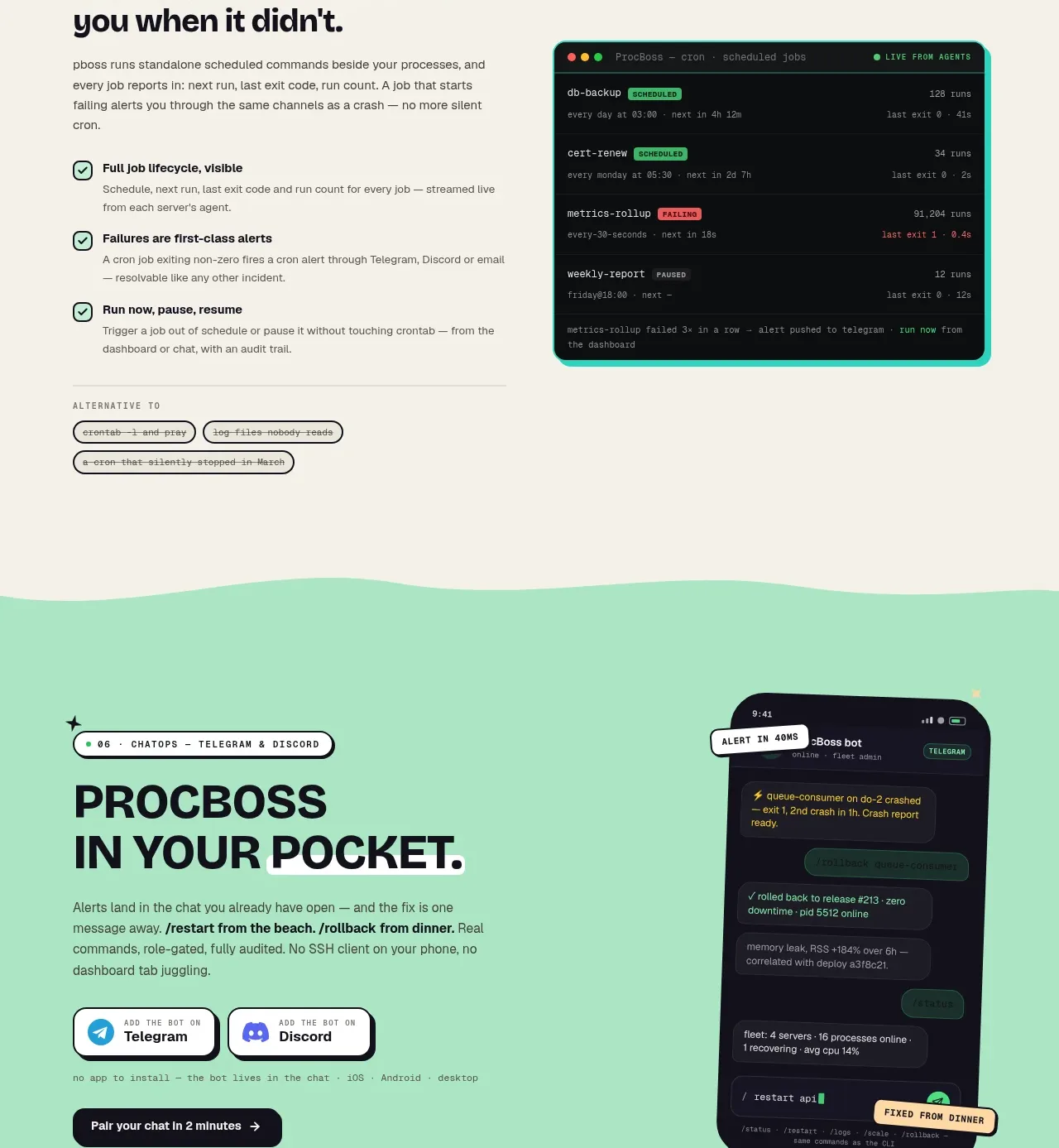
 Pocket alerts call to action
ProcBoss · Call to action
Pocket alerts call to action
ProcBoss · Call to action
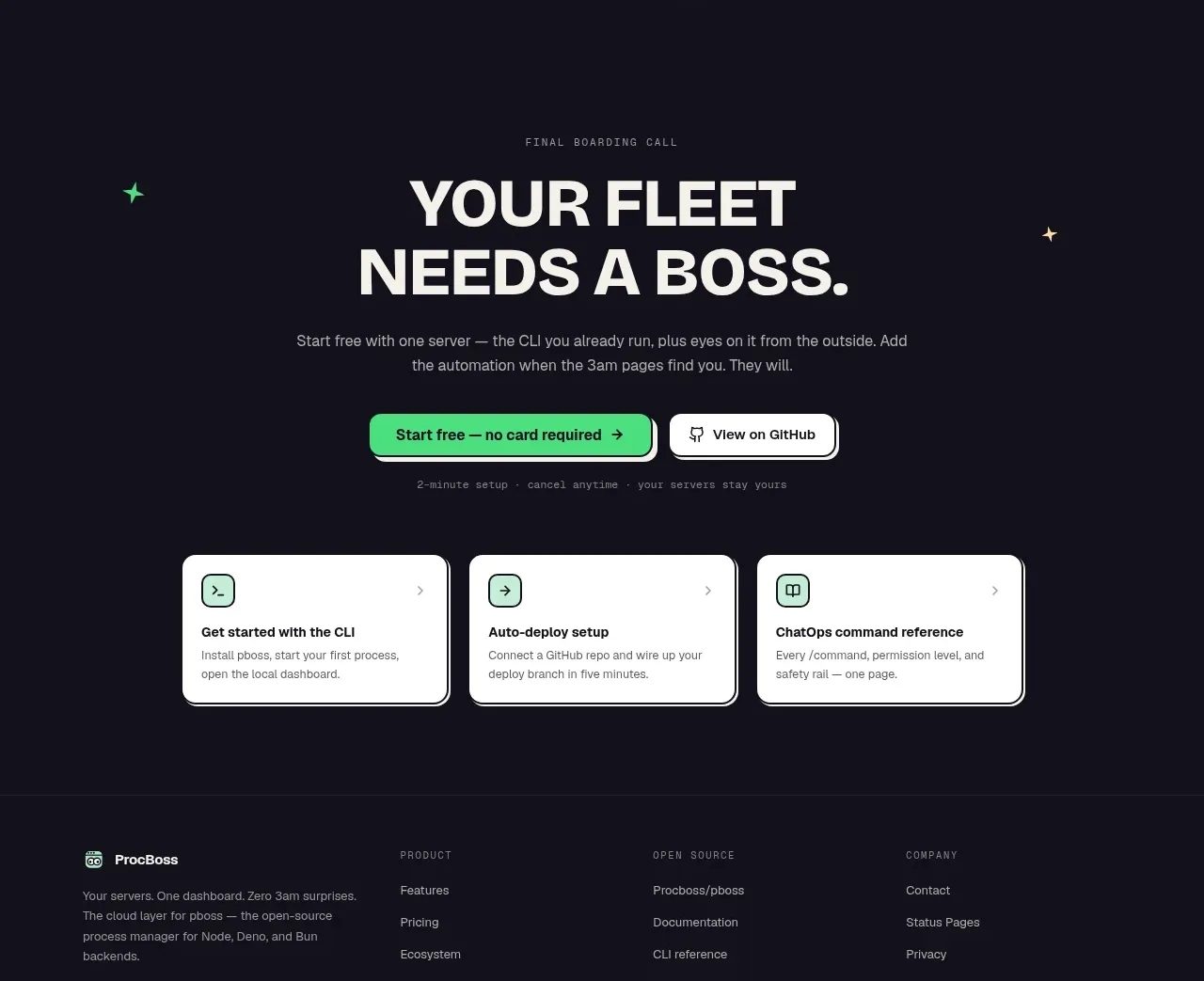 Dark final conversion band
ProcBoss · Call to action
Dark final conversion band
ProcBoss · Call to action
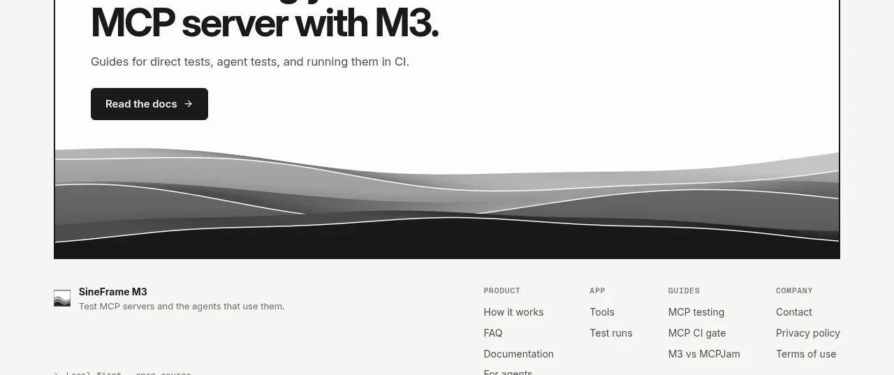
 Documentation call to action
SineFrame M3 · Call to action
Documentation call to action
SineFrame M3 · Call to action
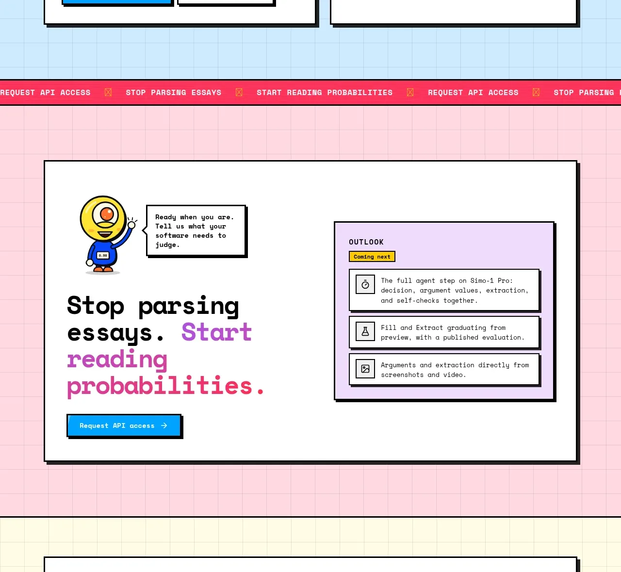
 Conversion call to action
Simo · Call to action
Conversion call to action
Simo · Call to action
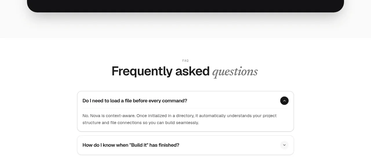
 Install command CTA
NOVA CLI v1.0 · Call to action
Install command CTA
NOVA CLI v1.0 · Call to action