kage
kage
fly.io

Design analysis
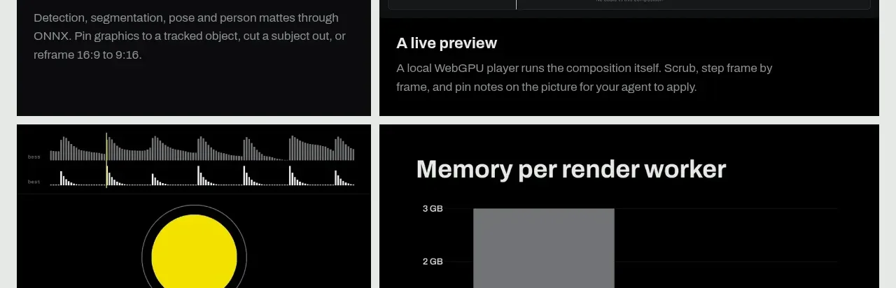
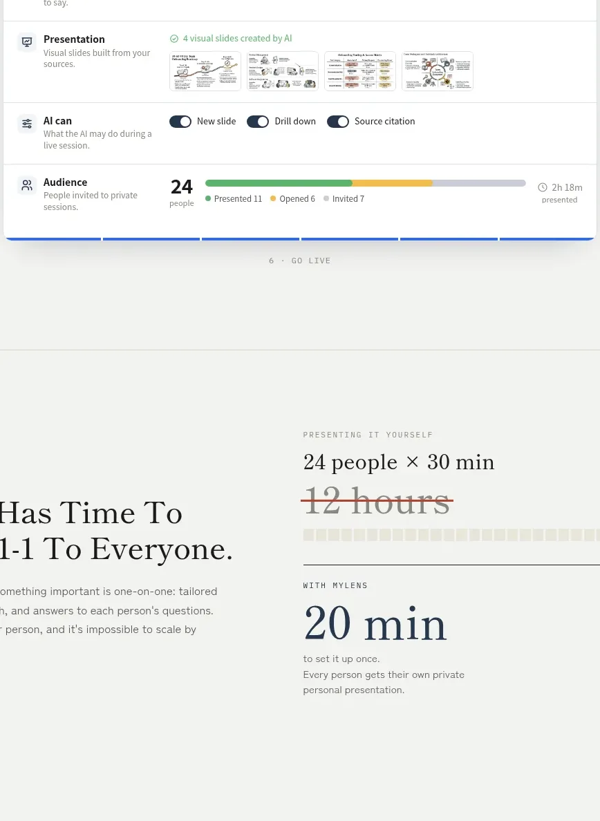
A centered product-introduction section pairs a short, high-impact statement with two equal capability cards. Soft lavender surfaces, restrained borders, generous spacing, and text-led links make the cards feel approachable while preserving a clear path to explore each offering.
Prompt preview
## Reference images

Study these alongside the description below: hierarchy, rhythm, spacing, colour. Build for the product you are asked about, using this design language.

- Component: https://kage-design-assets.t3.tigrisfiles.io/components/fly-io/55088b40-21c4-4b5b-a67c-8a1494f33e2d-1789073898-5.webp
- Full page it was cut from: https://kage-design-assets.t3.tigrisfiles.io/screenshots/fly-io/55088b40-21c4-4b5b-a67c-8a1494f33e2d-1789073866-full.webp
- Component on Kage: https://kage.design/component/fly-card

# Build a two-column product capability card section

## Before you start
Ask me what my product does, who it is for, and what its brand personality, colours, typography, and voice are. Apply the principles below to my product rather than reproducing the reference. If I do not have an established brand, propose a restrained visual direction before building.

## Goal
Create a responsive section that introduces two related product capabilities or offerings. It should feel editorial and confident: a concise statement establishes the relationship between the offerings, then two equal cards explain them and provide clear text links for deeper exploration.

## Structure and layout
- Place the section in a wide, centered container with a maximum width of approximately 1080–1120px.
- Start with a centered statement above the cards. Use a maximum text width of roughly 760–820px so the headline wraps into two or three balanced lines.
- Use a two-column grid for the cards with equal widths and a gap of approximately 16–20px.
- Keep the cards aligned at the top and make their heights equal on desktop, even if the copy lengths differ.
- Give the cards generous internal padding: approximately 38–42px horizontally and 34–40px vertically.
- On screens below about 720px, stack the cards into one column, preserve comfortable padding, and left-align the introductory statement if that better suits the product’s mobile reading flow.
- Leave visible breathing room above and below the section. The cards may visually overlap or sit near a decorative visual in the surrounding page, but the component must remain usable without any illustration.

## Typography
- Use a distinctive display serif or expressive headline face for the introductory statement and card titles if the brand supports it; otherwise use a strong editorial sans-serif consistently.
- The statement should be large and bold, approximately 42–52px on desktop with tight line-height around 0.98–1.08. Reduce to about 32–38px on mobile.
- Card titles should be prominent but clearly subordinate to the statement, approximately 30–34px with a tight line-height.
- Body copy should be easy to scan: approximately 17–18px, line-height 1.55–1.65, and a muted colour with enough contrast for accessibility.
- Links should be approximately 16–18px, medium or semibold, and visually distinct without looking like a button.
- Keep copy concise: one short title, one paragraph of roughly 3–5 lines, and one action link per card.

## Colour and surfaces
- Use a light, near-white page background, approximately #FFFFFF or #FCFCFE.
- Use a very pale lavender card surface, approximately #F5F4FC or #F3F2FA, rather than a stark white card.
- Use near-black for headings, approximately #09090B.
- Use a cool muted grey for body text, approximately #686878.
- Use an expressive purple accent for links, approximately #7A3FC2 or #8046C8. Adapt this accent to the user’s brand if one exists.
- Maintain WCAG-compliant contrast for all body text and interactive elements.

## Borders, radius, and depth
- Give each card a subtle 1px border in a cool neutral such as #D8D6E0.
- Use a restrained corner radius of approximately 10–12px: polished but not pill-shaped.
- Avoid heavy shadows. If depth is needed, use an extremely soft shadow such as 0 3px 12px rgba(30, 20, 60, 0.05).
- Keep the visual language calm and flat so the typography and content hierarchy lead.

## Interaction
- Make the action link keyboard accessible and give it a clear hover, focus-visible, and active state.
- On hover, shift the link accent slightly darker or add a subtle underline; do not use a dramatic animation.
- Consider making the entire card clickable only if that improves usability, but preserve the link’s visible affordance and accessible name.
- Add a small transition of roughly 150–200ms for colour, underline, or a very subtle card lift.
- Ensure focus rings are visible and not removed.

## Responsive and accessibility requirements
- Use semantic section, heading, paragraph, and link elements.
- Keep heading order logical and avoid relying on colour alone to communicate relationships.
- Support reduced motion preferences.
- Ensure the two cards remain understandable when stacked and at increased text zoom.
- Do not let long titles or translations break the card layout.

## Never
- Never copy the reference’s logos, product names, brand names, or wording.
- Never reuse the reference’s illustrations, imagery, decorative artwork, or distinctive visual assets.
- Never reproduce the exact copy or pretend the component belongs to the reference product.
- Never hard-code the reference brand; use the user’s product, audience, content, and design system instead.
- Never sacrifice readable contrast, responsive behaviour, or keyboard accessibility for visual similarity.