 kage
kage
fly.io

Design analysis
The page pairs an old-style serif display face with a sans body and sets nearly everything against soft pastel watercolor gradients — mint, pink, periwinkle and lilac washes — inside large rounded cards that alternate with plain white informational sections. Hierarchy is carried almost entirely by type scale and the purple accent: buttons, stat numerals and links are a single saturated violet against desaturated washes. Whimsical hand-drawn illustrations (a bird-headed computer box, a bed, slugs, a spy) act as spot icons instead of photography, and the page closes with a dark near-black-purple footer containing link columns and a newsletter row.
Prompt preview
## Reference images

Study these alongside the description below: hierarchy, rhythm, spacing, colour. Build for the product you are asked about, using this design language.

- Full page: https://kage-design-assets.t3.tigrisfiles.io/screenshots/fly-io/55088b40-21c4-4b5b-a67c-8a1494f33e2d-1789073866-full.webp
- Above the fold: https://kage-design-assets.t3.tigrisfiles.io/screenshots/fly-io/55088b40-21c4-4b5b-a67c-8a1494f33e2d-1789073677022.webp
- Design on Kage: https://kage.design/designs/fly-landing-page

## Before you start
Ask the user what product or page they are building, who it is for, and what brand assets they already have (name, logo, colours, typefaces). Wait for the answers before writing code. Everything below is a design language to apply to *their* product, not a template of the reference site.

## Page structure
1. **Header** — white bar: wordmark/logo left; centred nav of 6–7 short text links; right side a pale-lavender pill (secondary CTA) plus a solid primary button. Slim, calm, no borders.
2. **Hero** — full-bleed pastel watercolour gradient (pink, mint, periwinkle, lilac blending softly). Left: an oversized two-line serif headline (~90px), two short sans sub-copy lines, one solid purple CTA. Right: a single large whimsical illustrated object with squiggly ribbon shapes trailing off — the illustration is the only imagery.
3. **Rounded gradient mega-card** — a large radius (~24–32px) panel on a pastel wash: left-aligned serif heading, two-line subcopy, purple CTA, and prev/next circular arrow buttons on the right edge (carousel affordance). Inside the same card, below the fold of the heading, a 3-column row of use cases, each with a bold title, small grey body copy, and a hand-drawn spot illustration, separated by hairline vertical rules.
4. **White checklist section** — two columns: left a multi-line serif heading + body copy; right three bold checklist rows with checkmark glyphs. Ends with a fine-print line containing an inline text link.
5. **Rounded gradient card "nothing to do"** — left-aligned serif heading + one-line subcopy, then three white bordered tiles inside the wash, each holding a centred illustration, bold title and small grey paragraph.
6. **White product-split section** — centred two-sentence serif statement headline, two small illustrations above, then two equal cards side by side (one per product/primitive), each with a serif title, body copy and a purple text link.
7. **White stats section** — two columns: left serif heading + two paragraphs; right a 2×2 grid of stats separated by hairline rules — large purple serif numerals (18+, <1 second, 500ms, 99.9%) over small grey sans captions.
8. **Rounded gradient card (connectivity)** — serif heading, an italic serif lead paragraph, three bordered tiles with illustrations and bold titles, then a centred purple CTA below the tiles.
9. **Logo wall** — two rows of ~6 monochrome customer logos with wordmarks, grey on white, generous spacing, no borders.
10. **Rounded gradient card (support/testimonials)** — centred serif heading, one-line subcopy, purple CTA, then three equal white cards each holding a long plain-text quote with a small two-line attribution (role + company type) at the bottom.
11. **Dark footer** — near-black-purple block: logo left, five uppercase micro-label columns of small links (Company, Articles, Resources, Contact, Legal); below, a newsletter row — small bold label, one sentence, name + email inputs and a purple subscribe button; tiny copyright line at the very bottom.

## Design language
- **Type carries hierarchy.** One old-style/transitional serif for every heading — hero ~90px, section heads 40–56px, stats numerals 40–48px — paired with a neutral sans for body, UI and captions. Body text is small (14–16px) and grey; headings are near-black. Never bold-underline or uppercase headings (except footer micro-labels).
- **Rhythm via alternation.** Down the page, contained rounded gradient "poster" cards alternate with plain white sections, so density breathes: white sections are airy two-column text, gradient cards pack a heading + 3-tile grid. Card sections sit inset from the page edges with large radius (24–32px) and no shadow.
- **Colour.** Pastel washes do the atmosphere: mint `#d9f2e6`, pink `#fbe3ef`, periwinkle `#dbe3fb`, lilac `#ece5fb`, blended radially so no hard edges. One saturated accent does all the work — violet `#7b3fe4` for primary buttons, links, stat numerals and the footer background (a near-black plum like `#160f2e`). Body text `#3a3a3a`, headings `#191919`, hairlines `#e5e5e5`. Never introduce a second saturated hue.
- **Buttons and controls.** Small radius (4–6px), compact padding, white text on solid purple; secondary actions are pale lavender pills or plain purple text links. Circular icon-only carousel arrows in solid purple.
- **Tiles inside cards.** White surfaces with 1px light-grey borders and no shadow, letting the gradient show between them; inside padding is generous, titles bold sans at ~15px, copy 13–14px grey.
- **Illustration, not photography.** Hand-drawn, whimsical spot illustrations in the same pastel palette (with a touch of violet), used as hero object and small icons. Keep them sparse — one per card/tile maximum.
- **Lists and stats.** Checklists use bold sans lines with simple check glyphs; stats use purple serif numerals over tiny grey captions in a hairline-divided grid. Testimonials are long plain quotes with no avatars or stars.
- **Motion.** Keep it quiet: hover colour shifts on links/buttons, simple carousel arrows; no parallax or heavy animation.

## Never
- Do not reuse the Fly.io wordmark, butterfly logo, "Computers for agents" headline, Sprites/Machines naming, or any of its copy.
- Do not recreate its specific illustrations (bird-headed computer, bed, slugs, spy), its customer logo wall (Kilocode, Supabase, Replicate, etc.), or its testimonial quotes.
- Never present the result as Fly.io or imply affiliation.
Components from this page
All components
 Aviation-inspired SaaS navigation bar
fly.io · Navigation
Aviation-inspired SaaS navigation bar
fly.io · Navigation
 Illustrated split hero
fly.io · Hero
Illustrated split hero
fly.io · Hero
 Gradient feature-grid showcase
fly.io · Feature grid
Gradient feature-grid showcase
fly.io · Feature grid
 Editorial feature checklist
fly.io · Feature grid
Editorial feature checklist
fly.io · Feature grid
 Soft-gradient feature card grid
fly.io · Feature grid
Soft-gradient feature card grid
fly.io · Feature grid
 Two-column product capability cards
fly.io · Card
Two-column product capability cards
fly.io · Card
 Editorial stats grid
fly.io · Stats
Editorial stats grid
fly.io · Stats
 Pastel feature-card grid
fly.io · Feature grid
Pastel feature-card grid
fly.io · Feature grid
 Community proof cards
fly.io · Logo cloud
Community proof cards
fly.io · Logo cloud
 Pastel testimonial cards
fly.io · Testimonials
Pastel testimonial cards
fly.io · Testimonials
 Newsletter signup footer
fly.io · Footer
Newsletter signup footer
fly.io · Footer
Related designs
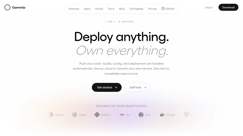

 OpenShip Cloud
Landing page · Cloud & infrastructure
OpenShip Cloud
Landing page · Cloud & infrastructure
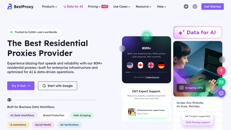

 bestproxy.com
Landing page · Cloud & infrastructure
bestproxy.com
Landing page · Cloud & infrastructure
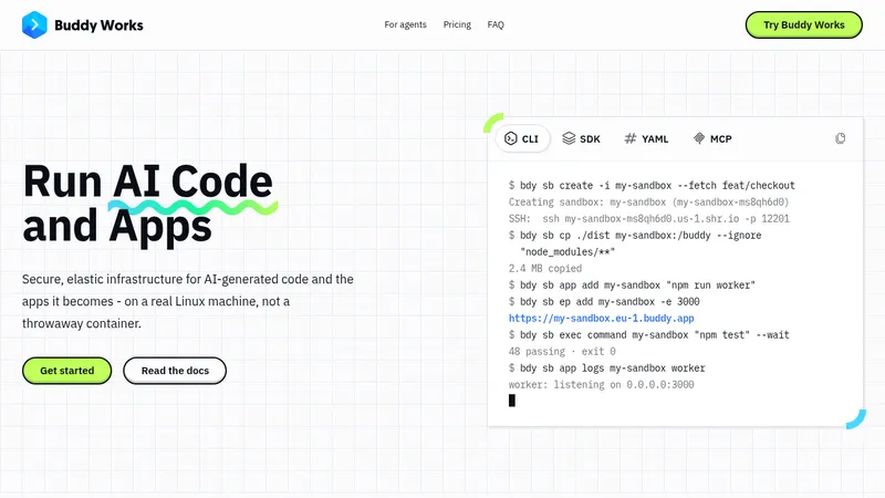

 AI Sandboxes by Buddy
Landing page · Cloud & infrastructure
AI Sandboxes by Buddy
Landing page · Cloud & infrastructure
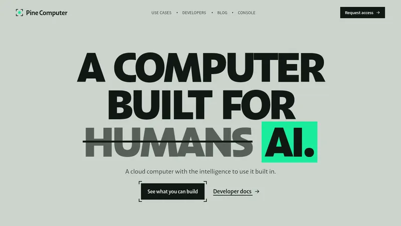

 Pine Computer
Landing page · Cloud & infrastructure
Pine Computer
Landing page · Cloud & infrastructure
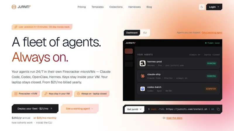

 jurniti
Landing page · Cloud & infrastructure
jurniti
Landing page · Cloud & infrastructure


 upstash.com
Landing page · Cloud & infrastructure
upstash.com
Landing page · Cloud & infrastructure