 kage
kage
fplxi.com

Design analysis
A restrained, editorial pricing section pairs a free plan and a highlighted paid plan with a compact adjacent outcome panel. It works through clear hierarchy, generous whitespace, explicit feature grouping, and low-pressure conversion cues rather than aggressive sales styling.
Prompt preview
## Reference images

Study these alongside the description below: hierarchy, rhythm, spacing, colour. Build for the product you are asked about, using this design language.

- Component: https://kage-design-assets.t3.tigrisfiles.io/components/fplxi-com/54b8421e-1a9f-4884-bebf-8d70ddcd8ef8-1789073157-6.webp
- Full page it was cut from: https://kage-design-assets.t3.tigrisfiles.io/screenshots/fplxi-com/54b8421e-1a9f-4884-bebf-8d70ddcd8ef8-1789073135-full.webp
- Component on Kage: https://kage.design/component/fplxi-pricing-table

# Before you start
Ask me what my product does, who it is for, and what its brand personality and visual identity are. Then apply the principles below to create an original pricing component for my product—not a copy of the reference.

## Design language

Build a responsive pricing-table section for a software product with two plan columns and a compact benefits/outcomes panel alongside them. The component should feel calm, trustworthy, practical, and lightly editorial, with a clear free-versus-paid decision and no unnecessary sales theatrics.

### Layout and alignment
- Use a centered, wide container with a subtle warm off-white page background, approximately `#f6f6f4`.
- On desktop, use a two-part composition: a large pricing card on the left occupying roughly two-thirds of the available width, and a narrower “what you get” or outcome panel on the right occupying roughly one-third.
- Keep the pricing card internally structured: an introductory header spans both plans, the two plan columns sit side by side, and a muted explanatory footer spans the full card width.
- Divide the free and paid plans with a thin vertical rule. Align plan labels, prices, feature lists, and actions consistently so the comparison can be scanned quickly.
- On smaller screens, stack the paid plan, free plan, and outcome panel in a logical order. Preserve generous horizontal padding and avoid cramped two-column content.
- Use a compact announcement or qualification pill below the introductory copy for time-sensitive pricing context, but only when it is genuinely useful.

### Typography hierarchy
- Use a clean sans-serif UI typeface with a neutral, highly legible appearance.
- Make the section eyebrow small, uppercase, and letter-spaced; use approximately `12px` with muted gray text.
- Use a concise section heading around `18–22px`, medium weight, with a near-black color such as `#171717`.
- Use supporting copy around `14px`, with a comfortable line height of `1.45–1.6` and a gray such as `#737373`.
- Make prices visually prominent at approximately `28–32px`, with the billing period or qualifier smaller and lighter beside or below the price.
- Keep feature text around `14px`; use short, plain-language lines and enough line height for effortless scanning.
- Use semibold text sparingly for the paid plan name, primary action, and important billing clarification.

### Colour and emphasis
- Use a mostly monochrome palette: page background around `#f6f6f4`, card background around `#ffffff`, main text around `#171717`, secondary text around `#737373`, and subtle text around `#9a9a9a`.
- Use a near-black filled button for the recommended or paid plan, approximately `#1b1b1b`, with white text.
- Use a white or very lightly tinted secondary button with a thin border for the free plan.
- Reserve stronger contrast for the paid plan action and price; do not add bright gradients, loud accent colours, or multiple competing highlights.
- If the product has a brand accent, introduce it only in small labels, focus states, or the announcement pill.

### Borders, surfaces, and radius
- Use white cards with a thin neutral border around `#e5e5e2` and a restrained radius around `10–12px`.
- Use internal dividers around `#e7e7e5`, approximately `1px`.
- Keep shadows absent or extremely subtle; the component should feel grounded rather than floating.
- Give the introductory area roughly `20–24px` of padding, plan columns around `20–24px`, and the footer around `16–20px`.
- Use a small radius around `6–8px` for buttons, pills, and compact controls.

### Feature and outcome comparison
- Represent included features with simple check marks or another quiet, consistent indicator aligned in a narrow column before the text.
- Organize plan features into a responsive two-column list when there is enough width; collapse to one column when necessary.
- Make the paid plan’s additional value concrete and easy to compare against the free plan, avoiding vague marketing claims.
- The adjacent outcome panel should list the practical results or capabilities users receive. Give each row a clear label, optional supporting line, and a right-aligned state such as included, locked, or available on the paid plan.
- Separate outcome rows with horizontal rules and keep the panel’s footer visually distinct with a pale neutral background.
- If some outcomes are gated, use understated lock icons or muted placeholders rather than hiding the comparison entirely.

### Interaction
- Provide one clear action per plan, such as starting free and upgrading to the paid tier.
- Buttons should have visible hover, focus, and pressed states: slightly darken filled buttons, strengthen outlined borders, and preserve a strong keyboard focus ring.
- Make the entire table readable without requiring hover. Do not hide essential prices or features behind interaction.
- If billing frequency or a discount is configurable, use a simple control above the plans and update price labels and supporting copy clearly.
- Ensure actions remain reachable on mobile and never allow long feature lists to push the primary paid action unpredictably far below the fold.

### Content guidance
- Use a direct heading explaining the starting point or pricing decision.
- State whether the free plan is genuinely free and clarify renewal, auto-renewal, one-time payment, or price-lock details near the relevant plan.
- Keep urgency factual and low-pressure. A small timing note is acceptable; avoid countdown timers and manipulative scarcity.
- Adapt plan names, features, prices, and outcome labels to my product rather than using generic SaaS filler.

## Never
- Never copy the reference’s logos, product names, brand identity, or exact wording.
- Never reuse the reference’s specific pricing, feature list, labels, or promotional copy.
- Never include the reference’s illustrations, screenshots, imagery, or decorative assets.
- Never reproduce the component as a pixel-perfect clone; preserve the design principles while creating a version suited to my product and brand.
- Never use dark patterns, fake scarcity, hidden fees, misleading feature locks, or unclear billing terms.
More components
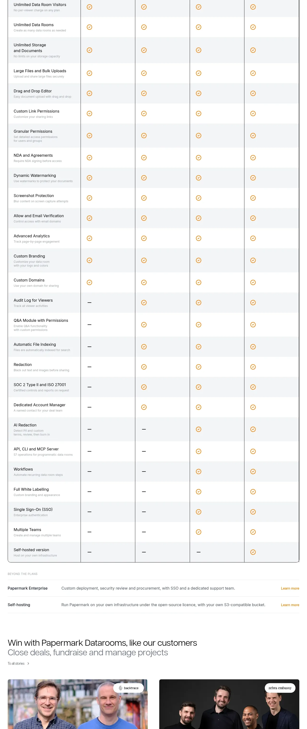
 Plan comparison table
Papermark Data Rooms · Pricing table
Plan comparison table
Papermark Data Rooms · Pricing table
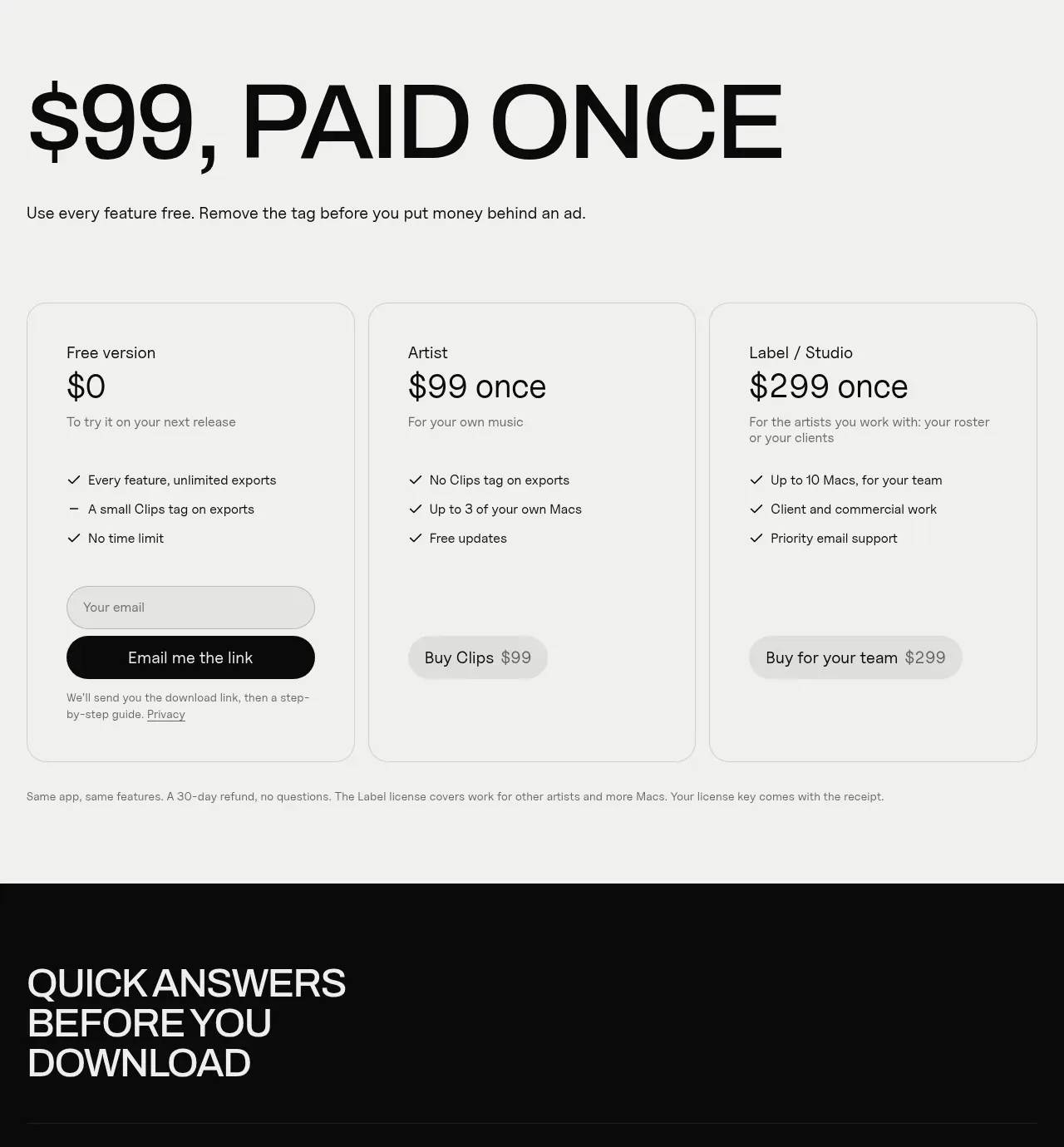
 One-time purchase pricing
Clips by Plastic · Pricing table
One-time purchase pricing
Clips by Plastic · Pricing table
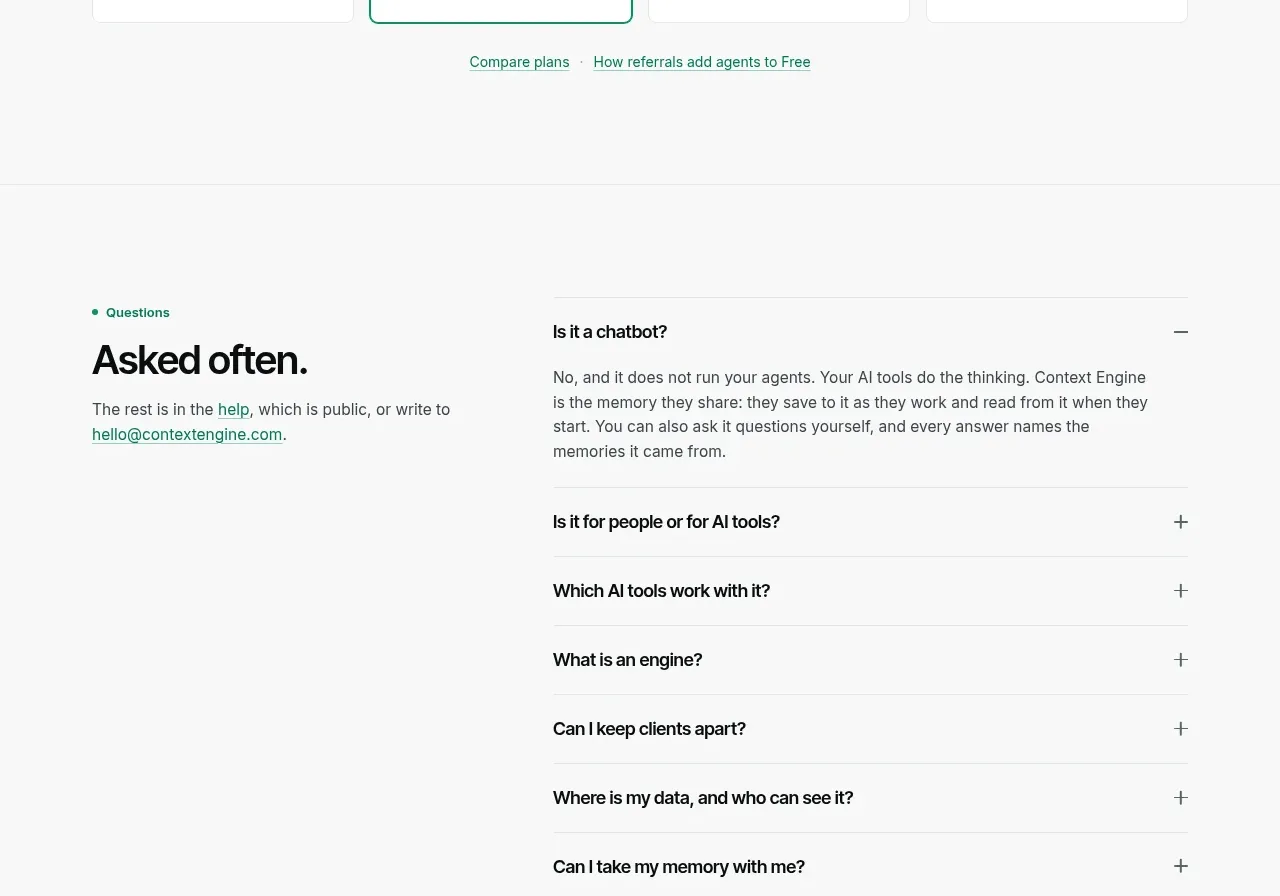
 Per-unit pricing table
Context Engine · Pricing table
Per-unit pricing table
Context Engine · Pricing table
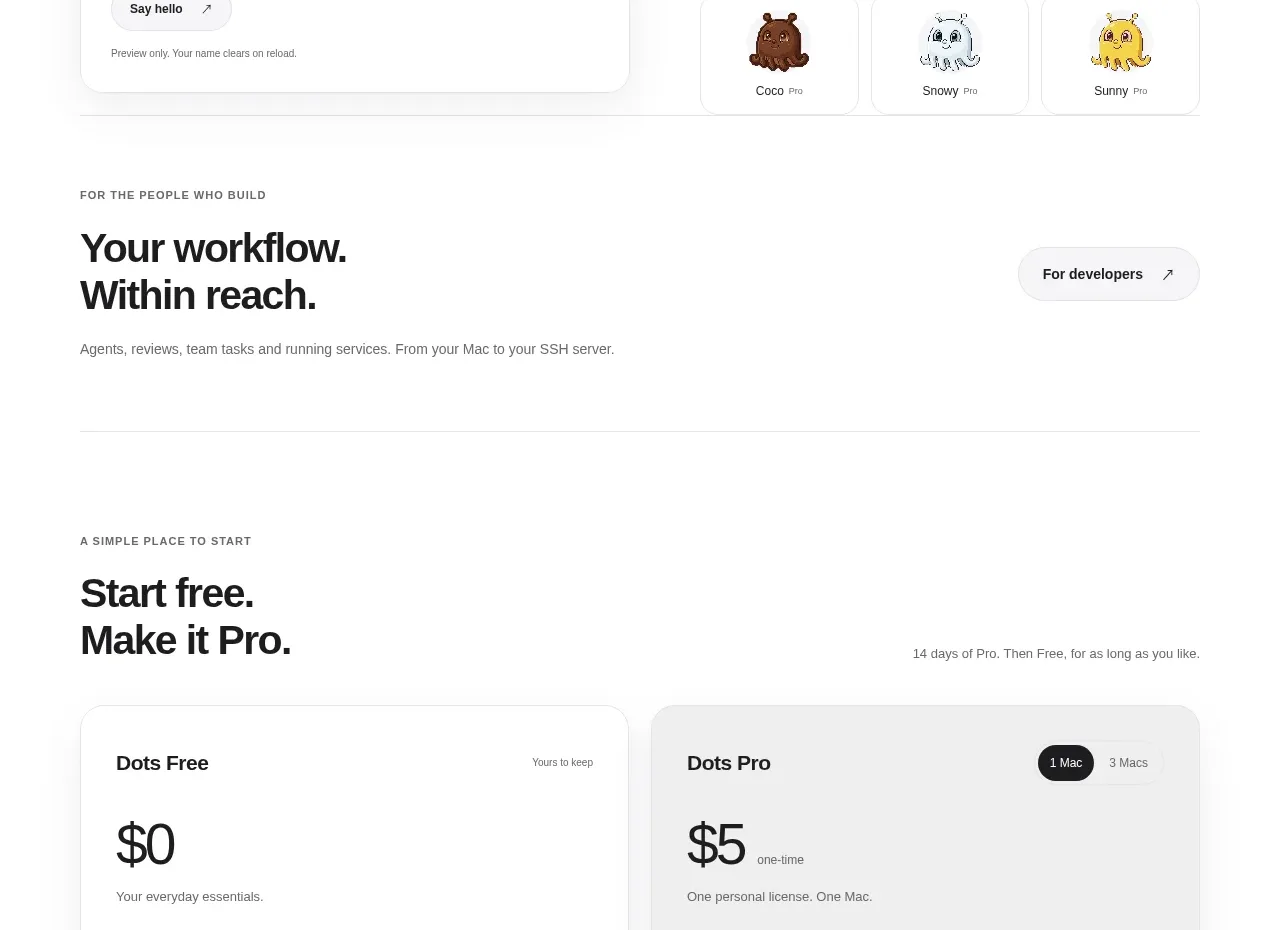
 Free and pro pricing cards
Dots · Pricing table
Free and pro pricing cards
Dots · Pricing table
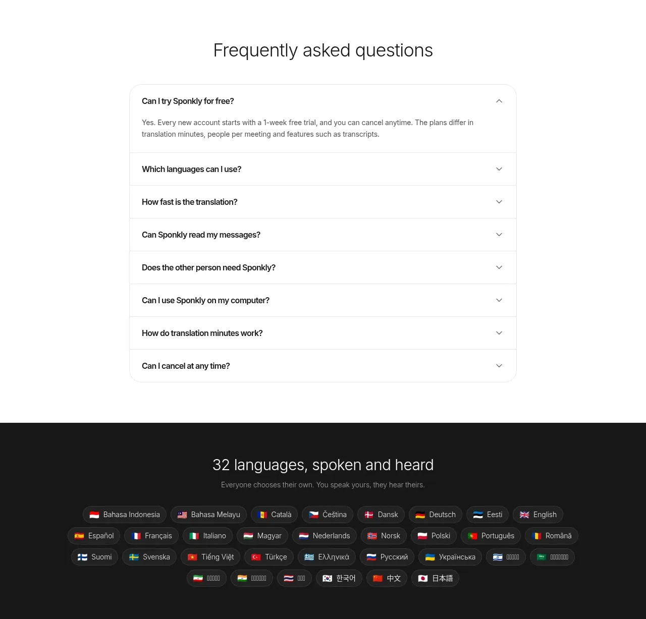
 Transparent multi-tier pricing
Sponkly · Pricing table
Transparent multi-tier pricing
Sponkly · Pricing table
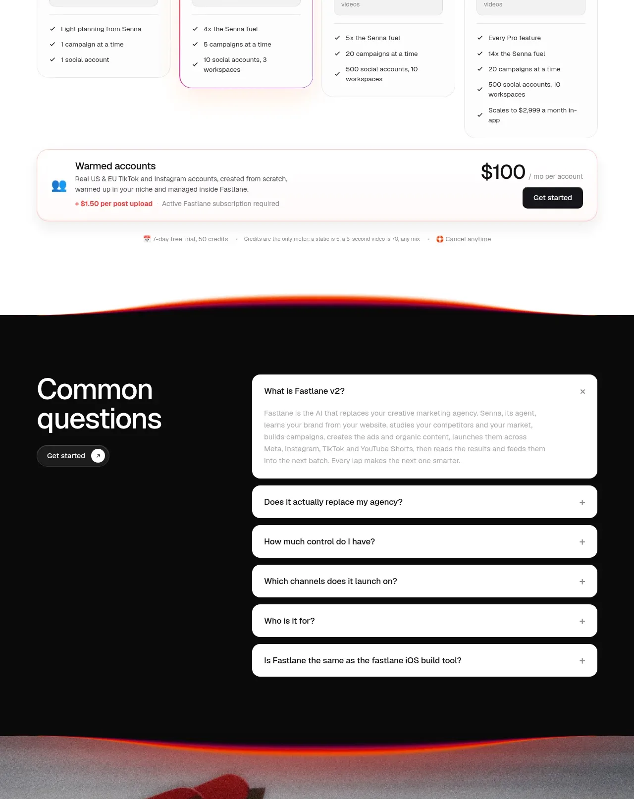
 Four-tier pricing table
Fastlane 2.0 · Pricing table
Four-tier pricing table
Fastlane 2.0 · Pricing table