 kage
kage

Design analysis
A data-dense fantasy football analytics landing page set on warm off-white paper, led by a floating black pill nav and a live gameweek ticker. The hero pairs a large serif headline and inline two-step form with a real model leaderboard, so the product's data does the persuading. Down the page the rhythm alternates hairline-bordered white data cards (best XI pitch view, fixtures, position leaders, accuracy charts) with full-black punctuation bands (testimonial, dark stat card), before loosening into pricing with deliberately blurred locked rows and a two-column FAQ accordion. Typography carries the identity: uppercase letterspaced micro-labels, monospaced tabular numerals in every table, and one indigo-blue accent reserved for CTAs and chart bars.
Prompt preview
## Reference images

Study these alongside the description below: hierarchy, rhythm, spacing, colour. Build for the product you are asked about, using this design language.

- Full page: https://kage-design-assets.t3.tigrisfiles.io/screenshots/fplxi-com/54b8421e-1a9f-4884-bebf-8d70ddcd8ef8-1789073135-full.webp
- Above the fold: https://kage-design-assets.t3.tigrisfiles.io/screenshots/fplxi-com/54b8421e-1a9f-4884-bebf-8d70ddcd8ef8-1789073004446.webp
- Design on Kage: https://kage.design/designs/fplxi-landing-page

## Before you start
Ask the user what product they are building, who it is for, and what brand assets they already have (name, colours, typefaces). Wait for their answers. Everything below is a design language to apply to their product — not a template to copy the reference site.

## Page structure
1. **Floating pill navigation** — a rounded near-black bar floating above the page with wordmark, 4 text links, a live countdown chip (deadline-style), a text "Sign in" link and a filled accent-coloured CTA button.
2. **Live ticker strip** — a full-width hairline-bordered row directly under the nav, horizontally scrollable, mixing a countdown item with per-item scores/badges and stat chips. It signals "this data is live" before any marketing copy.
3. **Split hero** — left: small uppercase eyebrow, two-line large serif headline, one short sans paragraph, a "STEP 1 OF 2" micro-label, an inline input + dark button, a screenshot drop-zone panel, and three tiny trust points with icons. Right: a real product table ("model board") with 10 ranked rows (rank, badge chip, name, position, fixture, price, owned %, projected points) and a row of captain-pick chips below — proof over promises.
4. **Stats band** — four equal cards with uppercase labels and oversized numbers (model error, ranking score, paying users on a dark card, points analysed). One card is solid black to break the row.
5. **Dark testimonial carousel** — full-width black band with a star row, a large quote, attribution with a stats line, dot pagination and arrow buttons.
6. **Two-column proof section** — left: a pitch view on a soft green panel showing the best XI as positioned player cards (formation, name, score) with a formation summary above; right: a fixtures list where each row is team-vs-team with coloured difficulty dots and kickoff time.
7. **Two-column data section** — left: four mini leaderboards (one per position) with projected points; right: a simple bar chart in the accent colour plus a small accuracy table (per-round predictions, error, ranking) and an overall summary row.
8. **Trending list** — full-width rows of rising items: name, position tag, upcoming fixtures as chips, and a right-aligned score.
9. **Pricing** — section header with a note chip ("early bird", deadline), two plans side by side (free £0 with a soft CTA; paid tier price + per-season note, feature list, dark CTA button), and to the right a "what you get" table where paid rows are visually blurred with lock icons — showing locked value instead of hiding it.
10. **FAQ** — two-column accordion of short questions with hairline dividers and chevrons, under a small uppercase "questions" label.
11. **Footer** — wordmark + one-line description + a secondary button, four link columns (product, tools, comparisons, account), then a bottom bar with copyright on the left and a legal/disclaimer line on the right.

## Design language
- **Palette**: warm off-white page background (#F6F4EE), white cards (#FFFFFF), near-black ink (#141414) for text, dark bands and primary buttons, hairline borders (#E6E3DA). One saturated accent (indigo-blue, ~#4B45E0) used sparingly: the top-right CTA, chart bars, and nothing else. Green appears only as the pitch panel tint (#E4F1E2); tiny status dots may use green/red.
- **Type pairing**: a serif display face for headlines only; a neutral sans for UI and body; monospaced/tabular numerals for every number in tables, prices and stats. Uppercase, letterspaced 0.08–0.12em micro-labels for eyebrows, card titles and table column headers (10–11px).
- **Hierarchy**: eyebrow → big serif headline (tight leading) → one short sans paragraph → data. Hierarchy comes from scale contrast (huge numerals vs 12px table text), not from colour.
- **Rhythm**: hero is roomy; the middle of the page is very dense (tables, chips, lists); pricing and FAQ loosen again with generous whitespace. Every few sections insert a solid black band or card as punctuation so the page never reads as uniform grey cards.
- **Cards and borders**: 1px hairline borders, radius 10–14px, no shadows (or barely visible). Depth is created by inverting to black, not by elevation.
- **Chips**: small uppercase tags for categories/fixtures/teams — hairline-bordered or soft-tinted backgrounds, 11px, radius 4–6px. Use colour coding consistently (positions, difficulty) with muted tints, never saturated fills.
- **Tables**: dense rows ~40–44px tall, hairline row separators, right-aligned numeric columns, rank numbers first, and a summary/footer row in a tinted strip. Column headers in small caps.
- **Dark bands**: solid #141414 with white text, muted gray secondary text (~#9A9A94), and content given extra padding so it feels like an intermission, not another card.
- **Motion**: restrained — a ticking countdown, carousel arrows and dots, hover states on rows and buttons only. No parallax, no big entrance animations.
- **Trust pattern**: pair every marketing claim with real numbers from the product (accuracy scores, counts, per-round tables), and render gated features as blurred values with lock icons rather than hiding them.

## Never
Do not reuse the reference's name, wordmark, logo, player/team names, club badges, copy, quotes, screenshots or icon set. Never present the result as that product; build a new brand in the same design language.
Components from this page
All components
 Pill-shaped fantasy football navigation bar
fplxi.com · Navigation
Pill-shaped fantasy football navigation bar
fplxi.com · Navigation
 Dashboard hero with team intake and model board
fplxi.com · Hero
Dashboard hero with team intake and model board
fplxi.com · Hero
 Four-card metrics strip
fplxi.com · Stats
Four-card metrics strip
fplxi.com · Stats
 Dark testimonial carousel
fplxi.com · Testimonials
Dark testimonial carousel
fplxi.com · Testimonials
 Analytical dashboard feature grid
fplxi.com · Feature grid
Analytical dashboard feature grid
fplxi.com · Feature grid
 Trending players data table
fplxi.com · Table
Trending players data table
fplxi.com · Table
 Two-tier pricing table with feature comparison
fplxi.com · Pricing table
Two-tier pricing table with feature comparison
fplxi.com · Pricing table
 Two-column FAQ accordion
fplxi.com · FAQ
Two-column FAQ accordion
fplxi.com · FAQ
 Structured multi-column product footer
fplxi.com · Footer
Structured multi-column product footer
fplxi.com · Footer
Related designs
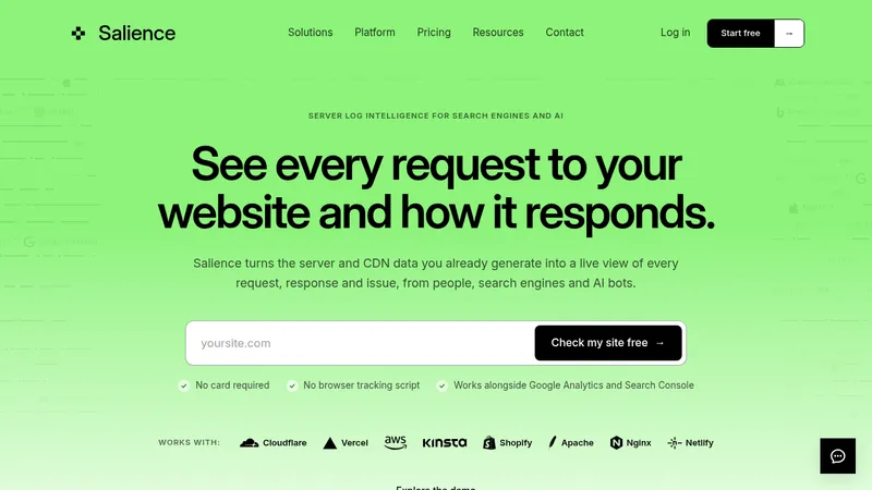

 Salience
Landing page · Analytics & data
Salience
Landing page · Analytics & data
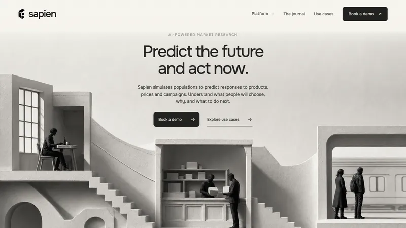

 Sapien
Landing page · Analytics & data
Sapien
Landing page · Analytics & data
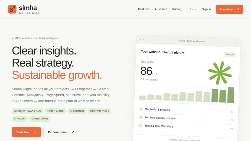

 Simha Digital
Landing page · Analytics & data
Simha Digital
Landing page · Analytics & data
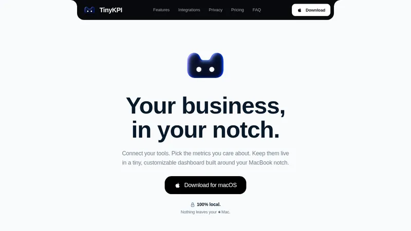

 TinyKPI
Landing page · Analytics & data
TinyKPI
Landing page · Analytics & data


 Basedash in Español Français & Português
Landing page · Analytics & data
Basedash in Español Français & Português
Landing page · Analytics & data


 AI Observability by OpenObserve
Landing page · Analytics & data
AI Observability by OpenObserve
Landing page · Analytics & data