kage
kage
frctl.art

Design analysis
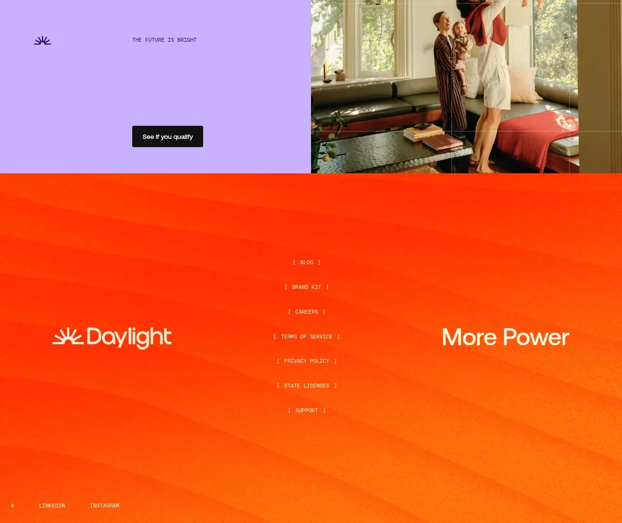
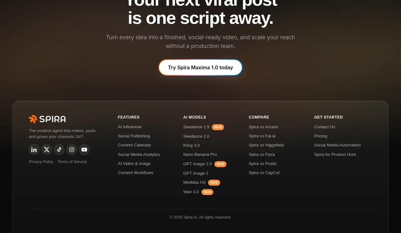
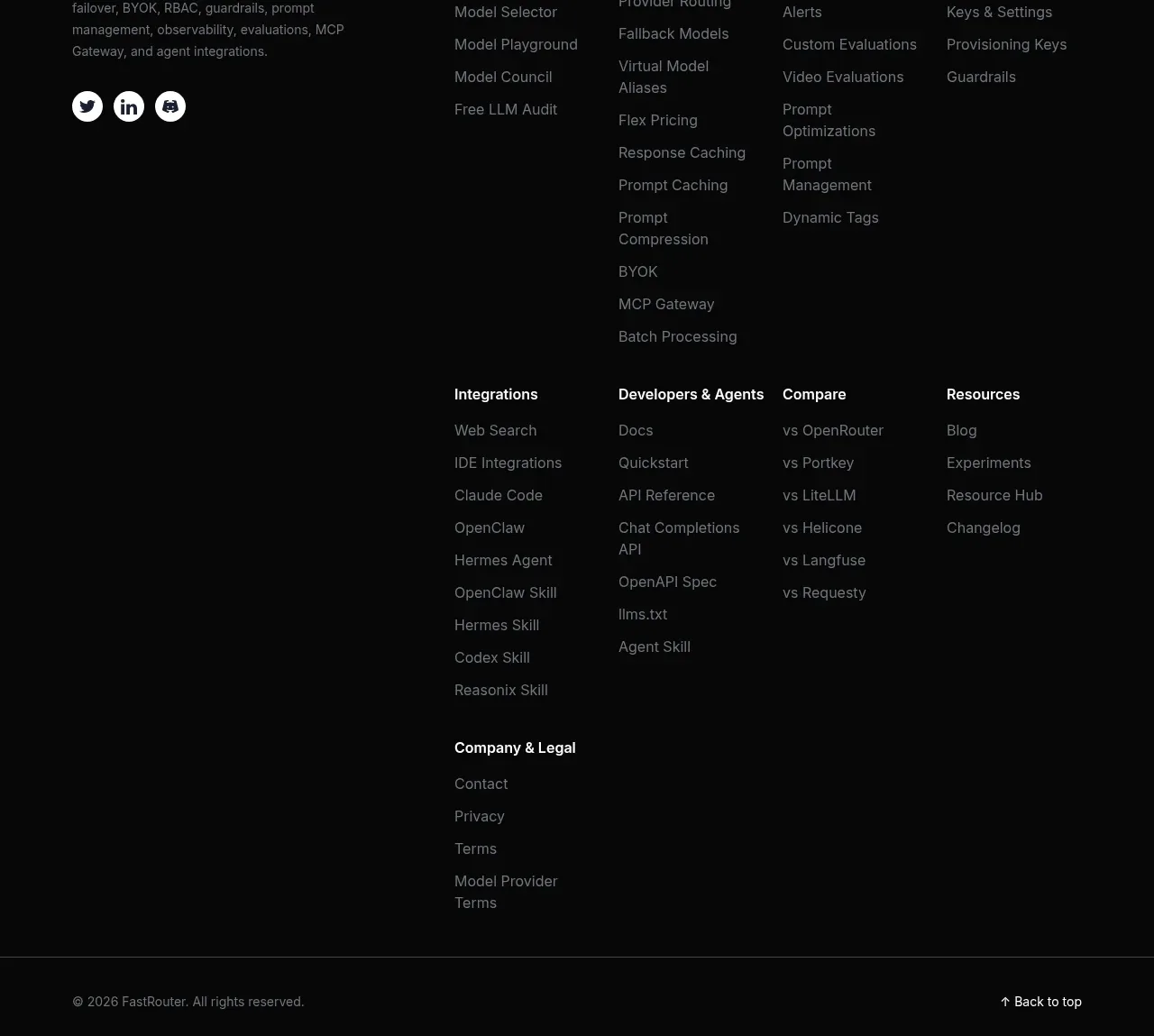
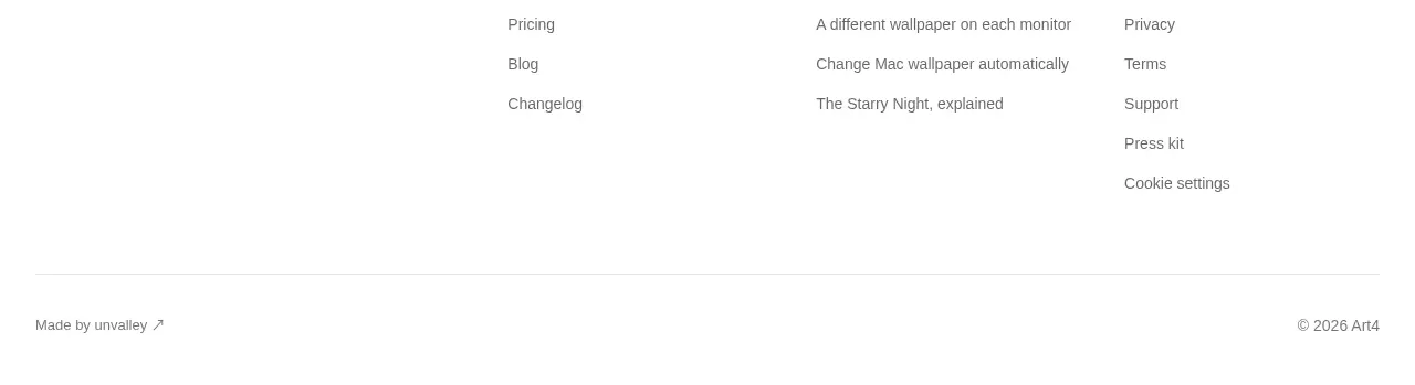
The footer leaves substantial black space around two small recognition badges, a compact copyright/update note, and right-aligned legal links. It feels intentionally quiet after the dense FAQ.
Prompt preview
## Reference images

Study these alongside the description below: hierarchy, rhythm, spacing, colour. Build for the product you are asked about, using this design language.

- Component: https://kage-design-assets.t3.tigrisfiles.io/components/frctl/44ee5e18-5619-4ecf-b1a3-c989d58893aa-1790488994-6.webp
- Full page it was cut from: https://kage-design-assets.t3.tigrisfiles.io/screenshots/frctl/44ee5e18-5619-4ecf-b1a3-c989d58893aa-1790488956222-full.webp
- Component on Kage: https://kage.design/component/frctl-footer

## Before you start
Ask what legal links, social links, recognition, and company details the user's product needs. Then create an original quiet footer using these principles.

Design a spacious near-black footer with a thin top rule and 32px horizontal gutters. Put one or two compact recognition or trust badges on the left in small rounded dark capsules, but use generic text and shapes rather than copied marks. Below or beside them, show a tiny muted mono copyright/status line. Align privacy, terms, accessibility, and other legal links to the right in 9–10px uppercase monospaced text with wide tracking. Use #050505 background, #222024 borders, #888388 secondary text, and #f0f0f0 for active links. Add responsive wrapping for narrow screens and maintain at least 64px top and bottom padding.

Never: use logos, product names, copy, illustrations, or imagery from the reference.