kage
kage
frctl.art
Design analysis
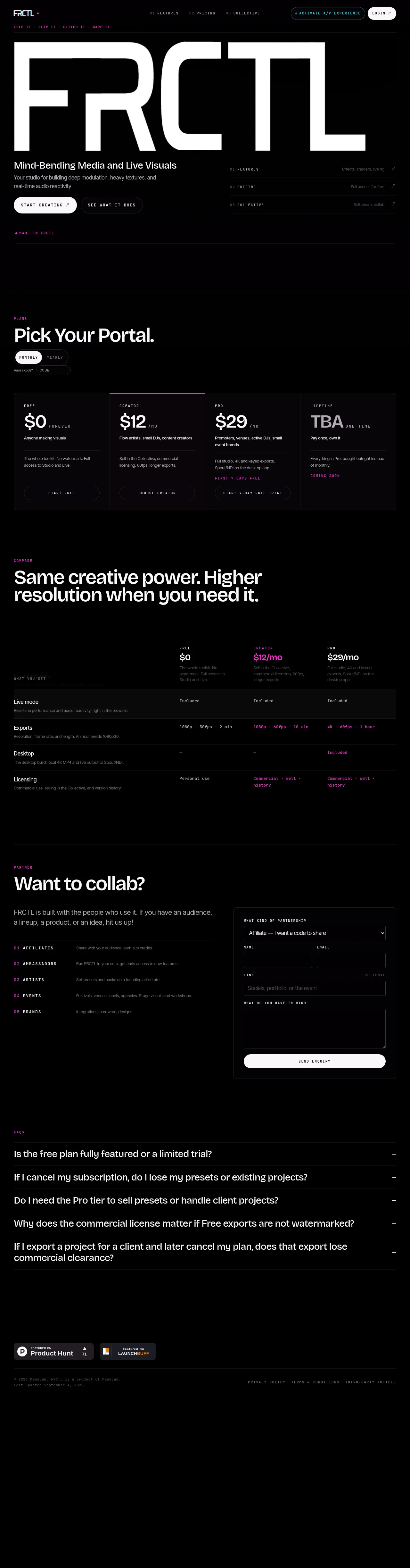
A near-black, full-width landing page uses an oversized white FRCTL typographic hero, tiny uppercase monospace labels, hairline dividers, and restrained magenta accents to create a technical live-visuals aesthetic. The page shifts from an open hero and compact feature links into a dense pricing card grid, a detailed comparison table, a two-column partnership section, and a wide FAQ accordion before ending with sparse badges and legal footer links.
Prompt preview
## Reference images

Study these alongside the description below: hierarchy, rhythm, spacing, colour. Build for the product you are asked about, using this design language.

- Full page: https://kage-design-assets.t3.tigrisfiles.io/screenshots/frctl/44ee5e18-5619-4ecf-b1a3-c989d58893aa-1790488956222-full.webp
- Above the fold: https://kage-design-assets.t3.tigrisfiles.io/screenshots/frctl/44ee5e18-5619-4ecf-b1a3-c989d58893aa-1790488953966.webp
- Design on Kage: https://kage.design/designs/frctl-landing-page

## Before you start
Ask the user what they are building, who it is for, and what brand assets they already have (name, colours, type choices, logo, imagery, and copy direction). Wait for their answers before designing. Apply the system below to their product, not to the reference product.

## Page structure
1. **Utility header:** Create a slim, dark navigation bar with a compact brand mark area on the left, small numbered section links in the centre, and a secondary outlined action plus a light pill login/action on the right.
2. **Micro-tagline strip:** Add a narrow row beneath the header with tiny monospaced, uppercase accent text separated by dots or short phrases.
3. **Hero:** Use a very large abstract typographic or product title treatment spanning most of the content width. Under it, place a clear product-specific headline, a short two-line explanation, two contrasting pill CTAs, and a compact three-row feature navigation list aligned to the right.
4. **Hero divider/status row:** Finish the hero with a thin horizontal rule and a small magenta status label, leaving generous black space before the next major section.
5. **Plans intro:** Introduce pricing with a small uppercase section label, a large headline, monthly/yearly toggle pills, and a compact promo-code control.
6. **Pricing cards:** Present four plans in one bordered, four-column panel. Each card contains a tiny tier label, prominent price and billing unit, audience description, feature summary, and full-width outlined CTA; use a magenta top rule or label to identify the emphasized plan.
7. **Comparison intro:** Add a small section label followed by a large two-line statement explaining the value difference between tiers.
8. **Comparison table:** Build a wide feature comparison table with the feature names and descriptions in the first column and plan headers/prices across the remaining columns. Use subtle row rules, a very faint alternating/highlighted first row, and magenta text for premium values.
9. **Partnership section:** After a large vertical break and divider, use a two-column layout. The left side has a section label, large collaboration headline, explanatory paragraph, and five numbered partnership categories with short descriptions. The right side is a bordered form card with a select field, paired name/email inputs, a link field, a textarea, and a wide light submit button.
10. **FAQ accordion:** Add a full-width FAQ block with a small label and five large question rows. Separate rows with hairline rules and place a plus control at the far right; allow each row to expand without changing the visual language.
11. **Footer:** End with a divider, compact dark promotional/community badges on the left, a tiny copyright/update note below, and small privacy, terms, and notices links aligned to the right. Keep the bottom area sparse with substantial black space.

## Design language
- Use a near-black background around `#030303` or `#050505`, white/off-white primary text around `#F4F4F2`, muted gray copy around `#777477`, and a hot magenta accent around `#D51B9A` or `#E21AA2`.
- Build hierarchy through scale and spacing rather than decoration: an oversized hero treatment, 40–56px section headlines, 16–22px body text, and 9–11px uppercase monospace metadata.
- Pair a clean geometric sans-serif for headlines and body copy with a compact monospaced or highly tracked uppercase face for labels, navigation, prices’ billing units, and technical details.
- Keep the page grid wide and deliberate, with generous outer margins, strong horizontal alignment, and major sections separated by long vertical intervals. Start spacious, become denser in pricing and comparison areas, then open up again around partnership and footer content.
- Treat borders as hairline strokes in near-black gray such as `#1A1A1D`; use them for section dividers, table rows, card edges, and input fields. Keep corner radii restrained, roughly 10–14px on cards and 999px on pills.
- Avoid conventional shadows and gradients. Let contrast, thin rules, black space, and the white/magenta colour relationship provide depth; use a faint panel fill such as `#080809` only where a card needs separation.
- Use white filled pills for primary actions and black/transparent outlined pills for secondary actions. Buttons should be compact, uppercase, tracked, and include a small directional cue where appropriate.
- Make pricing and data areas feel editorial and technical: align prices and values precisely, keep descriptions short, and use magenta sparingly for featured tiers, premium capabilities, status labels, and important microcopy.
- Make forms utilitarian rather than ornamental: dark inputs, thin borders, small uppercase labels, clear focus states, and one high-contrast submit control.
- For interaction, use restrained hover transitions on rules, pills, links, and accordion rows; animate FAQ expansion and menu/section navigation with quick opacity and height transitions. Do not add noisy motion that competes with the content.
- Ensure the responsive version preserves the rhythm: collapse multi-column cards and tables into readable stacked or horizontally scrollable layouts, keep the hero type responsive, and retain generous section spacing.

## Never
- Do not use the FRCTL logo, wordmark, product name, tagline, exact copy, pricing, badges, or any other branded asset from the reference.
- Do not copy the reference’s specific content, partnership categories, FAQ questions, illustrations, photography, or icon set.
- Do not present the result as FRCTL or imply affiliation with it. Create new product-specific branding, copy, data, and visuals while reusing only the structural and stylistic principles.
Components from this page
All components
 Minimal utility navigation
FRCTL · Navigation
Minimal utility navigation
FRCTL · Navigation
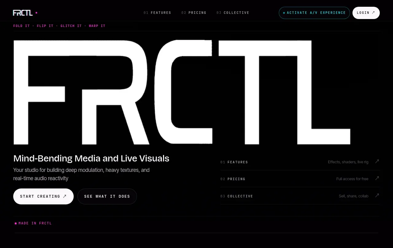 Oversized typographic hero
FRCTL · Hero
Oversized typographic hero
FRCTL · Hero
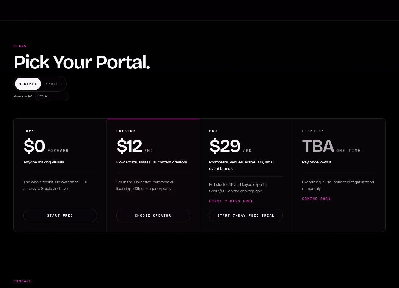 Four-tier pricing selector
FRCTL · Pricing table
Four-tier pricing selector
FRCTL · Pricing table
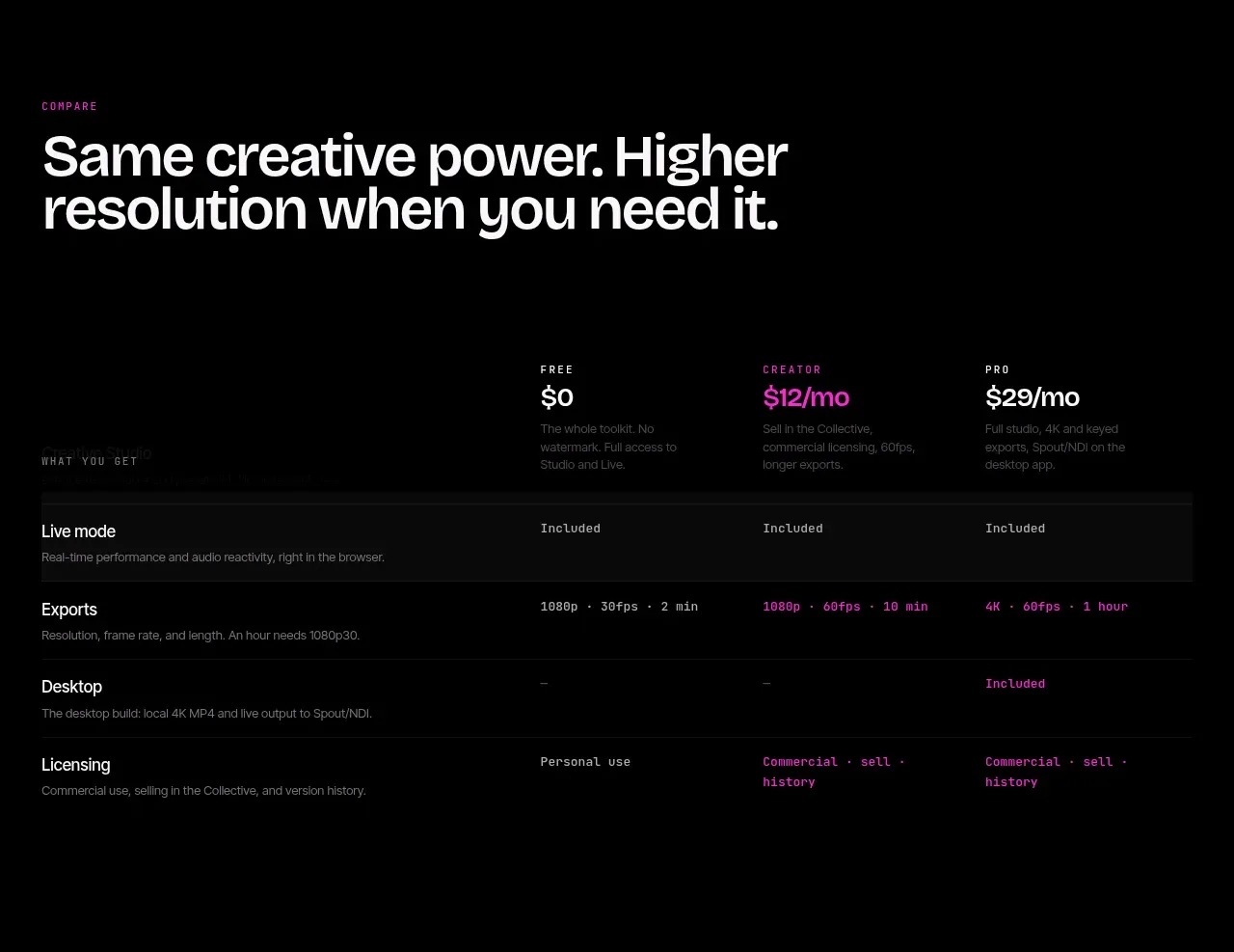 Plan capability comparison
FRCTL · Table
Plan capability comparison
FRCTL · Table
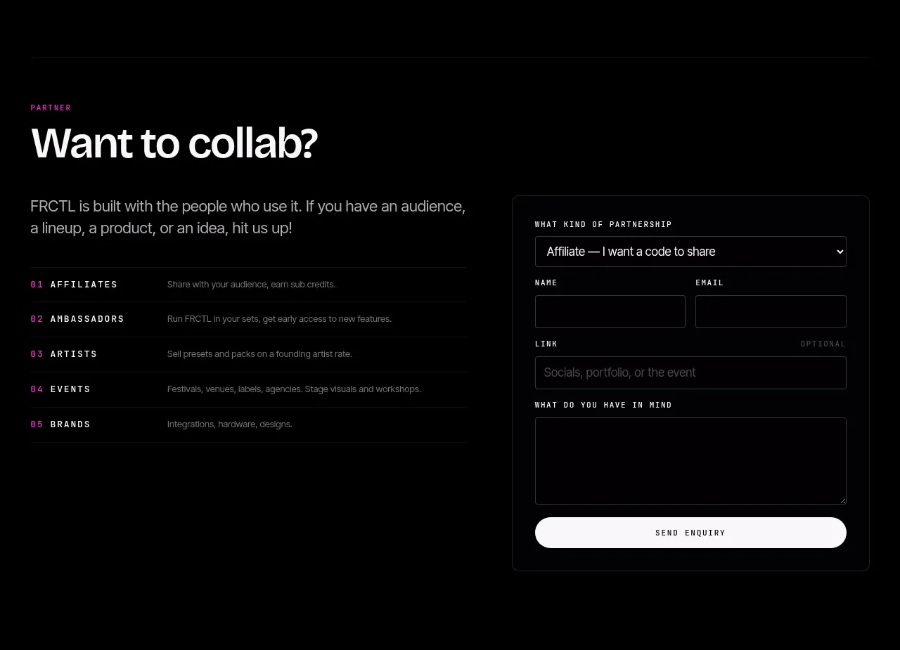 Partnership invitation and enquiry form
FRCTL · Form
Partnership invitation and enquiry form
FRCTL · Form
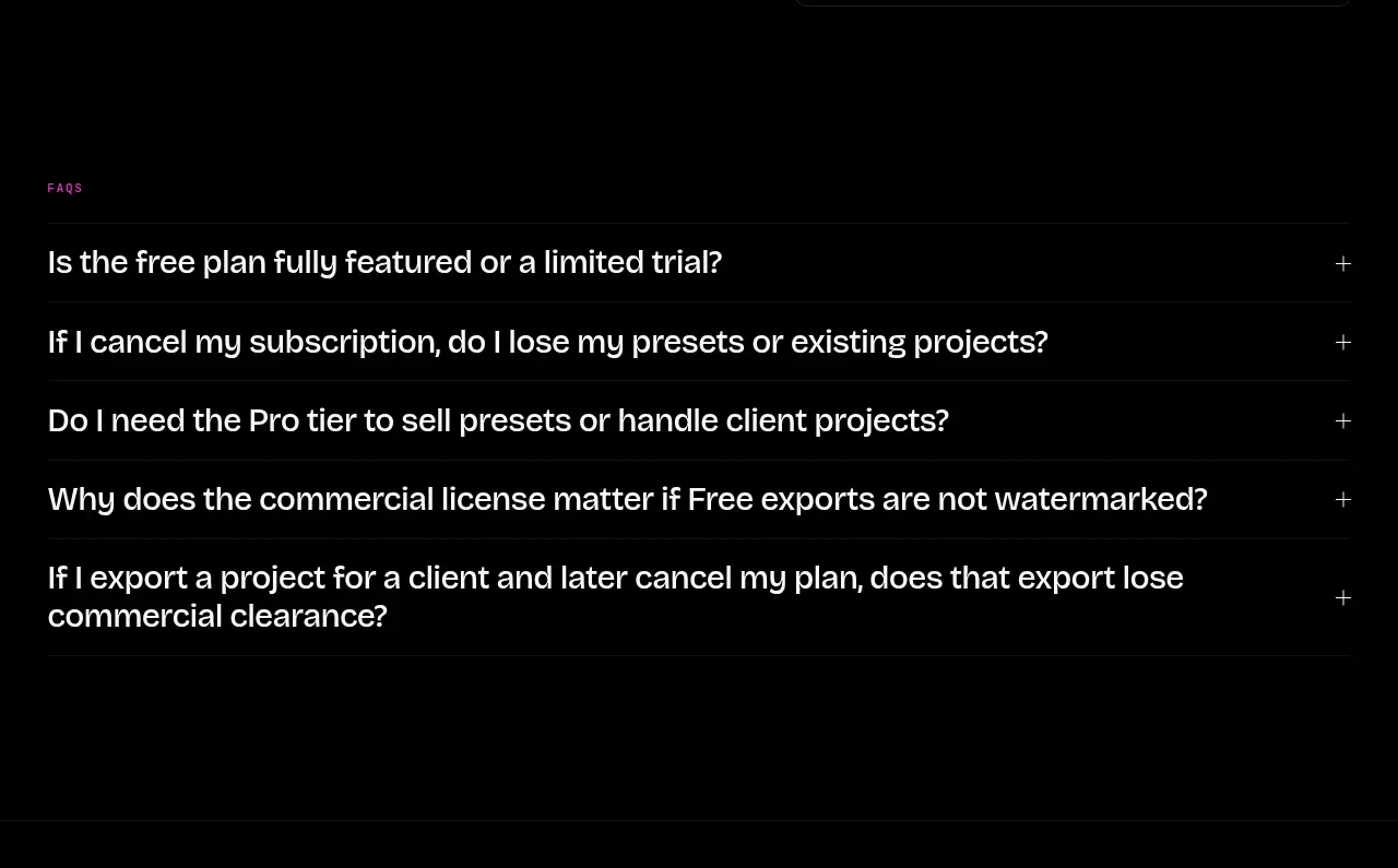 Frequently asked questions
FRCTL · FAQ
Frequently asked questions
FRCTL · FAQ
 Sparse product footer
FRCTL · Footer
Sparse product footer
FRCTL · Footer