 kage
kage
context.dev
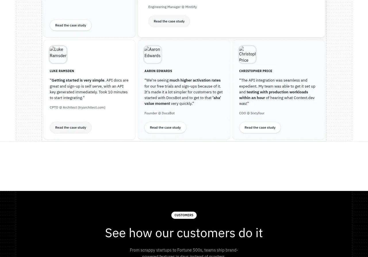
Design analysis
A black customer-story band uses three vivid colored story cards, pagination dots, and a centered heading to create a high-contrast proof moment.
Prompt preview
## Reference images

Study these alongside the description below: hierarchy, rhythm, spacing, colour. Build for the product you are asked about, using this design language.

- Component: https://kage-design-assets.t3.tigrisfiles.io/components/scrape-anything-by-context-dev/b0e64468-3924-45db-a4d8-d7cbe8044a77-1791871397-10.webp
- Full page it was cut from: https://kage-design-assets.t3.tigrisfiles.io/screenshots/scrape-anything-by-context-dev/b0e64468-3924-45db-a4d8-d7cbe8044a77-1791871314047-full.webp
- Component on Kage: https://kage.design/component/scrape-anything-by-context-gallery

## Before you start
Ask what the user's product, audience, and brand are, then adapt this customer-story carousel to their strongest outcomes.

Build a dark full-width customer stories section with a compact light eyebrow, centered heading, short supporting text, and a three-card carousel. Give each story card a distinct saturated but accessible color, rounded corners, a small thumbnail or abstract media area, a customer/result label, short story copy, and a white pill action. Add centered pagination dots and previous/next controls below. Use near-black #050607, bright green/purple/blue card accents, white text, 18–20px radii, and generous horizontal gutters. Support touch swipe, keyboard controls, pause behavior, and reduced motion.

Never: use logos, product names, copy, illustrations, or imagery from the reference.
More components
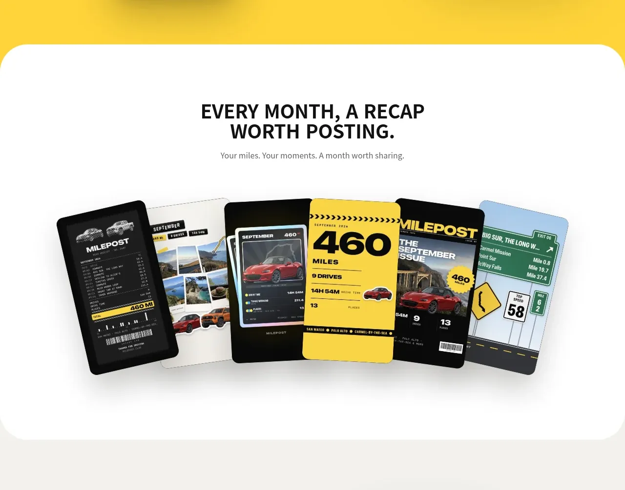
 Monthly recap gallery
Milepost · Gallery
Monthly recap gallery
Milepost · Gallery
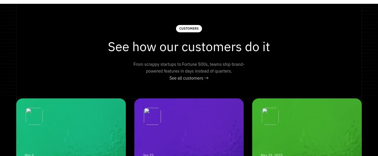
 Blog article cards
Scrape Anything by Context.dev · Gallery
Blog article cards
Scrape Anything by Context.dev · Gallery
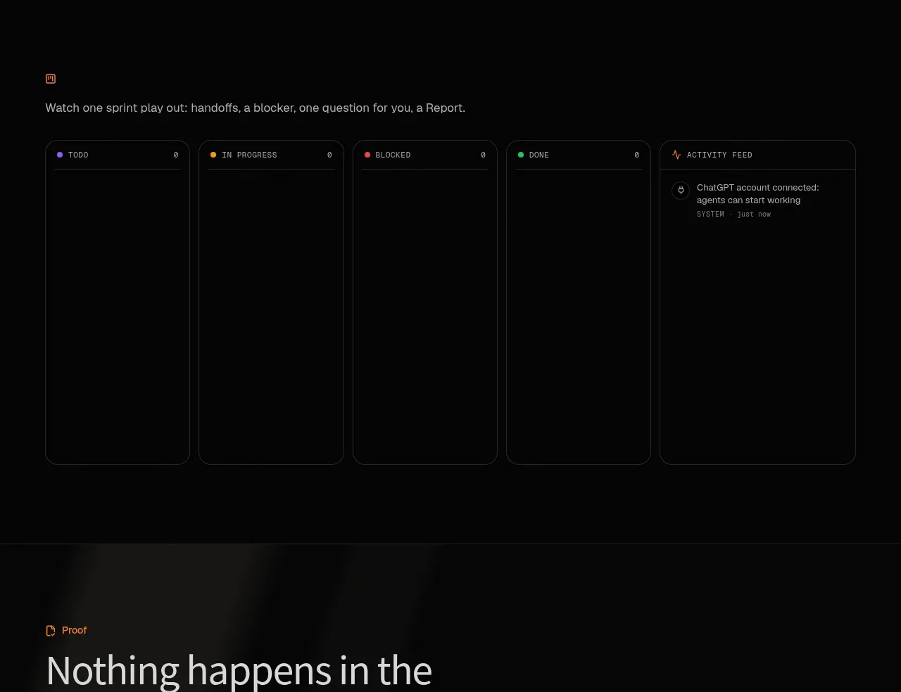
 Operational board preview
SquadRoom · Gallery
Operational board preview
SquadRoom · Gallery
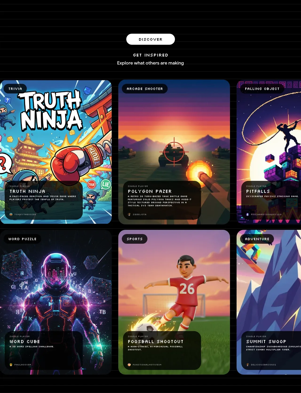
 Discover inspiration gallery
Playground by Google Labs · Gallery
Discover inspiration gallery
Playground by Google Labs · Gallery
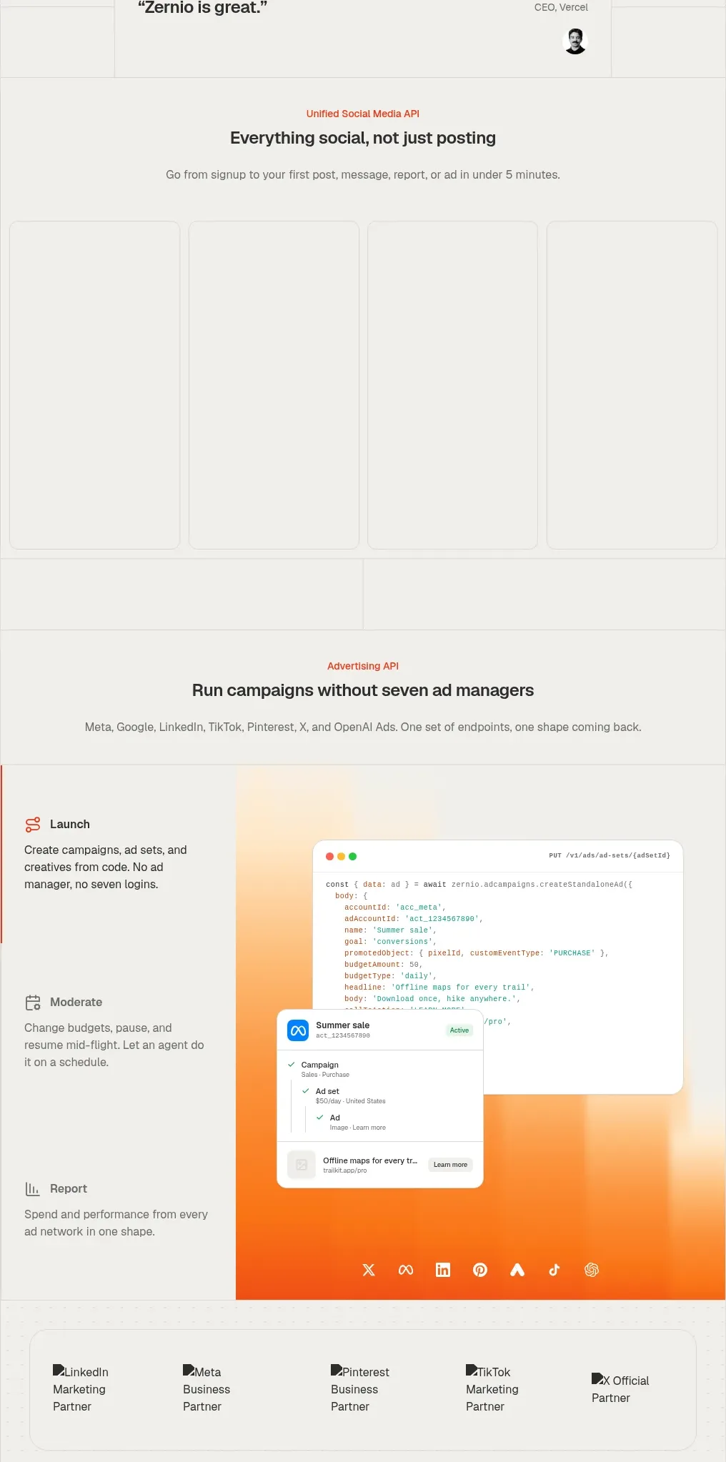
 Social media campaign API showcase
Zernio · Gallery
Social media campaign API showcase
Zernio · Gallery
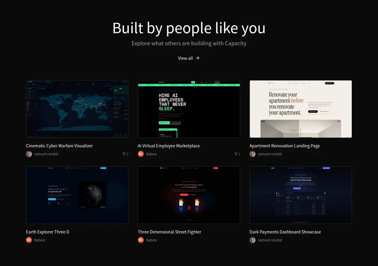
 Community project gallery
capacity.so · Gallery
Community project gallery
capacity.so · Gallery