kage
kage
geardex.app

Design analysis
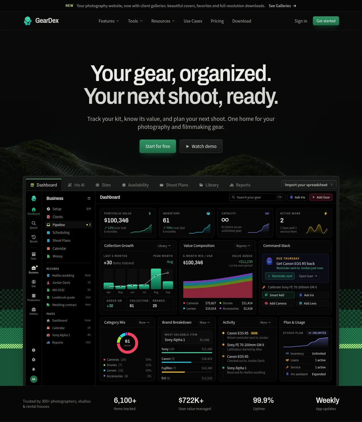
A long-form dark landing page uses a near-black canvas, compact sans-serif typography, and vivid green, lime, yellow, cyan, and purple accents to organize a photography gear-management product. The hero moves quickly from headline and CTAs into a large dashboard mockup and trust metrics; lower sections alternate between sparse editorial statements, dense product cards, site and lending showcases, a feature-rich library mockup, use-case tiles, a green migration CTA, pricing, FAQ, final CTA, and a structured footer. Thin borders, low-radius dark panels, patterned pixel-like dividers, and restrained glow make the interfaces feel operational rather than decorative.
Prompt preview
## Reference images

Study these alongside the description below: hierarchy, rhythm, spacing, colour. Build for the product you are asked about, using this design language.

- Full page: https://kage-design-assets.t3.tigrisfiles.io/screenshots/geardex-app/fc33b7d0-970c-45a6-93bf-9b94f05b130c-1791941487258-full.webp
- Above the fold: https://kage-design-assets.t3.tigrisfiles.io/screenshots/geardex-app/fc33b7d0-970c-45a6-93bf-9b94f05b130c-1791941459853.webp
- Design on Kage: https://kage.design/designs/geardex-landing-page

## Before you start
Ask the user what they are building, who it is for, and what brand assets they already have, including the product name, logo, colours, type choices, imagery, and existing UI screenshots. Wait for their answers before designing. Apply the system below to their product rather than copying the reference.

## Page structure
1. **Announcement strip:** Add a very slim top notice with a small status label, one-line announcement, and a compact link aligned to the right.
2. **Primary navigation:** Use a dark, shallow header with a small brand mark at left, several evenly spaced dropdown navigation labels, and sign-in plus a bright primary action at right.
3. **Hero:** Center a large two-line value proposition, short supporting paragraph, paired primary and secondary buttons, and a wide product interface preview beneath it. Keep the surrounding canvas nearly black with a subtle atmospheric background image or texture.
4. **Trust metrics bar:** Place a bordered horizontal strip below the hero with a short credibility statement and several large numeric metrics with small captions.
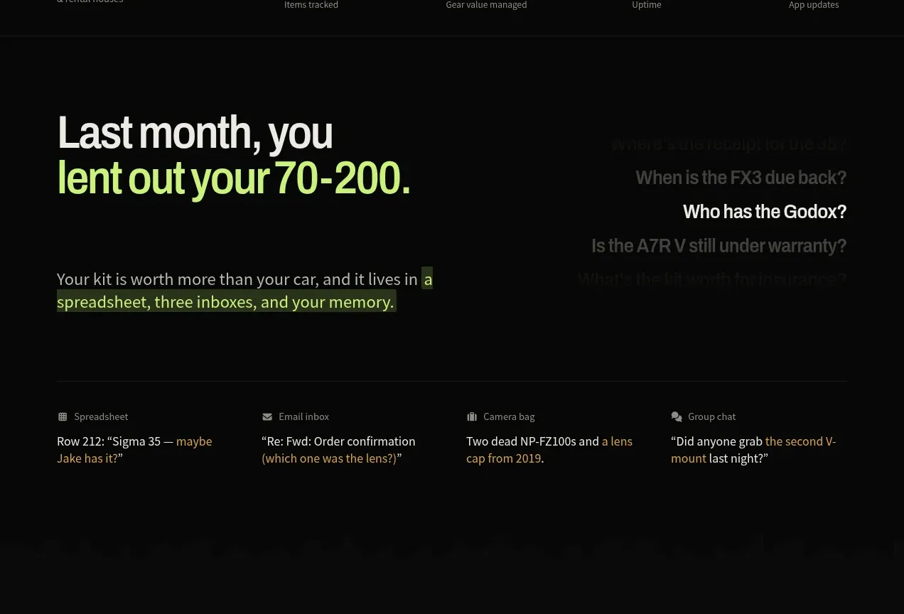
5. **Problem statement:** Create a generous, sparse section with a large left-aligned headline containing a lime-highlighted phrase, a short paragraph with highlighted inline words, and a faint right-side stack of example questions or reminders. Finish with four small source/problem columns.
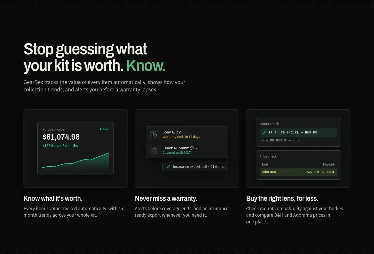
6. **Value tracking section:** Introduce the product's core value with a headline, description, and three equal feature cards. Each card combines a compact UI illustration, title, and short explanatory text.
7. **Website/showcase section:** Shift to a warm yellow/olive accent treatment. Add a headline, description, two CTAs, a horizontal numbered showcase tab row, and a large browser-and-phone mockup with floating booking/inquiry cards.
8. **Lending workflow section:** Return to the black canvas with a headline, supporting copy, two buttons, a large four-step workflow panel, and a second row of smaller utility cards.
9. **Complete product section:** Present a headline and CTAs followed by a large application/library mockup. Under it, add a dense grid of smaller feature tiles with short labels, coloured glyphs, and descriptions.
10. **Audience/use-cases section:** Add a concise heading and CTAs, then three larger audience cards and a bottom row of three smaller use-case links. Use dark cards and embedded UI snippets instead of photography.
11. **Import/migration CTA:** Switch to a full-width deep green section with a large heading, short testimonial-like lines, import and demo buttons, source-format chips, and three stacked benefit cards on the right.
12. **Pricing section:** Use a centered heading and billing toggle above three tall pricing cards. Give the middle plan a brighter green highlight and popular badge, the right plan a purple treatment, and include prices, buttons, and long checkmarked feature lists.
13. **FAQ:** Build a two-column layout with a large “questions answered” heading and contact prompt on the left; place a vertically divided accordion list on the right, with one answer expanded and plus/close controls.
14. **Final CTA:** Center a short closing headline over a very dark textured landscape/background area, add two buttons and a row of small reassurance points, then finish with a bright pixel-pattern divider.
15. **Footer:** Use a multi-column footer with brand description and small status/social marks at left, then Product, Use Cases, Resources, and Company link groups. Add a thin copyright row and a final oversized decorative brand word or motif at the bottom.

## Design language
- Build hierarchy with a condensed, bold sans-serif display face for headlines and a compact neutral sans for body text, navigation, labels, and UI. Use oversized 48–72px section headings, 14–18px supporting copy, and 10–12px metadata.
- Keep the base palette close to #070908 and #0b0e0d, with panels around #101413 and borders around #242a27. Use off-white text such as #e8e9e4 rather than pure white.
- Treat colour as a functional accent system: emerald green around #18b978 for primary actions and success, lime around #c8f34a for emphasis and migration, yellow around #f2c94c for showcase highlights, cyan/blue for secondary feature marks, and purple around #9b5de5 for premium states.
- Make the page rhythm deliberately change: sparse editorial storytelling and large gaps in the problem sections; compact, high-density panels for dashboards, workflow cards, feature matrices, and pricing; a full-bleed colour block for the import CTA.
- Use wide centered containers with consistent side gutters, mostly two- and three-column grids, and occasional full-width mockups. Let interface screenshots carry detail instead of adding decorative illustrations.
- Keep cards rectangular with small 4–8px radii, 1px low-contrast borders, dark inset surfaces, and almost no shadow. Reserve soft green or coloured glow for active buttons, selected plan edges, and key interface states.
- Use thin separators, tiny uppercase labels, compact tabs, checkmarks, and micro-status badges to create an operational product feel. Add subtle pixel/checker patterns as section dividers rather than generic gradients.
- Buttons should be compact and tactile: bright filled primary actions, dark bordered secondary actions, small corner radii, and clear arrow or play affordances. Navigation and FAQ rows should respond with colour or border emphasis on hover.
- Keep motion restrained: use gentle fade/slide reveals for sections, subtle glow on hover, and smooth accordion expansion. Avoid loud parallax or ornamental animation.
- Make the mockups feel credible: use dark application chrome, narrow sidebars, tables, charts, status pills, and realistic photography-workflow data. For browser showcases, contrast the dark page with a warm off-white viewport and floating notification cards.

## Never
- Do not use any logos, wordmarks, product names, copy, illustrations, photography, screenshots, icon sets, or distinctive branded assets from the reference.
- Do not reproduce GearDex or present the result as GearDex.
- Create original content, product UI, imagery, labels, and brand identity for the user's product while preserving only the reusable structural and visual principles.
Components from this page
All components
 Announcement bar and primary navigation
geardex.app · Navigation
Announcement bar and primary navigation
geardex.app · Navigation
 Product promise hero with dashboard preview
geardex.app · Hero
Product promise hero with dashboard preview
geardex.app · Hero
 Problem framing and scattered-work evidence
geardex.app · Feature grid
Problem framing and scattered-work evidence
geardex.app · Feature grid
 Value-tracking feature cards
geardex.app · Feature grid
Value-tracking feature cards
geardex.app · Feature grid
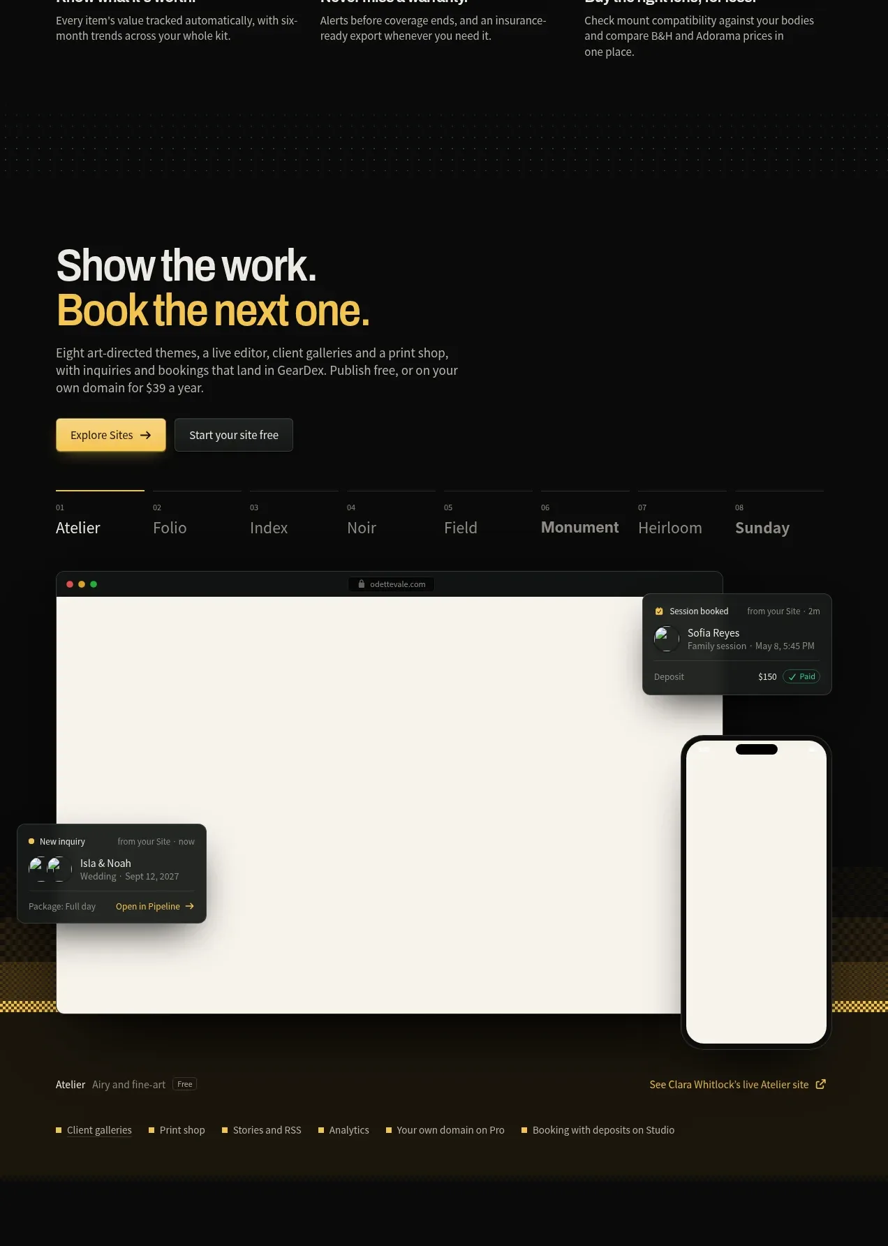 Website showcase and booking preview
geardex.app · Gallery
Website showcase and booking preview
geardex.app · Gallery
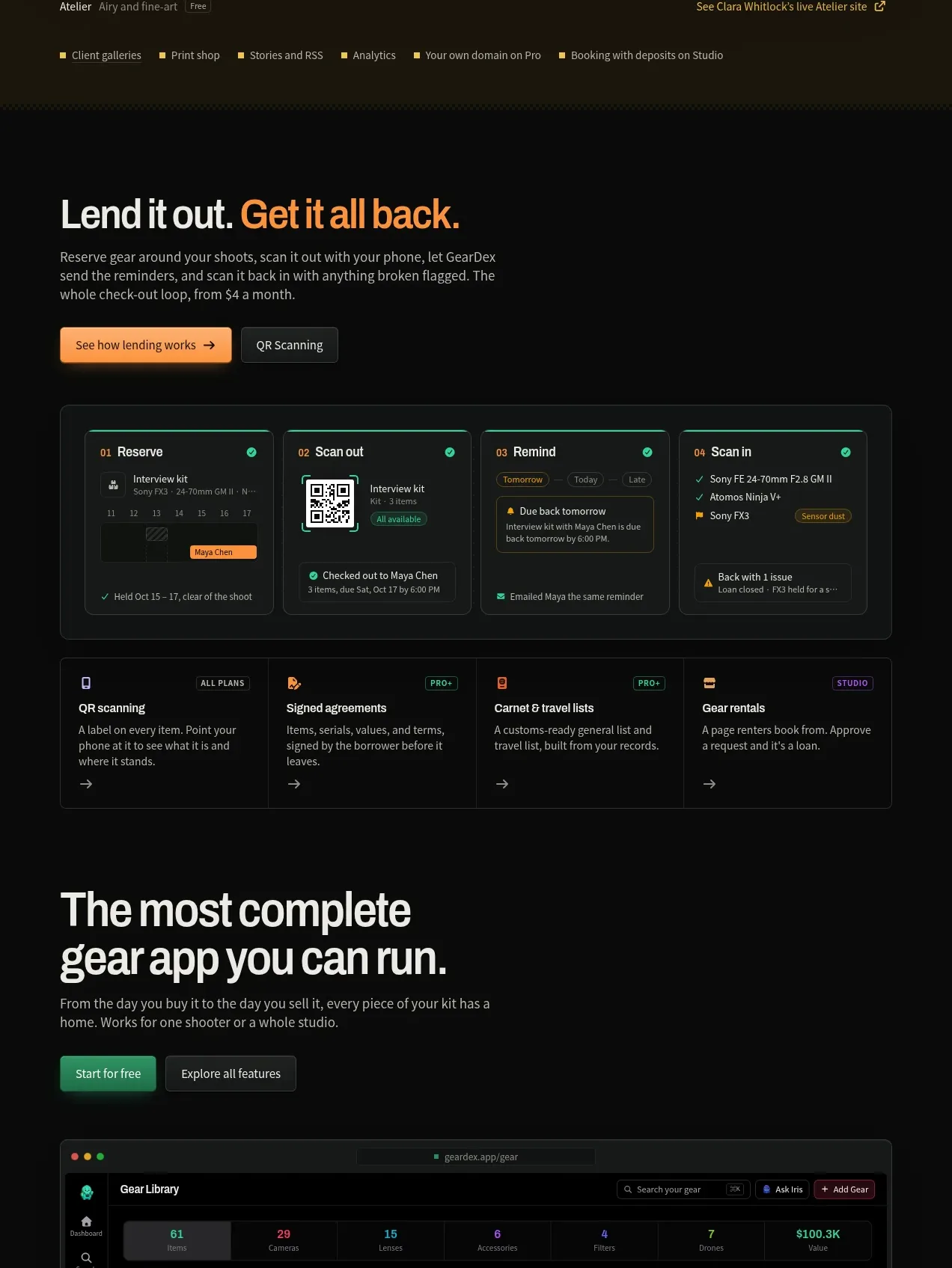 Gear lending workflow
geardex.app · Feature grid
Gear lending workflow
geardex.app · Feature grid
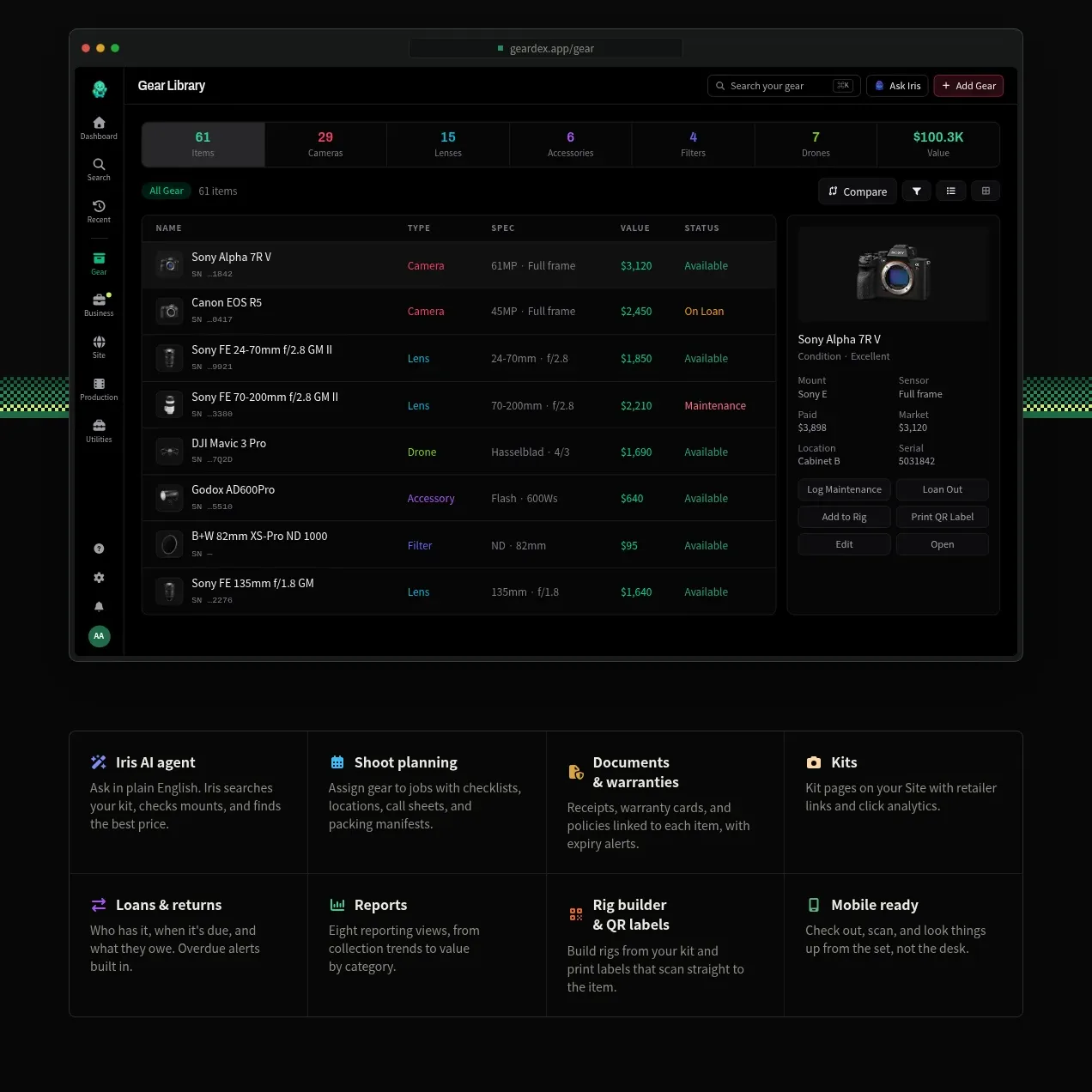 Complete gear library product tour
geardex.app · Feature grid
Complete gear library product tour
geardex.app · Feature grid
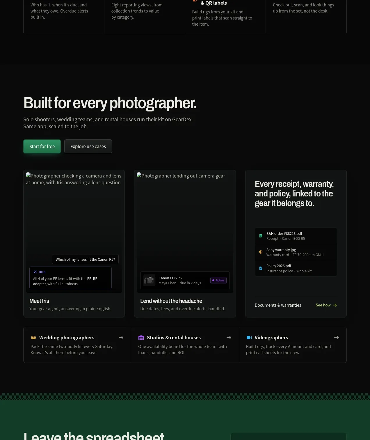 Use cases by customer type
geardex.app · Feature grid
Use cases by customer type
geardex.app · Feature grid
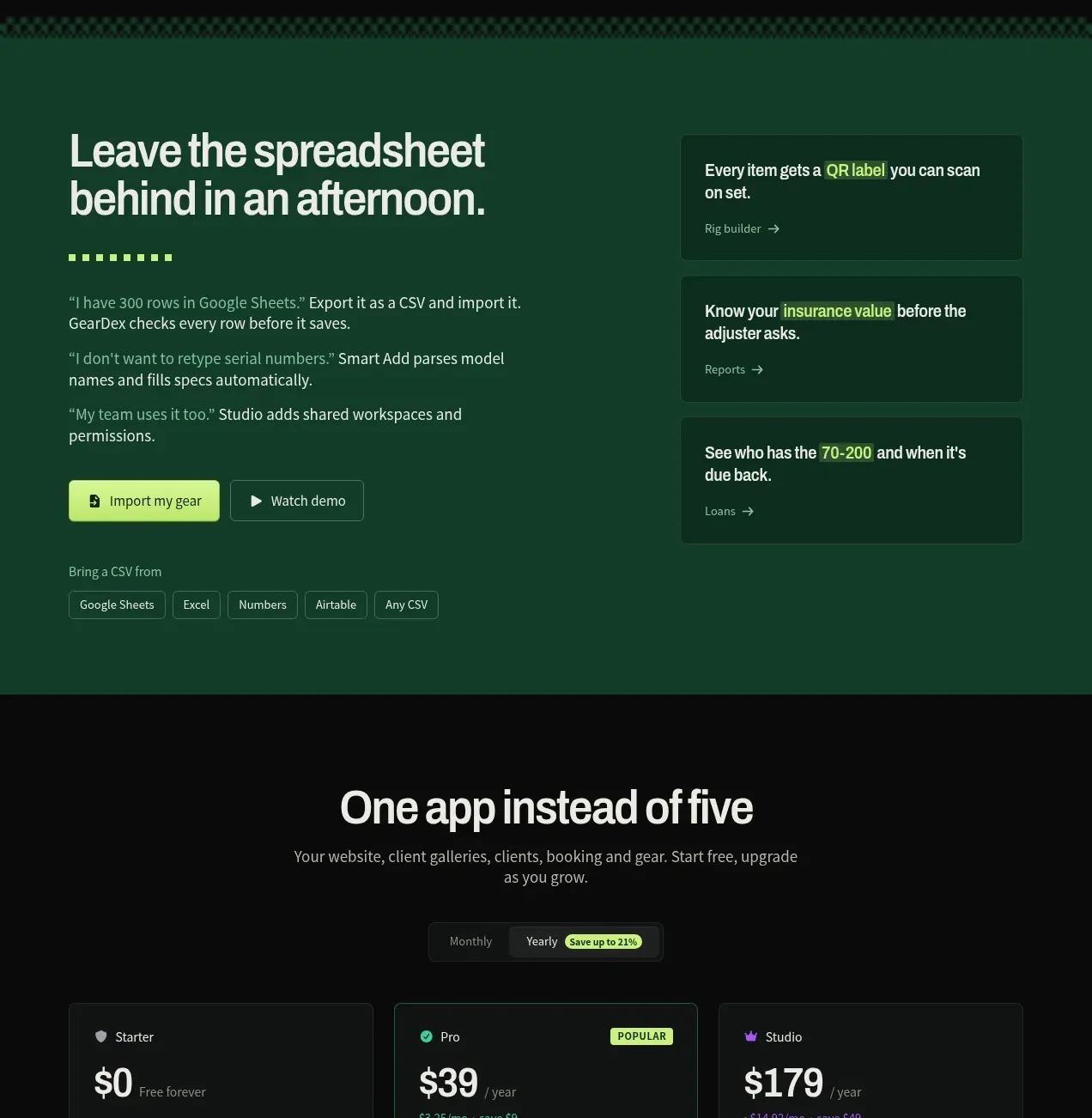 Spreadsheet replacement import CTA
geardex.app · Call to action
Spreadsheet replacement import CTA
geardex.app · Call to action
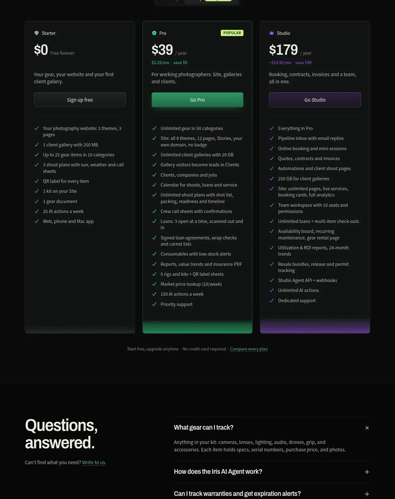 Three-tier pricing comparison
geardex.app · Pricing table
Three-tier pricing comparison
geardex.app · Pricing table
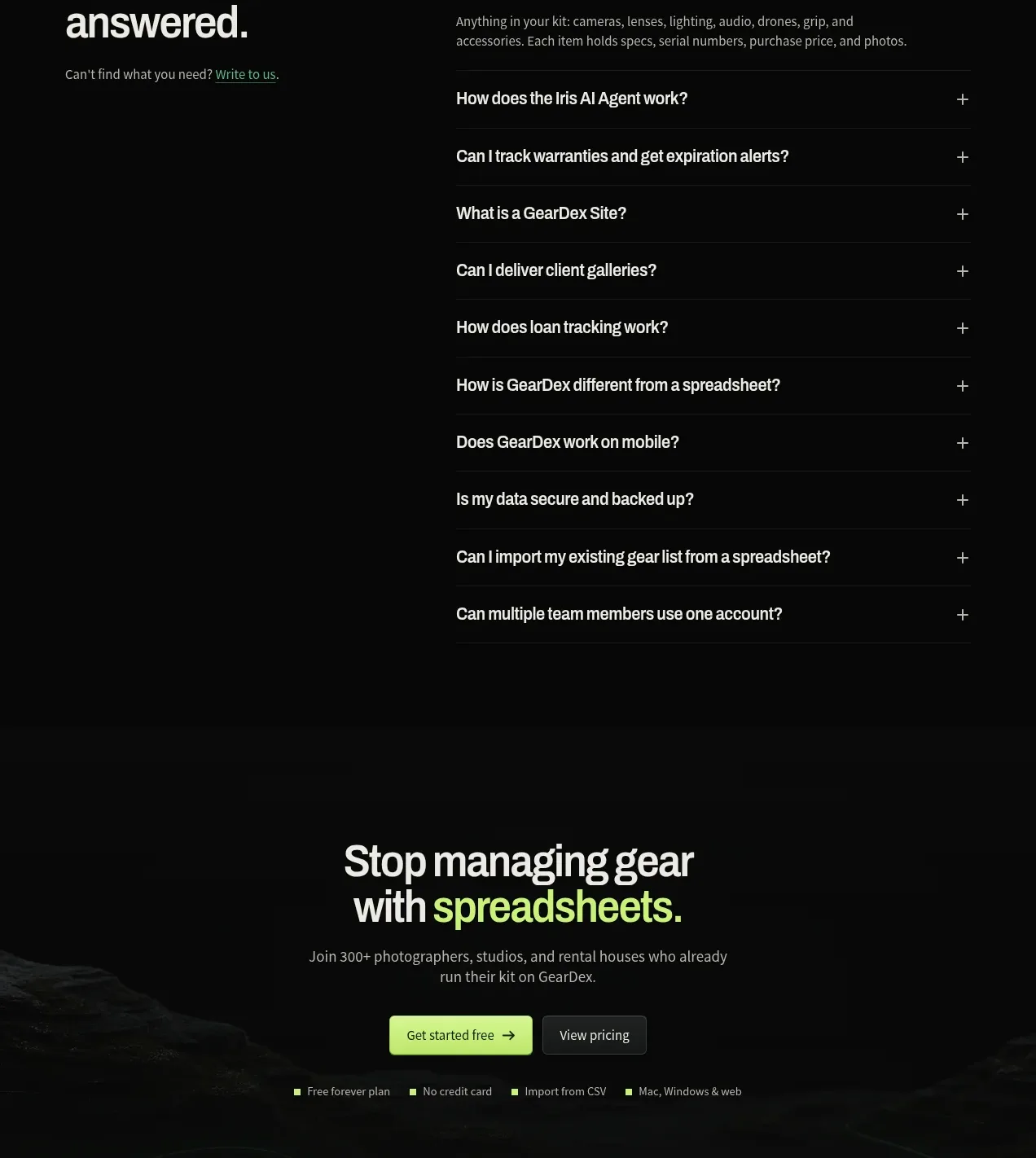 Questions and answers
geardex.app · FAQ
Questions and answers
geardex.app · FAQ
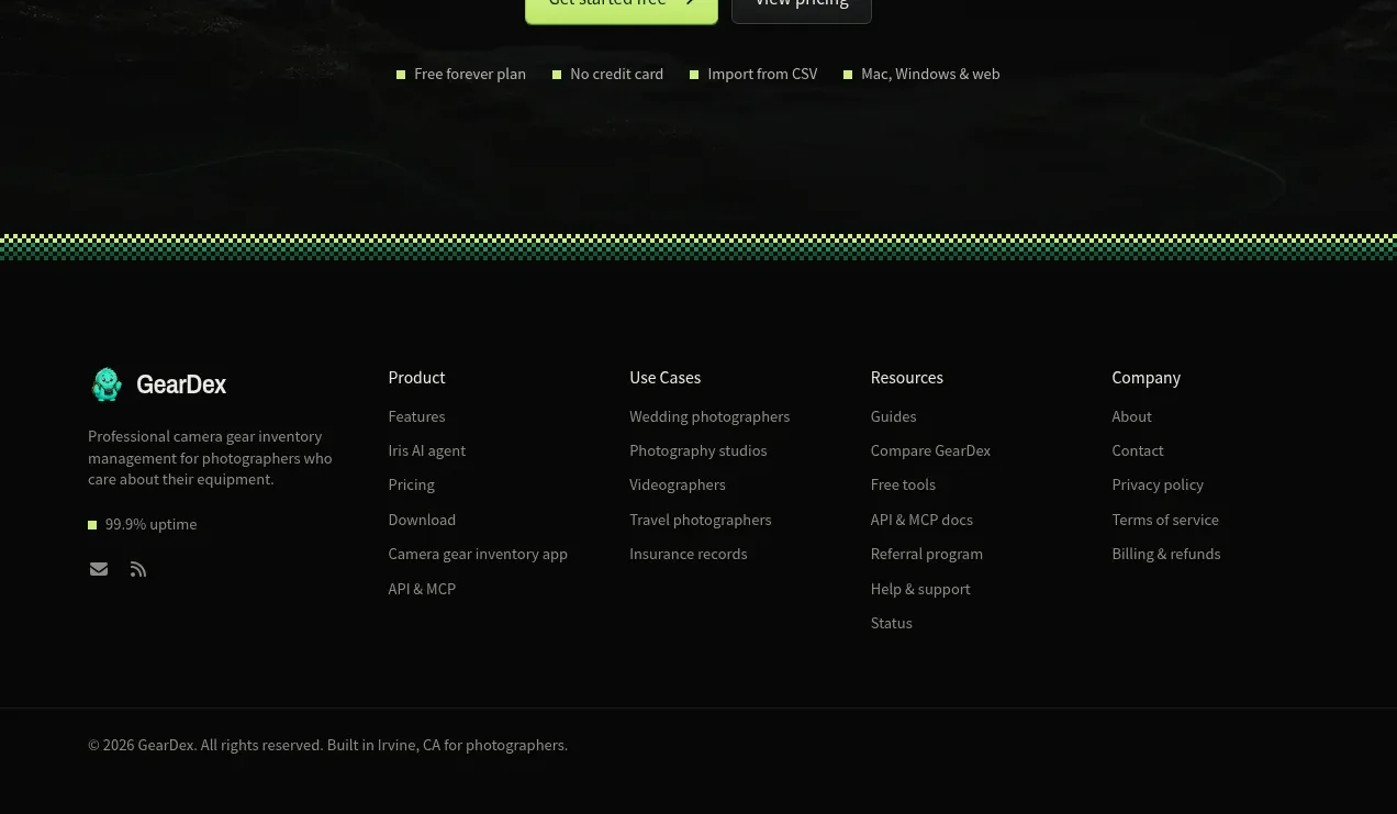 Final conversion call to action
geardex.app · Call to action
Final conversion call to action
geardex.app · Call to action