 kage
kage
context.dev
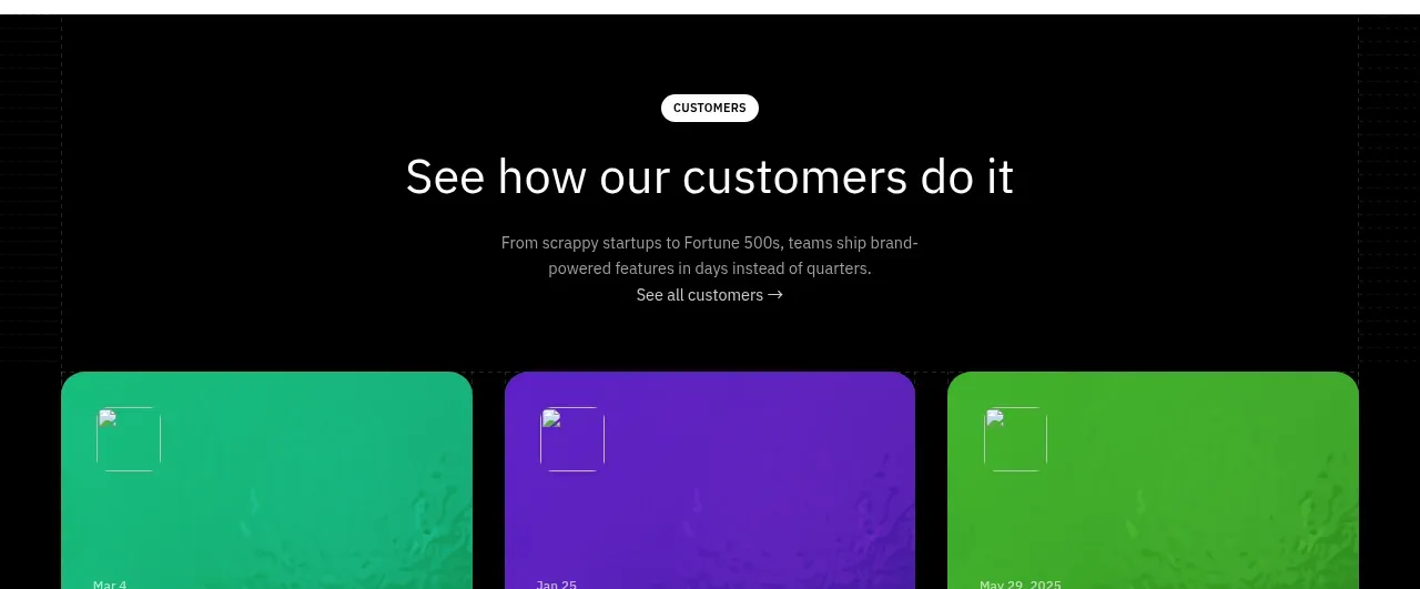
Design analysis
A dark editorial band presents a section title and three blue article cards with short headlines, dates, and a carousel indicator.
Prompt preview
## Reference images

Study these alongside the description below: hierarchy, rhythm, spacing, colour. Build for the product you are asked about, using this design language.

- Component: https://kage-design-assets.t3.tigrisfiles.io/components/scrape-anything-by-context-dev/b0e64468-3924-45db-a4d8-d7cbe8044a77-1791871398-11.webp
- Full page it was cut from: https://kage-design-assets.t3.tigrisfiles.io/screenshots/scrape-anything-by-context-dev/b0e64468-3924-45db-a4d8-d7cbe8044a77-1791871314047-full.webp
- Component on Kage: https://kage.design/component/scrape-anything-by-context-gallery-2

## Before you start
Ask what the user's product, audience, and brand are, then shape the editorial block around their content strategy.

Create a dark blog section with a left-aligned title and a small explanatory line on the right. Below, show three horizontal article cards with blue abstract media surfaces, short white headlines, and small date metadata. Add a compact carousel indicator and arrow control beneath. Use #050607 as the background, saturated blue around #2457D6 for cards, 16px radii, high-contrast typography, and consistent card heights. On mobile, show one card at a time with swipe and accessible controls.

Never: use logos, product names, copy, illustrations, or imagery from the reference.
More components
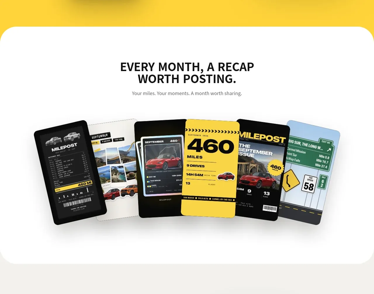
 Monthly recap gallery
Milepost · Gallery
Monthly recap gallery
Milepost · Gallery
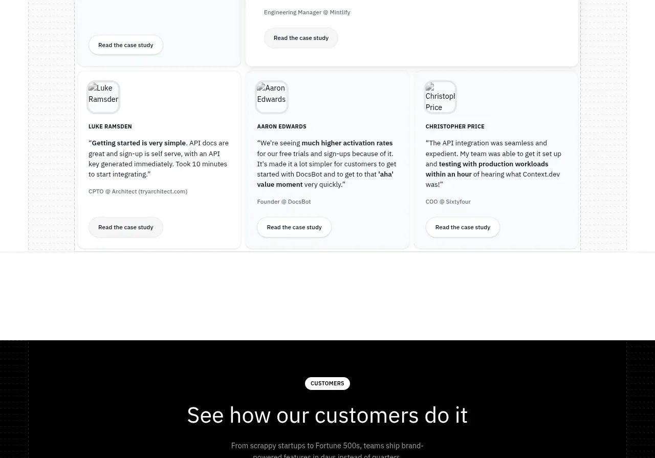
 Customer stories carousel
Scrape Anything by Context.dev · Gallery
Customer stories carousel
Scrape Anything by Context.dev · Gallery
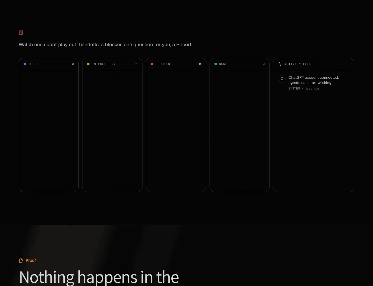
 Operational board preview
SquadRoom · Gallery
Operational board preview
SquadRoom · Gallery
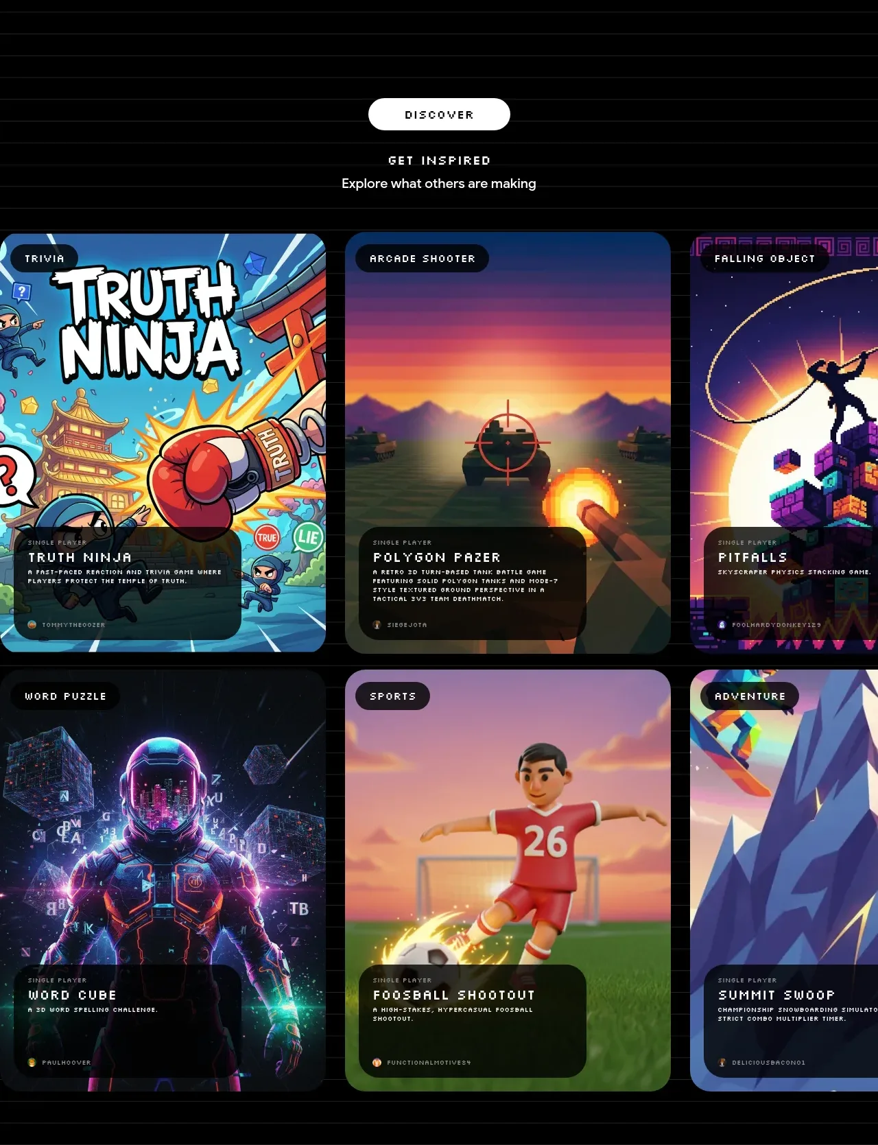
 Discover inspiration gallery
Playground by Google Labs · Gallery
Discover inspiration gallery
Playground by Google Labs · Gallery
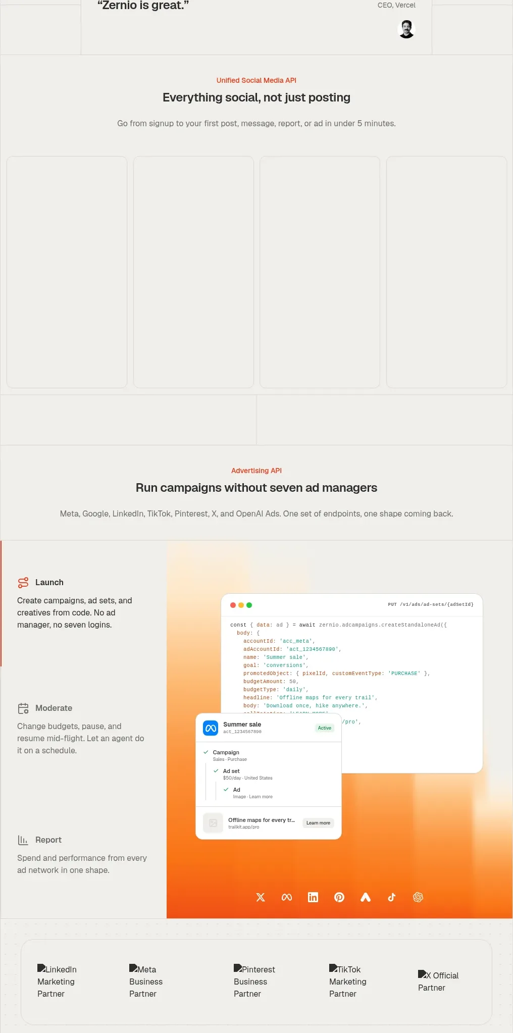
 Social media campaign API showcase
Zernio · Gallery
Social media campaign API showcase
Zernio · Gallery
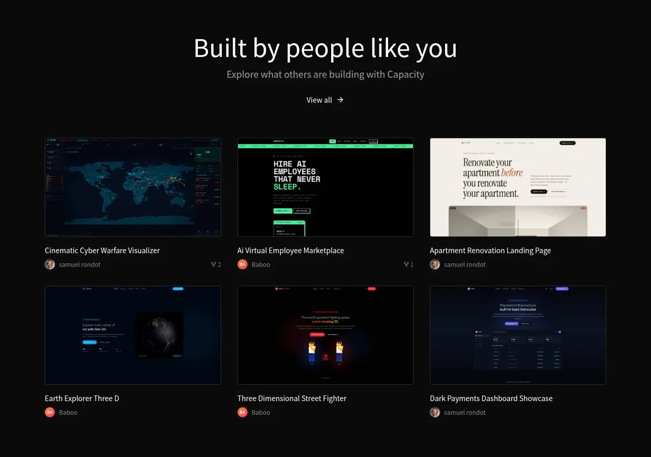
 Community project gallery
capacity.so · Gallery
Community project gallery
capacity.so · Gallery