 kage
kage
godaylight.com
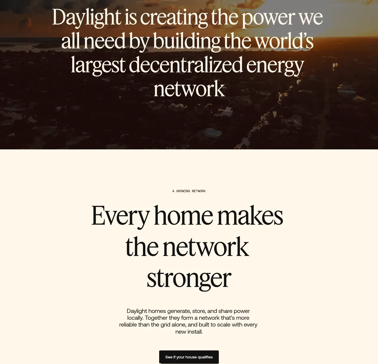
Design analysis
A spacious cream CTA explains the network effect in a centered serif headline, supporting copy, and one dark button, with a faint technical graphic below.
Prompt preview
## Reference images

Study these alongside the description below: hierarchy, rhythm, spacing, colour. Build for the product you are asked about, using this design language.

- Component: https://kage-design-assets.t3.tigrisfiles.io/components/godaylight-com/ca5e907b-4256-46ba-9367-b5c95fdb4894-1791311231-7.webp
- Full page it was cut from: https://kage-design-assets.t3.tigrisfiles.io/screenshots/godaylight-com/ca5e907b-4256-46ba-9367-b5c95fdb4894-1791311174290-full.webp
- Component on Kage: https://kage.design/component/godaylight-cta

## Before you start
Ask what the user's product is, who it serves, and what its brand personality and visual identity are. Apply the principles below to that product rather than reproducing this reference.

Build a generous centered CTA on a warm cream background. Add a small uppercase eyebrow, a large serif headline over 2–3 lines, concise centered supporting copy, and one dark rectangular button. Use a narrow reading width around 360–500px, 100–160px vertical spacing, charcoal text (#171716), and a dark button (#111110) with white text. Optionally place a very faint abstract network or system diagram below the CTA as supporting atmosphere, keeping it low contrast and nonessential. Use 6–8px button radius, clear hover inversion or slight lift, and stack naturally on mobile.

Never: use logos, product names, copy, illustrations, or imagery from the reference.
More components

 Split closing CTA
godaylight.com · Call to action
Split closing CTA
godaylight.com · Call to action

 Closing conversion banner
FastRouter.ai · Call to action
Closing conversion banner
FastRouter.ai · Call to action
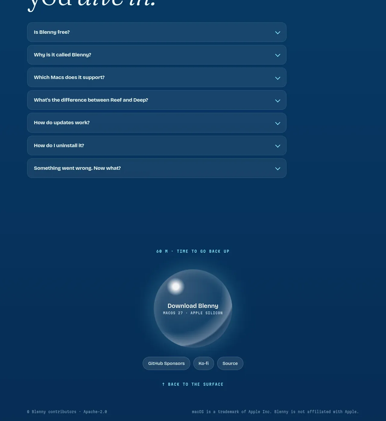
 Final download call to action
Blenny · Call to action
Final download call to action
Blenny · Call to action
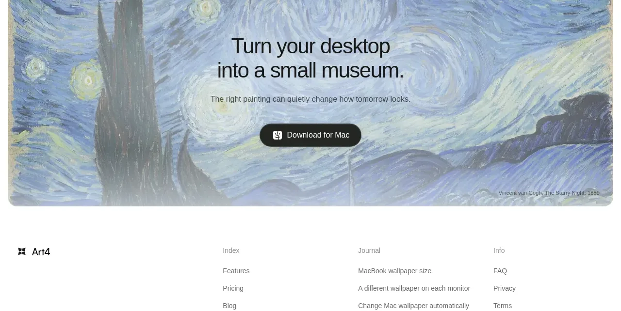
 Visual download call to action
Art4 · Call to action
Visual download call to action
Art4 · Call to action
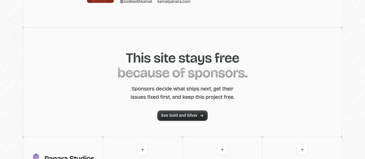
 Sponsor call to action
opensend.cc · Call to action
Sponsor call to action
opensend.cc · Call to action
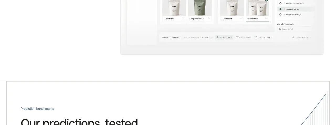
 Final conversion call to action
Sapien · Call to action
Final conversion call to action
Sapien · Call to action