kage
kage
godaylight.com
Design analysis
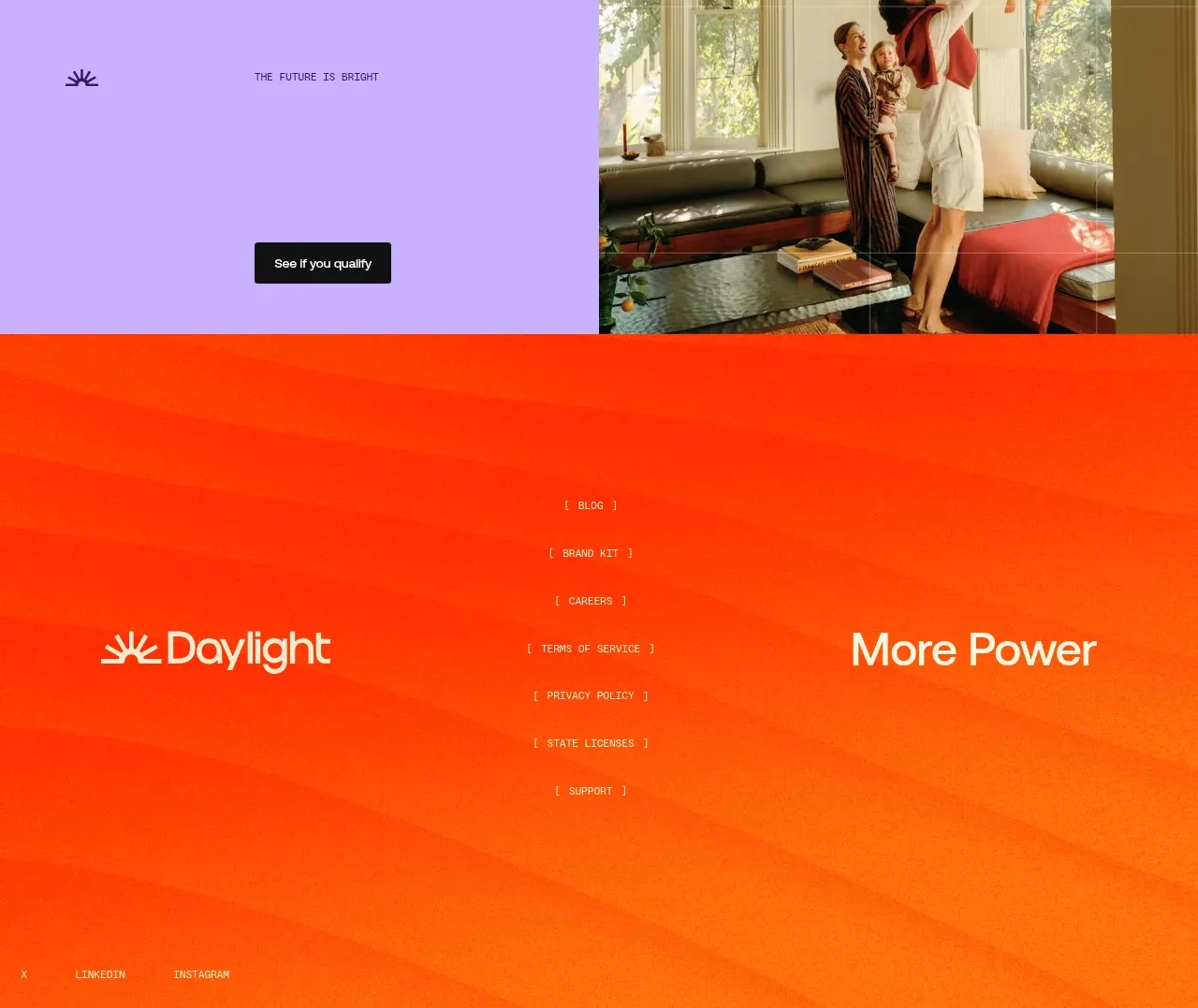
A vivid orange-red gradient footer balances large brand treatment at the sides with a centered vertical link list and small social/legal links along the bottom.
Prompt preview
## Reference images

Study these alongside the description below: hierarchy, rhythm, spacing, colour. Build for the product you are asked about, using this design language.

- Component: https://kage-design-assets.t3.tigrisfiles.io/components/godaylight-com/ca5e907b-4256-46ba-9367-b5c95fdb4894-1791311232-9.webp
- Full page it was cut from: https://kage-design-assets.t3.tigrisfiles.io/screenshots/godaylight-com/ca5e907b-4256-46ba-9367-b5c95fdb4894-1791311174290-full.webp
- Component on Kage: https://kage.design/component/godaylight-footer

## Before you start
Ask what the user's product is, who it serves, and what its brand personality and visual identity are. Apply the principles below to that product rather than reproducing this reference.

Build a tall, high-energy footer on an orange-to-red diagonal gradient (#ff5a12 to #ff2b0b). Use a three-zone desktop layout: a large brand treatment on the left, a centered vertical list of secondary links, and a short tagline or secondary brand phrase on the right. Add small social/legal links along the bottom edge with generous horizontal padding. Use white or warm-white text, uppercase microcopy at 10–12px, and a large serif or display treatment for the brand area. Keep the footer spacious, use 80–120px top padding, and collapse to stacked zones on mobile. Ensure all links have visible hover/focus states and sufficient contrast.

Never: use logos, product names, copy, illustrations, or imagery from the reference.