kage
kage
godaylight.com
Design analysis
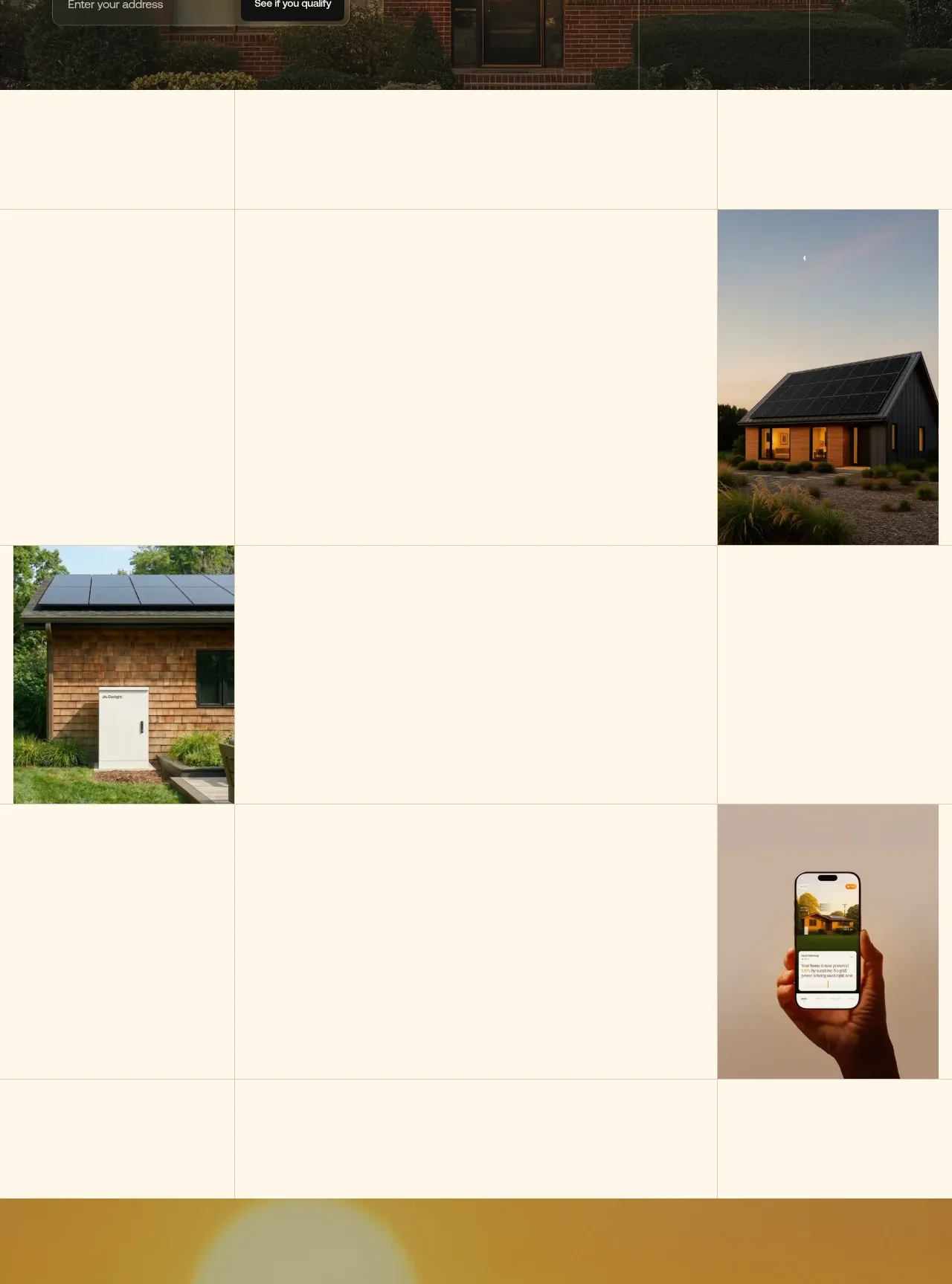
A sparse cream gallery uses large whitespace, hairline grid divisions, and offset residential imagery to create a quiet, premium visual rhythm between major narrative sections.
Prompt preview
## Reference images

Study these alongside the description below: hierarchy, rhythm, spacing, colour. Build for the product you are asked about, using this design language.

- Component: https://kage-design-assets.t3.tigrisfiles.io/components/godaylight-com/ca5e907b-4256-46ba-9367-b5c95fdb4894-1791311228-1.webp
- Full page it was cut from: https://kage-design-assets.t3.tigrisfiles.io/screenshots/godaylight-com/ca5e907b-4256-46ba-9367-b5c95fdb4894-1791311174290-full.webp
- Component on Kage: https://kage.design/component/godaylight-gallery

## Before you start
Ask what the user's product is, who it serves, and what its brand personality and visual identity are. Apply the principles below to that product rather than reproducing this reference.

Build a tall editorial image mosaic on a warm cream background. Use a 4-column grid with extremely subtle beige-gray rules, generous empty cells, and 2–3 offset image tiles rather than a conventional dense gallery. Let images occupy roughly one column each, with varied vertical positions and consistent crop quality. Keep tile edges square or minimally rounded (0–2px), preserve large negative space, and use natural, lightly graded photography. The composition should feel intentional and asymmetrical, with no captions unless the user's content requires them. Make the grid collapse to a simpler two-column or stacked layout on mobile.

Never: use logos, product names, copy, illustrations, or imagery from the reference.