kage
kage
flow.google.com
Design analysis
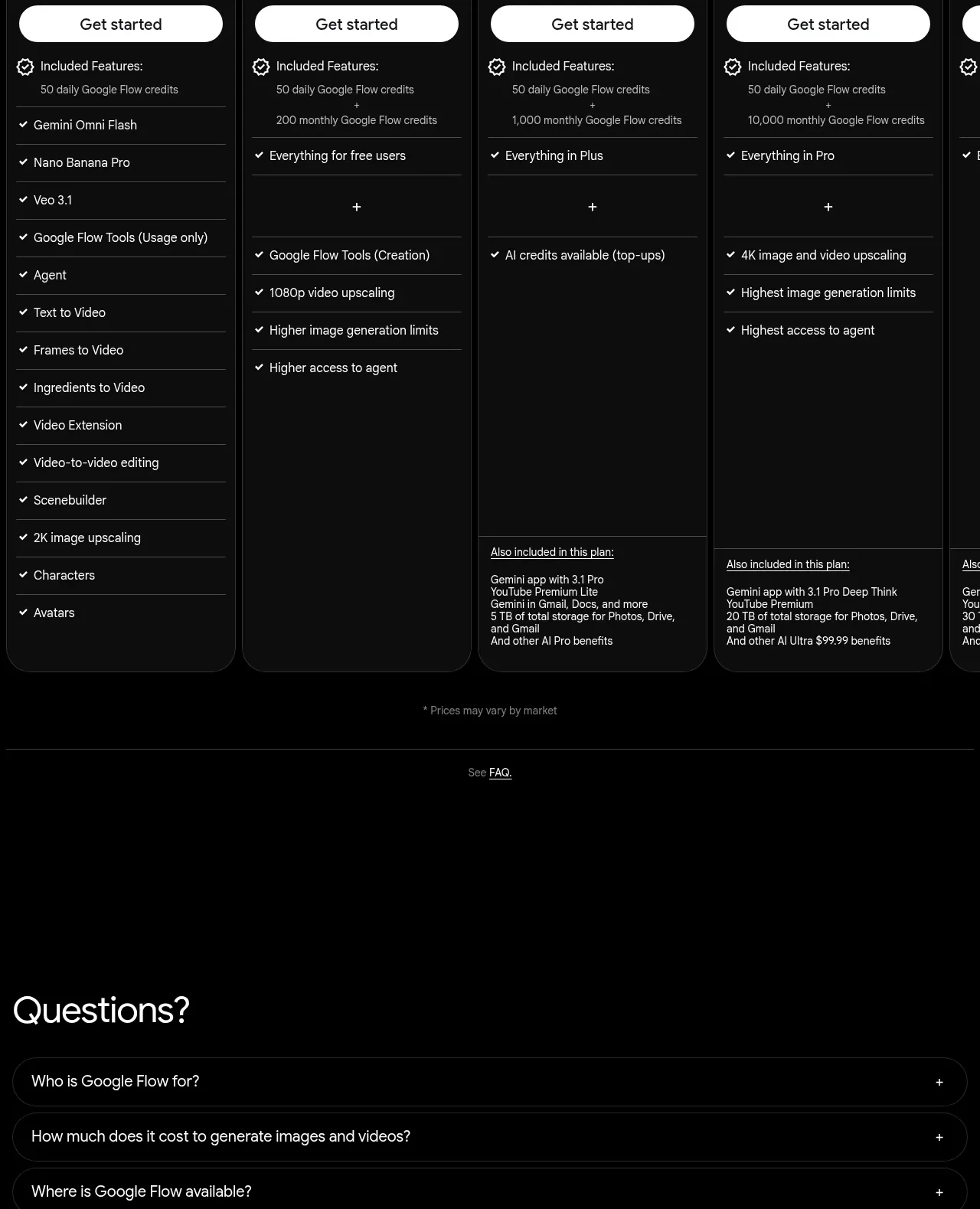
A spacious FAQ section uses a large heading and full-width outlined accordion rows. Minimal controls and generous black space preserve the page's quiet finish.
Prompt preview
## Reference images

Study these alongside the description below: hierarchy, rhythm, spacing, colour. Build for the product you are asked about, using this design language.

- Component: https://kage-design-assets.t3.tigrisfiles.io/components/google-flow-for-ios-android/998b1c85-b331-490a-bec1-b2413c6fadd0-1790056898-9.webp
- Full page it was cut from: https://kage-design-assets.t3.tigrisfiles.io/screenshots/google-flow-for-ios-android/998b1c85-b331-490a-bec1-b2413c6fadd0-1790056849877-full.webp
- Component on Kage: https://kage.design/component/google-flow-for-ios-android-faq

## Before you start
Ask what questions users commonly have about the user's product, pricing, availability, privacy, and onboarding. Use those answers and the user's tone of voice.

Build a full-width FAQ section on black with a large left-aligned heading and a stack of 3–6 rounded accordion rows beneath it. Use near-black transparent row fills, 1px #252525 borders, 999px or 20px radius, 14–16px horizontal padding, and 18–24px vertical padding. Place the question on the left and a plus/minus control on the right. Use white text for questions, gray text for answers, and a smooth height/opacity transition when opened. Keep the section width within 92–96% of the viewport, add 80–120px vertical breathing room, and include small legal/disclaimer text at the bottom if required.

Never: use logos, product names, copy, illustrations, or imagery from the reference.