kage
kage
flow.google.com

Design analysis
A full-bleed black landing page uses oversized white typography, cinematic image/video surfaces, and generous vertical pacing to frame Google Flow as a creative tool. The page moves from a collage-based hero into a product overview, model carousel, alternating Plan/Create/Refine feature demonstrations, a dense tools directory, editorial Flow Sessions showcase, pricing comparison, and a restrained FAQ/footer; blue-black atmospheric glows and rounded dark panels add depth without breaking the monochrome system.
Prompt preview
## Reference images

Study these alongside the description below: hierarchy, rhythm, spacing, colour. Build for the product you are asked about, using this design language.

- Full page: https://kage-design-assets.t3.tigrisfiles.io/screenshots/google-flow-for-ios-android/998b1c85-b331-490a-bec1-b2413c6fadd0-1790056849877-full.webp
- Above the fold: https://kage-design-assets.t3.tigrisfiles.io/screenshots/google-flow-for-ios-android/998b1c85-b331-490a-bec1-b2413c6fadd0-1790056846716.webp
- Design on Kage: https://kage.design/designs/google-flow-for-ios-android-landing-page

## Before you start
Ask the user what they are building, who it is for, and what brand assets they already have—name, colours, typography, imagery, and motion preferences. Wait for their answers before designing. Apply every instruction below to that product, not to the reference page.

## Page structure
1. **Persistent navigation** — Place a compact header over the black canvas with the product name at left, evenly spaced section links in the middle, social or utility controls at right, and one visibly active link.
2. **Cinematic hero** — Start with a wide collage or looping media wall made from staggered rounded image tiles. Overlay an extremely large centered headline, a short two-line positioning statement, a white pill CTA, legal microcopy, and a small down/paused-media control.
3. **Creative-work introduction** — Use a tall, quiet black section with a centered two-line headline such as a promise of better creative work, followed by one large framed product preview with a subtle play affordance.
4. **Models introduction** — Add a centered section heading and narrow explanatory paragraph, leaving generous black space before the content carousel.
5. **Models carousel** — Show oversized rounded model cards in a horizontal rail, with the focused card centered and partial neighboring cards visible at both edges. Use atmospheric gradients or model-specific media, concise explanatory copy, paired pill buttons, and a small floating previous/next control.
6. **Workflow stage navigation** — Introduce a compact rounded segmented control for the workflow stages, with one selected white or light-gray segment.
7. **Plan feature section** — Use a dark blue-black glow behind an oversized stage label. Pair a large layered product screenshot with a small floating explanatory card and a short caption; keep carousel controls near the lower edge.
8. **Create feature section** — Reverse the composition: place the huge stage label toward the right, the product preview toward the left/center, and the explanatory card on the opposite side. Preserve the layered-device treatment and sparse caption.
9. **Refine feature section** — Repeat the same visual system with the label on the left, a timeline/editor preview, a compact explanatory panel, and a short caption. Let the blue atmospheric background fade back to black between stages.
10. **Tools introduction** — Create a centered, text-led transition with a small eyebrow, a large two-line heading, and a concise paragraph explaining that users can create tools with natural language.
11. **Tools directory** — Build a two-column area: a colorful preview card on the left and a tall dark list panel on the right. Divide tool rows with thin rules, keep titles and descriptions muted, and place an outlined Explore pill at the end of every row. Finish with a full-width outlined CTA beneath the list.
12. **Flow Sessions heading** — Switch to an editorial split layout with a very large stacked title on the left and a short explanatory paragraph plus a light pill CTA on the right.
13. **Flow Sessions showcase** — Use a wide cinematic, softly blurred background with a vertical list of creator names at left, a centered video thumbnail with play control, and a focused story title, description, watch link, and circular up/down controls at right.
14. **Pricing introduction** — Return to a centered heading, short supporting copy, outlined CTA, and small account note.
15. **Pricing comparison** — Present horizontally scrollable rounded plan cards in a dense rail. Each card has a plan label, large price, white Get started button, included-features heading, credit details, and stacked checkmarked feature rows separated by fine rules. Add a market-pricing footnote and FAQ link below.
16. **Questions FAQ** — Use a large left-aligned heading followed by full-width, low-contrast outlined accordion rows. Keep each question on one line with a plus control aligned at the far right.
17. **Footer/legal** — End with tiny disclaimer text at the lower left and protection, privacy, and terms links at the lower right, separated from the FAQ by ample black space.

## Design language
- Build hierarchy through scale and whitespace: use very large display labels and headlines, compact 14–18px supporting copy, and tiny 10–12px metadata. Let each major section breathe rather than filling the viewport.
- Keep the base canvas near-black, approximately `#000000` or `#050505`, with primary text near-white `#F5F5F5` and secondary text in `#8A8A8A` to `#B5B5B5`.
- Use restrained atmospheric colour only behind media-led sections: deep navy and electric blue glows around `#061A2B`, `#063A72`, and `#0B4F8A`; let the actual imagery supply most of the colour.
- Pair a clean modern sans-serif with a high-contrast scale: oversized headings can be 72–140px on desktop with tight line-height, section headings around 40–64px, and body copy around 15–18px. Avoid decorative display fonts.
- Treat imagery and product screenshots as the visual anchors. Use wide cinematic crops, dark overlays, soft blur in editorial showcases, and layered device frames for feature demonstrations.
- Use rounded rectangles consistently: roughly 14–20px radius for cards and screenshots, 999px for pills and segmented controls, and subtle 1px borders around `rgba(255,255,255,.14)`.
- Keep surfaces mostly flat and dark. Prefer faint inner borders and atmospheric gradients over drop shadows; use a soft blue glow only where it helps separate a feature stage from the black background.
- Buttons should be compact pills: white filled buttons with black text for primary actions, transparent or dark outlined pills for secondary actions, and small circular controls for carousels and media.
- Change rhythm down the page: cinematic and image-heavy at the top, spacious and centered for introductions, alternating and demonstrative for workflow features, dense and utilitarian for tools and pricing, then sparse and quiet for FAQ/legal content.
- Make horizontal rails intentionally show partial neighboring cards to communicate browsing. On smaller screens, allow carousels and pricing cards to scroll horizontally rather than shrinking dense content into unreadable columns.
- Use motion sparingly: autoplay or loop hero media, subtle crossfades or slide transitions for carousels, and gentle hover/press states on pills and accordion rows. Preserve visible pause controls and respect reduced-motion preferences.

## Never
- Do not copy the reference’s logos, wordmarks, product names, exact copy, illustrations, photography, screenshots, creator names, or icon sets.
- Do not present the result as Google Flow or imply affiliation with the reference product.
- Replace all content, imagery, controls, and brand expression with assets and language appropriate to the user’s own product.
Components from this page
All components
 Minimal dark site navigation
Google Flow for iOS & Android · Navigation
Minimal dark site navigation
Google Flow for iOS & Android · Navigation
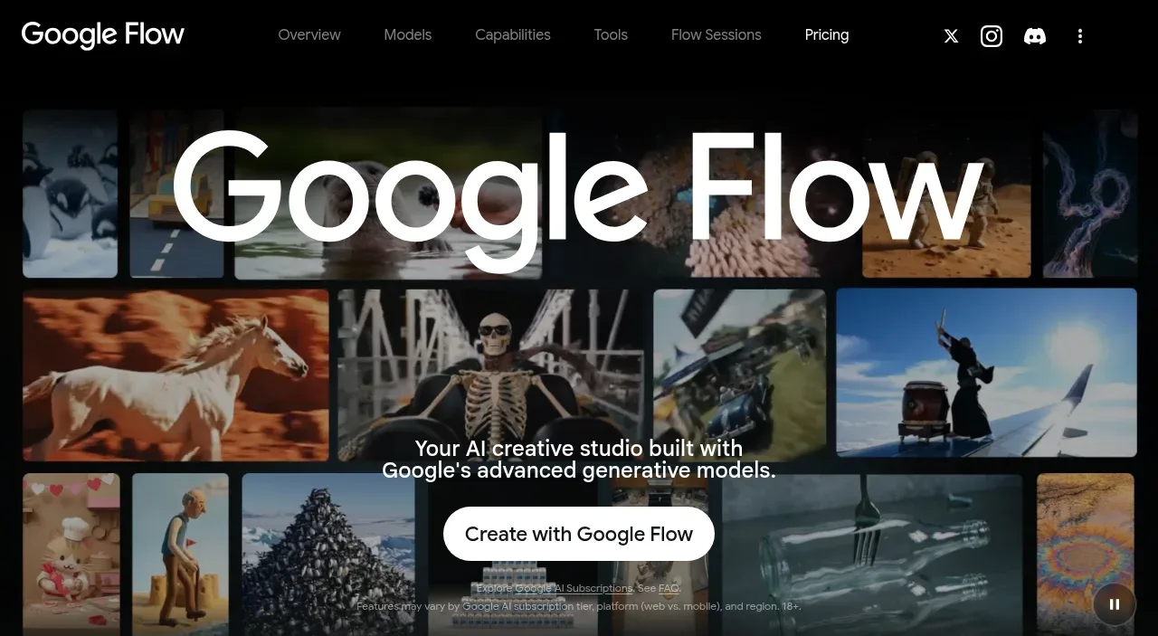 Immersive visual product hero
Google Flow for iOS & Android · Hero
Immersive visual product hero
Google Flow for iOS & Android · Hero
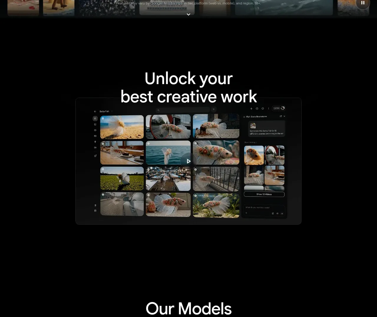 Creative work showcase
Google Flow for iOS & Android · Feature grid
Creative work showcase
Google Flow for iOS & Android · Feature grid
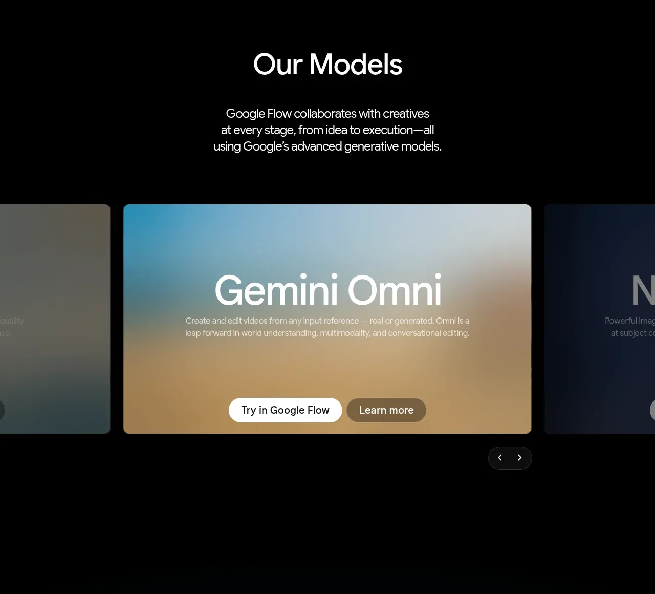 Model capability carousel
Google Flow for iOS & Android · Feature grid
Model capability carousel
Google Flow for iOS & Android · Feature grid
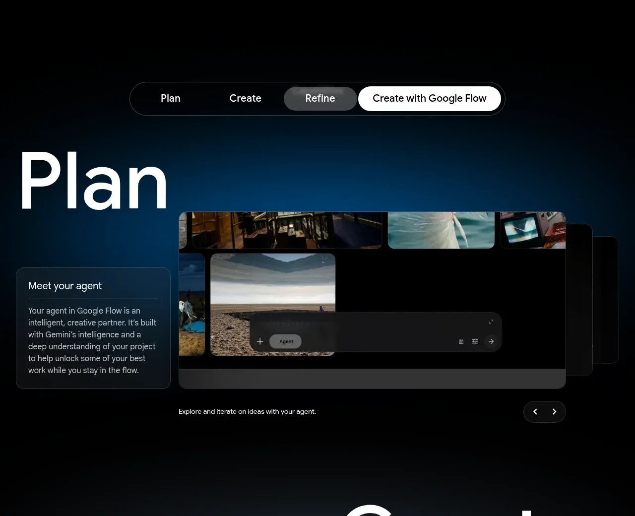 Plan workflow panel
Google Flow for iOS & Android · Feature grid
Plan workflow panel
Google Flow for iOS & Android · Feature grid
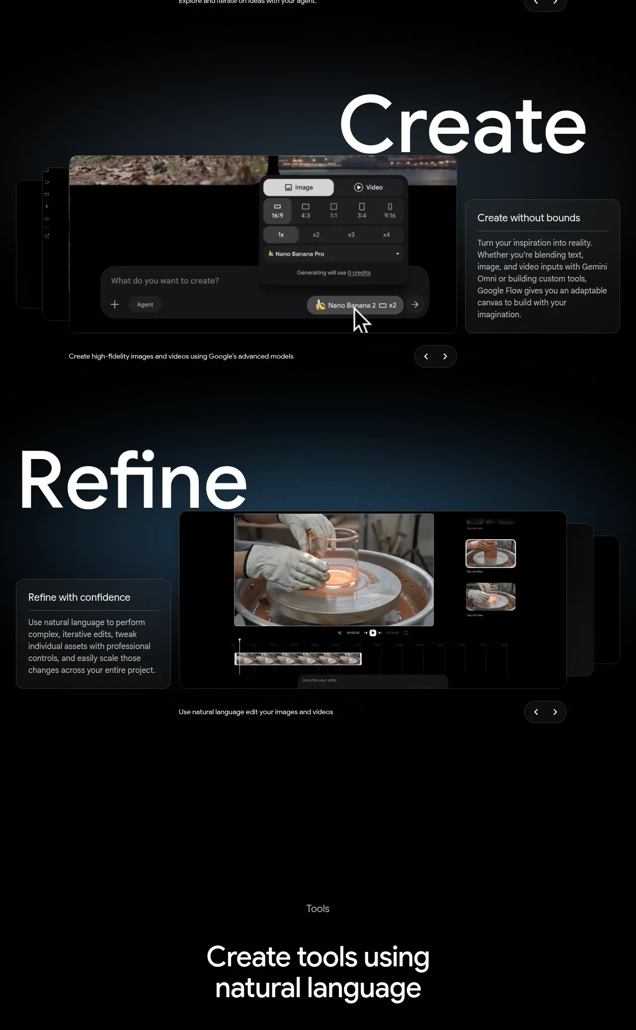 Create and refine workflow
Google Flow for iOS & Android · Feature grid
Create and refine workflow
Google Flow for iOS & Android · Feature grid
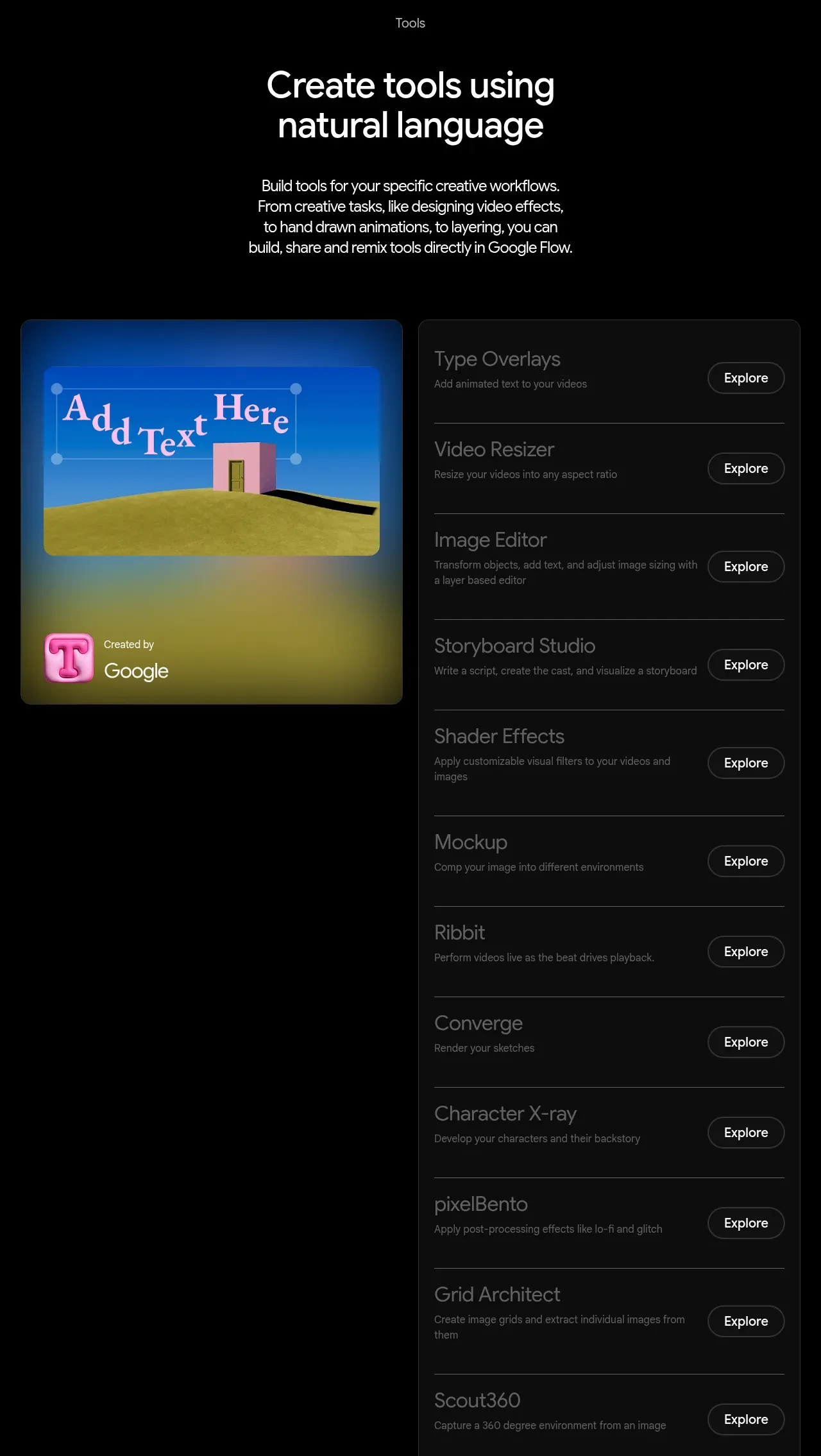 Natural-language tools directory
Google Flow for iOS & Android · Feature grid
Natural-language tools directory
Google Flow for iOS & Android · Feature grid
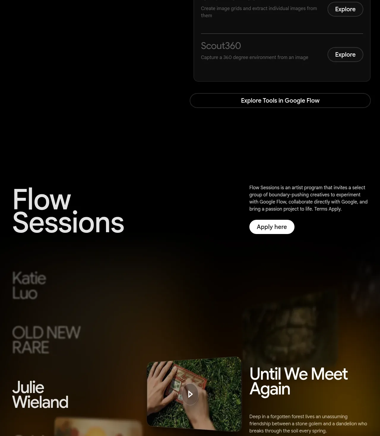 Featured creative sessions
Google Flow for iOS & Android · Gallery
Featured creative sessions
Google Flow for iOS & Android · Gallery
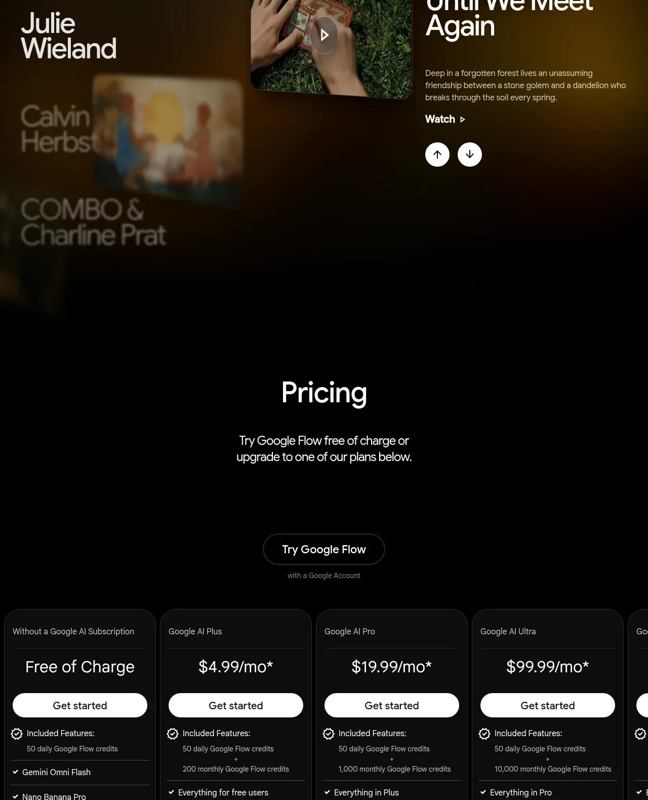 Plan comparison pricing
Google Flow for iOS & Android · Pricing table
Plan comparison pricing
Google Flow for iOS & Android · Pricing table
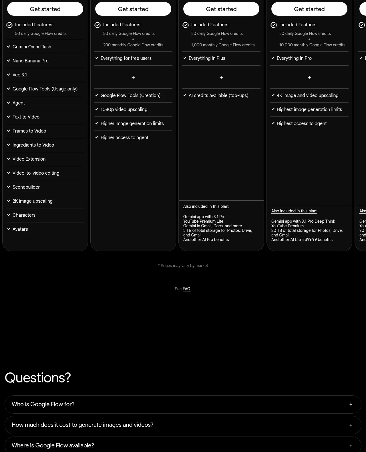 Questions and answers
Google Flow for iOS & Android · FAQ
Questions and answers
Google Flow for iOS & Android · FAQ
 Minimal legal footer
Google Flow for iOS & Android · Footer
Minimal legal footer
Google Flow for iOS & Android · Footer