kage
kage
flow.google.com
Design analysis
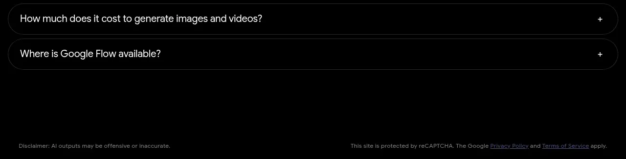
A quiet footer closes the page with small legal and policy text on the same black canvas. Its low visual weight keeps attention on the product and FAQ.
Prompt preview
## Reference images

Study these alongside the description below: hierarchy, rhythm, spacing, colour. Build for the product you are asked about, using this design language.

- Component: https://kage-design-assets.t3.tigrisfiles.io/components/google-flow-for-ios-android/998b1c85-b331-490a-bec1-b2413c6fadd0-1790056898-10.webp
- Full page it was cut from: https://kage-design-assets.t3.tigrisfiles.io/screenshots/google-flow-for-ios-android/998b1c85-b331-490a-bec1-b2413c6fadd0-1790056849877-full.webp
- Component on Kage: https://kage.design/component/google-flow-for-ios-android-footer

## Before you start
Ask what legal links, copyright notice, accessibility statement, and support destinations the user's product requires. Apply the user's brand and legal language.

Build a minimal dark footer with a thin top divider, small muted legal text, and a compact row of privacy, terms, accessibility, and support links. Use #000 background, #666–#888 text, 10–12px type, 20–32px horizontal padding, and generous top/bottom spacing. Align legal copy and links cleanly on desktop, then stack them on mobile. Ensure adequate contrast, keyboard focus styles, and no unnecessary visual decoration.

Never: use logos, product names, copy, illustrations, or imagery from the reference.