kage
kage
flow.google.com
Design analysis
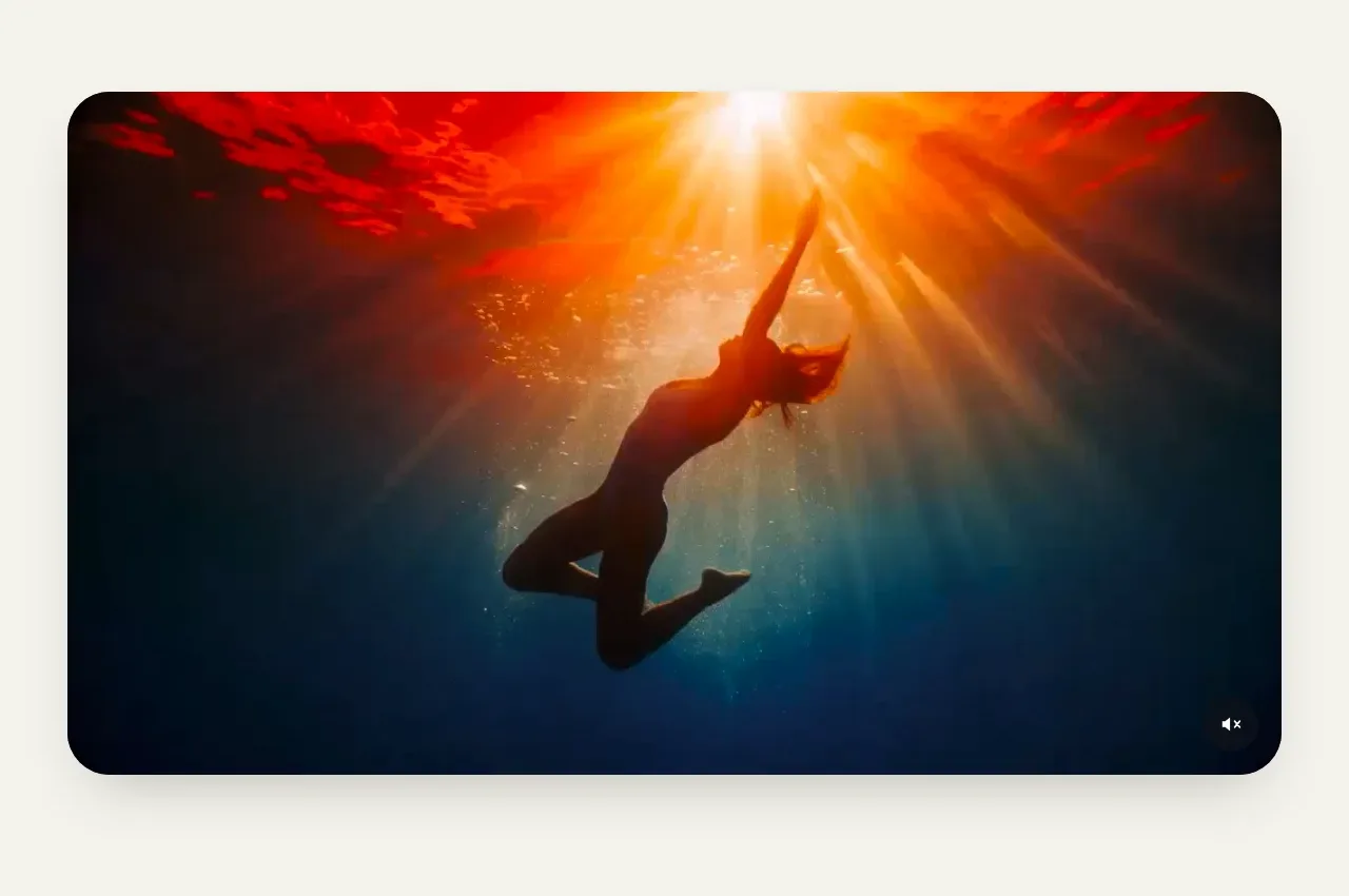
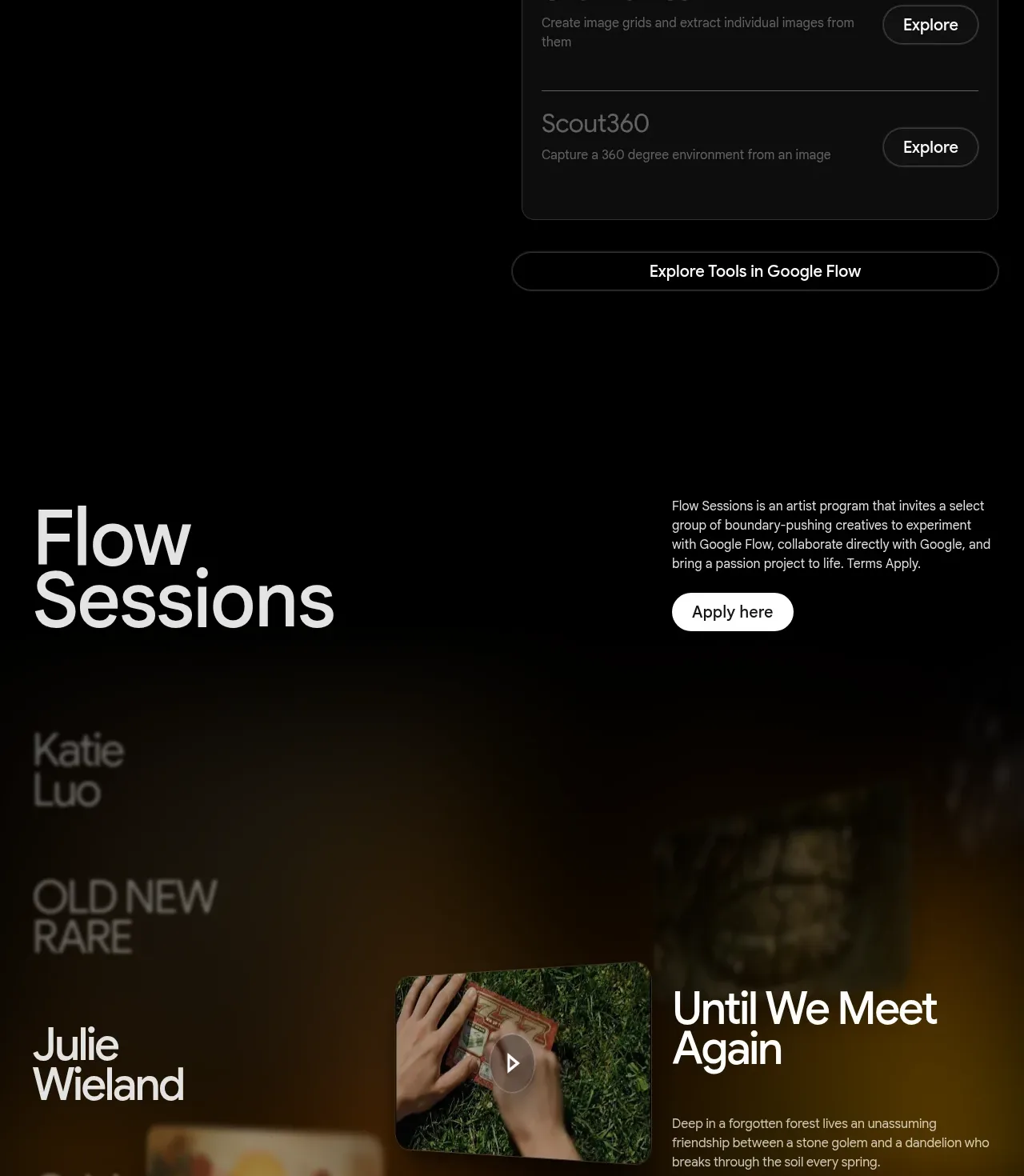
A large editorial title and application callout introduce a dark, image-led session gallery. The selected story combines a thumbnail, title, description, watch action, and directional controls.
Prompt preview
## Reference images

Study these alongside the description below: hierarchy, rhythm, spacing, colour. Build for the product you are asked about, using this design language.

- Component: https://kage-design-assets.t3.tigrisfiles.io/components/google-flow-for-ios-android/998b1c85-b331-490a-bec1-b2413c6fadd0-1790056897-7.webp
- Full page it was cut from: https://kage-design-assets.t3.tigrisfiles.io/screenshots/google-flow-for-ios-android/998b1c85-b331-490a-bec1-b2413c6fadd0-1790056849877-full.webp
- Component on Kage: https://kage.design/component/google-flow-for-ios-android-gallery

## Before you start
Ask what community stories, case studies, or creative sessions the user's product should showcase. Apply the same editorial pattern with original content.

Create an editorial featured-gallery section on black. Start with a large left-aligned title and a compact right-side description plus a bright pill application or participation CTA. Below, use a wide, softly blurred or darkened media backdrop with a selected story composition: small preview image, prominent story title, short description, a text watch link, and circular up/down or previous/next controls. Use white typography, muted gray supporting copy, warm or cool atmospheric overlays depending on the brand, and 10–14px rounded media corners. Keep the gallery responsive: on mobile, stack title, callout, and selected story; support swipe, keyboard navigation, and visible focus states.

Never: use logos, product names, copy, illustrations, or imagery from the reference.