 kage
kage
grimoai.com

Design analysis
A centered dark closing band repeats the core outcome in a short headline and pairs it with one bright pill-shaped download action.
Prompt preview
## Reference images

Study these alongside the description below: hierarchy, rhythm, spacing, colour. Build for the product you are asked about, using this design language.

- Component: https://kage-design-assets.t3.tigrisfiles.io/components/grimo-ai/49d17de6-ec9e-4ad1-a407-f0ba9cfffa22-1789538766-6.webp
- Full page it was cut from: https://kage-design-assets.t3.tigrisfiles.io/screenshots/grimo-ai/49d17de6-ec9e-4ad1-a407-f0ba9cfffa22-1789538658825-full.webp
- Component on Kage: https://kage.design/component/grimo-cta

## Before you start
Ask me what final action matters most for my product and what concise outcome should motivate it. Then create a closing CTA in my brand voice.

Build a centered, high-contrast closing CTA on a near-black background (`#151515`). Use generous top and bottom padding, a small original decorative product element if useful, a bold white two-line headline around 32–40px, and one light pill CTA with dark text. Keep the composition narrow and centered so the message feels decisive. Use a 999px radius, 14–16px horizontal padding, and a subtle hover state that shifts the button to `#e9e9e9` or adds a slight lift. Avoid extra navigation or competing actions.

Never: use logos, product names, copy, illustrations or imagery from the reference.
More components
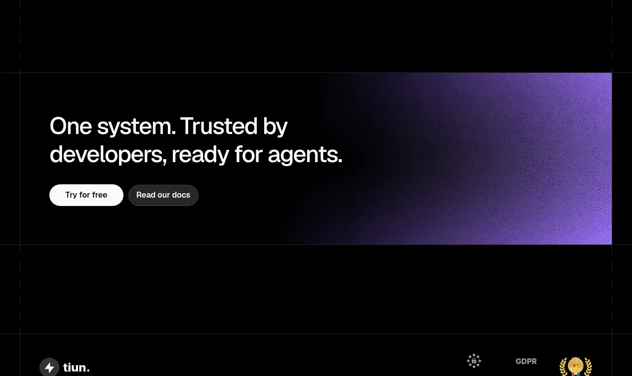
 Final conversion banner
tiun. · Call to action
Final conversion banner
tiun. · Call to action

 Mobile app conversion CTA
Payflip · Call to action
Mobile app conversion CTA
Payflip · Call to action
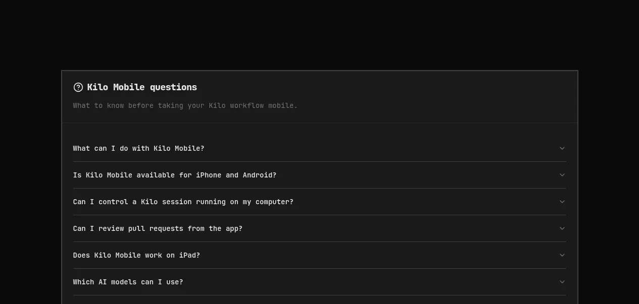
 Download conversion panel
Kilo Code for iOS and Android · Call to action
Download conversion panel
Kilo Code for iOS and Android · Call to action
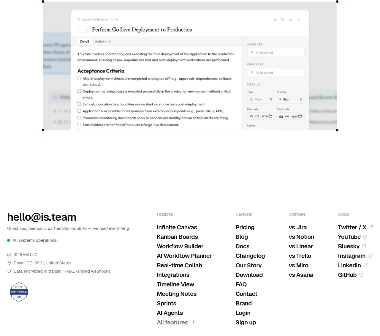
 Final conversion CTA
is.team · Call to action
Final conversion CTA
is.team · Call to action

 Studio closing call to action
FATHER · Call to action
Studio closing call to action
FATHER · Call to action
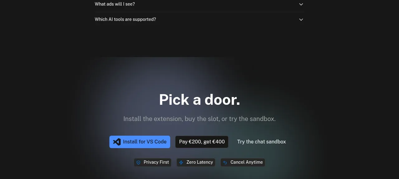
 Final conversion panel
Idlen · Call to action
Final conversion panel
Idlen · Call to action