kage
kage
grimoai.com
Design analysis
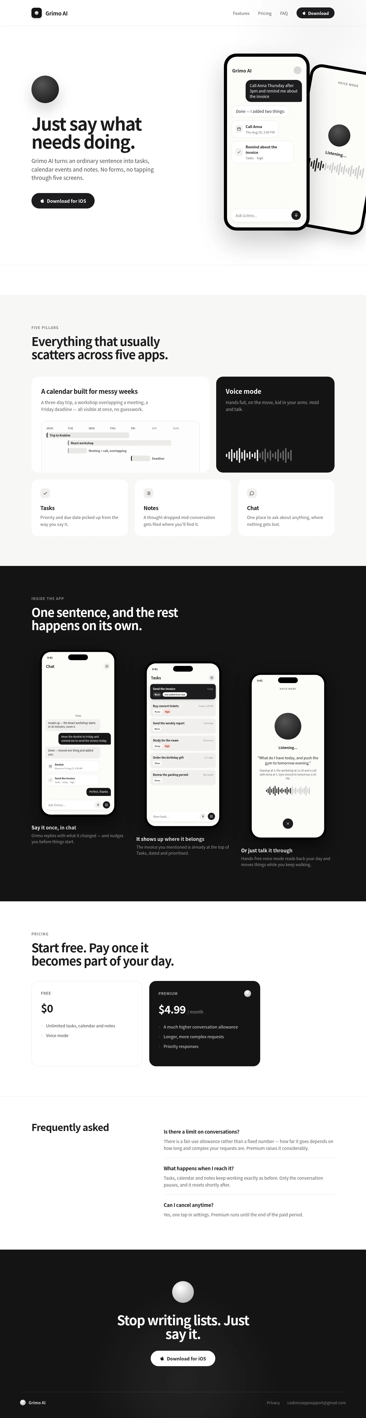
A strictly monochrome landing page that alternates light and dark bands to create rhythm: white hero with two overlapping phone mockups, a warm-gray bento grid for the "five pillars", a near-black band showcasing three staggered app screens, then light pricing and FAQ before a dark closing CTA. Hierarchy is built entirely from oversized tight-tracked headlines, letter-spaced uppercase eyebrows and gray body copy — never from colour, with inversion to black reserved for the voice-mode card and premium plan. A soft 3D sphere and waveform bars recur as brand motifs, and every device mockup contains real, readable mini UI instead of decorative screenshots.
Prompt preview
## Reference images

Study these alongside the description below: hierarchy, rhythm, spacing, colour. Build for the product you are asked about, using this design language.

- Full page: https://kage-design-assets.t3.tigrisfiles.io/screenshots/grimo-ai/49d17de6-ec9e-4ad1-a407-f0ba9cfffa22-1789538658825-full.webp
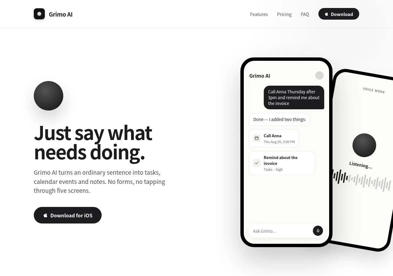
- Above the fold: https://kage-design-assets.t3.tigrisfiles.io/screenshots/grimo-ai/49d17de6-ec9e-4ad1-a407-f0ba9cfffa22-1789538657274.webp
- Design on Kage: https://kage.design/designs/grimo-landing-page

## Before you start
Ask the user what they are building, who it is for, and what brand assets they already have (name, logo, colours, typeface). Wait for the answers before writing any code. Everything below is a design system to apply to *their* product, not the reference site.

## Page structure
1. **Top nav** — slim bar on white with a hairline bottom border: small rounded-square logo mark + wordmark on the left; three plain text links and one solid black pill button on the right.
2. **Hero** — two columns on white with a faint vertical gradient. Left: a soft 3D sphere graphic above a ~60px bold two-line headline, a 2–3 line gray subcopy paragraph, and a single black pill CTA. Right: two overlapping phone mockups — the front one a chat thread (dark user bubble, confirmation reply, two task/event cards), the back one rotated ~10° showing a voice screen with a waveform.
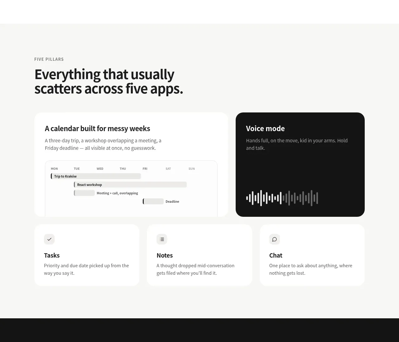
3. **Feature bento** — light gray full-width band. Letter-spaced uppercase eyebrow, then a large two-line headline. Bento grid: a row of two large cards (a white card containing a working mini week-calendar UI; a near-black card with a big waveform visualization), followed by a row of three compact icon cards. Each card has a title, one or two gray sentences, and some believable UI content.
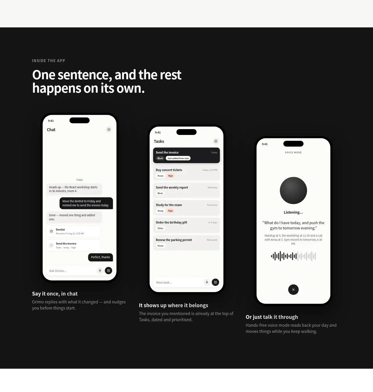
4. **Dark showcase** — near-black band. Eyebrow + white headline, then three phone mockups in a row at staggered vertical offsets. Under each, a bold white caption plus one gray sentence of detail. One screen per core capability.
5. **Pricing** — light band. Eyebrow + headline, then exactly two cards: a white free tier ($0, short bullet list) and a near-black paid tier (large price, small "/month", 3 short bullets, small sphere motif in the corner).
6. **FAQ** — two columns: left a large "Frequently asked" heading; right three Q&As with bold questions, gray answers and hairline rules between items.
7. **Closing CTA + footer** — dark band: centered sphere, big white headline, one white pill button; below it a slim footer row with mark + name on the left, privacy link and support email on the right.

## Design language
- **Colour:** strictly monochrome — white `#ffffff`, warm paper gray `#f1f0ee` for alternate bands, near-black `#141414` for dark bands and inverted cards, text at `#111111` and `#6f6f6f`. No decorative brand colour; at most one functional red for priority chips *inside* app mockups.
- **Section rhythm:** alternate light and dark full-width bands (light → gray → dark → light → dark) so tone changes every one or two screens; dark bands always showcase the product, light bands carry information.
- **Type:** one neutral sans family. Display headlines bold with tight tracking (≈ -0.02em): hero ~60px, section heads ~42px, card titles ~20px, body 15–16px at 1.5–1.6 line height. Eyebrow labels 11–12px uppercase with +0.12em tracking in gray.
- **Hierarchy by size, weight and tone, never by colour** — the gray body copy is what makes the black headlines feel loud.
- **Layout:** one centered container ~1120px wide; generous section padding (~96–128px vertical); hero left-aligned, grids 2-up then 3-up.
- **Cards:** 20–24px radius, 1px hairline border (`#e7e5e1` on light, `#2a2a2a` on dark), near-invisible shadow. Inside cards, render real product UI (mini calendars, task rows, chat bubbles) rather than stock illustrations.
- **Buttons:** full-radius pills; primary is solid black with white text and a small leading icon; on dark bands invert to white with black text. Exactly one CTA per band.
- **Motifs:** a soft 3D sphere (dark radial gradient, off-centre highlight) recurs in the hero, dark cards and final CTA; waveform bars of varied heights stand in for anything voice/audio-related.
- **Phone mockups:** ~44px outer radius, thin dark bezel, notch, and fully readable inner UI with concrete microcopy — the mockups are the proof, so keep their text real.
- **Copy:** short, concrete, conversational sentences; captions follow the pattern "bold capability — one gray sentence of detail".
- **Motion:** minimal — slight card hover lift and gentle mockup scale at most. No gradient ornaments, no coloured glows.

## Never
Do not reuse Grimo AI's name, logo, wordmark, copy, screenshots, sphere illustration or icon set. Never present the result as Grimo AI or imply any affiliation; apply this system to the user's own product and content only.
Components from this page
All components
 Minimal product navigation
Grimo AI · Navigation
Minimal product navigation
Grimo AI · Navigation
 Voice-first task capture hero
Grimo AI · Hero
Voice-first task capture hero
Grimo AI · Hero
 Five-pillar capability overview
Grimo AI · Feature grid
Five-pillar capability overview
Grimo AI · Feature grid
 Product workflow showcase
Grimo AI · Feature grid
Product workflow showcase
Grimo AI · Feature grid
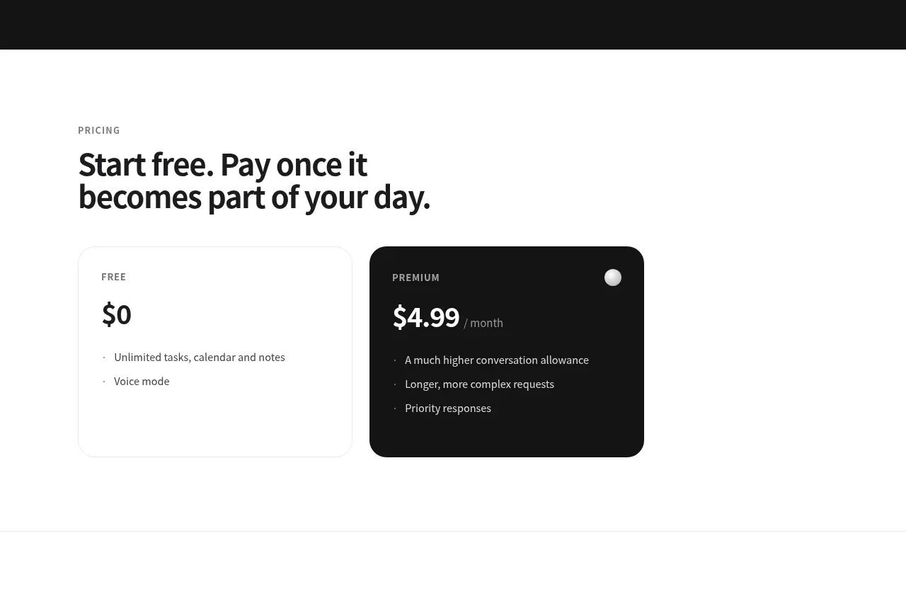 Free and premium pricing
Grimo AI · Pricing table
Free and premium pricing
Grimo AI · Pricing table
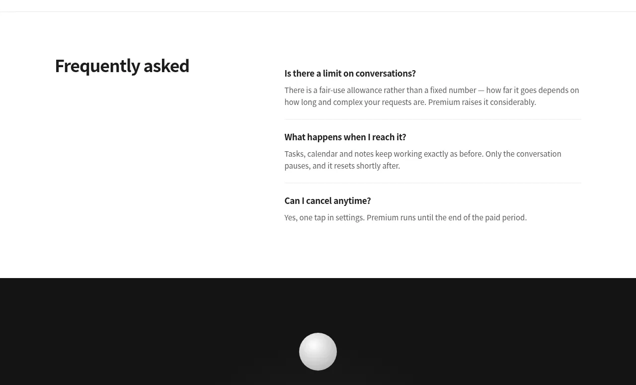 Frequently asked questions
Grimo AI · FAQ
Frequently asked questions
Grimo AI · FAQ
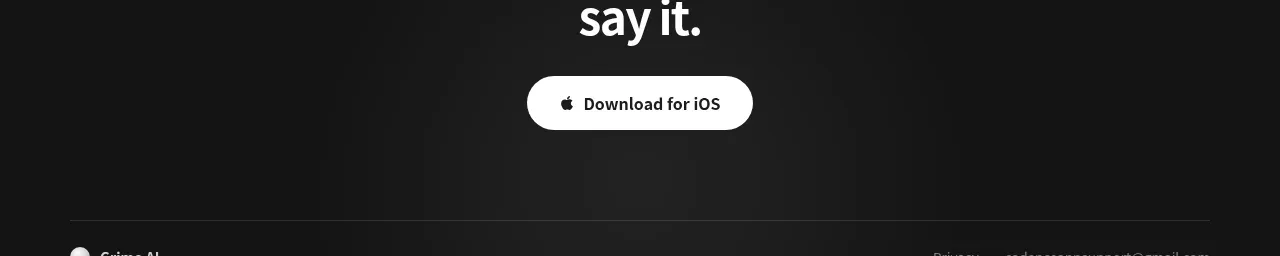 Final download call to action
Grimo AI · Call to action
Final download call to action
Grimo AI · Call to action
 Compact dark footer
Grimo AI · Footer
Compact dark footer
Grimo AI · Footer