kage
kage
grimoai.com
Design analysis
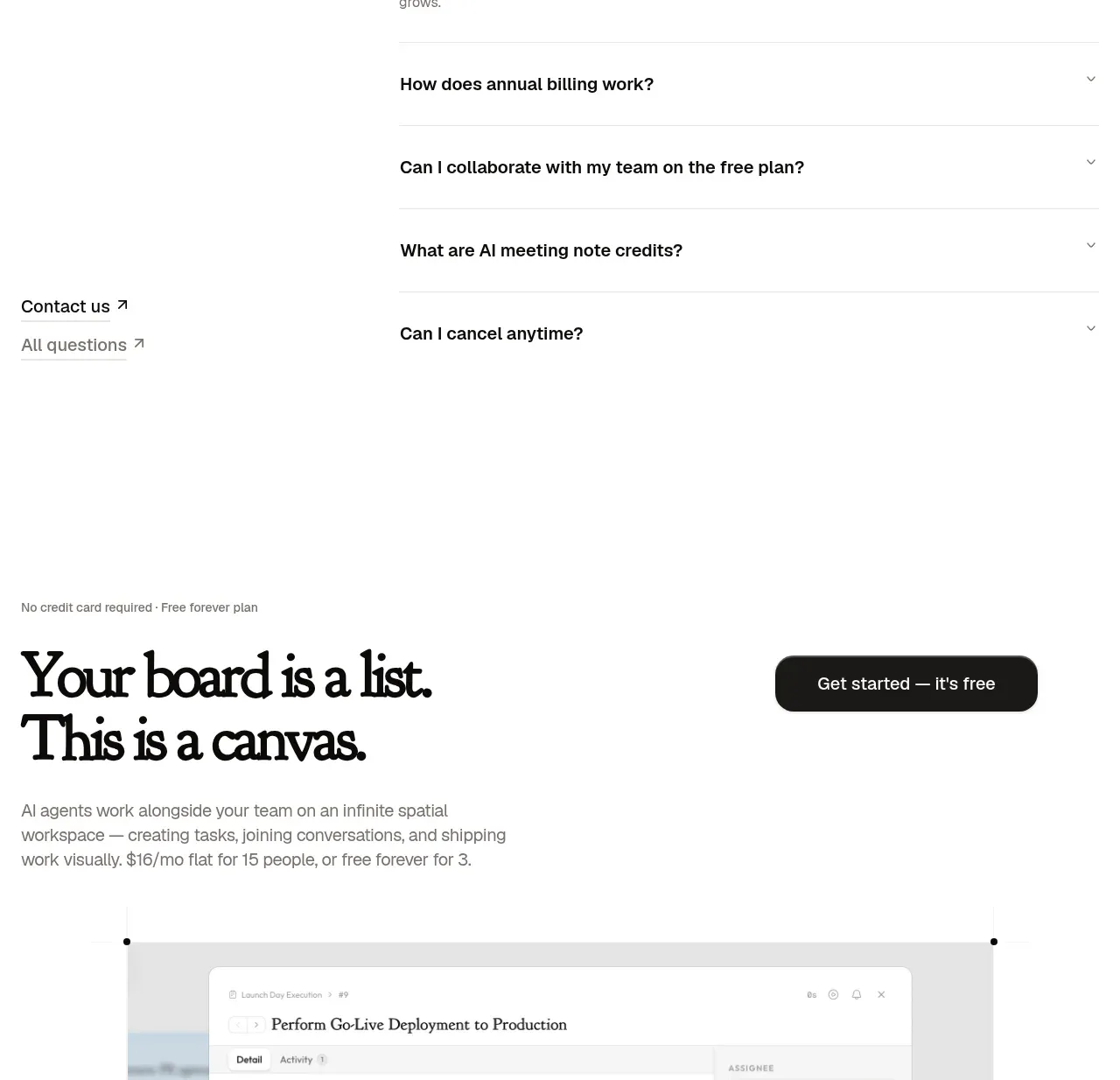
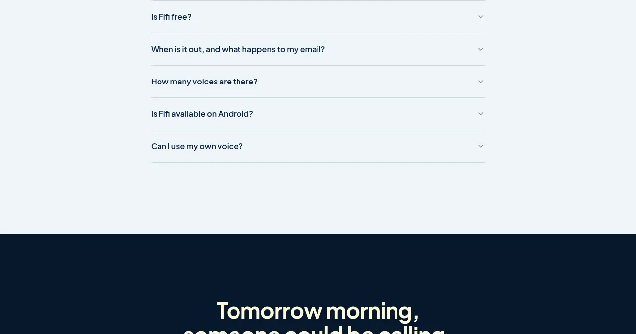
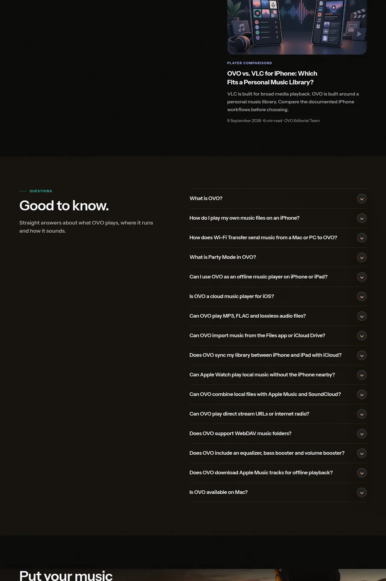
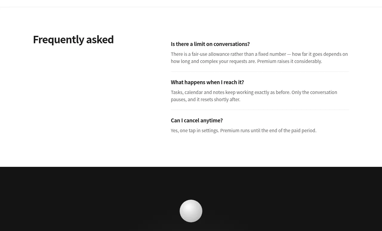
The FAQ uses a clear two-column composition: a strong section heading on the left and a short list of separated question-and-answer rows on the right.
Prompt preview
## Reference images

Study these alongside the description below: hierarchy, rhythm, spacing, colour. Build for the product you are asked about, using this design language.

- Component: https://kage-design-assets.t3.tigrisfiles.io/components/grimo-ai/49d17de6-ec9e-4ad1-a407-f0ba9cfffa22-1789538766-5.webp
- Full page it was cut from: https://kage-design-assets.t3.tigrisfiles.io/screenshots/grimo-ai/49d17de6-ec9e-4ad1-a407-f0ba9cfffa22-1789538658825-full.webp
- Component on Kage: https://kage.design/component/grimo-faq

## Before you start
Ask me which objections, setup questions, and policy details users most need answered. Then build the FAQ around my product.

Create a spacious FAQ section on white or near-white (`#ffffff`). Use a max-width container around 744px and a two-column layout: a fixed left heading column and a wider answer column. Set the heading around 28–34px, bold, with a compact line-height. Each FAQ row should have a 14–15px semibold question, a 13–14px answer in muted gray (`#666666`), and a subtle horizontal divider (`#eeeeee`) with 20–24px vertical padding. If interactive, make each row keyboard-accessible with a visible plus/chevron, smooth open/close animation, and only one or several items open according to the product’s needs. Collapse to one column on narrow screens.

Never: use logos, product names, copy, illustrations or imagery from the reference.