kage
kage
grimoai.com

Design analysis
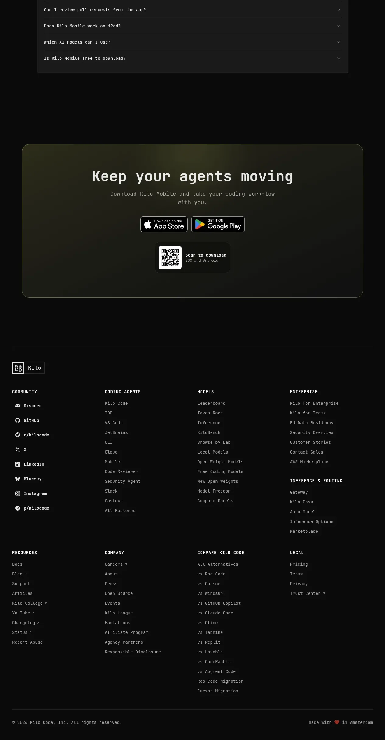
The footer is a thin dark utility row with a small brand marker on the left and muted legal/contact links on the right.
Prompt preview
## Reference images

Study these alongside the description below: hierarchy, rhythm, spacing, colour. Build for the product you are asked about, using this design language.

- Component: https://kage-design-assets.t3.tigrisfiles.io/components/grimo-ai/49d17de6-ec9e-4ad1-a407-f0ba9cfffa22-1789538766-7.webp
- Full page it was cut from: https://kage-design-assets.t3.tigrisfiles.io/screenshots/grimo-ai/49d17de6-ec9e-4ad1-a407-f0ba9cfffa22-1789538658825-full.webp
- Component on Kage: https://kage.design/component/grimo-footer

## Before you start
Ask me which legal links, contact details, and brand marker belong in my footer. Then build a minimal footer for my product.

Create a compact full-width footer continuing the dark CTA background (`#151515`) with a subtle top border (`#2b2b2b`). Use a centered max-width container around 744px, 16–20px vertical padding, and a small left-aligned brand marker plus text. Place muted utility links on the right in 11–12px gray (`#858585`), with 16–24px gaps. Keep typography understated and ensure links gain higher contrast on hover. Stack the two sides on mobile.

Never: use logos, product names, copy, illustrations or imagery from the reference.