 kage
kage
hanomi.ai
Design analysis
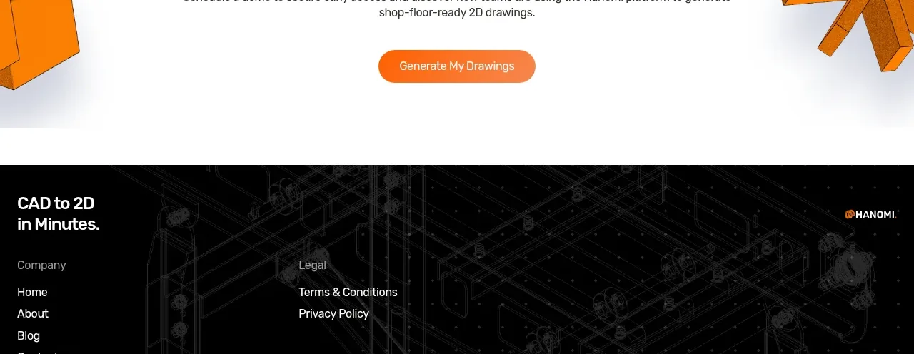
A centered CTA closes the light content area with a bold invitation, concise supporting text, a rounded orange button, and decorative mechanical forms pushed toward the outer edges.
Prompt preview
## Reference images

Study these alongside the description below: hierarchy, rhythm, spacing, colour. Build for the product you are asked about, using this design language.

- Component: https://kage-design-assets.t3.tigrisfiles.io/components/hanomi-ai/e6570335-e597-4dea-b51d-b53895fecbf1-1790500616-7.webp
- Full page it was cut from: https://kage-design-assets.t3.tigrisfiles.io/screenshots/hanomi-ai/e6570335-e597-4dea-b51d-b53895fecbf1-1790500563313-full.webp
- Component on Kage: https://kage.design/component/hanomi-cta

## Before you start
Ask what the user's product is, who it serves, and what its brand personality and visual identity are. Apply the following principles to that product rather than reproducing this reference.

Create a centered conversion section with generous vertical padding. Use a short bold heading, a two-line maximum supporting paragraph, and one prominent rounded pill button. Keep the content constrained to a readable max width and center aligned. Use a white or very light background, near-black text, and a warm orange gradient or solid accent button (#f97316 to #f59e0b) with white text. Optional abstract geometric accents may sit partially off-canvas at the far left and right, but they must not compete with the message. Include hover, focus, and pressed states, and stack cleanly on mobile.

Never: use logos, product names, copy, illustrations, or imagery from the reference.
More components

 Network growth CTA
godaylight.com · Call to action
Network growth CTA
godaylight.com · Call to action
 Split closing CTA
godaylight.com · Call to action
Split closing CTA
godaylight.com · Call to action

 Closing conversion banner
FastRouter.ai · Call to action
Closing conversion banner
FastRouter.ai · Call to action

 Final download call to action
Blenny · Call to action
Final download call to action
Blenny · Call to action

 Visual download call to action
Art4 · Call to action
Visual download call to action
Art4 · Call to action

 Sponsor call to action
opensend.cc · Call to action
Sponsor call to action
opensend.cc · Call to action