kage
kage
hanomi.ai
Design analysis
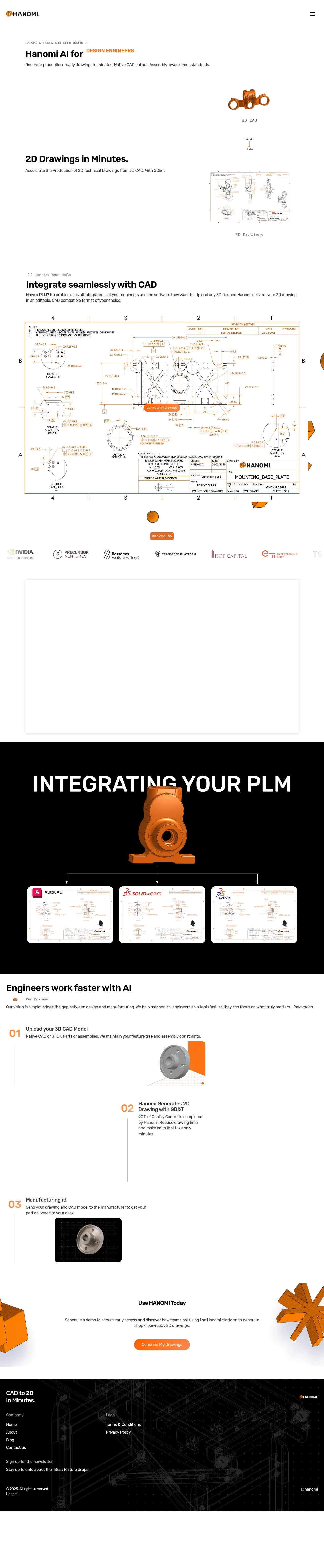
A restrained engineering-tool landing page built almost entirely in white with a single vivid orange accent (≈#E86A1C) and black type. The hero pairs a short editorial headline with floating 3D CAD renders, and the page's rhythm alternates white sections (hero, integration copy, oversized technical drawing, logo strip, numbered process) with a full-bleed black band ("INTEGRATING YOUR PLM") that provides the page's biggest contrast moment. Monospace micro-labels, real technical-drawing artifacts as imagery, and generous whitespace give it credibility with mechanical engineers, while the numbered 01–03 process and final dark CTA/footer give the page a clear, calm close.
Prompt preview
## Reference images

Study these alongside the description below: hierarchy, rhythm, spacing, colour. Build for the product you are asked about, using this design language.

- Full page: https://kage-design-assets.t3.tigrisfiles.io/screenshots/hanomi-ai/e6570335-e597-4dea-b51d-b53895fecbf1-1790500563313-full.webp
- Above the fold: https://kage-design-assets.t3.tigrisfiles.io/screenshots/hanomi-ai/e6570335-e597-4dea-b51d-b53895fecbf1-1790500557074.webp
- Design on Kage: https://kage.design/designs/hanomi-landing-page

## Before you start
Ask the user what they are building, who it is for, and what brand assets they already have (name, logo, colours, type). Wait for the answers; everything below is applied to their product, not the reference.

## Page structure
1. **Top nav**: thin white bar, small logo left, a minimal hamburger/menu icon right. Nothing else — no buttons crowding it.
2. **Hero**: small monospace eyebrow ("news/announcement" style with arrow), an editorial-size headline where one phrase is set in the accent colour, and one short subline. To the right/above, a floating 3D render of the product's output with a tiny monospace caption underneath ("3D CAD").
3. **Feature statement block**: a bold short heading ("output in minutes" style) with a one-line subhead, paired with a second annotated visual (the result of the product) and another monospace caption.
4. **Integration section**: small icon-plus-monospace label, then a strong heading and a two-sentence paragraph explaining compatibility.
5. **Hero artifact**: a full-width, oversized technical drawing / detailed product artifact with a small pill CTA overlaid in the centre and small floating accent shapes around it.
6. **Logo strip**: a small pill label ("Backed by") above a single row of 6–7 muted partner/investor logos.
7. **Light framed media panel**: a large soft-shadow rounded rectangle (video/demo placeholder).
8. **Dark band**: full-bleed black section with an enormous condensed uppercase headline, a centred 3D render, connector lines branching down to a 3-up row of white cards showing integrations.
9. **Process section**: white background; heading with an icon-and-monospace sublabel, one italic-touched vision sentence, then three numbered steps (01/02/03 in accent orange) alternating left/right with supporting visuals.
10. **CTA**: centred short heading, one sentence, and a single rounded accent-colour button; decorative 3D shapes bleed in from the corners.
11. **Footer**: dark near-black band with a monospace-style tagline top-left, two link columns (Company / Legal), newsletter signup lines, and a copyright row with social handle.

## Design language
- Two-tone discipline: everything is white or near-black; exactly one saturated accent (orange ≈ #E86A1C) used only for the eyebrow highlight, step numbers, small pills, and the primary button.
- Hierarchy is built from scale contrast: oversized grotesque headings (60–120px, tight leading) vs. small monospace captions/labels (11–12px, uppercase, letter-spaced). Body copy is small and short.
- Monospace micro-labels act as a recurring system: eyebrows, image captions, process tags all share it, giving an engineering-drawing feel.
- Rhythm down the page: airy white sections with huge whitespace → one full-bleed black band as the dramatic pivot → return to white for process → dark CTA/footer. Never two dark bands adjacent.
- Real product artifacts (drawings, renders) are the imagery; captions label them like figure annotations.
- Borders: hairline light-gray dividers around the drawing; cards use soft large-radius corners with very soft shadows (rgba(0,0,0,0.06), 40px blur).
- Buttons: single pill/rounded-rect accent button per page section; no secondary buttons competing.
- Motion: subtle — floating render in hero, small decorative accent shapes drifting near section edges; connector lines in the dark band suggest flow without animation.
- Dark sections use white display type at extreme size and keep content centred and sparse.

## Never
- Do not reuse the reference's name, logo, tagline, drawing images, renders, or partner logos.
- Do not copy its copy verbatim; write copy for the user's product.
- Do not add extra accent colours or gradients; keep the two-tone + one-accent system.
Components from this page
All components
 Minimal brand navigation
hanomi.ai · Navigation
Minimal brand navigation
hanomi.ai · Navigation
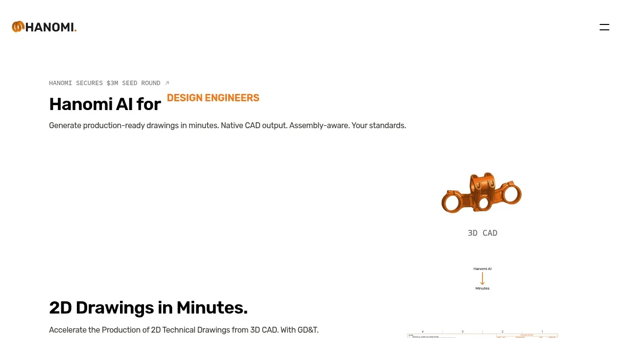 Technical CAD generation hero
hanomi.ai · Hero
Technical CAD generation hero
hanomi.ai · Hero
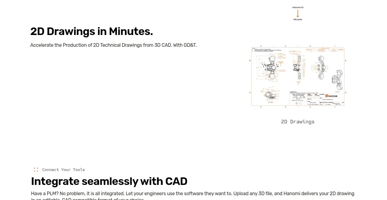 Two-dimensional drawing capability
hanomi.ai · Feature grid
Two-dimensional drawing capability
hanomi.ai · Feature grid
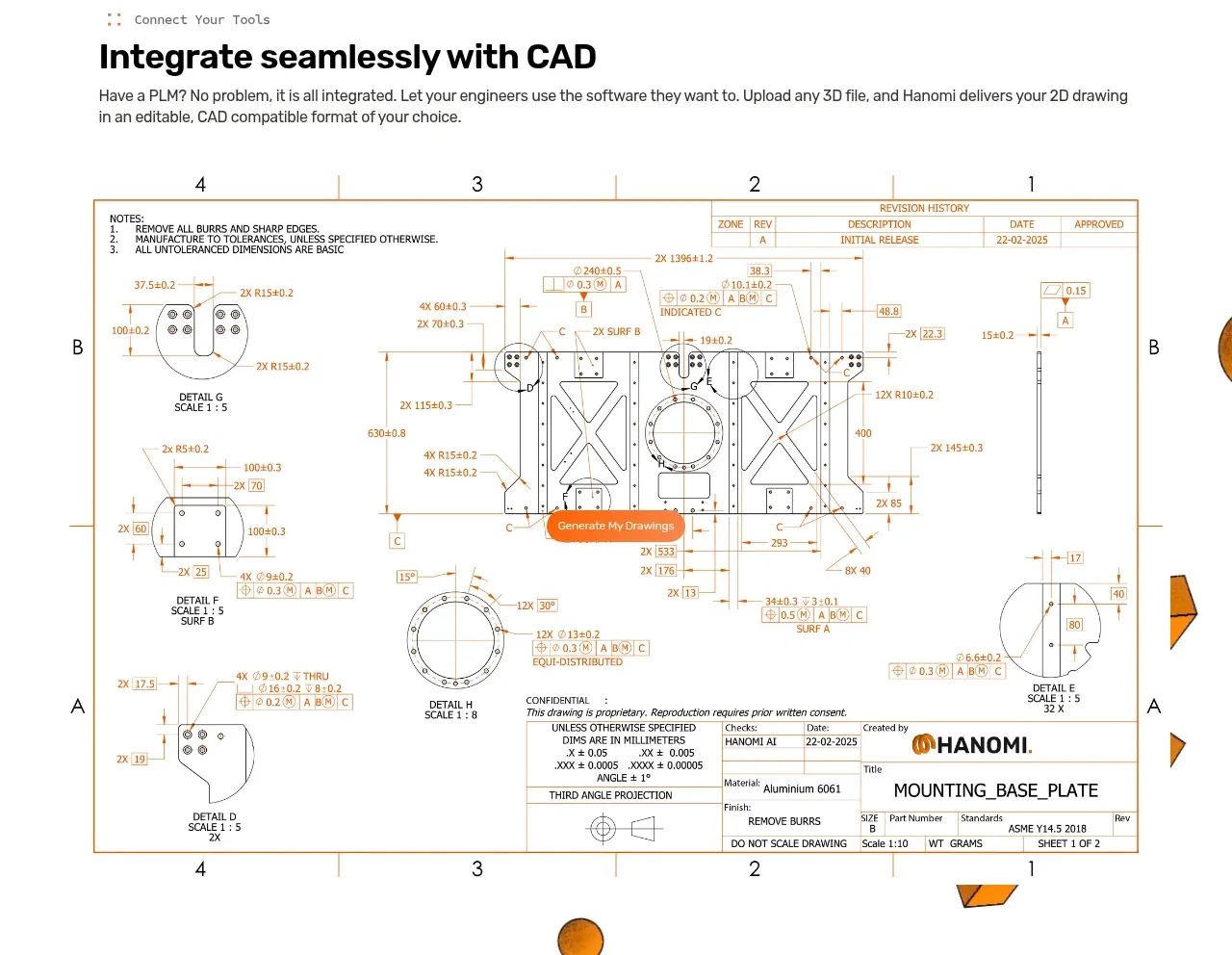 CAD integration workflow
hanomi.ai · Feature grid
CAD integration workflow
hanomi.ai · Feature grid
 Backed by investor logos
hanomi.ai · Logo cloud
Backed by investor logos
hanomi.ai · Logo cloud
 PLM integration compatibility
hanomi.ai · Feature grid
PLM integration compatibility
hanomi.ai · Feature grid
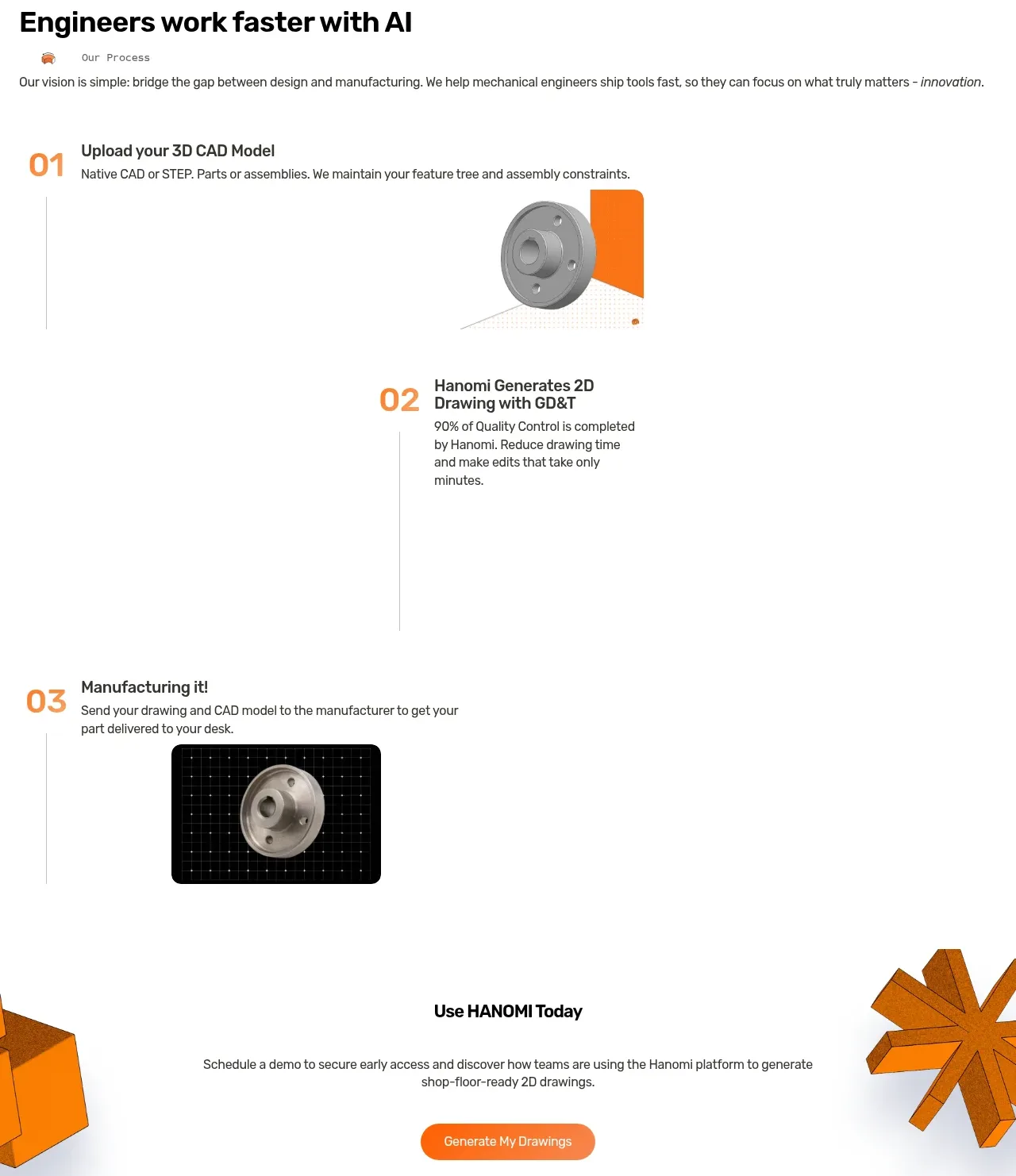 Three-step engineering workflow
hanomi.ai · Feature grid
Three-step engineering workflow
hanomi.ai · Feature grid
 Primary conversion call to action
hanomi.ai · Call to action
Primary conversion call to action
hanomi.ai · Call to action
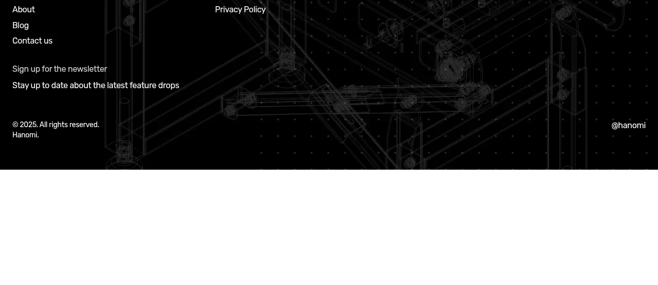 Dark technical footer
hanomi.ai · Footer
Dark technical footer
hanomi.ai · Footer