kage
kage
hanomi.ai

Design analysis
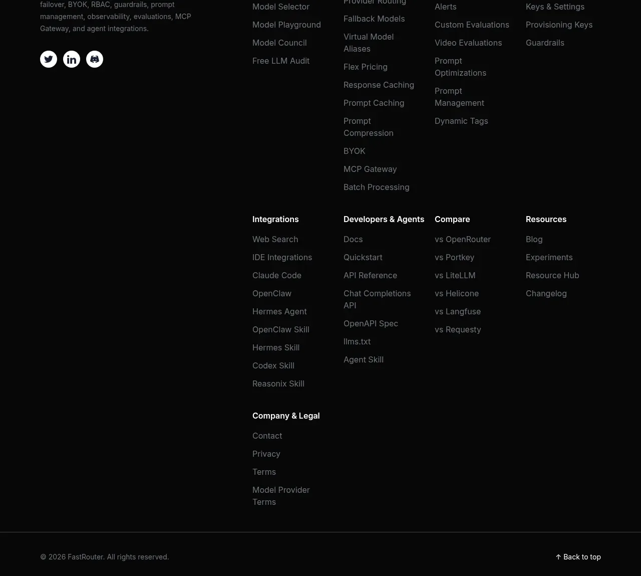
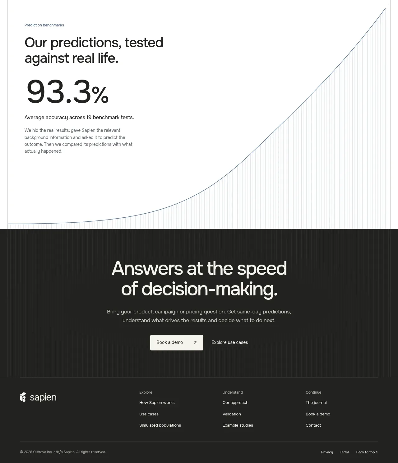
The footer switches to a dark technical background, pairing a short positioning statement with grouped company/legal links, newsletter copy, copyright, and a small right-aligned handle.
Prompt preview
## Reference images

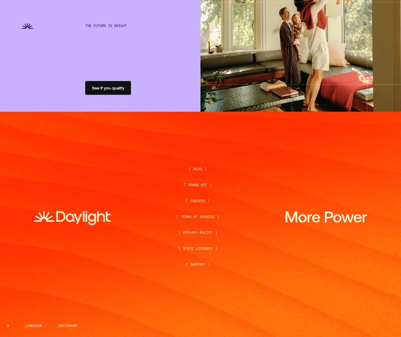
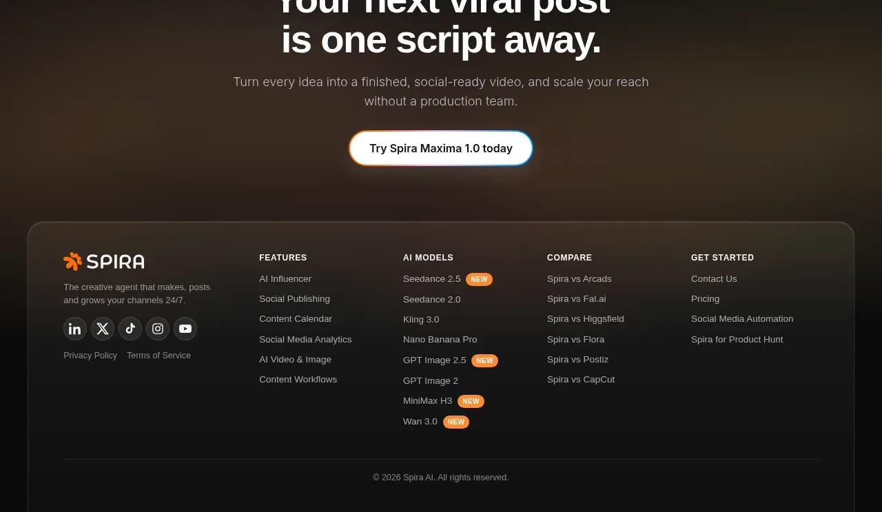
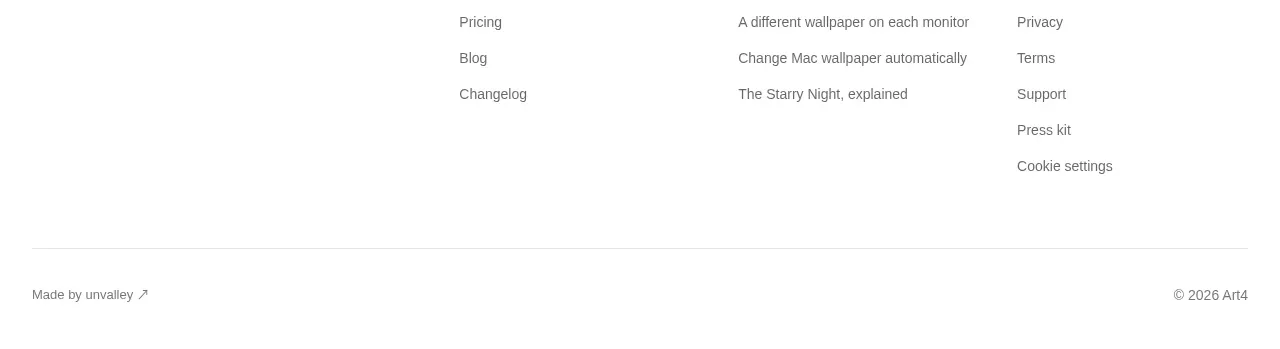
Study these alongside the description below: hierarchy, rhythm, spacing, colour. Build for the product you are asked about, using this design language.

- Component: https://kage-design-assets.t3.tigrisfiles.io/components/hanomi-ai/e6570335-e597-4dea-b51d-b53895fecbf1-1790500616-8.webp
- Full page it was cut from: https://kage-design-assets.t3.tigrisfiles.io/screenshots/hanomi-ai/e6570335-e597-4dea-b51d-b53895fecbf1-1790500563313-full.webp
- Component on Kage: https://kage.design/component/hanomi-footer

## Before you start
Ask what the user's product is, who it serves, and what its brand personality and visual identity are. Apply the following principles to that product rather than reproducing this reference.

Build a full-width dark footer with a subtle low-contrast technical pattern or grid texture. Use a responsive multi-column layout: a short brand positioning statement, a company links column, a legal links column, and a newsletter or contact area. Keep text white or soft gray, with muted secondary text and one small accent detail. Add a thin top border or quiet separation from the preceding CTA. Use 14–16px body text, 11–12px labels, 48–72px desktop horizontal padding, and enough bottom spacing for copyright and a small social/contact handle. On mobile, collapse into stacked groups with clear headings and generous tap targets.

Never: use logos, product names, copy, illustrations, or imagery from the reference.