 kage
kage
harbor.my
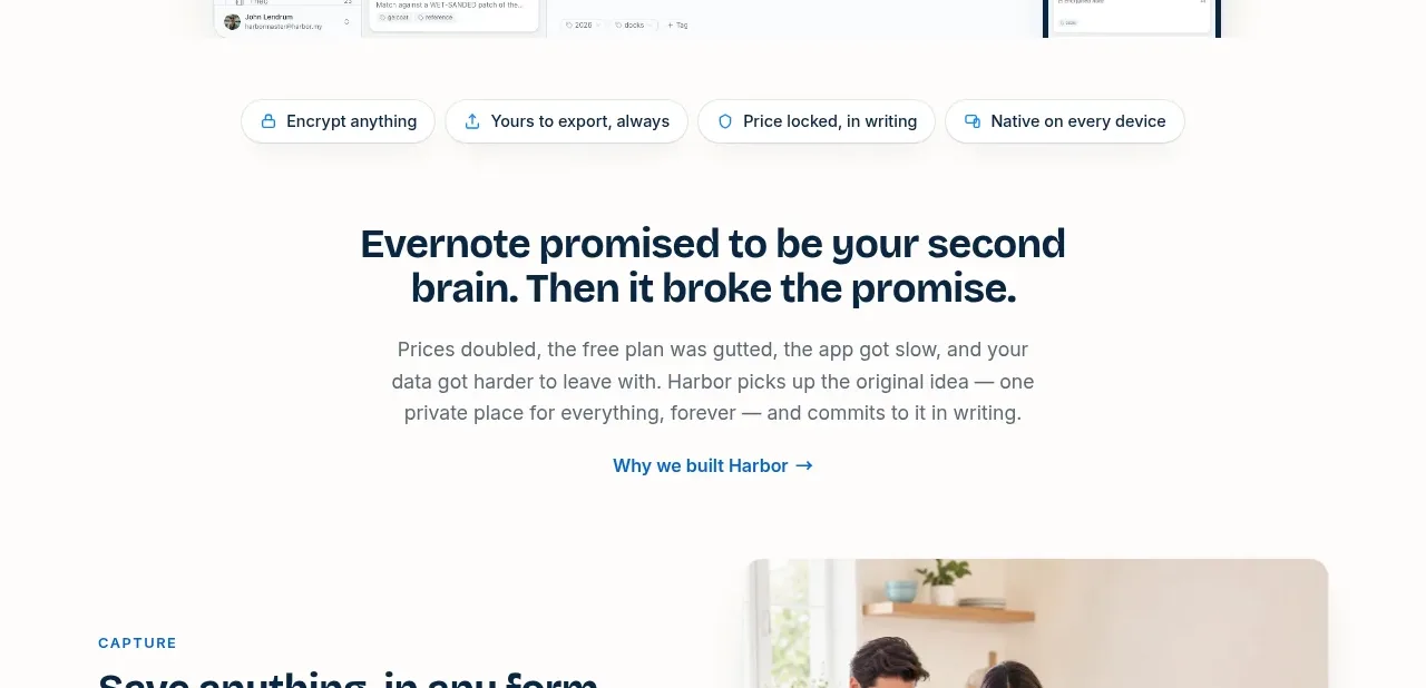
Design analysis
A quiet transition section frames the market problem with a strong statement, supporting explanation, and a single contextual link before product capabilities begin.
Prompt preview
## Reference images

Study these alongside the description below: hierarchy, rhythm, spacing, colour. Build for the product you are asked about, using this design language.

- Component: https://kage-design-assets.t3.tigrisfiles.io/components/harbor/210c2f1c-cc35-4a7c-ab88-9680504ac3f6-1789970604-2.webp
- Full page it was cut from: https://kage-design-assets.t3.tigrisfiles.io/screenshots/harbor/210c2f1c-cc35-4a7c-ab88-9680504ac3f6-1789970506977-full.webp
- Component on Kage: https://kage.design/component/harbor-cta

## Before you start
Ask what the user's product, audience, and brand are, then apply the principles below to that product rather than reproducing the reference.

Build a centered problem-framing section with a generous top and bottom rhythm. Use a compact trust or benefit strip near the top if useful, followed by a two-line bold headline, a readable paragraph constrained to roughly 500px, and one small inline link with an arrow. Keep the section visually calm and editorial: warm white background `#FCFBF9`, navy heading `#09243A`, gray body copy `#687178`, and blue links `#176FA8`. Use 48–72px vertical padding, 16–20px heading line height, and avoid adding competing buttons. The purpose is to create narrative momentum from the hero into the feature story.

Never use logos, product names, copy, illustrations, or imagery from the reference.
More components
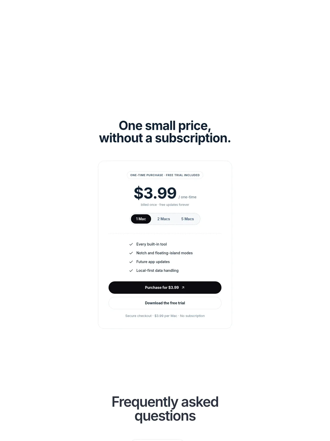
 Visual closing product statement
NotchPop · Call to action
Visual closing product statement
NotchPop · Call to action
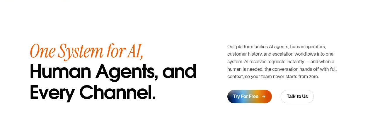
 System positioning statement
IntellAgents.io · Call to action
System positioning statement
IntellAgents.io · Call to action
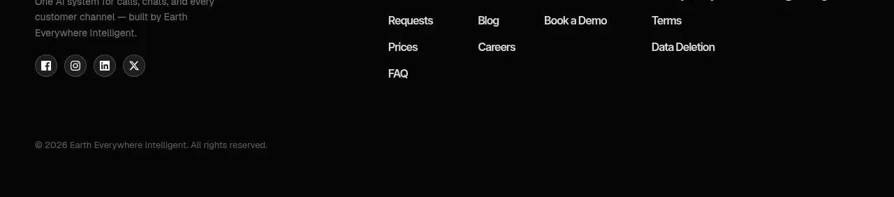 Final conversion banner
IntellAgents.io · Call to action
Final conversion banner
IntellAgents.io · Call to action
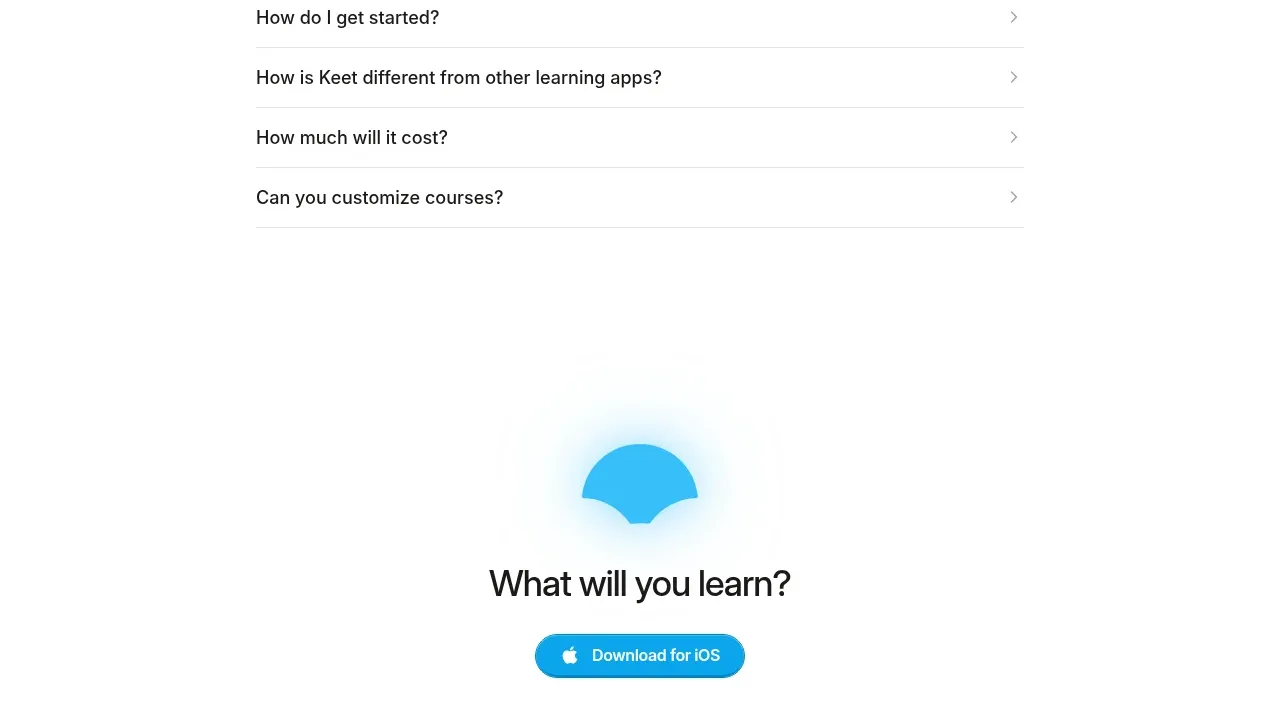
 Final app-download call to action
Keet · Call to action
Final app-download call to action
Keet · Call to action
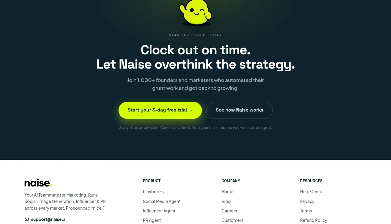
 Dark conversion call to action
Naise AI · Call to action
Dark conversion call to action
Naise AI · Call to action
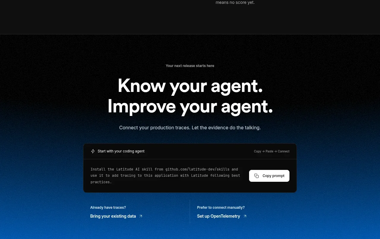
 Connect data and start improving
AgentScore · Call to action
Connect data and start improving
AgentScore · Call to action