 kage
kage
harbor.my
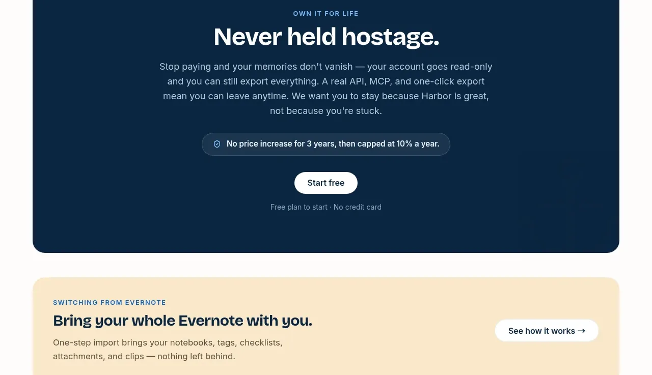
Design analysis
A dark, high-contrast panel turns ownership and portability promises into a memorable closing argument with one primary CTA.
Prompt preview
## Reference images

Study these alongside the description below: hierarchy, rhythm, spacing, colour. Build for the product you are asked about, using this design language.

- Component: https://kage-design-assets.t3.tigrisfiles.io/components/harbor/210c2f1c-cc35-4a7c-ab88-9680504ac3f6-1789970605-7.webp
- Full page it was cut from: https://kage-design-assets.t3.tigrisfiles.io/screenshots/harbor/210c2f1c-cc35-4a7c-ab88-9680504ac3f6-1789970506977-full.webp
- Component on Kage: https://kage.design/component/harbor-cta-2

## Before you start
Ask what the user's product, audience, and brand are, then apply the principles below to that product rather than reproducing the reference.

Create a large centered CTA panel with a deep navy background around `#092A46`, 24px radius, and ample internal whitespace. Use a small uppercase eyebrow, a high-contrast white headline, a constrained supporting paragraph, a pill-shaped reassurance badge, and one light primary button followed by a small note. Center the content and make the hierarchy feel confident rather than salesy. Add a subtle tonal gradient or texture only if it improves depth. Buttons should have 999px radius, clear hover contrast, and keyboard focus states.

Never use logos, product names, copy, illustrations, or imagery from the reference.
More components
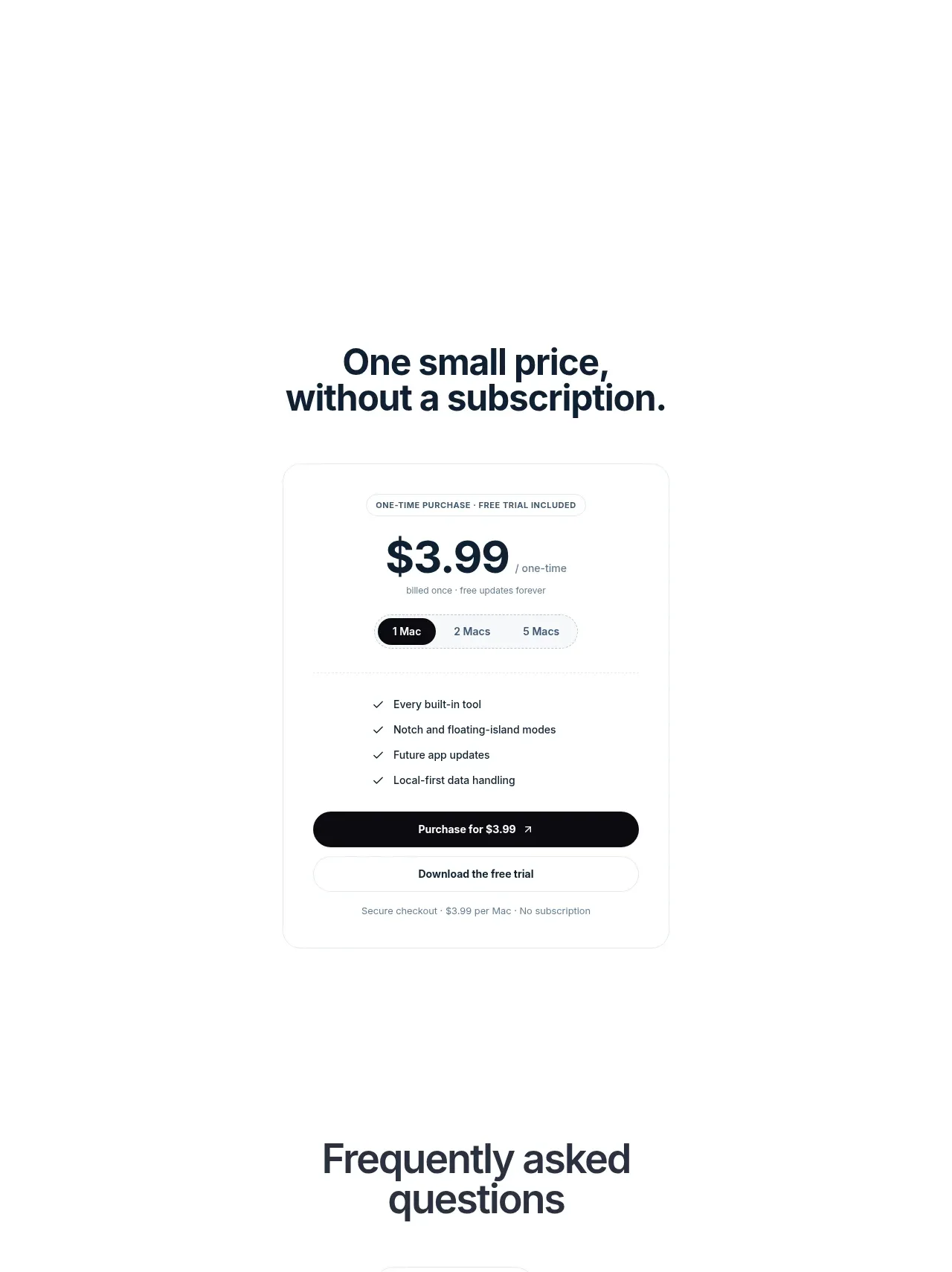
 Visual closing product statement
NotchPop · Call to action
Visual closing product statement
NotchPop · Call to action
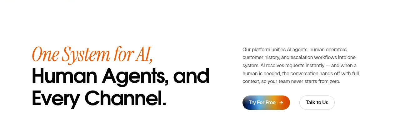
 System positioning statement
IntellAgents.io · Call to action
System positioning statement
IntellAgents.io · Call to action
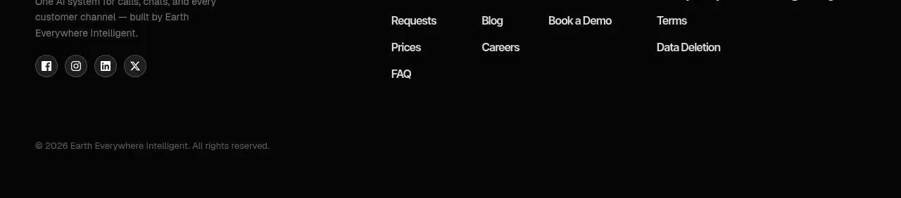 Final conversion banner
IntellAgents.io · Call to action
Final conversion banner
IntellAgents.io · Call to action
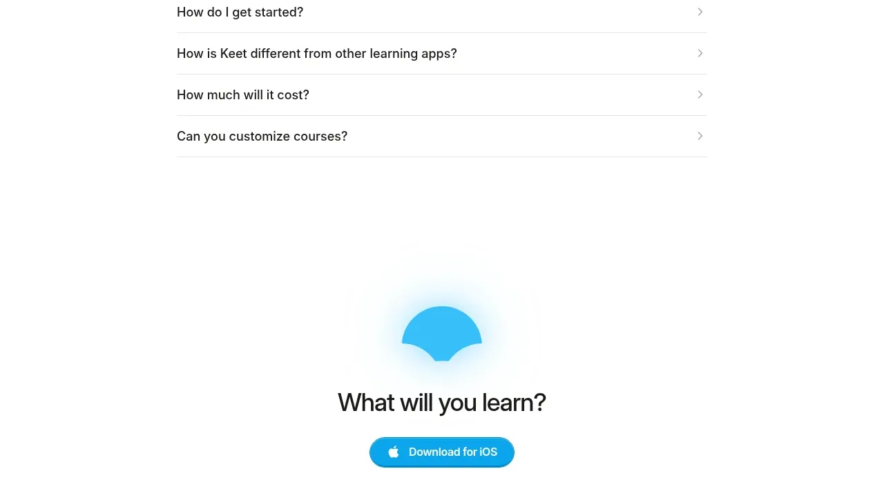
 Final app-download call to action
Keet · Call to action
Final app-download call to action
Keet · Call to action
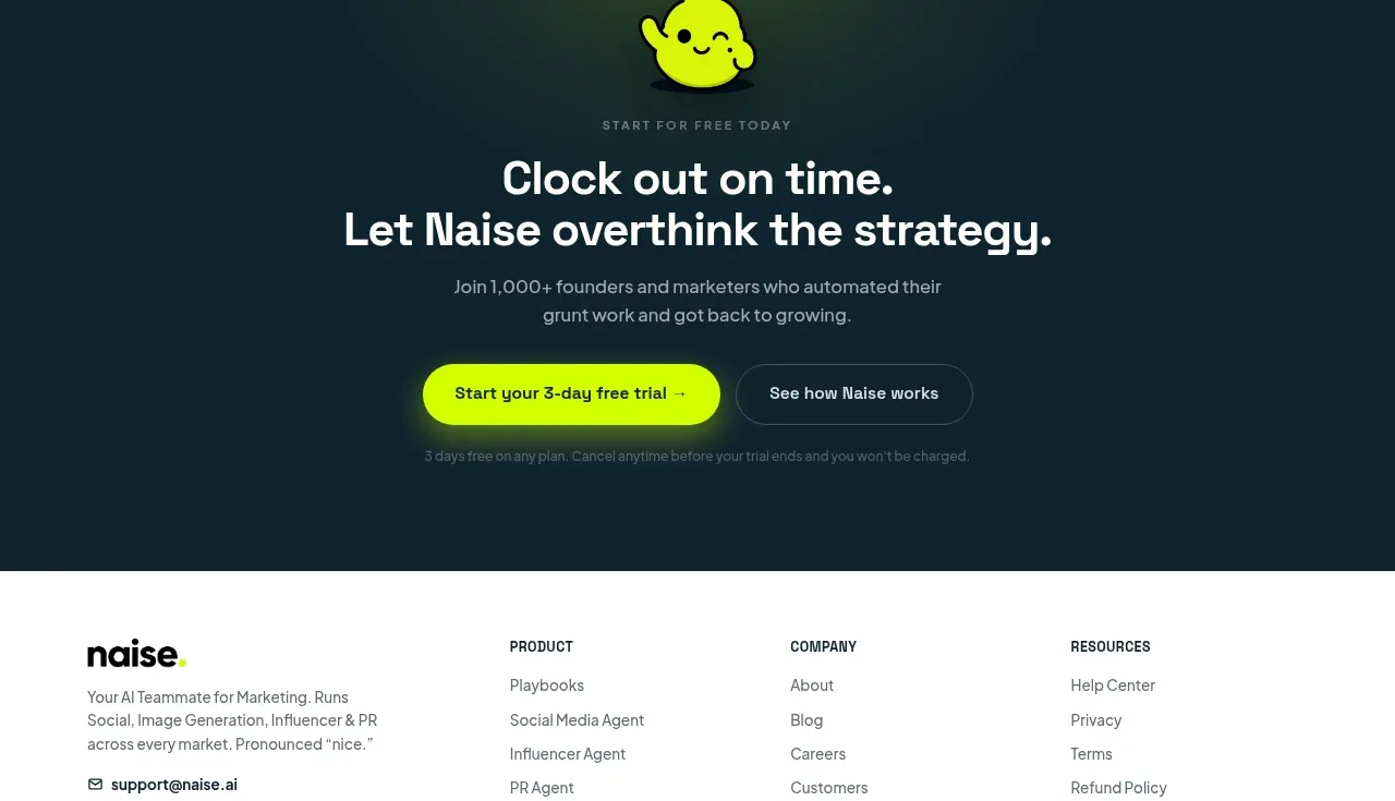
 Dark conversion call to action
Naise AI · Call to action
Dark conversion call to action
Naise AI · Call to action
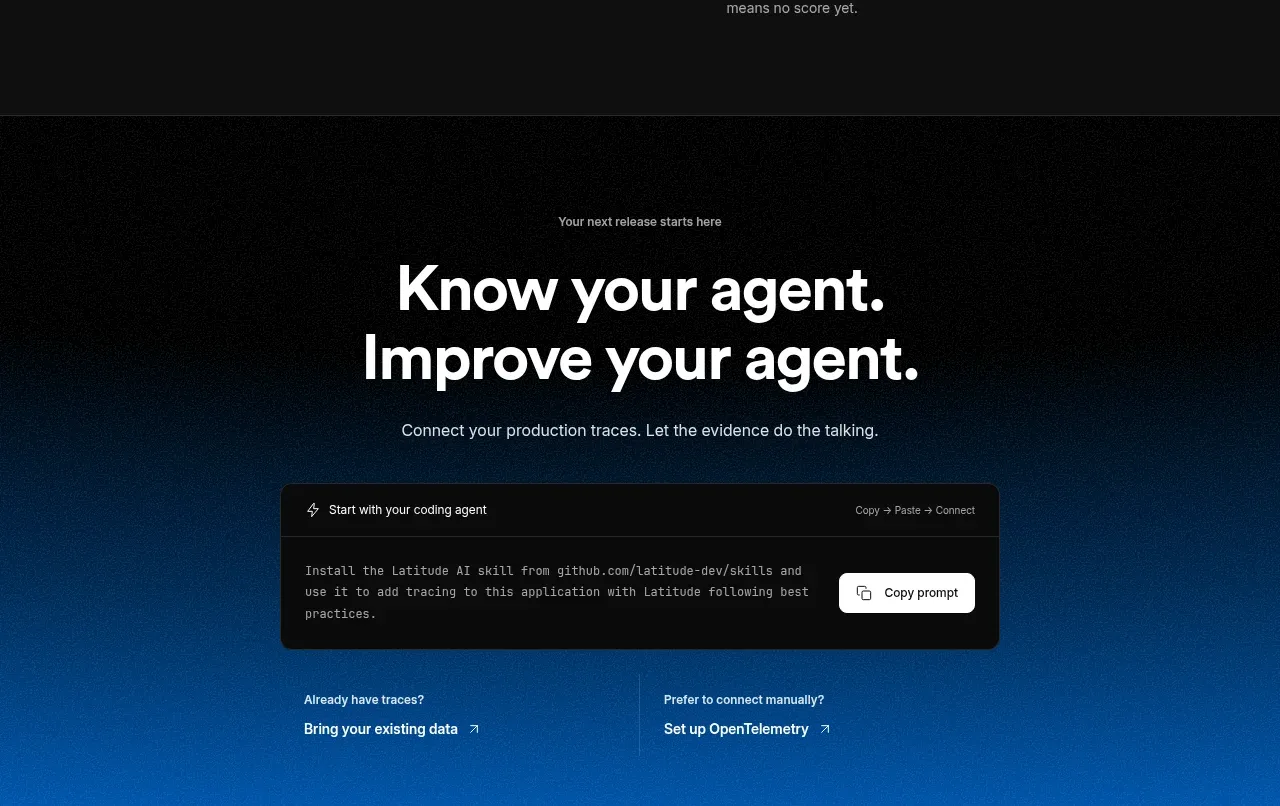
 Connect data and start improving
AgentScore · Call to action
Connect data and start improving
AgentScore · Call to action