 kage
kage
harbor.my
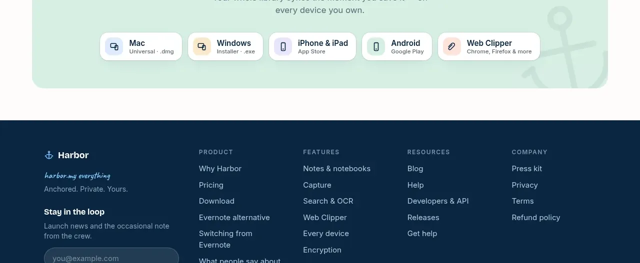
Design analysis
A mint-tinted download panel closes the product story by presenting platform options as compact buttons under a direct acquisition message.
Prompt preview
## Reference images

Study these alongside the description below: hierarchy, rhythm, spacing, colour. Build for the product you are asked about, using this design language.

- Component: https://kage-design-assets.t3.tigrisfiles.io/components/harbor/210c2f1c-cc35-4a7c-ab88-9680504ac3f6-1789970606-10.webp
- Full page it was cut from: https://kage-design-assets.t3.tigrisfiles.io/screenshots/harbor/210c2f1c-cc35-4a7c-ab88-9680504ac3f6-1789970506977-full.webp
- Component on Kage: https://kage.design/component/harbor-cta-3

## Before you start
Ask what the user's product, audience, and brand are, then apply the principles below to that product rather than reproducing the reference.

Build a centered download CTA in a mint panel around `#DDF3E8` with 22px radius. Include a small reassurance badge, a bold heading, a short centered sentence, and a horizontal row of platform download buttons. Each button should be a compact white or near-white rounded tile with a neutral abstract device icon, platform name, and optional sublabel. Use navy text, blue or pastel icon accents, 24–40px panel padding, and a subtle decorative shape only if it remains secondary. Wrap buttons on narrow screens and provide hover/focus states.

Never use logos, product names, copy, illustrations, or imagery from the reference.
More components
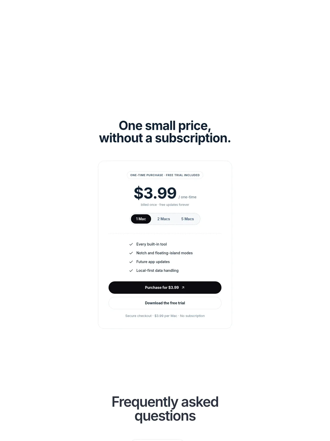
 Visual closing product statement
NotchPop · Call to action
Visual closing product statement
NotchPop · Call to action
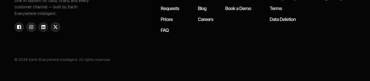
 Final conversion banner
IntellAgents.io · Call to action
Final conversion banner
IntellAgents.io · Call to action
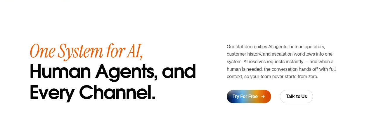 System positioning statement
IntellAgents.io · Call to action
System positioning statement
IntellAgents.io · Call to action
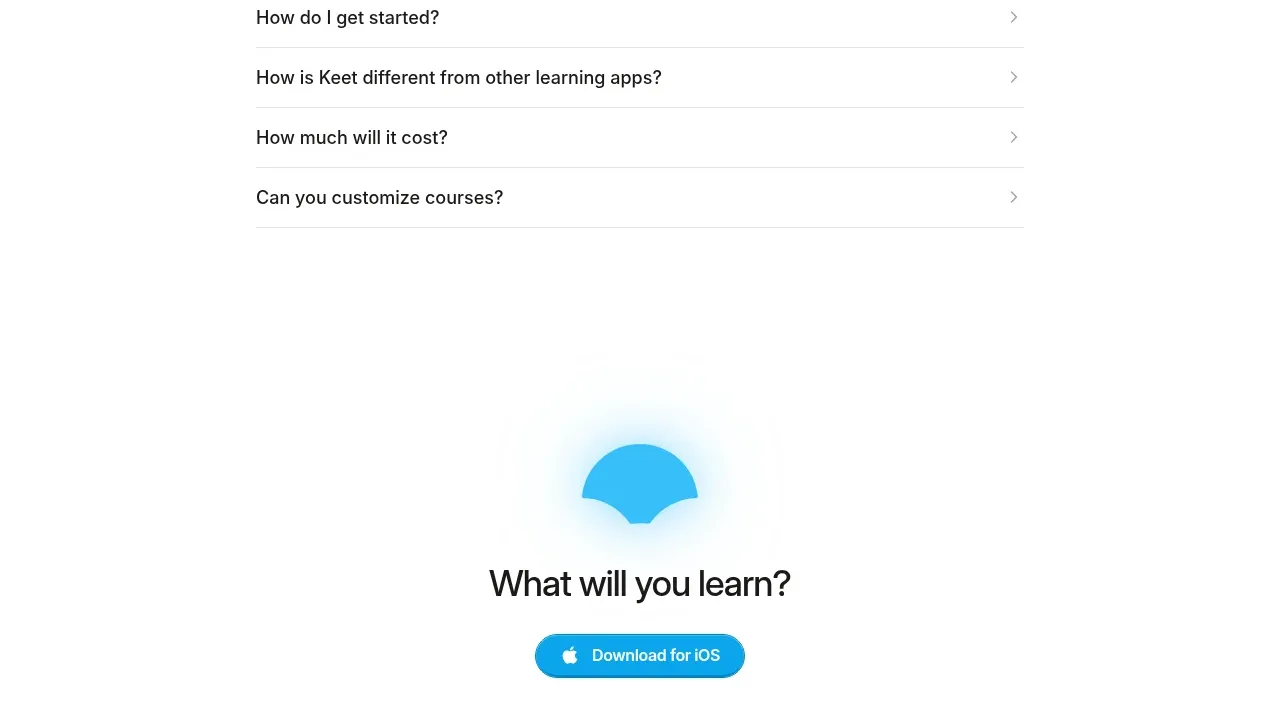
 Final app-download call to action
Keet · Call to action
Final app-download call to action
Keet · Call to action
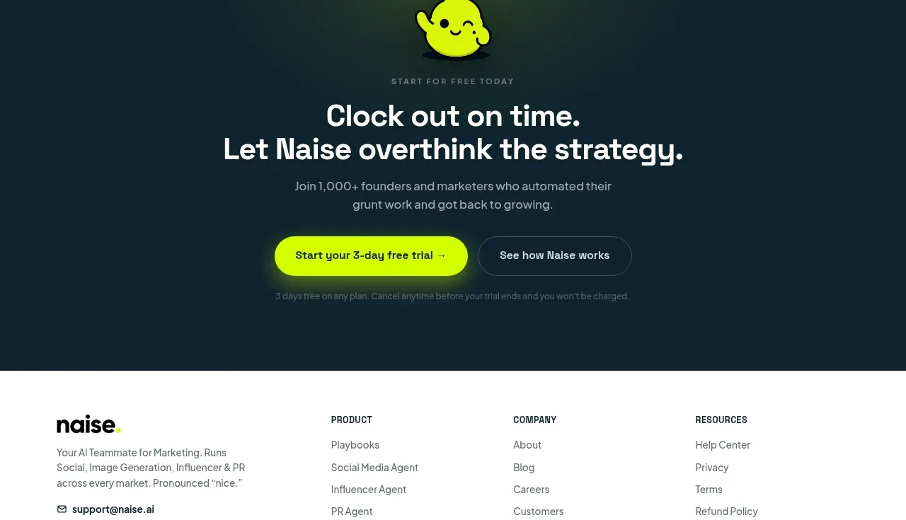
 Dark conversion call to action
Naise AI · Call to action
Dark conversion call to action
Naise AI · Call to action
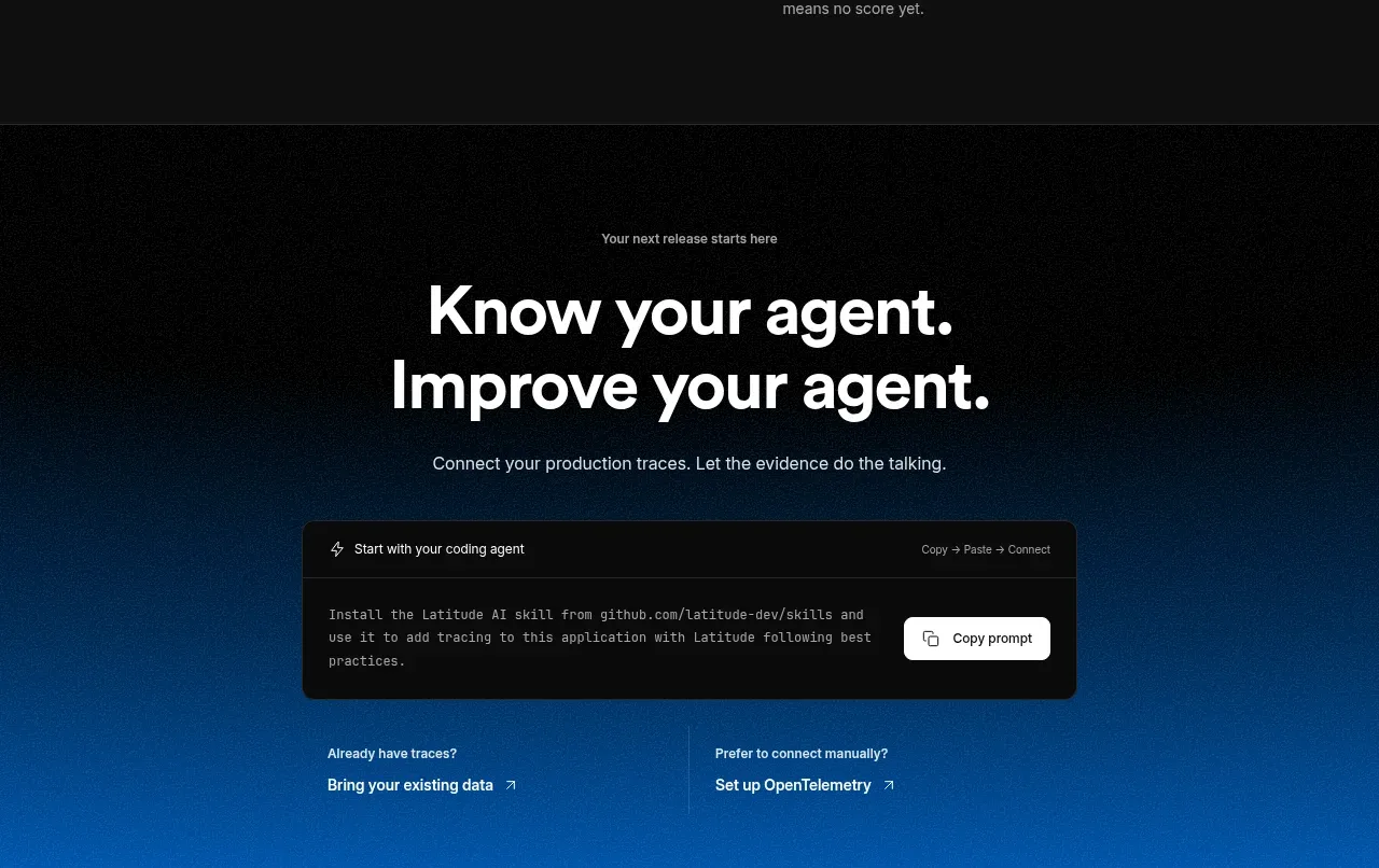
 Connect data and start improving
AgentScore · Call to action
Connect data and start improving
AgentScore · Call to action