kage
kage
harbor.my
Design analysis
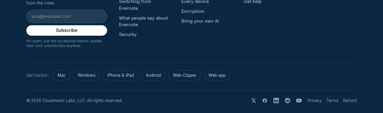
The dark footer combines brand positioning, an email signup, grouped navigation links, platform shortcuts, and a legal/social utility row.
Prompt preview
## Reference images

Study these alongside the description below: hierarchy, rhythm, spacing, colour. Build for the product you are asked about, using this design language.

- Component: https://kage-design-assets.t3.tigrisfiles.io/components/harbor/210c2f1c-cc35-4a7c-ab88-9680504ac3f6-1789970607-11.webp
- Full page it was cut from: https://kage-design-assets.t3.tigrisfiles.io/screenshots/harbor/210c2f1c-cc35-4a7c-ab88-9680504ac3f6-1789970506977-full.webp
- Component on Kage: https://kage.design/component/harbor-footer

## Before you start
Ask what the user's product, audience, and brand are, then apply the principles below to that product rather than reproducing the reference.

Build a deep navy footer around `#092A46` with a centered max-width container. In the upper area, place a brand summary and newsletter form on the left, then three or four columns of grouped navigation links. Use small uppercase group labels, muted blue-gray links, and a clear email input plus rounded subscribe button. Add a horizontal divider, a row of platform shortcuts as outlined pills, and a bottom legal/social row. Use 40–56px top padding, 24px column gaps, 1px dividers around `#21445D`, white or pale text for emphasis, and responsive stacking on mobile. Ensure the form has labels, validation, and visible focus styles.

Never use logos, product names, copy, illustrations, or imagery from the reference.