kage
kage
harbor.my
Design analysis
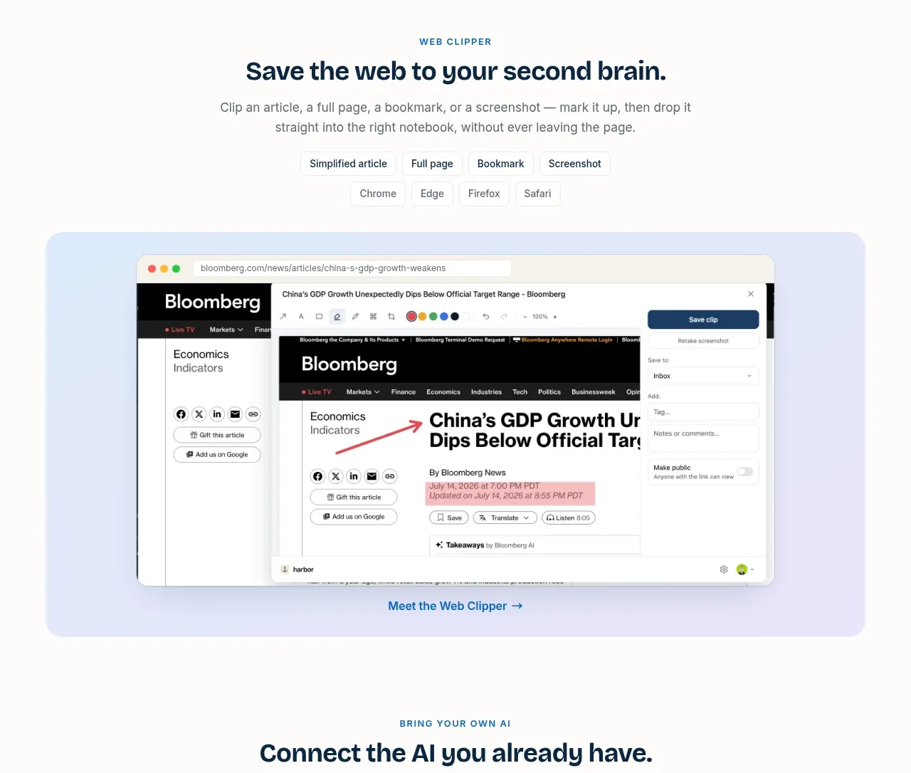
A centered web-clipping feature introduces the workflow with format chips and a large browser-style screenshot in a tinted rounded panel.
Prompt preview
## Reference images

Study these alongside the description below: hierarchy, rhythm, spacing, colour. Build for the product you are asked about, using this design language.

- Component: https://kage-design-assets.t3.tigrisfiles.io/components/harbor/210c2f1c-cc35-4a7c-ab88-9680504ac3f6-1789970604-4.webp
- Full page it was cut from: https://kage-design-assets.t3.tigrisfiles.io/screenshots/harbor/210c2f1c-cc35-4a7c-ab88-9680504ac3f6-1789970506977-full.webp
- Component on Kage: https://kage.design/component/harbor-gallery

## Before you start
Ask what the user's product, audience, and brand are, then apply the principles below to that product rather than reproducing the reference.

Create a centered feature demonstration for saving content from the web. Use an eyebrow, a concise headline, one explanatory paragraph, small selectable format/browser chips, and a large browser mockup below. Put the mockup in a pale lavender-blue rounded container with generous inset padding; use layered browser chrome and a visible save action to make the workflow obvious. Keep the content max-width around 800px, center the heading, and provide one text link beneath the visual. Use `#F1F0FF` or `#E4EEFF` for the panel, `#09243A` for type, `#168BE3` for actions, 12–24px radii, and a delicate shadow.

Never use logos, product names, copy, illustrations, or imagery from the reference.