 kage
kage
hark.com

Design analysis
A second, taller typographic statement presents the company belief as a centered manifesto moment, using scale and whitespace rather than supporting UI.
Prompt preview
## Reference images

Study these alongside the description below: hierarchy, rhythm, spacing, colour. Build for the product you are asked about, using this design language.

- Component: https://kage-design-assets.t3.tigrisfiles.io/components/hark/c0ab7f75-9849-4088-b995-f4bab40ea0a8-1791525721-8.webp
- Full page it was cut from: https://kage-design-assets.t3.tigrisfiles.io/screenshots/hark/c0ab7f75-9849-4088-b995-f4bab40ea0a8-1791525672611-full.webp
- Component on Kage: https://kage.design/component/hark-cta-2

## Before you start
Ask what the user's product, audience, and brand are, then apply the principles below to create an original version for that product.

Build a manifesto-style CTA section that states the product’s worldview in a few centered lines and offers one quiet follow-up link.

### Design language
- Reserve a tall, calm band with a centered content column roughly 620–700px wide.
- Use a refined serif at approximately 58–84px desktop size, with compact line height and intentional wrapping.
- Keep the background pure or warm white (`#ffffff` / `#fcfcfb`) and the text nearly black (`#101010`).
- Add a small pill action beneath the statement; it should feel like an invitation to learn more, not a sales button.
- Use generous top and bottom whitespace and ensure the section remains legible at narrow widths.

### Never
- Never reuse logos, product names, copy, illustrations, or imagery from the reference.
- Never dilute the statement with feature lists, testimonials, or decorative imagery.
More components
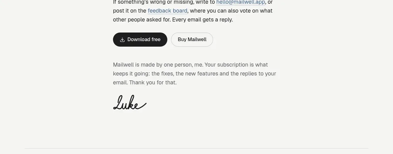
 Trial and purchase call to action
Mailwell · Call to action
Trial and purchase call to action
Mailwell · Call to action
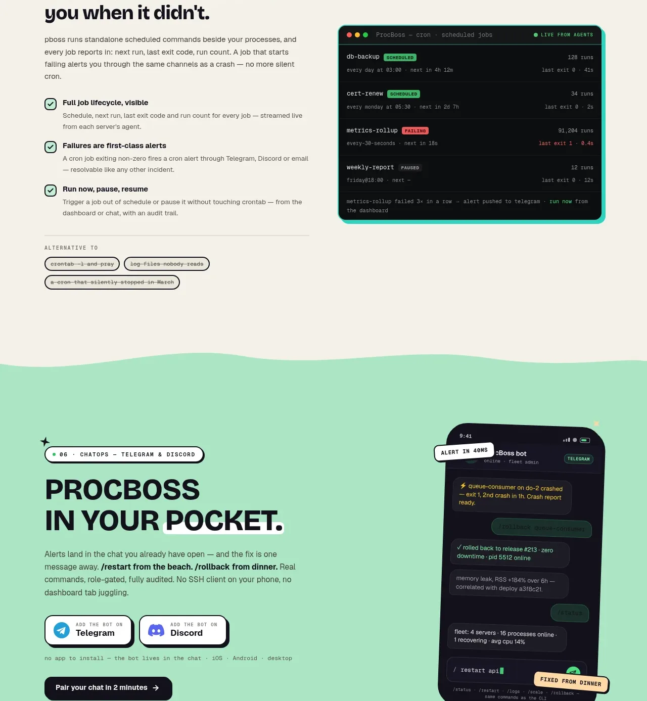
 Pocket alerts call to action
ProcBoss · Call to action
Pocket alerts call to action
ProcBoss · Call to action
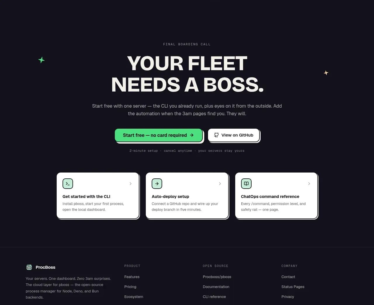 Dark final conversion band
ProcBoss · Call to action
Dark final conversion band
ProcBoss · Call to action
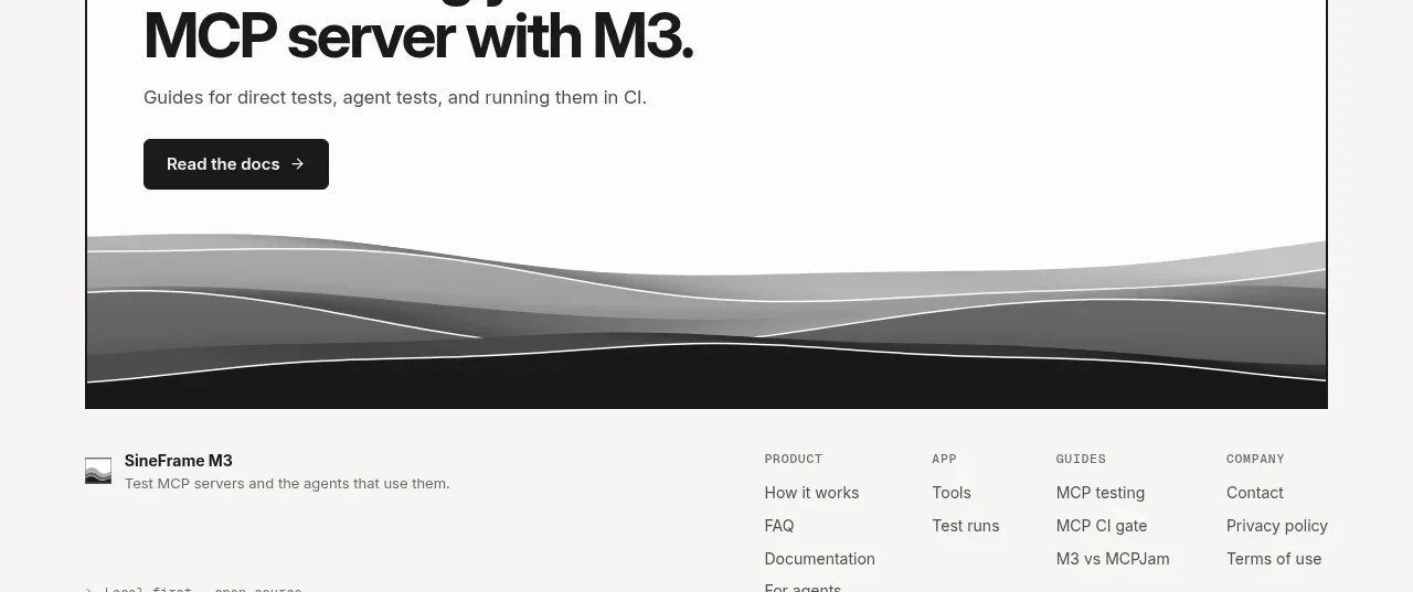
 Documentation call to action
SineFrame M3 · Call to action
Documentation call to action
SineFrame M3 · Call to action
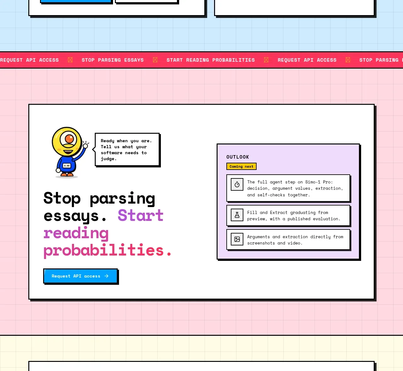
 Conversion call to action
Simo · Call to action
Conversion call to action
Simo · Call to action
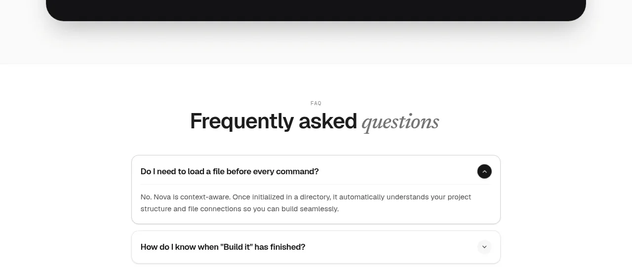
 Install command CTA
NOVA CLI v1.0 · Call to action
Install command CTA
NOVA CLI v1.0 · Call to action