kage
kage

Design analysis
A consumer AI landing page built on a very light, airy canvas: a compact nav, a short hero with a large friendly headline, and then a long scroll of product moments rather than dense feature lists. The page alternates white breathing-room sections with vivid pastel-gradient cards — pink-to-purple and cool blues — that showcase app screens and use-cases, so the rhythm swings between calm whitespace and saturated colour blocks. Soft, generous corner radii, floating phone-style UI captures and a rounded card grid keep it feeling approachable and consumer-grade, closing on a deep blue band with links. Typography is large but sparse: one oversized statement in the hero, then smaller supporting copy that lets the colourful product visuals do the persuading.
Prompt preview
## Reference images

Study these alongside the description below: hierarchy, rhythm, spacing, colour. Build for the product you are asked about, using this design language.

- Full page: https://kage-design-assets.t3.tigrisfiles.io/screenshots/hark/c0ab7f75-9849-4088-b995-f4bab40ea0a8-1791525672611-full.webp
- Above the fold: https://kage-design-assets.t3.tigrisfiles.io/screenshots/hark/c0ab7f75-9849-4088-b995-f4bab40ea0a8-1791525669452.webp
- Design on Kage: https://kage.design/designs/hark-landing-page

## Before you start
Ask the user what they are building, who it is for, and what brand assets they already have (name, colours, type). Wait for the answers. Everything below is a design language to apply to *their* product, not a clone of the reference.

## Page structure
1. **Nav**: minimal top bar — small wordmark left, a few quiet links and one strong CTA button right. Keep it short and transparent-feeling against the page background.
2. **Hero**: a single oversized statement headline (short enough to read in one breath), one line of supporting copy, and one primary CTA. Lots of white space; centre or left-align on a narrow measure.
3. **Product visual strip**: immediately below the hero, a row of app/phone screens or UI cards, slightly overlapping or floating, so the product is visible before any explanation.
4. **Use-case cards**: a grid or alternating band of rounded cards, each pairing a vivid pastel gradient (pink→purple, blue→teal) with a short benefit headline and a product screenshot. These carry the persuasion; copy stays minimal.
5. **How-it-works section**: back to a white background — 2–3 simple steps or capability rows with small icons, generous vertical spacing, quieter type.
6. **Feature highlights**: one or two full-width colour sections (a saturated blue band works well) that break the white rhythm and re-energise the scroll near the end.
7. **Closing CTA**: a short centred section repeating the value promise with one button.
8. **Footer**: deep dark-blue band with 3–4 columns of small links, muted text colour, plus a light legal row at the very bottom.

## Design language
- **Hierarchy**: one hero statement does the heavy lifting; below it, hierarchy shifts from colour and imagery, not from more big type. Keep supporting copy at 14–16px and never let more than two text sizes compete in a section.
- **Rhythm**: alternate dense, colourful card bands with near-empty white sections. The scroll should feel like inhale/exhale — saturated, then quiet, then saturated again near the end.
- **Colour**: off-white or pure white base (#FFFFFF / #FAFAFA); ink text near-black (#14161F); accents in warm pink→violet gradients (#F58BC0 → #7B5CFF) and cool blue (#3B6BFF / #123A8C for the footer band). Use gradients only inside cards and bands, never on body text.
- **Type**: a friendly geometric sans throughout. Hero at ~clamp(40px, 6vw, 72px), tight line-height (~1.05); section headlines ~32–40px; body 16px with relaxed line-height (~1.6). No serif, no more than one family.
- **Shape & surface**: large soft radii (16–24px on cards, fully rounded buttons and pills), very subtle shadows (0 8px 30px rgba(0,0,0,0.08)) or none — let colour do the depth. Thin 1px light-grey borders where cards sit on white.
- **Spacing**: generous — 96–128px between major sections, 24–32px inside card grids, wide gutters around hero text.
- **Motion**: gentle only — soft fade/slide-up on scroll-in for cards, subtle hover lift (translateY(-4px)) on cards and buttons. Nothing bouncy or autoplaying video.
- **Tone**: warm, human, consumer-friendly. Benefit-led copy, first-person voice, short sentences.

## Never
- No logos, wordmarks, product names, screenshots, illustrations, photography or icon sets from the reference page.
- Never present the result as the reference product or reuse its copy, tagline or brand colours verbatim.
- Do not fill the page with fake testimonials or invented stats if the user hasn't supplied them; leave clear placeholders instead.
Components from this page
All components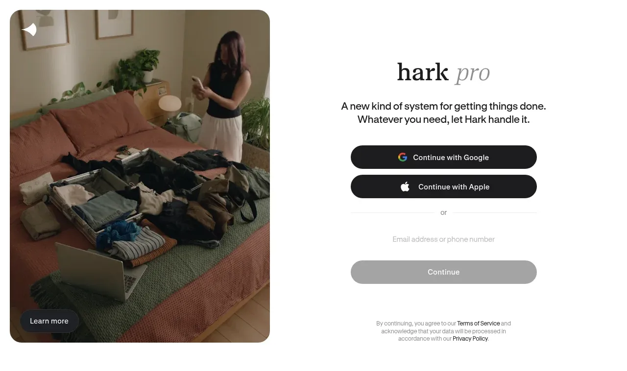
 Split sign-up hero
Hark · Hero
Split sign-up hero
Hark · Hero
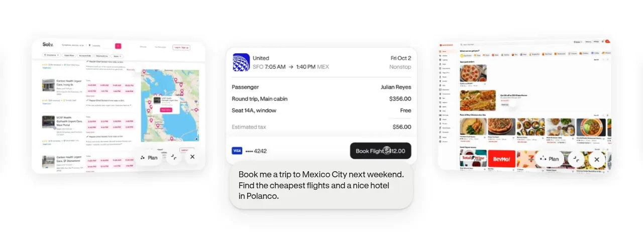 Product-in-context showcase
Hark · Gallery
Product-in-context showcase
Hark · Gallery
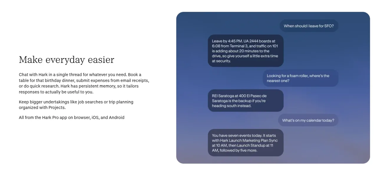 Everyday assistance feature
Hark · Feature grid
Everyday assistance feature
Hark · Feature grid
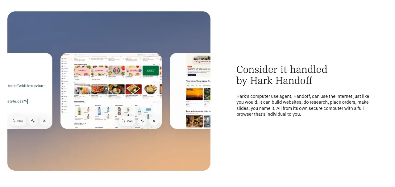 Handled-on-your-behalf feature
Hark · Feature grid
Handled-on-your-behalf feature
Hark · Feature grid
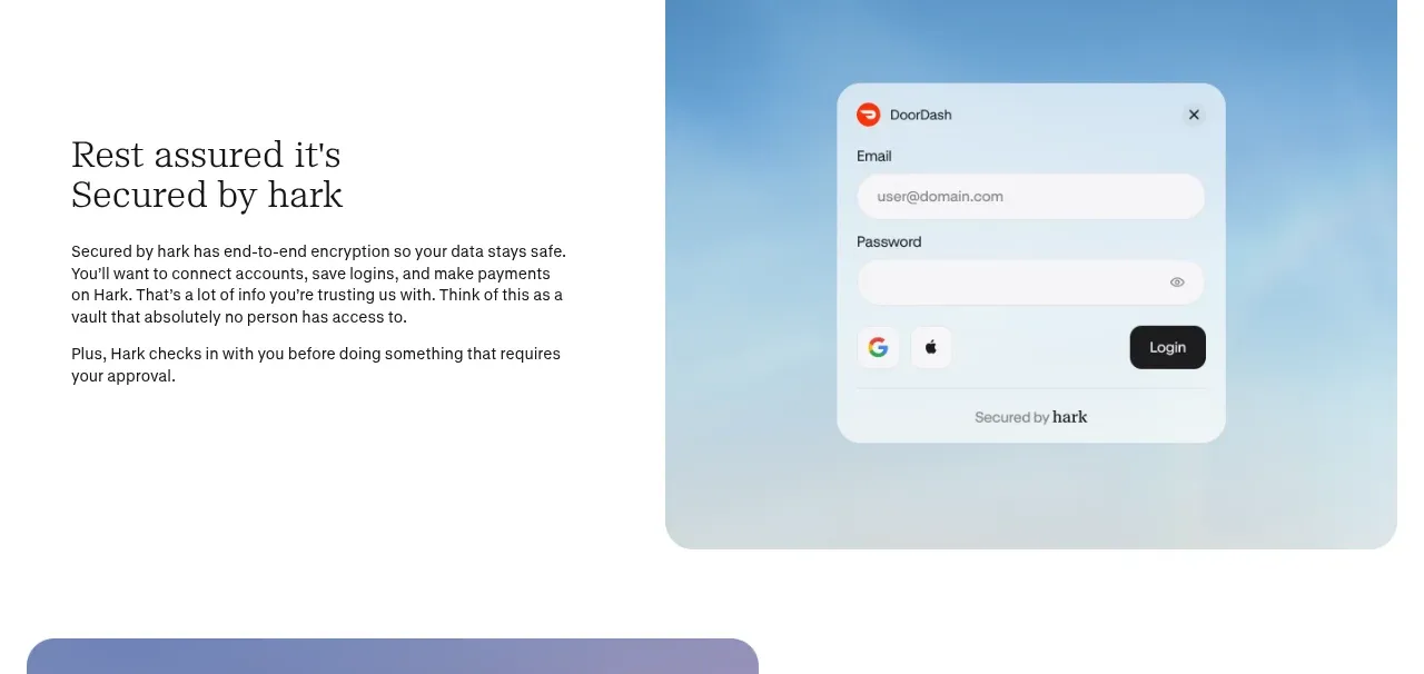 Security and trust feature
Hark · Feature grid
Security and trust feature
Hark · Feature grid
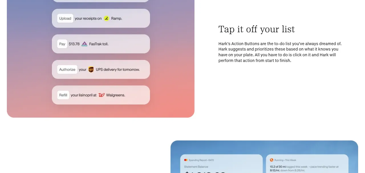 Action buttons feature
Hark · Feature grid
Action buttons feature
Hark · Feature grid
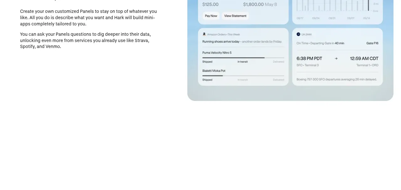 Custom panels feature
Hark · Feature grid
Custom panels feature
Hark · Feature grid
 Capability statement
Hark · Call to action
Capability statement
Hark · Call to action
 Manifesto statement
Hark · Call to action
Manifesto statement
Hark · Call to action
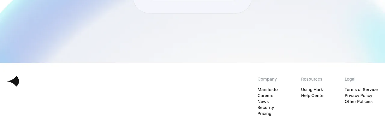 Final sign-up form
Hark · Form
Final sign-up form
Hark · Form
 Multi-column site footer
Hark · Footer
Multi-column site footer
Hark · Footer